FvDesigner provides plenty of objects for users, the following is a list of all available objects and an introduction to each object.
19.1 Object Planning and Properties Modification
There are two ways to place an object onto the work space:
- Left-click the mouse on an object in the object section of the design page in the function section and then left-click the mouse on the work space.
- Use the mouse to drag-and-drop an object in the toolbox onto the work space.
Every object added to the work space will appear in the object list and has its own unique ID. There are two ways to view and change the properties of an object:
- Double-click on the object and the setting page of the object will appear.
- Single-click on an object and then click on the right mouse button to display the object menu, and then select Properties.
When the objects on the screen overlap, you can right-click the object, and the 【Overlapping Object List】will appear in the order for users to view
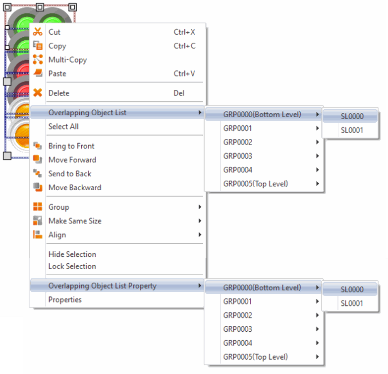
Figure 236 Object List【Overlapping Object List】
The Monitor Address can be set for many objects. This means that the data source of this object is from the register address of the device (HMI, PLC). Details can be viewed at the【Memory Address】section of the screen in order for the user to have a better understanding of the usage status of the registers.
Part of the objects can be set from the Ribbon workspace【Theme】on the software interface, as shown in the figure below.
Note: The Ribbon only has some common settings. Detailed settings for each object must be set through another method.
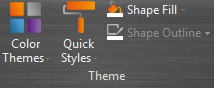
Figure 237 【Theme】in【Ribbon workspace】【Design】paging
The following is the list of objects provided by the FvDesigner; click on the hyperlink of the object’s name to view the detailed descriptions of the object.
Table 112 Image Objects and Basic Object Library Categories
|
Function |
Description |
||||||||||||||||||||||||||||
|
【Draw】 |
Basic Draw components. |
||||||||||||||||||||||||||||
|
【Lamp/Switch】 |
Basic Lamp/Switch.
|
||||||||||||||||||||||||||||
|
【Numeric/Text】 |
Numeric/Text Display/Input. |
||||||||||||||||||||||||||||
|
【Display】 |
Display Date/Time, Window Screen Display |
||||||||||||||||||||||||||||
|
【Graph】 |
Graph |
||||||||||||||||||||||||||||
|
【Other Switch】 |
Other Switches.
|
||||||||||||||||||||||||||||
|
【Keypad】 |
Keypad related objects. |
||||||||||||||||||||||||||||
|
【Animated Graphic】 |
Animated Graphic.
|
||||||||||||||||||||||||||||
|
【Data Log】 |
Data Log-related objects.
|
||||||||||||||||||||||||||||
|
【Alarm】 |
Alarm-related objects.
|
||||||||||||||||||||||||||||
|
【Recipe】 |
Recipe-related objects. |
||||||||||||||||||||||||||||
|
【Operation Logger】 |
Operation Logger-related objects.
|
||||||||||||||||||||||||||||
|
【Schedule】 |
Schedule-related objects.
|
||||||||||||||||||||||||||||
|
【Video Input】 |
Video Input-related objects.
|
 【Dot】
 【Line】
 【Polyline】
 【Rectangular】
 【Polygon】
 【Ellipse】
 【Arc】
 【Pie】
 【Table】
 【Text】
 【Image】
 【Scale】
 【Pipeline】
 【Lamp】
 【Bit Switch】
 【Word Switch】
 【Change Screen】
 【Function Switch】
 【Numeric Input/Display】
 【Text Input/Display】
 【QR Code Input/Display】
 【Date/Time Display】
 【Window Screen Display】
 【Meter】
 【Linear Meter】
 【Circular Graph】
 【Data Block Graph】
 【Data Block XY Scatter】
 【Multistate Switch】
 【Slide Switch】
 【Selector List】
 【Radio Button】
 【Input Display】
 【Key】
 【Limit Value Display】
 【Animated Graphic】
 【Rotation Indicator】
 【Gif Display】
 【Historic Trend】
 【Historic XY Scatter】
 【Historic Data Table】
 【Historic Data Selector】
 【Alarm Display】
 【Alarm Scrolling Text】
 【Alarm Data Selector】
 【Recipe Selector】
 【Recipe Table】
 【Operation Viewer】
 【Schedule Setting Table】
 【Video Input Display】
19.2 Object Operation Page Setting
The paging is shown in the figure below, and the meanings of each setting option are as follows:
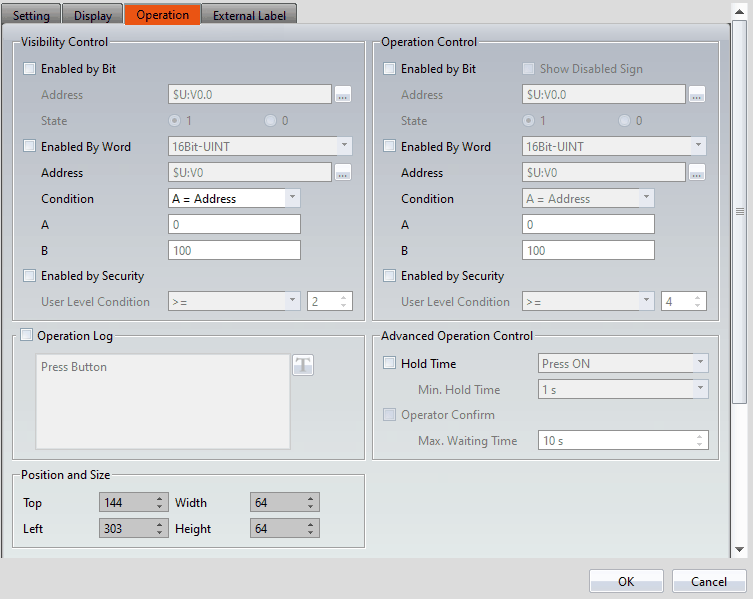
Figure 238 Object Setting page for【Operation】
Table 113 Property settings for【Operation】
|
Property |
Description |
|
【Visibility Control】 |
Visibility control of the object. It can be controlled by a specific Bit or by User Level. 【Enable by Bit】 Select to control visibility by a specific Bit. 【Address】 Set the address of the visibility control Bit. 【State】 Set the control bit as 1 or 0 to show object. 【Enabled by Word】 Check whether the visibility is controlled by word. 【Address】 Set the visibility control word address. 【Condition】 Set the condition of word control and when it is true then show up the object, when false not show the object. The condition include’ =’,’ !=’, ‘>’, ‘<’, ‘>=’, ‘<=’. 【Enabled by Security】 Select if visibility is to be controlled by the level of the user logged in. 【User Level Condition】 Set the level and condition of the object. |
|
【Operation Control】 |
Operation control of the object. It can be controlled by a specific Bit or User Level. 【Enable by Bit】 Select to control operation by a specific Bit. 【Show Disabled Sign】 Check if you want to display the forbidden symbol, it’s valid when check【Enable by Bit】,【Enabled by Word】 or【Enable by Security】. 【Address】 Set the address of the operation control Bit. 【State】 Set the control bit as 1 or 0 to operate object. 【Enabled by Word】 Check whether the operation is controlled by word. 【Address】 Set the operation control word address. 【Condition】 Set the condition of word control and when it is true then the object can be controlled, when false not the object can not be controlled. The condition include’ =’,’ !=’, ‘>’, ‘<’, ‘>=’, ‘<=’. 【Enabled by Security】 Select if operation is to be controlled by the level of the user logged in. 【User Level Condition】 Set the level and condition of the object. |
|
【Operation Log】 |
Select to enable the【Operation Log】of the object. It can also edit operation messages, in which the message can be inputted directly or acquired from the【Text Library】. |
|
【Advanced Operation Control】 |
【Input Timeout】 Select if the【Pop-up Keypad】,【On-screen Keypad】or【USB Barcode Scanner】is controlled by time. 【Timeout Time】 If the user did not operate the【Keypad Screen】within this time, the system will close the【Keypad Screen】and cancel this operation. 【Operation Confirm】 Select to display the confirmation window after the operation is executed. 【Max Waiting Time】 The system will close the confirmation window and cancel this operation if the user did not acknowledge it within this time. |
|
【Position and Size】 |
Set the position and size of the object on the screen. |
19.3 Draw Object Properties Dialog
19.3.1 【Dot】
19.3.1.1 【Setting】
The 【Dot】【Setting】page is a shown in the figure below. Each option is explained.
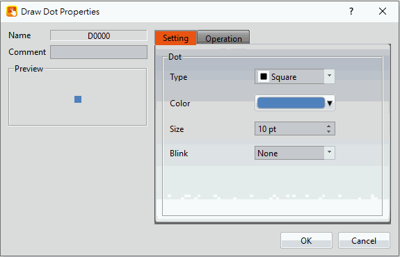
Figure 239 Setting page for【Dot】
Table 114 Property settings for【Dot】
|
Property |
Description |
|
【Preview】 |
Preview the appearance of the object. |
|
【Dot】 |
【Type】 Set the type of dot. 【Color】 Set the color of the dot. 【Size】 Set the size of the dot. 【Blink】 Set the blinking of the dot; four blinking speeds are available for selection: None, Fast, Medium and Slow. |
19.3.2 【Line】
19.3.2.1 【Setting】
The【Line】【Setting】page is a shown in the figure below. Each option is explained.
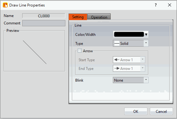
Figure 240 Setting page for【Line】
Table 115 Property settings for【Line】
|
Property |
Description |
|
【Preview】 |
Preview the appearance of the object. |
|
【Line】 |
【Color/Width】 Set the color and the width of the line. 【Type】 Set the type of line. 【Arrow】 Set whether to have arrows on the ends of the line. 【Start Type】 Set the arrow type at the start of the line. 【End Type】 Set the arrow type at the end of the line. 【Blink】 Set the blinking speed of the line; four blinking speeds are available for selection: None, Fast, Medium and Slow. |
Tips:
- User can create a line at an angle that is a multiple of 45 degrees (including horizontal and vertical line) easily by holding "Shift" while creating the line.
- If user modifies the line’s length while pressing "Shift", the line’s angle will be fixed.
- Generally (without pressing any keypad), the angle can be changed at multiples of 5 degrees.
- If user modifies the line’s length while pressing "Alt", the line angle can be changed freely
19.3.3 【Polyline】
19.3.3.1 【Setting】
The 【Polyline】【Setting】page is a shown in the figure below. Each option is explained.
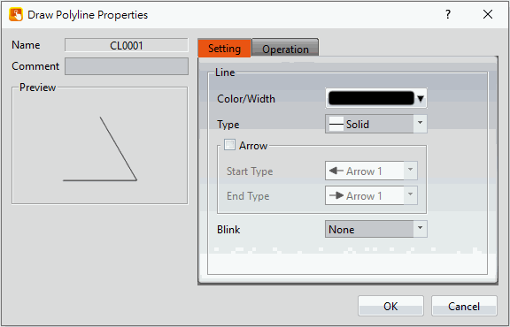
Figure 241 Setting page for【Polyline】
Table 116 Property setting for【Polyline】
|
Property |
Description |
|
【Preview】 |
Preview the appearance of the object. |
|
【Line】 |
【Color/Width】 Set the color and the width of the line. 【Type】 Set the type of line. 【Arrow】 Set whether to have arrows on the ends of the line. 【Start Type】 Set the arrow type at the start of the line. 【End Type】 Set the arrow type at the end of the line. 【Blink】 Set the blinking speed of the line; four blinking speeds are available for selection: None, Fast, Medium and Slow. |
Users can freely modify the corresponding dot positions for【Polyline】, as well as add or delete a dot.
- To modify the relative position of a dot
When the user double-clicks on an object, a dragging block will be displayed for the dots of this object; this is when you can change the position of the dots, as shown in the figure below:
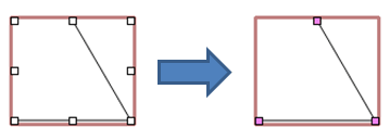
Figure 242 Illustration diagram when users double-click on a【Polyline】
- Adding a dot
When the user double-clicks on an object, a dragging block will be displayed for the dots of this object; move the mouse anywhere on the line and the cursor will change to  . At this time, press and hold the left mouse button and move the mouse to insert a dot anywhere you want.
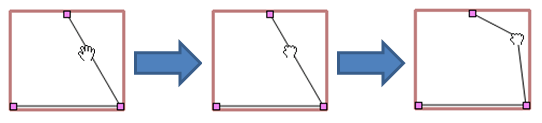
Figure 243 Illustration diagram of adding a dot on a【Polyline】
- Deleting a dot
When the user double-clicks on an object, a dragging block will be displayed for the dots of this object; move the mouse onto any block on the line and the cursor will change to  . At this time, press and hold the right mouse button to display the option to delete the dot.

Figure 244 Illustration diagram of deleting a dot on a【Polyline】
19.3.4 【Rectangle】
19.3.4.1 【Setting】
The 【Rectangle】【Setting】page is a shown in the figure below. Each option is explained.
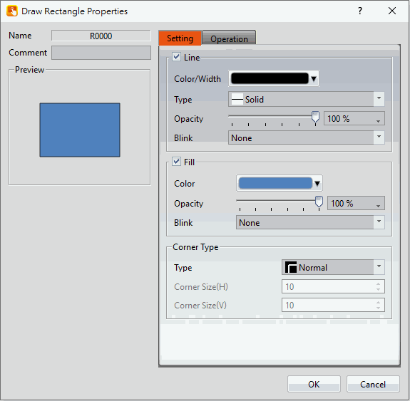
Figure 245 Setting page for【Rectangular】
Table 117 Property setting for【Rectangular】
|
Property |
Description |
|
【Preview】 |
Preview the appearance of the object. |
|
【Line】 |
【Color/Width】 Set the color and the width of the line. 【Type】 Set the type of line. 【Opacity】 Set the opacity of the line. 【Blink】 Set the blinking speed; four blinking speeds are available for selection: None, Fast, Medium and Slow. |
|
【Fill】 |
【Color】 Set the color or material type of the fill. 【Opacity】 Set the opacity of the fill. 【Blink】 Set the blinking of the fill; four blinking speeds are available for selection: None, Fast, Medium and Slow. |
|
【Corner Type】 |
【Type】 Set the corner type. Supports Normal, Rounded, and Clipped. 【Corner Size(H)】 Set the horizontal size of the corner. 【Corner Size(V)】 Set the vertical size of the corner. |
19.3.5 【Polygon】
【Polygon】is similar to【Polyline】. Users can freely modify the corresponding dot positions as well as add and delete dots. The operating method is identical to【Polyline】.
19.3.5.1 【Setting】
The 【Polygon】【Setting】page is a shown in the figure below. Each option is explained.
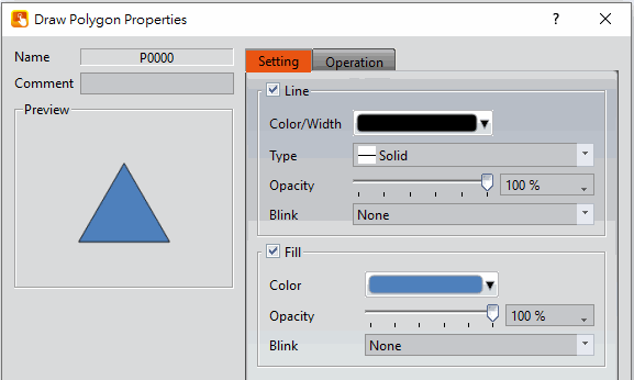
Figure 246 Setting page for【Polygon】
Table 118 Property settings for【Polygon】
|
Property |
Description |
|
【Preview】 |
Preview the appearance of the object. |
|
【Line】 |
【Color/Width】 Set the color and the width of the line. 【Type】 Set the type of line. 【Opacity】 Set the opacity of the line. 【Blink】 Set the blinking speed of the line; four blinking speeds are available for selection: None, Fast, Medium and Slow. |
|
【Fill】 |
【Color】 Set the color or material type of the fill. 【Opacity】 Set the opacity of the fill. 【Blink】 Set the blinking speed of the fill; four blinking speeds are available for selection: None, Fast, Medium and Slow. |
19.3.6 【Ellipse】
19.3.6.1 【Setting】
The【Ellipse】【Setting】page is a shown in the figure below. Each option is explained.
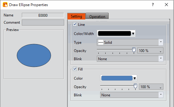
Figure 247 Setting page for【Ellipse】
Table 119 Property settings for【Ellipse】
|
Property |
Description |
|
【Preview】 |
Preview the appearance of the object. |
|
【Line】 |
【Color/Width】 Set the color and the width of the line. 【Type】 Set the type of line. 【Opacity】 Set the opacity of the line. 【Blink】 Set the blinking speed of the line; four blinking speeds are available for selection: None, Fast, Medium and Slow. |
|
【Fill】 |
【Color】 Set the color or material type of the fill. 【Opacity】 Set the opacity of the fill. 【Blink】 Set the blinking speed of the fill; four blinking speeds are available for selection: None, Fast, Medium and Slow. |
19.3.7 【Arc】
19.3.7.1 【Setting】
The【Arc】【Setting】page is a shown in the figure below. Each option is explained.
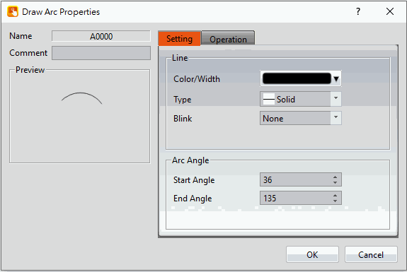
Figure 248 Setting page for【Arc】
Table 120 Property settings for【Arc】
|
Property |
Description |
|
【Preview】 |
Preview the appearance of the object. |
|
【Line】 |
【Color/Width】 Set the color and the width of the line. 【Type】 Set the type of line. 【Blink】 Set the blinking speed of the line; four blinking speeds are available for selection: None, Fast, Medium and Slow. |
|
【Arc Angle】 |
【Start Angle】 Set the starting angle of the arc. 【End Angle】 Set the ending angle of the arc. |
Users can change the angle of the【Arc】directly:
When the user clicks on the object, dragging blocks will appear at the two ends of this object. Drag the blocks to change the angle of the arc.
19.3.8 【Pie】
19.3.8.1 【Setting】
The【Pie】【Setting】page is a shown in the figure below. Each option is explained.
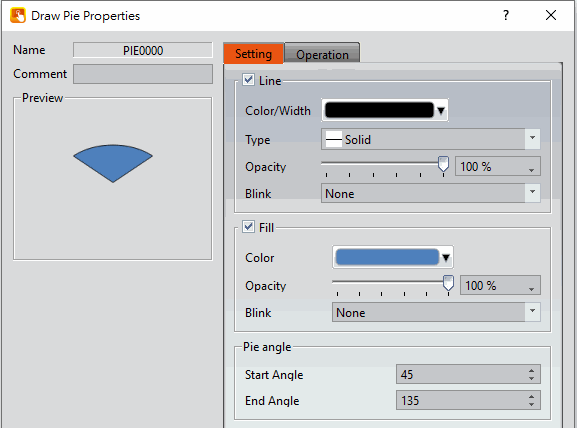
Figure 249 Setting page for【Pie】
Table 121 Property settings for【Pie】
|
Property |
Description |
|
【Preview】 |
Preview the appearance of the object. |
|
【Line】 |
【Color/Width】 Set the color and the width of the line. 【Type】 Set the type of line. 【Opacity】 Set the opacity of the line. 【Blink】 Set the blinking speed of the line; four blinking speeds are available for selection: None, Fast, Medium and Slow. |
|
【Fill】 |
【Color】 Set the color or material type of the fill. 【Opacity】 Set the opacity of the fill. 【Blink】 Set the blinking speed of the fill; four blinking speeds are available for selection: None, Fast, Medium and Slow. |
|
【Pie Angle】 |
【Start Angle】 Set the starting angle of the pie. 【End Angle】 Set the ending angle of the pie. |
Users can change the angle of the【Pie】directly:
When the user clicks on the object, dragging blocks will appear at the two ends of this object. Drag the blocks to change the angle of the arc.
19.3.9 【Table】
19.3.9.1 【Setting】
The【Table】【Setting】page is a shown in the figure below. Each option is explained.
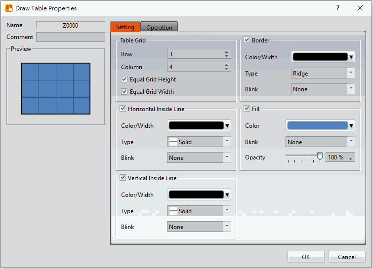
Figure 250 Setting page for【Table】
Table 122 Property settings for【Table】
|
Property |
Description |
|
【Preview】 |
Preview the appearance of the object. |
|
【Border】 |
【Color/Width】 Set the color and the width of the border. 【Type】 Set the border type. 【Blink】 Set the blinking speed of the border; four blinking speeds are available for selection: None, Fast, Medium and Slow. |
|
【Table Grid】 |
【Row】 Set the number of rows for the table. 【Column】 Set the number of columns for the table. 【Equal Grid Height】 Set the cells in the table to have the same height. 【Equal Grid Width】 Set the cells in the table to have the same width. Note: When【Equal Grid Height】and【Equal Grid Width】are not selected, users can drag the border of the grids to change the size of the grids. |
|
【Fill】 |
【Color】 Set the color or material type of the fill. 【Blink】 Set the blinking speed of the fill; four blinking speeds are available for selection: None, Fast, Medium and Slow. 【Opacity】 Set the opacity of the fill. |
|
【Horizontal Inside Line】 |
Select to display the horizontal grid lines. 【Color/Width】 Set the color and width of the horizontal grid lines. 【Type】 Set the type of horizontal grid line. 【Blink】 Set the blinking speed of the fill; four blinking speeds are available for selection: None, Fast, Medium and Slow. |
|
【Vertical Inside Line】 |
Select to display the vertical grid lines. 【Color/Width】 Set the color and width of the vertical grid lines. 【Type】 Set the type of vertical grid line. 【Blink】 Set the blinking speed of the fill; four blinking speeds are available for selection: None, Fast, Medium and Slow. |
19.3.10 【Text】
19.3.10.1 【Setting】
The【Text】【Setting】page is a shown in the figure below. Each option is explained.
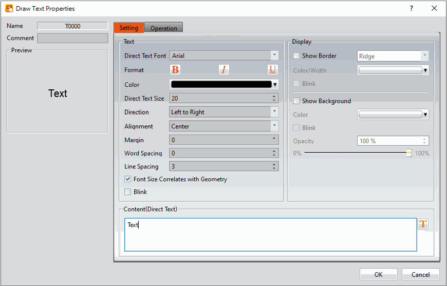
Figure 251 Settings page for【Text】
Table 123 Property settings for【Text】
|
Property |
Description |
|
【Preview】 |
Preview the appearance of the object. |
|
【Text】 |
【Font】 Set the font of the text. 【Format】 Set the format of the text, bold, italics or bottom line. 【Color】 Set the color of the text. 【Size】 Set the size of the text, default is 20. 【Direction】 Set the direction of the text, optional vertical or horizontal. 【Alignment】 Set the alignment of the text. 【Margin】 Set the margin of the text, it will only work when【Font Size Correlates with Geometry】is checked. 【Word Spacing】 Set word sapcing of the text. 【Line Spacing】 Set line spacing of the text. 【Font Size Correlates with Geometry】 The size of the object may change more or less by the font size. 【Blink】 Select to turn on the blinking function for the texts. |
|
【Display】 |
Divided into two parts: borders and backgrounds; can be set individually. Border: 【Show Border】 Select to display the border. When it is checked, the color, width and blinking function of the border can be set at the bottom. 【Color/Thickness】 Set the displayed color and thickness of the border. 【Blink】 Set to turn on the blinking function of the border. Background: 【Show Background】 Select to display the background. When it is checked, the color, width and blinking function of the background can be set at the bottom. 【Color】 Set the background color of the object. 【Blink】 Set to turn on the blinking function for the background of the object. 【Opacity】 Set the background opacity of the object. The larger the value, the less transparent the background. |
|
【Content】 |
Fill the words you want, can be entered directly or by the 【Font Library】. |
19.3.11 【Image】
19.3.11.1 【Setting】
The【Image】【Setting】page is a shown in the figure below. Each option is explained.
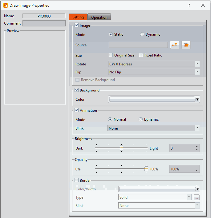
Figure 252 Settings page for【Image】
Table 124 Property settings for【Image】
|
Property |
Description |
|
【Preview】 |
Preview the appearance of the object. |
|
【Setting】 |
【Mode】 【Static】Display fixed image, can select from file or library. 【Dynamic】Switch image dynamically, more details in the next chapter. 【Source】 【Static】Display the path of image. 【Dynamic】Can set the path of dynamic image, more details in the next chapter. 【Size】 When the mode is【Static】, this option can be used. It is use to setup the limit of the image size. 【Original Size】The size of the image object is fixed at its original size. 【Fixed Ratio】the image object can be scaled proportional to its original ratio. The image object can be stretched freely when neither is selected. 【Rotate】 Set the rotate degree of the figure, including CW 0 Degrees, CW 90 Degrees, CW 180 Degrees and CW 270 Degrees. 【Flip】 Set the degree the image is rotated, including no flip, X Axis and Y Axis. 【Tone Type】 There are multiple color modes to choose from. 【Tone Color】 Set the color to apply when using【Tone Type】. 【Remove Background】 The mode can be enabled when【Static】is selected and a image has been selected. After checking it, you can click the button of 【Select Color】to select the color to be deleted. |
|
【Background】 |
【Color】 Set the background color. |
|
【Animation】 |
Check whether to enable animated effects. 【Mode】Choose whether to use static or dynamic control elements to flicker. 【Blink】Select the blinking mode, and use the numerical value to switch during dynamic control. |
|
【Brightness】 |
Set the brightness of the image object. The greater the value the brighter the object will be displayed. |
|
【Opacity】 |
Set the opacity of the image object. The greater the value the less transparent the object will be displayed. |
|
【Border】 |
Set the border of the image object. The display appearance of the border can be set once this option is selected. 【Color/Thickness】 Set the displayed color and thickness of the border. 【Type】 Set the border type. 【Blink】 Set the blinking speed of the border. Four blinking speeds are available for selection: None, Fast, Medium and Slow. |
19.3.11.2 Dynamic Image Setting
The following describes the settings when【Dynamic】option is selected.
Note : The images that can be read are limited to JPG/PNG/BMP, and the file size must be less than 2MB.
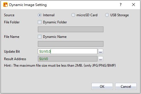
Figure 253 Dynamic Image Setting Page
Table 125 Property settings for Dynamic Image
|
Property |
Description |
||||||||||
|
【Source】 |
Select the source path, including Internal, SD Sard, and USB drive. |
||||||||||
|
【File Folder】 |
If【Dynamic Folder】is not checked, it will be in【Static】mode. 【Static】 If didn’t set the folder name, the default file is in the outermost layer of the USB. If did set up the folder name, it will be read in the specified folder. It should be noted that only can read one layer of folders in 【Static】mode, and no slashes are required. 【Dynamic folder】 The data type is【Ascii】, the length of the string can be set below, and the length of the continuous occupied register will be automatically calculated. The maximum string of characters is 100 words, and the folder name can be dynamically changed according to the content of the register. |
||||||||||
|
【File Name】 |
It can be divided into【Static】and【Dynamic】file names. If 【Dynamic】is not checked, it will be【Static】and the file name can be set directly below. If【Dynamic】is checked, the data type is【Ascii】. The length of the string can be set below, and the length of the continuous occupied register will be automatically calculated. The maximum length of the string is 100 words, and the file name can be dynamically changed according to the content of the register. The file name can be manually selected using the file name extractor. Please click the text below to refer to【Filename Extractor】. The file name needs to be added with a file extension, for example: image.jpg |
||||||||||
|
【Update Bit】 |
Set a bit register as a trigger to read the picture according to the file name, update it when it is on, and it will automatically change back to off after the end. |
||||||||||
|
【Result Address】 |
Displays the address of the read result, the result address is in word. The following is the result address definition table:
|
19.3.12 【Scale】
19.3.12.1 【Setting】
The【Scale】【Setting】page is a shown in the figure below. Each option is explained.
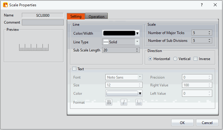
Figure 254 Settings Page for【Scale】
Table 126 Property Settings for【Scale】
|
Property |
Description |
|
【Preview】 |
Preview the appearance of the object. |
|
【Line】 |
【Color/Width】 Set the line width and color. 【Line Type】 Select the appearance of the line. 【Sub Scale Length】 Set the length of the minor scales. |
|
【Scale】 |
【Number of Major Ticks】 Set the number of major divisions of the scale. 【Number of Sub Divisions】 Set the number of minor divisions of the scale. |
|
【Direction】 |
【Horizontal】 Set to align the scale horizontally. If the scale has text, the text is displayed above. 【Vertical】 Set to align the scale vertically. If the scale has text, the text is displayed on the right. 【Inverse】 If the scale is aligned horizontally, set to display the text below the scale. If the scale is aligned vertically, set to display the text on the left side of the scale. |
|
【Text】 |
【Font】 Select the font of the text. 【Size】 Select the size of the text. 【Color】 Select the color of the text. 【Format】 Set the format of the text. 【Precision】 Set the number of decimal places for the text. 【Right/Bottom Value】 When the direction is horizontal, set the far right value of the text. When the direction is vertical, set the bottom value of the text. 【Left/Top Value】 When the direction is horizontal, set the far left value of the text. When the direction is vertical, set the top value of the text. |
19.3.13 【Pipeline】
FvDesigner provide user can build pipeline easily and can use in different environment , such as water treatment application,display flow state and effect, etc.
The object can except drang【Pipeline】from【Toolbox】【Draw】to work space, also can drag from【Ribbon】【Draw】, figure as shown below.
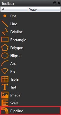
Figure 255【Pipeline】in【Toolbox】
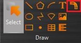
Figure 256【Pipeline】in【Ribbon】
19.3.13.1 【General】
The【Pipeline】【General】page is as shown in the figure below, the meaning of each setting item are listed below:
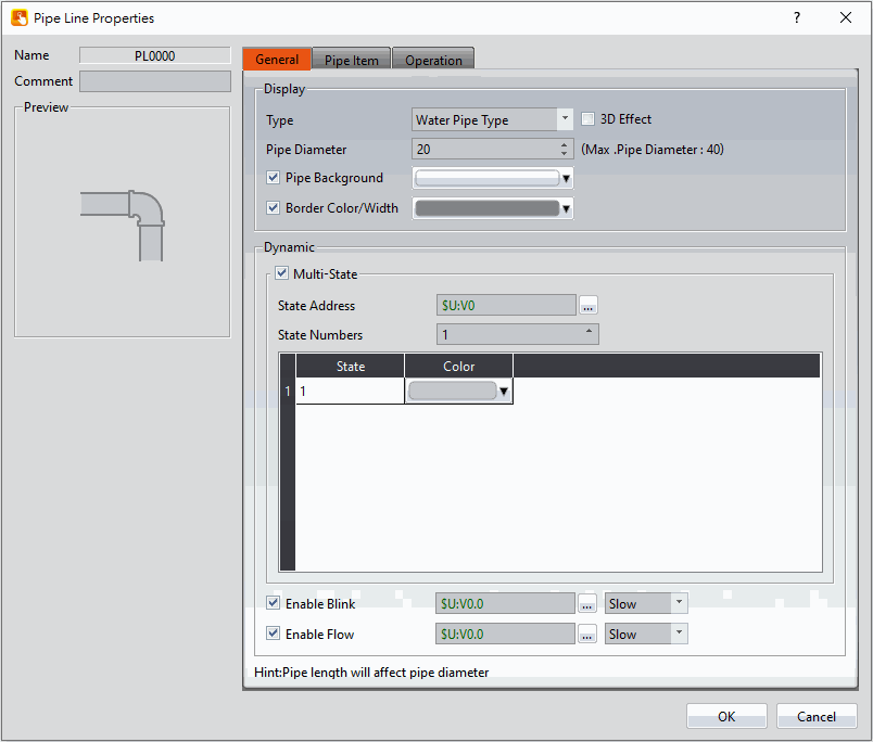
Figure 257 Settings Page for【Pipeline】【General】
Table 127【General】Properties of【Pipeline】
|
Property |
Description |
||||||||||||
|
【Preview】 |
Preview the appearance of this object. |
||||||||||||
|
【Display】 |
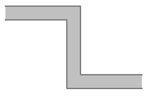
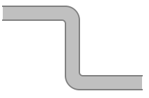
【Type】 Pipeline has 3 types to choose, right side you can click【3D Effect】,totally 5 types.
【Pipe Diameter】 Set the diameter of pipe, the length of each pipe affects the maximum diameter, with a maximum diameter of 40. 【Pipe Background Color】 Set the background color of pipe, if the【Multi-State】has checked, then set the color in the below table. 【Border Color/Width】 Set the color and width of border. |
||||||||||||
|
【Dynamic】 |
【Multi-State】 Check the pipeline whether to be multi-states function. 【Multi-State】【State Address】 Set the reading address of multi-state, the pipeline will read this adress to change different states, such as set the address as R30, when R30=0 display state 1, when R30=1 display state 2, when R30=2 display state 3, and so on. 【Multi-State】【State Numbers】 Set the state numbers. 【Multi-State】【Table】 Set the color of each state. 【Enable Blink】 Check whether to let pipeline blink, if checked, will show up the address and speed options to set, such as set the address set as M10, when M10=ON the pipeline will blink. 【Enable Flow】 Check whether to let pipeline show flow effect, if checked, will show up the address and speed options to set, such as set the address set as M20, when M20=ON the pipeline will show flow effect. |
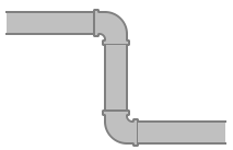

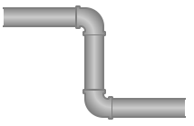
19.3.13.2 【Pipe Item】
The【Pipeline】【Pipe Item】page is as shown in the figure below, the meaning of each setting item are listed below:
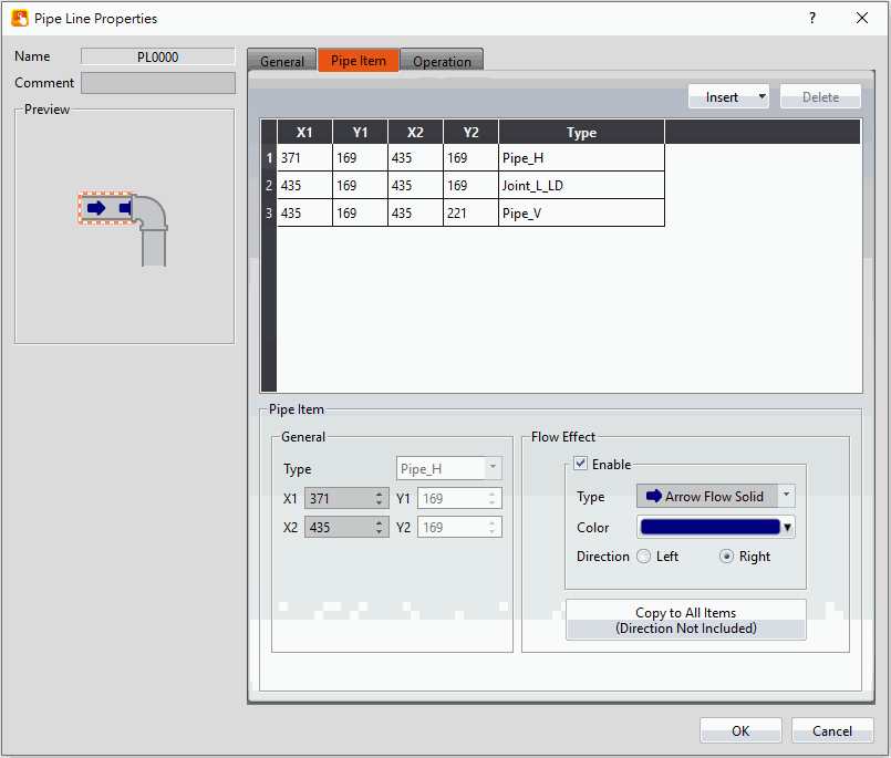
Figure 258 Settings Page for【Pipeline】【Pipe Item】
Table 128【Pipe Item】Properties of【Pipeline】
|
Property |
Description |
||||||||||||||||||||||||||||||||||
|
【Insert】 |
Insert joint to the middle of the pipe or add at the end of the pipe. |
||||||||||||||||||||||||||||||||||
|
【Delete】 |
Delete pipe or joint of the pipeline, the first pipe cannot be deleted and the pipe that connected to the back will be deleted. |
||||||||||||||||||||||||||||||||||
|
【Table】 |
Display all of the pipe item, choose the pipe item , can modify the property of【General】and【Flow Effect】modify the property. All of the pipe items are as follows:
|
||||||||||||||||||||||||||||||||||
|
【Pipe Item】 |
【General】【Type】 Set the type of pipe item, only joint can be modified. 【General】【Length】 Set the length of pipe item, only pipe can be modified. 【Flow Effect】 Set the flow effect of pipe item, only pipe can be modified. 【Flow Effect】【Type】 Set the type of all flow effect. Flow effect types as follows:
【Flow Effect】【Color】 Set the color of flow effect type. 【Flow Effect】【Copy to All Items(Direction Not Included)】 Copy the flow effect to all items. 【Flow Effect】【Direction】 Set the direction of flow effect. |


19.3.13.3 Pipeline Pipe Add or Delete
【Pipeline】in addition to adding, inserting and deleting in【Pipe Item】of object properties setting, also can click the right mouse botton and select the desired item to modify the pipe or joint, the quick menu will be displayed and select the item will to modify.
Setting methods as follow:
-
-
-
- Modify joint:
-
-
First, click the object you would like to modify and will appear a red outer frame, as the left figure below.
Second, click the right botton of the mouse on the joint that you want to modify, then will appear a quick menu, as the middle figure below.
Third, click replace and select the joint , result as the right figure below.
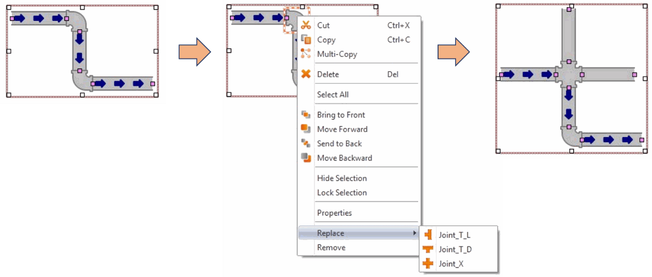
Figure 259【Pipeline】click the right mouse button to modify joint
-
-
-
- Insert pipe:
-
-
First, First, click the object you would like to modify and will appear a red outer frame, as the left figure below.
Second, click the right botton of the mouse on the pipe that you want to modify, then will appear a quick menu, as the middle figure below.
Third, click replace and select the joint , result as the right figure below.
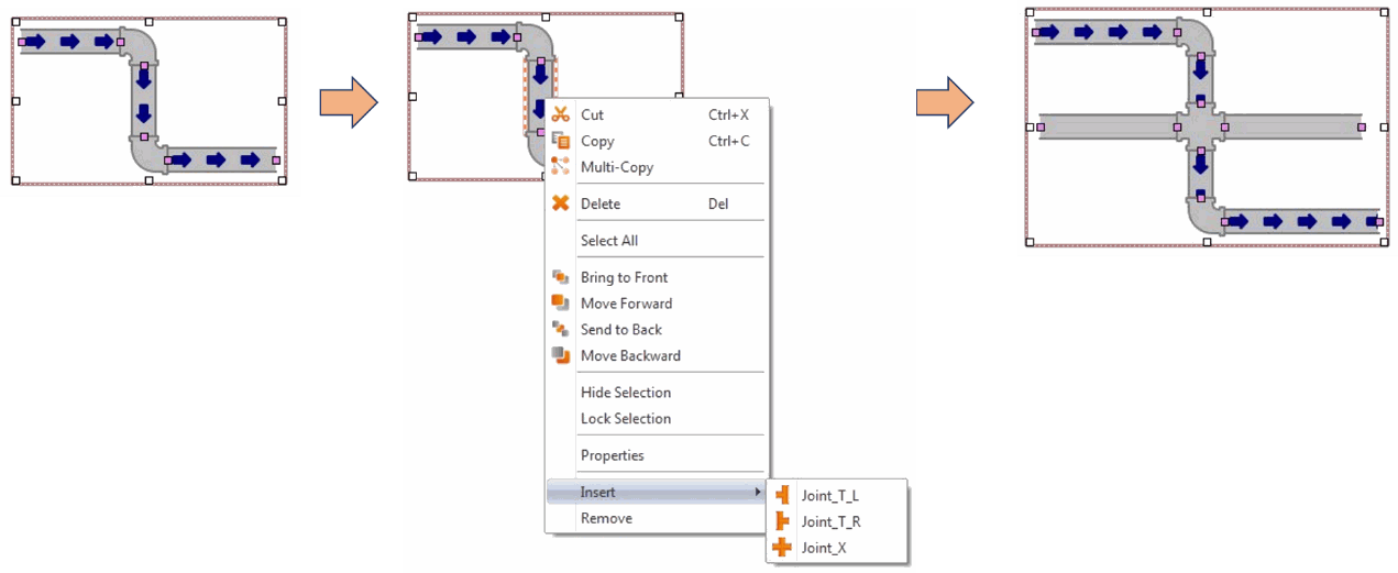
Figure 260【Pipeline】click the right mouse button to insert pipe
-
-
-
- Remove pipe or joint :
-
-
First, click the object you would like to remove and will appear a red outer frame, as the left figure below.
Second, click the right botton of the mouse on the object that you want to remove, then will appear a quick menu, as the middle figure below.
Third, click remove then the object will be removed , result as the right figure below.
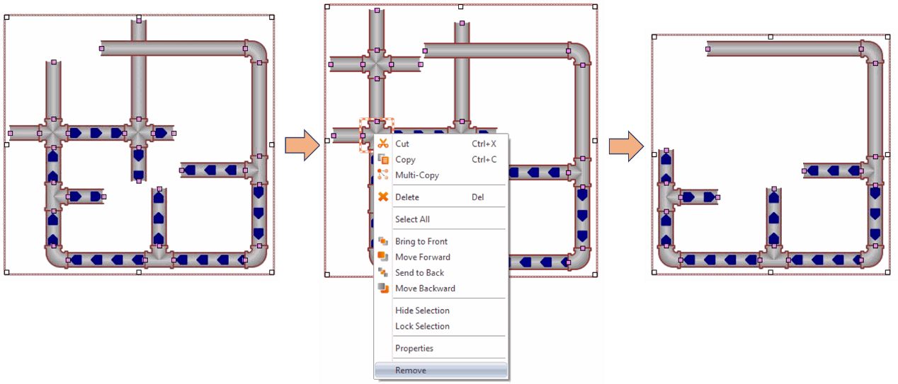
Figure 261【Pipeline】click the right mouse button to remove pipe or joint
19.4 Base Object Properties Dialog
19.4.1 【Lamp】
When the numeric value of an address has changed, the【Lamp】object can be used to map the changes of each numeric value of the register to a specific icon (such as bright or dim lamp) in order to allow a more intuitive understanding of the current numeric value of the register.
19.4.1.1 【Setting】
The【Lamp】【Setting】page is as shown in the figure below, the meaning of each setting item are listed below:
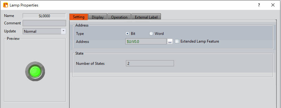
Figure 262【Setting】Screen of【Lamp】
Table 129【Setting】Properties of【Lamp】
|
Property |
Description |
|
【Preview】 |
Preview the appearance of this object. |
|
【Name】 |
The default name of the object. |
|
【Comment】 |
Set the comment of the object. |
|
【Update】 |
Provide user can select a suitable speed to get the latest data under different situation, such as you would like to get the latest data or adjust the object on the screen to display first, etc. Provide three modes: 【once】: update once only when switch to this page or use the system tag【OP_UPDATE_SCREEN_OBJECTS】, update once when trigger once a time, it will keep update if the monitor address is internal address. 【normal】: normal update speed. 【fast】: the fastest update speed. |
|
【Address】 |
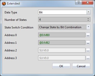
【Type】 Set whether the monitored address of the lamp is a Bit or Word. The default setting is Bit. 【Address】 Set the address for the lamp to monitor. 【Enable Extended Lamp Feature】 Set to enable extra features for the lamp object. When set, extension options will appear to the right. The original address set in the window will no longer be read and is replaced by the【Addresses 0~3】in the dialog as shown below. After checked, the original【Type】and【Data Type】setting value will be changed from the following figure【Data Type】to set.
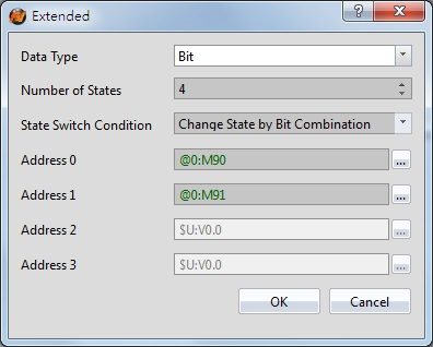
【Data Type】 Set the address type of【Addresses 0~3】. Data types include Bit, 16Bit-BCD, 16Bit-INT, 16Bit-UINT, 32Bit-BCD, 32Bit-INT and 32Bit-UINT. 【Number of states】 Set the number of states the lamp will have. 【State Switch Condition】 Set how the state of the lamp is determined. The conditions include【Change State by Bit Combination】,【Change State by Bit】, or【Change State by Data】. 【Change State by Bit Combination】uses【Addresses 0~3】in combination to switch the displayed state. For example, the【Number of states】is 4,【Address 0】is M80,【Address 1】is M82,【Addresses 2】and【Addresses 3】are not set, the state will be determined as follows: M80 = OFF and M82 = OFF State 0 M80 = ON and M82 = OFF State 1 M80 = OFF and M82 = ON State 2 M80 = ON and M82 = ON State 3, and so on. 【Change State by Bit】refers to【Addresses 0~3】to switch the displayed state. For example, the【Data Type】is set to Bit, the【Number of states】is 4,【Address 0】is M80,【Address 1】is M82,【Address 2】is M84, and【Address 3】is not set, the state will be determined as follows: M80, M82, M84 = OFF State 0 M80 = ON, M82 = OFF, M84 = OFF State 1 M80 = OFF, M82 = ON, M84 = OFF State 2 M80 = OFF, M82 = OFF, M84 = ON State 3, and so on. If the【Data Type】is 16Bit-UINT, the【Number of states】is 5,【Address 0】is R40, the other addresses are not set, when R40 = 0 the state is 0. R40 = 1, state 1. R40 = 2, state 2. R40 = 4, state 3. R40 = 8, state 4. 【Change State by Data】refers to switching the display status according to the value of【Address 0】. In【Data Type】, this option will appear for all types except Bit type. If the【Data Type】is 16Bit-Uint, the【Number of states】is 5,【Address 0】is R40, the other addresses are not set, when R40 = 0, the state is 0. R40 = 1, state 1. R40 = 2, state 2, R40 = 3, state 3, R40 = 4, state 4, and so on. 【Addresses 0~3】 Specify the address to use to determine the state of the lamp. 【Data Type】 Set the data type of the lamp; this setting item will appear when the type is set as Word. |
|
【State】 |
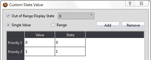
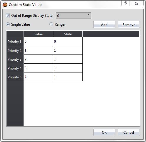
【Number of States】 Set the number of states of the lamp. When the Lamp Type is Bit, the number of states is fixed as 2. If the Type is Word, it can be set between 2~256. 【Custom State Value】 When choose【Word】, you can check【Custom State Value】beside the【Number of States】. If didn’t check【Custom State Value】, for example, the address of the lamp is R52, munber of states is two, then R52=0, state display as 0, R52=1, state display as 1. After checked【Custom State Value】, you can press【Detail】to set each single value and range corresponding to the state. Setting dialog as figure below.
【Out of Range Display State】 Set the status to be displayed when the value exceeds the corresponding range 【Single Value】 Set the mode corresponding to the state as single value, the field will changed after checked, then you can set each value corresponding to the state in【Value】field. 【Range】 Set the mode corresponding to the state as range, the field will changed after checked, then you can set each value corresponding to the state in【Lower Limit】and【Upper Limit】field. |
19.4.1.2 【Display】
The【Lamp】【Display】page is as shown in the figure below, the meanings of each setting item are listed below:
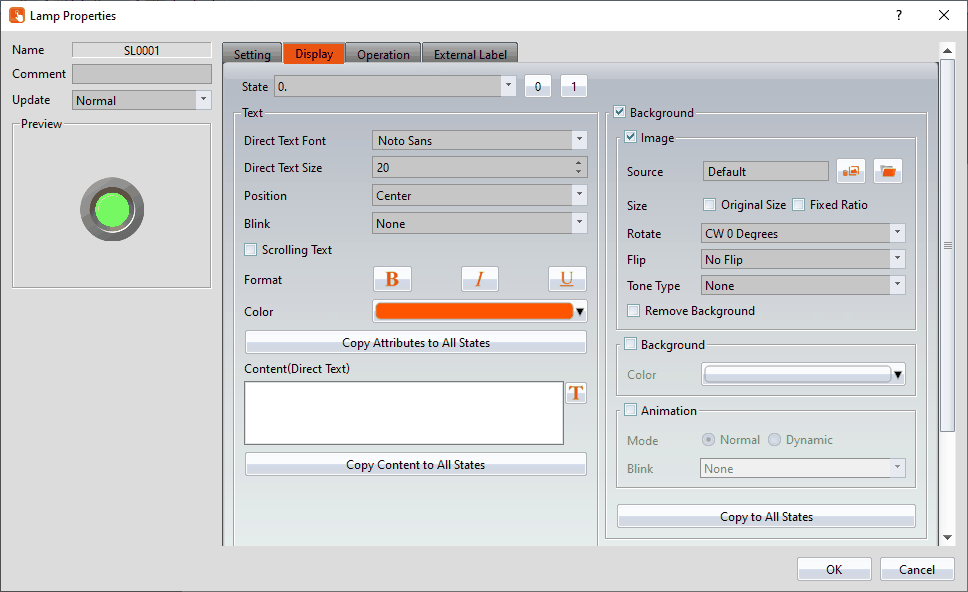
Figure 263【Display】Setting Screen of【Lamp】
Table 130【Display】Setting Properties of【Lamp】
|
Property |
Description |
|
【State】 |
Select the state to be edited. 0 and 1 buttons are provided to enable quick switching between states 0 and 1. |
|
【Text】 |
【Direct Text Font】 Set the font of the text displayed for the current editing state. 【Direct Text Size】 Set the size of the text displayed for the current editing state. 【Position】 Set the position of the text displayed for the current editing state. 【Blink】 Set the blinking function for the text of the current editing state. There are four blinking speeds available to choose from: None, Slow, Medium and Fast. 【Scrolling Text】 Set the scrolling text function for the text of the current editing state. There are four scrolling speeds available to choose, from slow to fast. 【Format】 Set the format of the text displayed for the current editing state, including Bold, Italics and Underline. 【Color】 Set the color of the text displayed for the current editing state. 【Copy Attributes to All States】 The text properties for the current editing state is applied to all states. 【Content (Direct Text)】 Set the text displayed for the current editing state. It can be inputted directly or acquired from the【Text Library】. 【Copy to All States】 Apply the settings of the text for the current editing state to all states. |
|
【Background】 |
【Background】 Check whether to enable background 【Image】 Check whether to use image 【Source】 Set whether to use an image for the displayed background of the current editing state. When this option is checked, an【Image Selector】will appear asking the user to select an image either from the【Image Library】or from【File】. 【Size】 You can set the picture to use 【Original Size】, or check 【Fixed Ratio】 to maintain a fixed length and width ratio when stretching 【Rotate】 Set image rotation angle 【Flip】 Set the flip direction of the image, includes No Flip, X-Axis and Y-Axis. 【Tone Type】 You can choose the tone type you want to change. After selecting the type, you can choose the color from【Tone Color】. 【Remove Background】 You can set the color to be transparent by【Choose Color】. 【Background】 Check whether to enable the background. After checking, you can set the background color displayed in the current editing state from【Color】. 【Animation】 Check whether to enable animated effects. 【Mode】Choose whether to use static or dynamic control elements to flicker. 【Blink】Select the blinking mode, and use the numerical value to switch during dynamic control. 【Copy to All States】 Apply the settings of the background for the currently editing state to all states. |
|
【Border】 |
Set the border of the lamp object, set the appearance after checked. 【Color/Width】 Set the color and width of the border. 【Type】 Set the type of the boder, click 【Copy to All States】 Apply the settings of the border for the currently editing state to all states. |
 for more types.
19.4.1.3 【External Lable】
The【Lamp】【External Lable】page is as shown in the figure below, the meanings of each setting item are listed below:
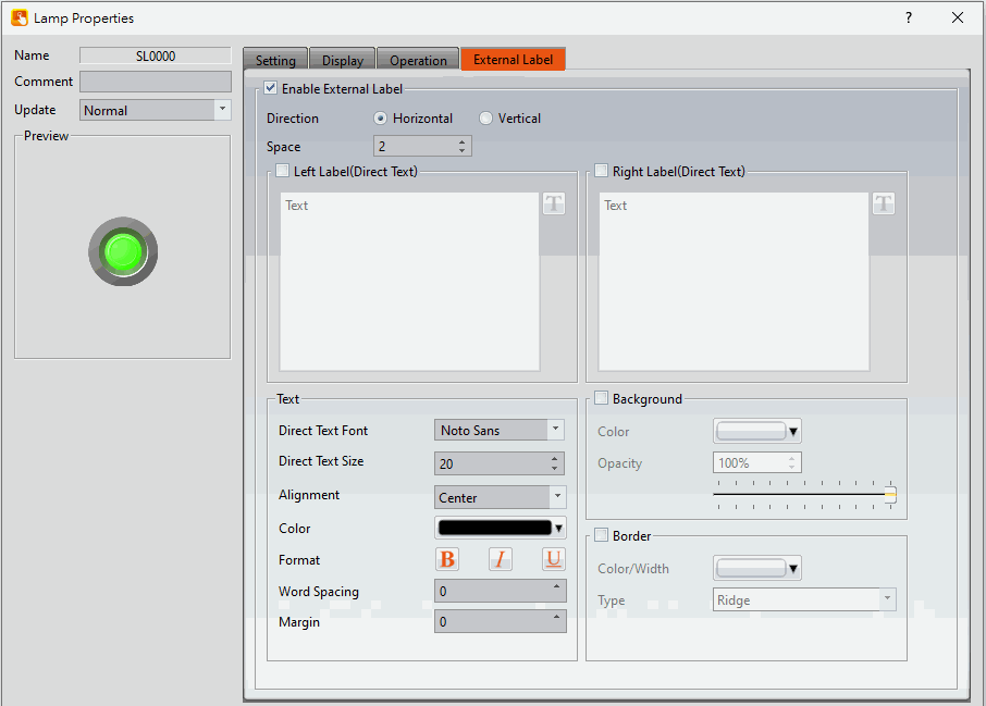
Figure 264【External Lable】Setting Screen of【Lamp】
Table 131【Lamp】【External Lable】setting properties
|
Option |
Description |
|
【Enable External Lable】 |
Checked, the bottom will appear the external lable settings of the object. |
|
【Direction】 |
Set the display direction, there are horizontal and vertical two selections. |
|
【Space】 |
Set the space between external lable and the object. |
|
【Left/Top Lable(Direct Text)】 |
Fill in the text to be displayed on the left / top lable of the object, can be directly input or selected from【Font Library】. |
|
【Right/Bottom Lable(Direct Text)】 |
Fill in the text to be displayed on the right / bottom lable of the object, can be directly input or selected from【Font Library】. |
|
【Text】 |
【Direct Text Font】 Set the font of text. 【Direct Text Size】 Set the size of text, the default size is 20. 【Alignment】 Set the alignment of text. 【Color】 Set the color of text. 【Format】 Set the format of text, includes Bold, Italic and Underline. 【Word Spacing】 Set the word space of text. 【Margin】 Set the margin of text. |
|
【Background】 |
Check whether to display background, set the color and opacity of background after checked. 【Color】 Set the background color of external lable. 【Opacity】 Set the opacity of external lable background, the greater the value the more the background opacity is. |
|
【Border】 |
Check whether to display border. 【Color/Width】 Set the color and width of border. 【Type】 Set the type of border. |
19.4.2 【Switch】
Switch allows users to perform specific operation behaviors by pressing objects, including【Bit Switch】,【Word Switch】,【Change Screen】and【Function Switch】.
19.4.2.1 【Bit Switch】
The【Bit Switch】【Setting】page is as shown in the figure below, the meanings of each setting item are listed below:
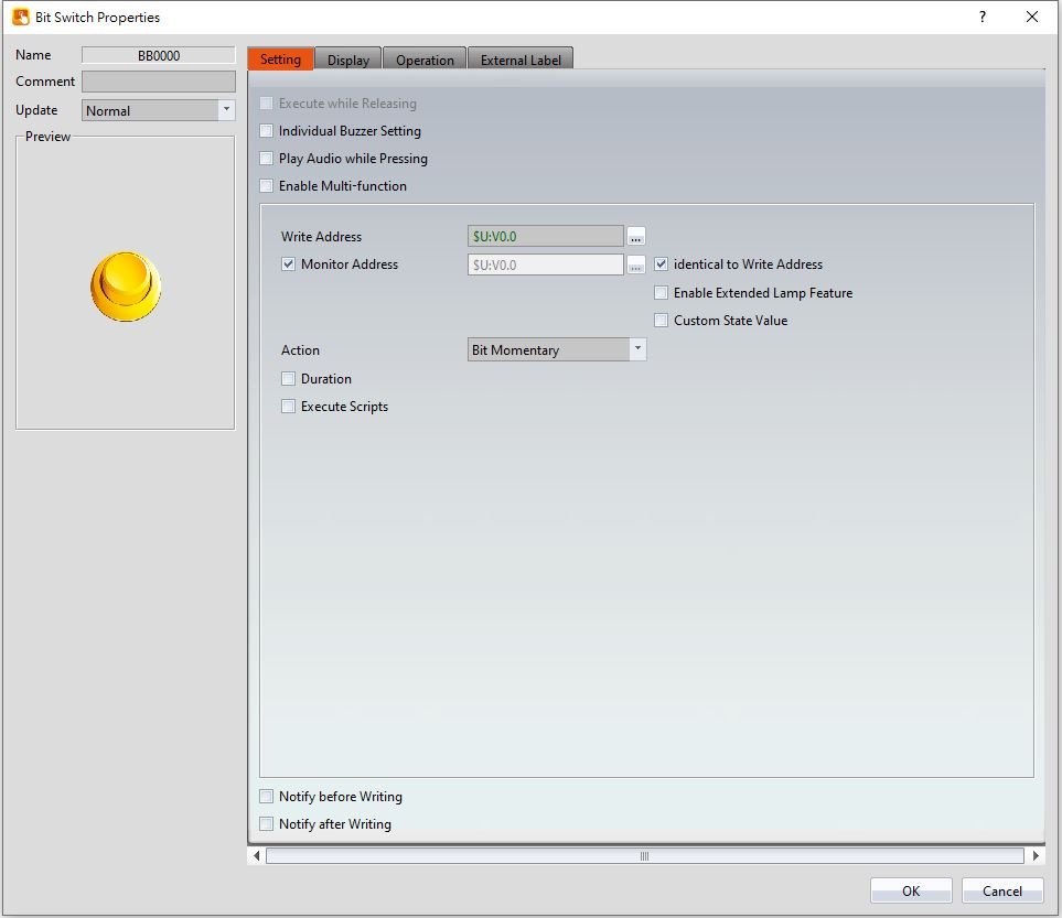
Figure 265【Setting】Screen of【Bit Switch】
Table 132【Setting】Properties of【Bit Switch】
|
Property |
Description |
|
【Preview】 |
Preview the appearance of this object. |
|
【Name】 |
The default name of the object. |
|
【Comment】 |
Set the comment of the object. |
|
【Update】 |
Provide user can select a suitable speed to get the latest data under different situation, such as you would like to get the latest data or adjust the object on the screen to display first, etc. Provide three modes: 【once】: update once only when switch to this page or use the system tag【OP_UPDATE_SCREEN_OBJECTS】, update once when trigger once a time, it will keep update if the monitor address is internal address. 【normal】: normal update speed. 【fast】: the fastest update speed. |
|
【Execute while Releasing】 |
Select to execute the action set for the Bit Switch while releasing. The action will be executed immediately when the switch is pressed if this option is not selected. |
|
【Individual Buzzer Setting】 |
Can individually setup buzzer setting. Includes 5 modes: Off, Short, Long, Short-Short, Long-Short. |
|
【Play Audio while Pressing】 |
Select to play audio when the switch is pressed; an【Audio Selector】will appear on the right when enabled. The switch on the right of the【Audio Selector】can be pressed to select an audio and the switch on the left of the【Audio Selector】can be pressed to play the selected audio. |
|
【Enable Multi-function】 |
Select to enable the Multi-function Switch. A【Multi-function List】will appear on the left when selected. |
|
【Multi-function List】 |
This list will appear when【Enable Multi-function】 is selected. The【Multi-function List】is used to display the list of functions that will be executed when the switch is pressed. A maximum of 16 operations can be set, and the system will execute the operations in order when the switch is pressed. 【Add】 Add to the number of switches in【Multi-function List】. The type of switch to add can be selected. 【Delete】 Delete the switch currently selected in the【Multi-function List】. 【Up】 Move the order of the switch currently selected in the【Multi-function List】up. 【Down】 Move the order of the switch currently selected in the【Multi-function List】down. Notice:
|
|
【Address】 |
Set the operating address of the Bit Switch. |
|
【Monitor Address】 |
Set the switch to change its state according to the value in the monitored address. The user will be able to set the address to monitor when this option is selected. After checking【identical to Write Address】, the【Monitor Address】cannot be modified and will be the same as the write address. |
|
【Enable Extended Lamp Feature】 |
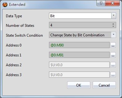
Set to enable extra features for the bit switch object. When set, extension options will appear to the right. The original address set in the window will no longer be read and is replaced by the【Addresses 0~3】in the dialog as shown below. After checked, the original【Type】and【Data Type】setting value will be changed from the following figure【Data Type】to set.
【Data Type】 Set the address type of【Addresses 0~3】. Data types include Bit, 16Bit-BCD, 16Bit-INT, 16Bit-UINT, 32Bit-BCD, 32Bit-INT and 32Bit-UINT. 【Number of states】 Set the number of states the bit switch will have. 【State Switch Condition】 Set how the state of the bit switch is determined. The conditions include【Change State by Bit Combination】,【Change State by Bit】, or【Change State by Data】. 【Change State by Bit Combination】uses【Addresses 0~3】in combination to switch the displayed state. For example, the【Data Type】is set to Bit, the【Number of states】is 4,【Address 0】is M90,【Address 1】is M91,【Addresses 2】and【Addresses 3】are not set, the state will be determined as follows: M90 = OFF and M91 = OFF State 0 M90 = ON and M91 = OFF State 1 M90 = OFF and M91 = ON State 2 M90 = ON and M91 = ON State 3, and so on. 【Change State by Bit】refers to【Addresses 0~3】to switch the displayed state. For example, the【Data Type】is set to Bit, the【Number of states】is 4,【Address 0】is M90,【Address 1】is M91,【Address 2】is M92, and【Address 3】is not set, the state will be determined as follows: M90, M91, M92 = OFF State 0 M90 = ON, M91 = OFF, M92 = OFF State 1 M90 = OFF, M91 = ON, M92 = OFF State 2 M90 = OFF, M91 = OFF, M92 = ON State 3, and so on. If the data type is 16Bit-UINT, the number of states is 5, 【Address 0】is R50, the other addresses are not set, when R50 = 0 the state is 0. R50 = 1, state 1. R50 = 2, state 2. R50 = 4, state 3. R50 = 8, state 4. 【Change State by Data】refers to switching the display status according to the value of【Address 0】. In【Data Type】, this option will appear for all types except Bit type. If the【Data Type】is 16Bit-Uint, the【Number of states】is 5,【Address 0】is R50, the other addresses are not set, when R40 = 0, the state is 0. R50 = 1, state 1. R50 = 2, state 2, R50 = 3, state 3, R50 = 4, state 4, and so on. 【Addresses 0~3】 Specify the address to use to determine the state of the bit switch. |
|
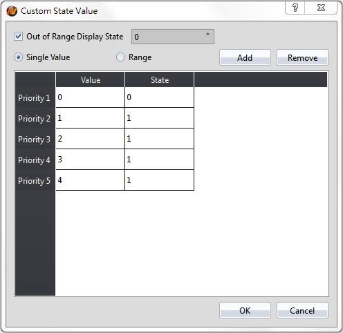
【Custom State Value】 |
After check【Custom State Value】, you can click【Detail】at the back, set the value and range of each state. Setting dialog as below:
【Out of Range Display State】 Set the state when the value display out of range. 【Single Value】 Set the mode of corresponding state as single value, the following table will change after clicked, then you can set the value of each corresponding state in【Value】field. 【Range】 Set the mode of corresponding state as range, the following table will change after clicked, then you can set the value of each corresponding state in【Lower Limit】and【Upper Limit】field. |
|
【Action】 |
Set the operation of the Bit Switch. Setting items that will appear below varies according to the different operation selected. |
|
【Duration】 |
The duration of the operation when the Bit Switch is pressed. The duration time can be set on the right when this option is selected. For example, if the operation is set as【Set Bit】, and the duration is set as 1 second, when the Bit Switch is pressed the【Address】will change to 1 and then automatically change to 0 after 1 second. |
|
【Execute Scripts】 |
Set to execute scripts when the Bit Switch is pressed. The ID of the script to execute can be set on the right when this option is selected. If the【Action】is set as【Bit Momentary】,【Bit Invert】or【Periodic Switch】, individual scripts can be set to execute when the【Address】is 1 or 0. |
|
【Set Bit】 |
The【Address】will change to 1 when the Bit Switch is pressed. |
|
【Reset Bit】 |
The【Address】will change to 0 when the Bit Switch is pressed. |
|
【Bit Momentary】 |
The【Address】will change to 1 when the Bit Switch is pressed, and the【Address】will change to 0 when the Bit Switch is released. |
|
【Bit Invert】 |
The current state of the【Address】will change from 1 to 0 or 0 to 1 according to its current state. |
|
【Comparison】 |
If the numeric value of the【Reference Address】read by【Data Type】satisfies the【Condition】and【Constant】set when the Bit Switch is pressed, the【Address】will change to 1. |
|
【Periodic Switch】 |
The state of the【Address】will change periodically according to the【Time Interval】and【Number of Times】set for the【Address】when the Bit Switch is pressed. |
|
【Notify before Writing】 |
The signal will notify before writing. Level: Set the bit as 0 or 1. Pulse: Set the bit to 1 and automatically restore to 0 after continuing the time set by【Width】. |
|
【Notify after Writing】 |
The signal will notify after writing. Level: Set the bit as 0 or 1. Pulse: Set the bit to 1 and automatically restore to 0 after continuing the time set by【Width】. |
19.4.2.2 【Word Switch】
The【Word Switch】【Setting】page is as shown in the figure below, the meanings of each setting item are listed below:
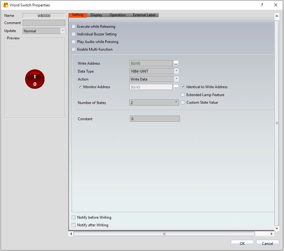
Figure 266【Setting】Screen of【Word Switch】
Table 133【Setting】Properties of【Word Switch】
|
Property |
Description |
|
【Preview】 |
Previews the appearance of this object. |
|
【Name】 |
The default name of the object. |
|
【Comment】 |
Set the comment of the object. |
|
【Update】 |
Provide user can select a suitable speed to get the latest data under different situation, such as you would like to get the latest data or adjust the object on the screen to display first, etc. Provide three modes: 【once】: update once only when switch to this page or use the system tag【OP_UPDATE_SCREEN_OBJECTS】, update once when trigger once a time, it will keep update if the monitor address is internal address. 【normal】: normal update speed. 【fast】: the fastest update speed. |
|
【Execute while Releasing】 |
Select to execute the action set for the Word Switch while releasing. The action will be executed immediately when the switch is pressed if this option is not selected. |
|
【Individual Buzzer Setting】 |
Can individually setup buzzer setting. Includes 5 modes: Off, Short, Long, Short-Short, Long-Short. |
|
【Play Audio while Pressing】 |
Select to play audio when the switch is pressed. An【Audio Selector】will appear on the right when enabled. The switch on the right of the【Audio Selector】can be pressed to select an audio and the switch on the left of the【Audio Selector】can be pressed to play the selected audio. |
|
【Enable Multi-function】 |
Select whether to enable the Multi-function Switch. A【Multi-function List】will appear on the left when selected. |
|
【Multi-function List】 |
This list will appear when【Enable Multi-function】is selected. The【Multi-function List】is used to display the list of functions that will be executed when the switch is pressed. A maximum of 16 operations can be set, and the system will execute the operations in order when the switch is pressed. 【Add】 Add to the number of switches in【Multi-function List】. The type of switch to add can be selected. 【Delete】 Delete the switch currently selected in the【Multi-function List】. 【Up】 Move the order of the switch currently selected in the【Multi-function List】up. 【Down】 Move the order of the switch currently selected in the【Multi-function List】down. Notice:
|
|
【Address】 |
Set the operating address of the Word Switch. |
|
【Monitor Address】 |
Set the switch to change its state according to the value in the monitored address. The user will be able to set the address to monitor when this option is selected. |
|
【Data Type】 |
Set the data type of the Word Switch. |
|
【Action】 |
Set the operate action of word switch, following will show different options according different action. |
|
【Write Data】 |
When pressing word switch, the【Constant】will be write into 【Write Address】according to its【Data Type】. |
|
【Add Data】 |
This function increases the value of【Write Address】by the value of【Constant】every time you press the word switch. 【Constant】 Set the value to increase each time when pressing the switch. 【Max】 Set the maximum value of this address. For example: set 10, if the original value of this address is 50, it will become 10 after pressing this button. Check【Address】to dynamically control the maximum value. 【Continuously Add】 If check this option, when pressing the word switch and unrelease, word switch will excute【Add Data】continuously, and after wait for【Time Delay】will excute【Add Data】according to【Interval】time. 【Cyclically Add】 If check this option, when the value has add to【Max】, press this word switch then will write【Min】to【Address】. |
|
【Subtract Data】 |
This function reduces the value of【Write Address】to the value of【Constant】every time you press the word group button. 【Constant】 Set the value to decrease each time when pressing the switch. 【Min】 Set the minimum value of this address. For example: set 10, if the original value of this address is 0, it will become 10 after pressing this button Check【Address】to dynamically control the minimum value. 【Continuously Subtract】 If check this option, when pressing the word switch and unrelease, word switch will excute【Subtract Data】continuously, and after wait for【Time Delay】will excute【Subtract Data】according to【Interval】time. 【Cyclically Subtract】 If check this option, when the value has subtract to【Min】, press this word switch then will write【Max】to【Address】. |
|
【Numeric Input】 |
When this button is pressed, the keyboard will pop up, allowing the user to set the value to【Write Address】. The setting method is the same as in chapter 19.4.3.1-【Setting】. |
|
【Enable Extended Lamp Feature】 |
Set to enable extra features for the bit switch object. When set, extension options will appear to the right. The original address set in the window will no longer be read and is replaced by the【Addresses 0~3】in the dialog as shown below. After checked, the original【Type】and【Data Type】setting value will be changed from the following figure【Data Type】to set.
【Data Type】 Set the address type of【Addresses 0~3】. Data types include Bit, 16Bit-BCD, 16Bit-INT, 16Bit-UINT, 32Bit-BCD, 32Bit-INT and 32Bit-UINT. 【Number of states】 Set the number of states the bit switch will have. 【State Switch Condition】 Set how the state of the bit switch is determined. The conditions include【Change State by Bit Combination】,【Change State by Bit】, or【Change State by Data】. 【Change State by Bit Combination】uses【Addresses 0~3】in combination to switch the displayed state. For example, the【Data Type】is set to Bit, the【Number of states】is 4,【Address 0】is M90,【Address 1】is M91,【Addresses 2】and【Addresses 3】are not set, the state will be determined as follows: M90 = OFF and M91 = OFF State 0 M90 = ON and M91 = OFF State 1 M90 = OFF and M91 = ON State 2 M90 = ON and M91 = ON State 3, and so on. 【Change State by Bit】refers to【Addresses 0~3】to switch the displayed state. For example, the【Data Type】is set to Bit, the【Number of states】is 4,【Address 0】is M90,【Address 1】is M91,【Address 2】is M92, and【Address 3】is not set, the state will be determined as follows: M90, M91, M92 = OFF State 0 M90 = ON, M91 = OFF, M92 = OFF State 1 M90 = OFF, M91 = ON, M92 = OFF State 2 M90 = OFF, M91 = OFF, M92 = ON State 3, and so on. If the data type is 16Bit-UINT, the number of states is 5, 【Address 0】is R50, the other addresses are not set, when R50 = 0 the state is 0. R50 = 1, state 1. R50 = 2, state 2. R50 = 4, state 3. R50 = 8, state 4. 【Change State by Data】refers to switching the display status according to the value of【Address 0】. In【Data Type】, this option will appear for all types except Bit type. If the【Data Type】is 16Bit-Uint, the【Number of states】is 5,【Address 0】is R50, the other addresses are not set, when R40 = 0, the state is 0. R50 = 1, state 1. R50 = 2, state 2, R50 = 3, state 3, R50 = 4, state 4, and so on. 【Addresses 0~3】 Specify the address to use to determine the state of the bit switch. |
|
【Custom State Value】 |
After check【Custom State Value】, you can click【Detail】at the back, set the value and range of each state. Setting dialog as below:
【Out of Range Display State】 Set the state when the value display out of range. 【Single Value】 Set the mode of corresponding state as single value, the following table will change after clicked, then you can set the value of each corresponding state in【Value】field. 【Range】 Set the mode of corresponding state as range, the following table will change after clicked, then you can set the value of each corresponding state in【Lower Limit】and【Upper Limit】field. |
|
【State】 |
Set the number of states, set whether the word switch changes its status according to the value of the set monitor address. |
|
【Notify before Writing】 |
The signal will notify before writing. Level: Set the bit as 0 or 1. Pulse: Set the bit to 1 and automatically restore to 0 after continuing the time set by【Width】. |
|
【Notify after Writing】 |
The signal will notify after writing. Level: Set the bit as 0 or 1. Pulse: Set the bit to 1 and automatically restore to 0 after continuing the time set by【Width】. |
19.4.2.3 【Change Screen】
The【Change Screen】【Setting】page is as shown in the figure below, the meanings of each setting item are listed below:
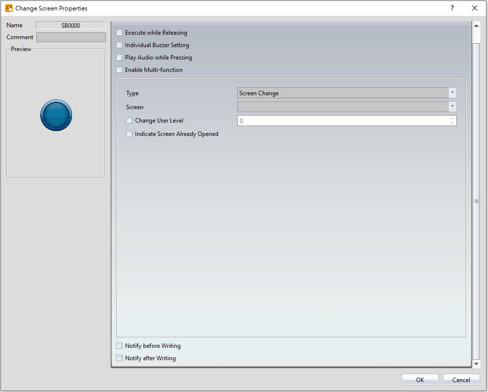
Figure 267【Setting】Screen of【Change Screen】
Table 134【Setting】Properties of【Change Screen】
|
Property |
Description |
|
【Preview】 |
Previews the appearance of this object. |
|
【Name】 |
The default name of the object. |
|
【Comment】 |
Set the comment of the object. |
|
【Execute while Releasing】 |
Select to execute the action set for Change Screen while releasing; the action will be executing immediately when the switch is pressed if this option is not selected. |
|
【Individual Buzzer Setting】 |
Can individually setup buzzer setting. Includes 5 modes: Off, Short, Long, Short-Short, Long-Short. |
|
【Play Audio while Pressing】 |
Select to play audio when the switch is pressed; an【Audio Selector】will appear on the right when enabled. The switch on the right of the【Audio Selector】can be pressed to select an audio and the switch on the left of the【Audio Selector】can be pressed to play the audio selected. |
|
【Enable Multi-function】 |
Select whether to enable the Multi-function Switch. A【Multi-function List】will appear on the left when selected. |
|
【Multi-function List】 |
This list will appear when【Enable Multi-function】is selected. The【Multi-function List】is used to display the list of functions that will be executed when the switch is pressed. A maximum of 16 operations can be set, and the system will execute the operations in order when the switch is pressed. 【Add】 Add to the number of switches in【Multi-function List】. The type of switch to add can be selected. 【Delete】 Delete the switch currently selected in the【Multi-function List】. 【Up】 Move the order of the switch currently selected in the【Multi-function List】up. 【Down】 Move the order of the switch currently selected in the【Multi-function List】down. Notice:
|
|
【Type】 |
Set the operation type of Change Screen; setting items that will appear below varies according to the different operation selected. |
|
【Screen Change】 |
The displayed screen of the human machine interface will change to the screen set in【Screen】when Change Screen is pressed. |
|
【Previous Screen】 |
The displayed screen of the human machine interface will change to the previous screen displayed when Change Screen is pressed. |
|
【Pop-up Window Screen】 |
When the button is pressed, the HMI display will pop up the selected window screen. |
|
【Close Pop-up Window Screen】 |
When the button is pressed, the pop-up window screen containing the button will close. |
|
【Close Pop-up Window Screen and Switch Screen】 |
When the button is pressed, the pop-up window screen containing the button will close and the screen set to switch will appear. |
|
【Change User Level】 |
When the button is pressed, security level of the user will be changed to the selected value. |
|
【Indicate Screen Already Opened】 |
If the screen ID is the same as the button’s setting then the color of the word and background will turn into the complementary color. |
|
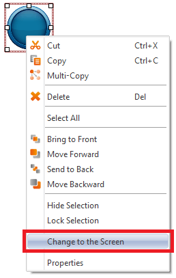
【Change to the Screen】 |
When the type of the【Change Screen】are: Screen Change, Pop-up Window Screen, Close Pop-up Window Screen, Close Pop-up Window Screen and Screen Change. Right-click the object will show this option.
|
|
【Notify before Writing】 |
The signal will notify before writing. Level: Set the bit as 0 or 1. Pulse: Set the bit to 1 and automatically restore to 0 after continuing the time set by【Width】. |
|
【Notify after Writing】 |
The signal will notify after writing. Level: Set the bit as 0 or 1. Pulse: Set the bit to 1 and automatically restore to 0 after continuing the time set by【Width】. |
19.4.2.4 【Function Switch】
The【Function Switch】【Setting】page is as shown in the figure below, the meanings of each setting item are listed below:
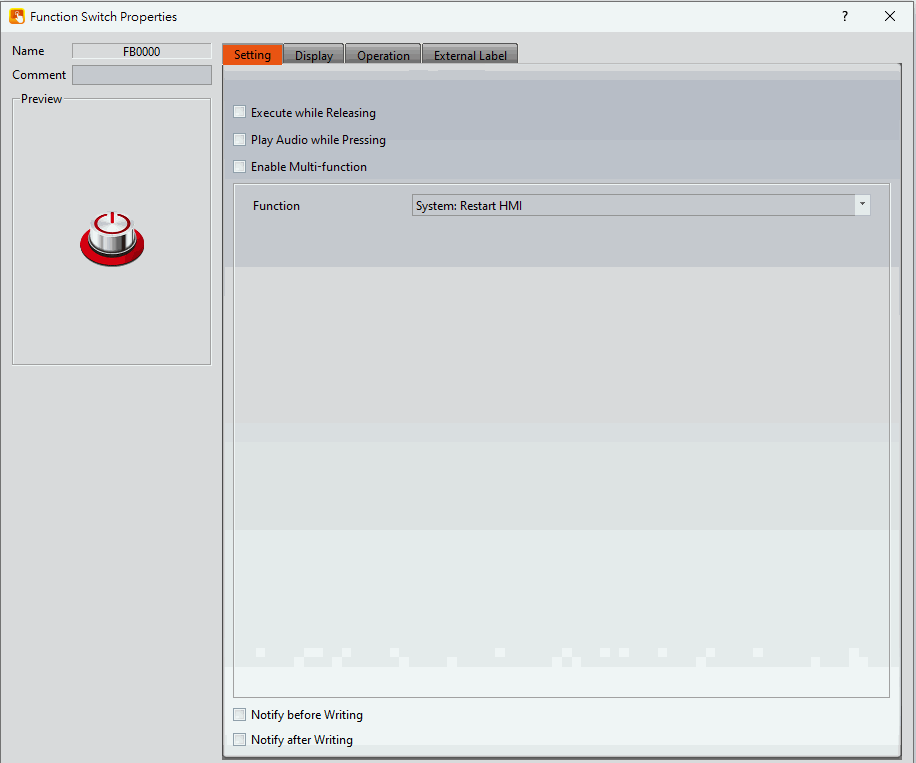
Figure 268【Setting】Screen of【Function Switch】
Table 135【Setting】Properties of【Function Switch】
|
Property |
Description |
|
【Preview】 |
Previews the appearance of this object. |
|
【Name】 |
The default name of the object. |
|
【Comment】 |
Set the comment of the object. |
|
【Execute while Releasing】 |
Select to execute the action set for the Function Switch while releasing. The action will be executed immediately when the switch is pressed if this option is not selected. |
|
【Play Audio while Pressing】 |
Select to play audio when the switch is pressed; an【Audio Selector】will appear on the right when enabled. The switch on the right of the【Audio Selector】can be pressed to select an audio and the switch on the left of the【Audio Selector】can be pressed to play the audio selected. |
|
【Enable Multi-function】 |
Select whether to enable the Multi-function Switch. A【Multi-function List】will appear on the left when selected. |
|
【Multi-function List】 |
This list will appear when【Enable Multi-function】is selected. The【Multi-function List】is used to display the list of functions that will be executed when the switch is pressed. A maximum of 16 operations can be set, and the system will execute the operations in order when the switch is pressed. 【Add】 Add to the number of switches in【Multi-function List】. The type of switch to add can be selected. 【Delete】 Delete the switch currently selected in the【Multi-function List】. 【Up】 Move the order of the switch currently selected in the【Multi-function List】up. 【Down】 Move the order of the switch currently selected in the【Multi-function List】down. Notice:
|
|
【Function】 |
Set the operation function of the Function Switch. Setting items that will appear below varies according to the different functions selected. |
|
【System: Restart HMI】 |
The human machine interface will restart when the Function Switch is pressed. |
|
【System: Increase Brightness】 |
The brightness of the human machine interface display will increase when the Function Switch is pressed. |
|
【System: Decrease Brightness】 |
The brightness of the human machine interface display will decrease when the Function Switch is pressed. |
|
【System: Turn Backlight OFF】 |
The brightness of the human machine interface display will decrease to the lowest brightness level when the Function Switch is pressed. |
|
【System: Show System Configuration】 |
The system will pop-up system configuration when Function Switch is pressed, including four paging【General】,【Ethernet】,【Screen Saver】and【Date/Time】,user can select items to be displayed. 【General】paging including device name, station number, OS Version, Firmware Version. 【Ethernet】paging set whether to enable ethernet, whether to use DHCP, display or set HMI IP Address, display or set HMI Netmask, display , DNS setting or set HMI Gateway. 【Screen Saver】paging set whether to enable screen saver, waiting time. 【Date/Time】paging display or set HMI date and time. |
|
【System: Show Link Setting】 |
The HMI will show the link setting configuration and users can also adjust the settings as well. Note: the interface type can not be changed. |
|
【FvRT: Restart Project】 |
Restart the project. |
|
【FvRT: Stop FvRT】 |
After stopping the FvRT setting, there are four ways to select as below. 【Following FvRT setting】Perform the according to the seeting of ‘After stopping the project’ in FvRT settings. 【Return to startup screen】Press the button to end up the project then return to the FvRT startup interface. 【Close the program】Press the button to end up the project and close the FvRT program. 【Shutdown the machine】Press the button to end up the project and close the PC. |
|
【FvRT: Open File/Url】 |
When the function button is pressed, other software in the computer will be executed according to the preset path, and the path of the file to be opened can also be dynamically modified through the register. Open the file filling example: C:\Users\user\Downloads\modscan64\ModScan64.exe
Open the webpage filling example: https://www.google.com/
|
|
【FvRT: Print Alarm Data】 |
【Alarm Group Setting】 【Group ID】Select the group to print, the alarm group must set the export data and choose .csv format. 【Print Mode】Support History and File modes. 【History】When Enable Time Filter is not checked, will print all messages. When Enable Time Filter is checked, the selected range of messages will be printed. 【File】Select the csv file to print. 【Printer Setting】 【Name】Select the printer. 【Paper Size】Select the print size. 【Orientation】Select the print orientation. |
|
【Security: Log in】 |
The system will display the log in window for the operator to log in when Function Switch is pressed. |
|
【Security: Log Out】 |
The operator will be logged out when Function Switch is pressed. |
|
【Security: Password Manager】 |
The password table will be displayed for the operator to view. For example, if the security level of the operator is 5, the level 5 password table will appear. For more details refer to Chapter 5 -Security. |
|
【Security: Import User Accounts】 |
Update the username and user passwords, or passwords only, it depends on the setting in 【Security】. 【Overwrite】 If【Overwrite】is selected, the usernames and user passwords currently saved on the human machine interface will be overwritten. If it is not selected, the new username and user password will be added to the human machine interface. |
|
【Script: Execute Script】 |
The system will execute the selected【Script】when Function Switch is pressed. |
|
【Recipe: Import Recipe Group from File】 |
Import the file contents of the recipe group; user will be able to see the complete contents of the recipe group if recipe tables are available. Users will also be able to see the changes in the numeric value of the displayed components if the register addresses of the displayed components are the same as the current recipe address set in the recipe. A drop-down list will appear below when this function is used for the user to decide which recipe group will be used. 【Recipe Group】 The recipe group ID and recipe group name can be seen here if the user adds new recipe groups with the recipe setting function. Note: the index of this recipe group will become 0 when this function is used, so the current recipe collection will have an index value of 0. |
|
【Recipe: Export Recipe Group back to File】 |
Export the contents of the recipe group into a recipe group file. The user can choose to export a new file or overwrite the original recipe group file. A drop-down list will appear below when this function is used for the user to decide which recipe group will be used. |
|
【Recipe: Write Current Recipe to Target Address】 |
A drop-down list will appear below when this function is used for the user to decide which recipe group will be used. The contents of the parameter in the HMI current recipe will be written to the register of the target address according to the setting of this recipe group. |
|
【Recipe: Read From Target Address to Current Recipe】 |
A drop-down list will appear below when this function is used for the user to decide which recipe group will be used. The register contents of the target address will be read and the value will be written to the current recipe of the HMI according to the setting of this recipe group. |
|
【Recipe: Add Default Recipe】 |
Add a set of recipes in recipe table to above or below the current recipe and switch current recipeto the new recipe. |
|
【Recipe: Copy Current Recipe】 |
Copy current recipe in recipe table to above or below the current recipe and switch current recipeto the new recipe. |
|
【Recipe: Delete Current Recipe】 |
Delete the current recipe and switch current recipe to next recipe. |
|
【Recipe: Transfer Source Address to Recipe Group】 |
Read the parameter data from source address and write to the recipe group storage space, source address can be set in the advanced paging of the recipe, the function switch transfer all recipe group data. |
|
【Recipe: Transfer Recipe Group to Source Address】 |
Write the parameter data of the recipe group storage space to source address, source address can be set in the advanced paging of the recipe, the function switch transfer all recipe group data. |
|
【Recipe: Import Recipe Group from File, then Transfer to Source Address】 |
After import the contents of the recipe group file to recipe group stprage space and write the parameter data of the recipe group storage space to source address, source address can be set in the advanced paging of the recipe, the function switch transfer all recipe group data. |
|
【Recipe: Transfer Source Address to Recipe Group,then Export to File】 |
After read the parameter data from source address and write to the recipe group storage space, then export the contents of the recipe group storage space, source address can be set in the advanced paging of the recipe, the function switch transfer all recipe group data. |
|
【File Manager: Transfer File from HMI to USB Storage】 |
Transfer the files from HMI internal storage to USB storage. |
|
【File Manager: Transfer File from HMI to microSD Card】 |
Transfer the files from HMI internal storage to microSD card. |
|
【Switch to VGA Input Terminal】 |
When the function switch is pressed, the display signal switches to the VGA input. Currently, the P5070VS and P5102VS models are supported. 【Long Press VGA Return Time (s)】 Set the long press time it takes for the screen to return from the VGA display. |
|
【Printer: Print Screen】 |
When the function switch is pressed, the current screen will be printed to the specified location. 【Save To】allows the user to specify the location to save the screenshot. The available options are internal, USB, SD, or printer. 【Format】allows the user to change the type of file the screenshot is. The available options are PNG or JPG. |
|
【Printer: Abort Print Job】 |
When the function switch is pressed, the current print job will be stopped. |
|
【FTP: Connect to FTP】 |
When the function switch is pressed, the setting window will appear, users can set the HMI to remote, press
|
|
【Wi-Fi: Show Wifi Configuration】 |
When the function switch is pressed, the setting window will appear.
|
|
【PLC: Show Ladder Viewer】 |
When the function switch is pressed, HMI interface will show【Select Device】dialog, after selected the device, press【OK】button, then it will excute read and display FATEK PLC program of the link device. For more detail please refer ch27-PLC Integration |
|
【PLC: Update FATEK PLC Project From HMI or USB Flash Drive】 |
When the function switch is pressed, HMI UI will show【Select Update File】dialog, after selected the file, will show【Select link Device】dialog, then press【OK】button, if you have set the password will show up【Enter Password】dialog first , and enter password to excute FATEK PLC program update. For more detail please refer ch27-PLC Integration |
|
【PLC: Show Ethernet Module Configuration】 |
When the function switch is pressed, HMI UI will scan the dialog list of the ethernet module of FATEK PLC on the internet, after choose, press【Properties】button, will show the dialog of the module property, provide view and modify, same as the use of 【Fatek Ethernet Module Configuration tool】dialog. For more detail please refer ch27-PLC Integration |
|
【PLC: Run PLC】 |
When this function button is pressed, FATEK PLC can be put into Run state. For more detail please refer ch27.5-Control PLC run/stop from HMI. |
|
【PLC: Stop PLC】 |
When this function button is pressed, FATEK PLC can be put into stop state. For more detail please refer ch27.5-Control PLC run/stop from HMI. |
|
【Safe Removal: Remove USB Storage】 |
When the function switch is pressed, HMI UI will check whether insert the USB Drive, if yes will show【Device Removal】dialog, figure show as below, press【Ok】button, will show a successful message as shown below.
|
|
【Safe Removal: Remove microSD Card】 |
When the function switch is pressed, HMI UI will check whether insert the MicroSD card, if yes will show【Device Removal】dialog, figure show as below, press【Ok】button, will show a successful message as shown below.
|
|
【Installment: Enter Installment Password】 |
When the function switch is pressed, HMI UI will show【Installment Password Enter】dialog, figure as shown below. If you have entered the last password or super user password, it won’t show this dialog when press the function switch.
|
|
【Installment: Modify Installment】 |
When the function switch is pressed, HMI will pop-up modify dialog, figure shown as below. For static mode: The dialog can modify【Total Period】,【Super User】password, next period deadline and password, etc. If you have entered the last password or super user password, it won’t show this dialog when press the function switch.
For dynamic mode: You can change the project key.
|
|
【Screen Lock: Operation Lock(Lock)】 |
When the function switch is pressed, if the multi-link of the current HMI has open the【Operation Lock】function, then other multi-link HMI will go into screen lock status, that is, other multi-link HMI cannot operate, and other multi-link HMI will show【Operation Lock】figure in the upper left corner, figure as shown below, remide operator the HMI has already in the operation lock status.
【Do Not Automatically Unlock】 If check the【Do Not Automatically Unlock】function, only press【Screen Lock: Operation Lock(Unlock)】or【Screen Lock: Operation Lock(Lock & Unlock)】can unlock other multi-link HMI. For more detail please refer ch29-Multi-Link |
|
【Screen Lock: Operation Lock(Unlock)】 |
When the function switch is pressed, if the multi-link of the current HMI has open the【Operation Lock】function, then other multi-link HMI will go into screen unlock status, and other multi-link HMI will show【Operation Lock】figure in the upper left corner will disappear. For more detail please refer ch29-Multi-Link |
|
【Screen Lock: Operation Lock(Lock & Unlock)】 |
When the function switch is pressed, if the multi-link of the current HMI has open the【Operation Lock】function, then other multi-link HMI will go into lock or unlock screen status according to the status of the current HMI. For more detail please refer ch29-Multi-Link |
|
【Update: Project Update】 |
When this function button is pressed, a dialog window for selecting the project update will be displayed. You can select the .uferp file stored in the HMI, SD card, or USB flash drive, which is a USB update file created using the software. After selection, you can update the current HMI project. |
|
【Upload: Project Upload】 |
When this function button is pressed, a dialog window for selecting the project update is displayed. You can choose to store it in the HMI, SD card, or USB flash drive. The uploaded .cfrp file needs to be decompiled to see the project content. |
|
【SMTP: Modify Sender Information】 |
Modify sender’s SMTP Setting, Sender Information, Contact List, Import and Export.
For more detail please refer ch4.3-【SMTP】 Note: Due to security considerations during export, the password will not be exported. |
|
【SMTP: Modify Contact Lists】 |
Add or remove contacts, etc.
For more detail please refer ch4.3-【SMTP】 Note: Press this button when the HMI is executing a project, it does not support adding a group or changing the group name. |
|
【PDF: Show PDF Viewer】 |
Open PDF Viewer |
|
【Filename Extractor】 |
This function is applied by pressing the button and the file selection window will appear. After selecting the file, the file name will be recorded to the specified destination address in Ascii format. The length can be set from 1 to 100 |
|
【Memory: Export XNV Backup】 |
If user choose【Manual】, it will pop up a window to let users choose the project to open and check asks for the path and file name to be saved. If user choose【Auto】, It will follow the settings of【Save To】and【File name prefix】generate files at the destination. |
|
【Memory: Inport XNV Backup】 |
it will pop up a window to let users choose the file to be inported. Human machine interface will restart after the import is successful. |
|
【RFID Security: Read Mode】 |
Switch the mode of the【RFID card reader】function to Read Mode. |
|
【RFID Security: Register Mode】 |
Switch the mode of the【RFID card reader】function to Register Mode. |
|
【RFID Security: Remove Mode】 |
Switch the mode of the【RFID card reader】function to Remove Mode. |
|
【RFID Security: Edit Mode】 |
Switch the mode of the【RFID card reader】function to Edit Mode. |
|
【RFID Security: Cardless Operation】 |
Manage card status using the system configuration interface, and note that you can only operate on users with a lower 【Security Level】than yours. |
|
【RFID Security: Import User List】 |
Import RFID user lists from other HMIs, with the file extension ".rfid_ulst". Before importing, the file’s correctness will be checked, and if it fails, an error window will pop up; After importing, all existing user-card binding data will be cleared, and the card numbers will be bound to corresponding users according to the file content. If the corresponding user does not exist, the card number record will be canceled. |
|
【RFID Security: Export User List】 |
Export the bound card numbers and corresponding user data with the file extension ".rfid_ulst". |
|
【Data Transfer Ile: Select File】 |
When the data file transfer function is enabled, you can use this button to select the file to import. |
|
【Notify before Writing】 |
The signal will notify before writing. Level: Set the bit as 0 or 1. Pulse: Set the bit to 1 and automatically restore to 0 after continuing the time set by【Width】. |
|
【Notify after Writing】 |
The signal will notify after writing. Level: Set the bit as 0 or 1. Pulse: Set the bit to 1 and automatically restore to 0 after continuing the time set by【Width】. |


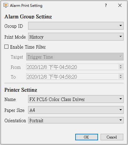
 to do the remote control.
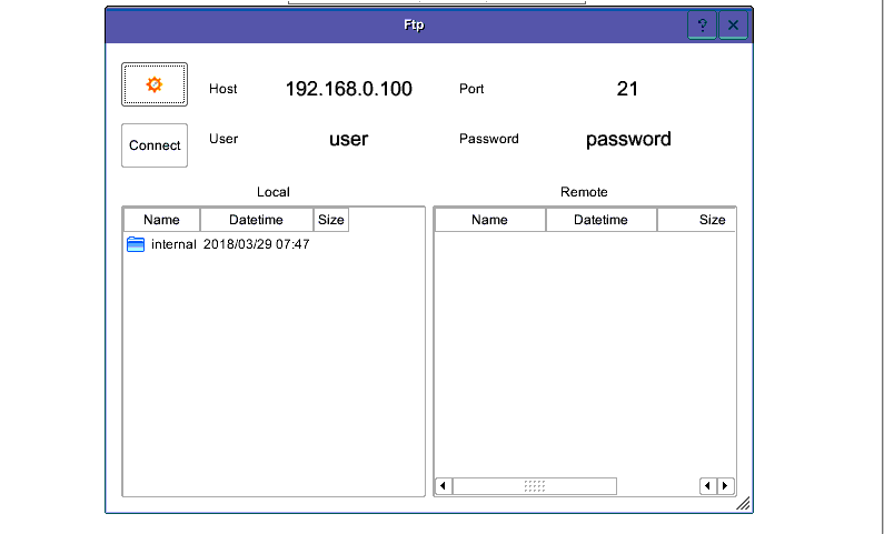
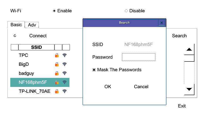
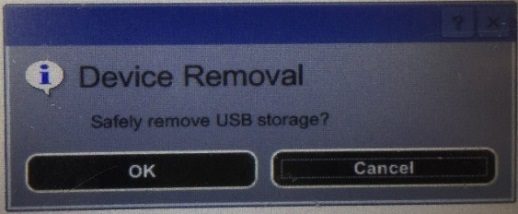
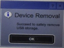
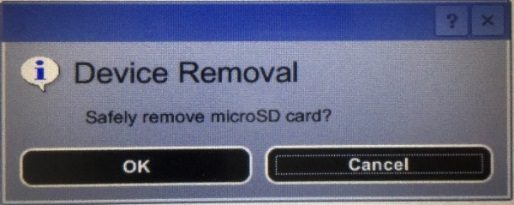
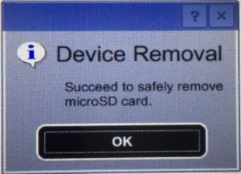
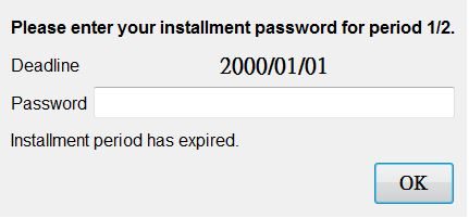
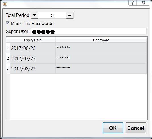
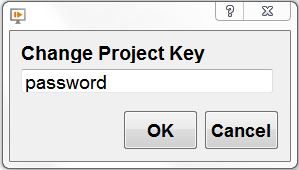

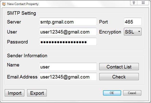
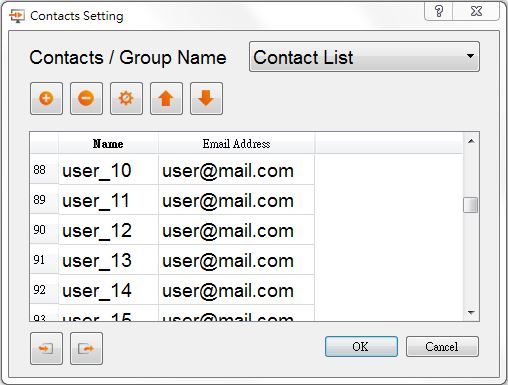
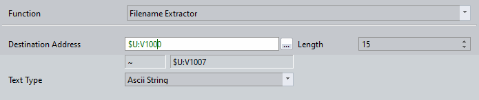
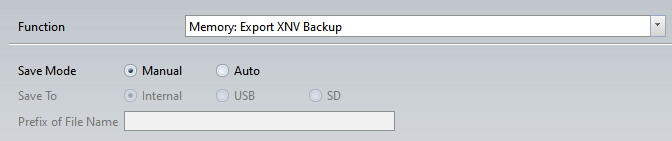
19.4.2.5 【Display】
The【Switch】【Display】page is as shown in the figure below, the meanings of each setting item are listed below:
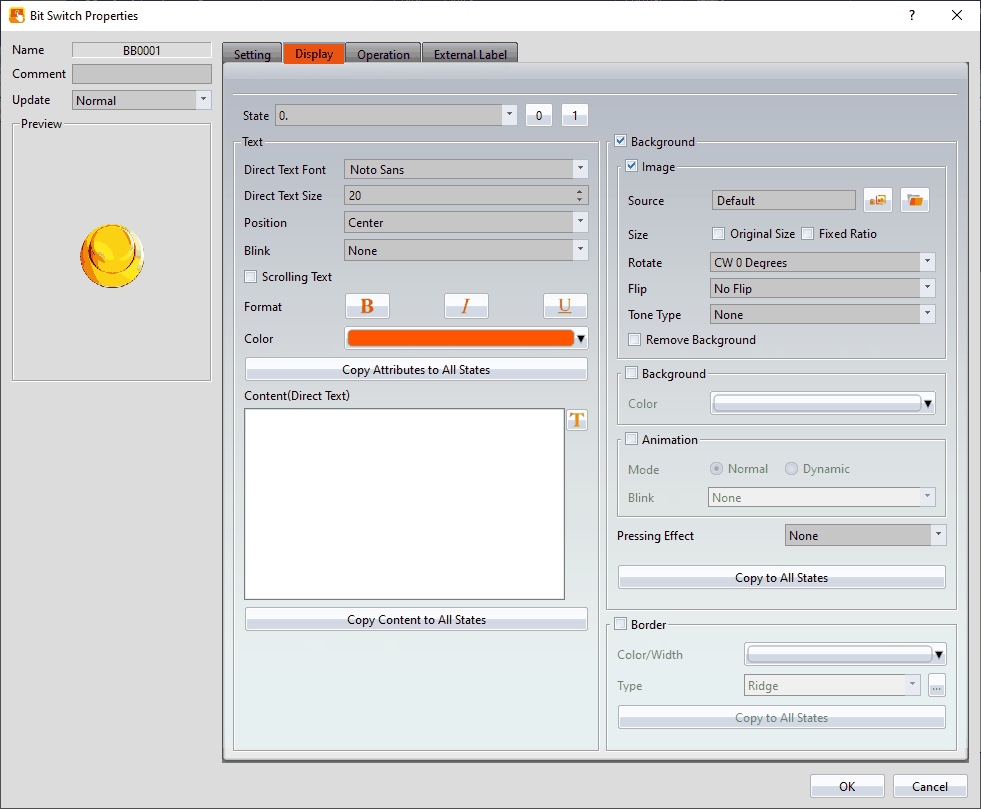
Figure 269【Display】Setting Screen of【Switch】
Table 136【Display】Setting Properties of【Switch】
|
Property |
Description |
|
【Set All the States to State 0】 |
If it’s【Change Screen Switch】, there will appear a option as【Set All the States to State 0】, will set all the switch as state 0. |
|
【State】 |
Select the state needed to be edited. 0 and 1 buttons are provided to enable quick switching between states 0 and 1. |
|
【Text】 |
【Direct Text Font】 Set the font of the text displayed for the current editing state. 【Direct Text Size】 Set the size of the text displayed for the current editing state. 【Position】 Set the position of the text displayed for the current editing state. 【Blink】 Set the blinking function for the text of the current editing state. There are four blinking speeds available to choose from: None, Slow, Medium and Fast. 【Scrolling Text】 Set the scrolling text function for the text of the current editing state; There are four scrolling speeds available to choose from slow to fast. 【Format】 Set the format of the text displayed for the current editing state, including Bold, Italics and Underline. 【Color】 Set the color of the text displayed for the current editing state. 【Copy Attributes to All States】 The text properties for the current editing state is applied to all states. 【Content (Direct Text)】 Set the displayed text of the currently editing state; it can be inputted directly or acquired from the【Text Library】. 【Copy to All States】 Apply the settings of the text for the current editing state to all states. |
|
【Background】 |
【Background】 Check whether to enable background 【Image】 Check whether to use image 【Source】 Set whether to use an image for the displayed background of the current editing state. When this option is checked, an【Image Selector】will appear asking the user to select an image either from the【Image Library】or from【File】. 【Size】 You can set the picture to use 【Original Size】, or check 【Fixed Ratio】 to maintain a fixed length and width ratio when stretching 【Rotate】 Set image rotation angle 【Flip】 Set the flip direction of the image, includes No Flip, X-Axis and Y-Axis. 【Tone Type】 You can choose the tone type you want to change. After selecting the type, you can choose the color from【Tone Color】. 【Remove Background】 You can set the color to be transparent by【Choose Color】. 【Background】 Check whether to enable the background. After checking, you can set the background color displayed in the current editing state from【Color】. 【Animation】 Check whether to enable animated effects. 【Mode】Choose whether to use static or dynamic control elements to flicker. 【Blink】Select the blinking mode, and use the numerical value to switch during dynamic control. 【Pressing Effect】 Set the pressing effect of the current editing state. There are two effects available for selection: None and Highlight. 【Copy to All States】 Apply the settings of the background for the currently editing state to all states. |
|
【Border】 |
Set the border of the object, set the appearance after checked. 【Color/Width】 Set the color and width of the border. 【Type】 Set the type of the boder, click 【Copy to All States】 Apply the settings of the border for the currently editing state to all states. |
 for more types.
19.4.2.6 【External Lable】
The【Switch】【External Lable】page is as shown in the figure below, the meanings of each setting item are listed below:
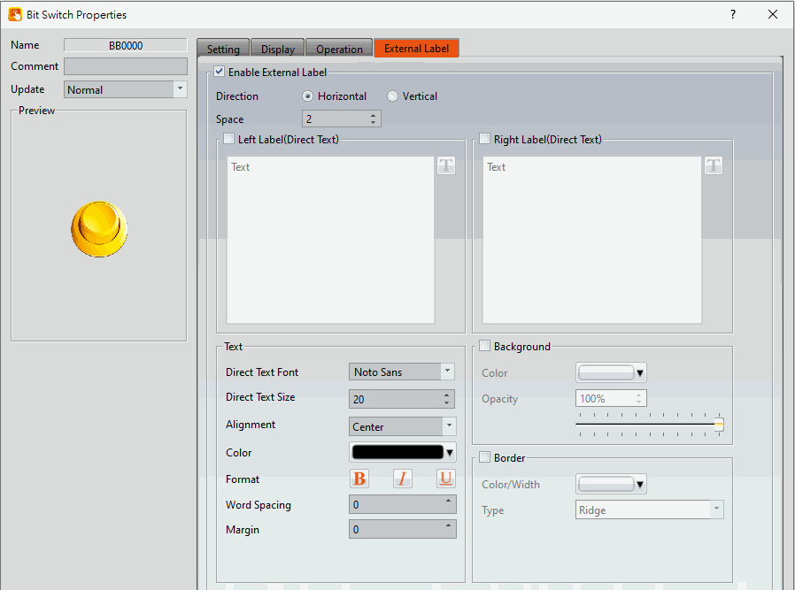
Figure 270【External Lable】Setting Screen of【Switch】
Table 137【Switch】【External Lable】setting properties
|
Option |
Description |
|
【Enable External Lable】 |
Checked, the bottom will appear the external lable settings of the object. |
|
【Direction】 |
Set the display direction, there are horizontal and vertical two selections. |
|
【Space】 |
Set the space between external lable and the object. |
|
【Left/Top Lable(Direct Text)】 |
Fill in the text to be displayed on the left / top lable of the object, can be directly input or selected from【Font Library】. |
|
【Right/Bottom Lable(Direct Text)】 |
Fill in the text to be displayed on the right / bottom lable of the object, can be directly input or selected from【Font Library】. |
|
【Text】 |
【Direct Text Font】 Set the font of text. 【Direct Text Size】 Set the size of text, the default size is 20. 【Alignment】 Set the alignment of text. 【Color】 Set the color of text. 【Format】 Set the format of text, includes Bold, Italic and Underline. 【Word Spacing】 Set the word space of text. 【Margin】 Set the margin of text. |
|
【Background】 |
Check whether to display background, set the color and opacity of background after checked. 【Color】 Set the background color of external lable. 【Opacity】 Set the opacity of external lable background, the greater the value the more the background opacity is. |
|
【Border】 |
Check whether to display border. 【Color/Width】 Set the color and width of border. 【Type】 Set the type of border. |
19.4.3 【Numeric Input/Display】
【Numeric Input/Display】can display the numeric value saved in specific addresses; The【Numeric Input/Display】can also be clicked to enter specific numeric values to the register address if the【Allow Input】setting is enabled.
19.4.3.1 【Setting】
The【Numeric Input/Display】【Setting】page is as shown in the figure below, the meanings of each setting item are listed below:
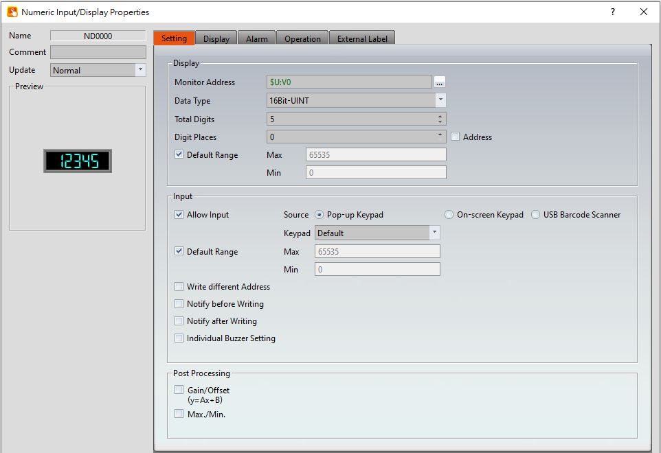
Figure 271【Setting】Screen of【Numeric Input/Display】
Table 138【Setting】Properties of【Numeric Input/Display】
|
Property |
Description |
||||||||||||||||
|
【Preview】 |
Preview the appearance of this object. |
||||||||||||||||
|
【Name】 |
The default name of the object. |
||||||||||||||||
|
【Comment】 |
Set the comment of the object. |
||||||||||||||||
|
【Update】 |
Provide user can select a suitable speed to get the latest data under different situation, such as you would like to get the latest data or adjust the object on the screen to display first, etc. Provide three modes: 【once】: update once only when switch to this page or use the system tag【OP_UPDATE_SCREEN_OBJECTS】, update once when trigger once a time, it will keep update if the monitor address is internal address. 【normal】: normal update speed. 【fast】: the fastest update speed. |
||||||||||||||||
|
【Display】 |
【Monitor Address】 Set the monitored address of Numeric Input/Display. The address can be from internal memory or a PLC register address. 【Data Type】 Set the data type of Numeric Input/Display. The available data types are: 16Bit-BCD, 16Bit-INT, 16Bit-UINT, 16Bit-HEX, 32Bit-BCD, 32Bit-INT, 32Bit-UINT, 32Bit-HEX, 32Bit-FLOAT. When 32Bit-FLOAT is selected, you can also choose a display option for【Exponential Format】. 【Total Digits】 Set the total number of digits of Numeric Input/Display. 【Digit Places】 Set the decimal place of the Numeric Input/Display. If check 【Address】then you can set the source address of digital places, and digital places can be dynamically control, data type used by address is same as【Data Type】. 【Default Range】 Set the【Max】and【Min】display of the Numeric Input/Display. The【Address】checkbox can be used to set the source address for reading the maximum value or minimum value by【Data Type】. If this option is checked , the option will have a different default range depending on the【Data Type】. For example, type select as 16Bit-UINT, the【Max】is 65535,【Min】is 0 【Maximum Value】 Set the maximum value allowed for the numeric input / display to be displayed. If you check the address, the maximum value can be set to the value of the source address, allowing the maximum value to be dynamic. 【Minimum Value】 Set the minimum value allowed for the numeric input / display to be displayed. If you check the address, the minimum value can be set to the value of the source address, allowing the minimum value to be dynamic. |
||||||||||||||||
|
【Input】 |
【Allow Input】 Set whether to allow the input function for the Numeric Input/Display object. Related input setting items will appear if this option is selected. 【Source】 When setting the touch Numeric Input/Display object, the source of the keyboard is【Pop-up Keypad】,【On-screen Keypad】or【USB Barcode Scanner】. 【Pop-up Keypad】 Select the【Keypad Screen】no. to use. 【On-screen Keypad】 Use the self-planned keyboard on the basic screen, and the Numeric Input/Display object object and the self-planned keyboard must be on the same basic screen.
【USB Barcode Scanner】 When the source is selected as a USB barcode scanner, touching the Numeric Input/Display object changes the object color and is put on standby for the input of the USB barcode scanner. When the input is complete, the data is transferred directly to the specified address. 【Default Range】 Default Range of the Numeric Input/Display object,if this option is checked , the option will have a different default range depending on the【Data Type】. For example, type select as 16Bit-UINT, the【Max】is 65535,【Min】is 0 , if don’t check this option, then can enter the【Max】and【Min】of the Numeric Input/Display object. 【Max】 Set the maximum allowed input value for Numeric Input/Display. The【Address】checkbox can be used to set the source address for writing the maximum value by【Data Type】. 【Min】 Set the minimum allowed input value for Numeric Input/Display. The【Address】checkbox can be used to set the source address for writing the minimum value by【Data Type】. 【Write different Address】 Set to allow writing to a different address for the Numeric Input/Display object. Related settings will appear if this option is selected, allowing the setting of a target address for writing values. The source address for reading value and the target address for writing value will be different if this option is used. 【Notify before Writing】 The signal will notify before writing. Level: Set the bit as 0 or 1. Pulse: Set the bit to 1 and automatically restore to 0 after continuing the time set by【Width】. 【Notify after Writing】 The signal will notify after writing. Level: Set the bit as 0 or 1. Pulse: Set the bit to 1 and automatically restore to 0 after continuing the time set by【Width】. 【Individual Buzzer Setting】 Can individually setup buzzer setting. Includes 5 modes: Off, Short, Long, Short-Short, Long-Short. 【Barcode Continuous Input】 Base on【USB Barcode Scanner】, you can determine which component to input next by Bit controlling to reduce inconvenience of manual selection ; if there is a component in【Comment】, it will be displayed in Barcode input Order interface.
|
||||||||||||||||
|
【Post Processing】 |
【Gain/Offset】 Set whether to allow post-processing functions for the Numeric Input/Display object. Related post processing settings will appear if this option is selected, allowing the setting of processing functions (add, subtract, multiply and divide) and constants. Formula is as follows: y=Ax+B, gain is A, offset for the B, y value is displayed for HMI, x is PLC value. For example, gain A=5, offset B=2, when the PLC x=3, HMI value display is 17 (17=(5*3)+2).
In the numerical input/display object, enter 12 and the PLC value x will get 2 (x=(y-B)/A, 2=(12-2)/5).
The【Address】checkbox can be used to set the source address for processing constant. The type of data used to read the address is fixed to 16Bit-INT. 【Max./Min.】 Sets the ratio of the read source address and the display. Can be set by【Data Max.】,【Data Min.】,【Display Max.】and【Display Min.】to determine the proportional relationship. For example, read the PLC R100 address, and the maximum of the R100 is 100, minimum is 0, in the HMI wants to show the maximum is 1000, minimum is 0. So the【Data Max.】indicates the maximum value of the source address, can be set to 100,【Data Min.】indicates the minimum valueof the source address, can be set to 0,【Display Max.】indicates the maximum value of the display, can be set to 1000,【Data Min.】indicates the minimum value of the display, can be set to 0, when PLC register R100=50, then HMI will display as 500. If check the【Address】then can set the source address of the【Data Max.】,【Data Min.】,【Display Max.】and【Display Min.】, the data type of the read address is fixed to 16Bit-INT. |
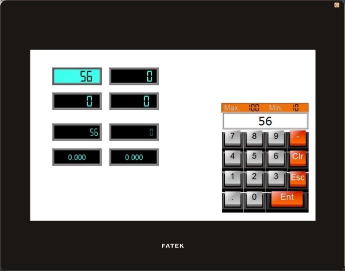
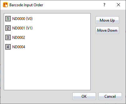
19.4.3.2 【Display】
The【Numeric Input/Display】【Display】page is as shown in the figure below, the meanings of each setting item are listed below:
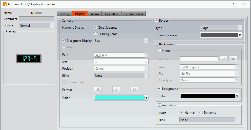
Figure 272【Display】Setting Screen of【Numeric Input/Display】
Table 139【Display】Setting Properties of【Numeric Input/Display】
|
Property |
Description |
|
【Content】 |
【Numeric Display】 Set the display method for the numeric value of Numeric Input/Display. Selecting【Zero Suppress】will not display the zeros in front and selecting【Leading Zeroes】will display the zeros in front. 【7-segment Display】 Set to allow the 7-segment display function for the Numeric Input/Display object. If this option is selected, related settings for the style of the 7-segment display will appear. These styles include outline, filled, and flat. 【Mask】 Set the text of the numerical input/display object displayed as asterisks (#), can not use the【Mask】function if use the【7-segment Display】. 【Font】 Set the font for the displayed text of Numeric Input/Display, can not use the【Mask】function if use the【7-segment Display】. 【Size】 Set the size for the displayed text of Numeric Input/Display, can not use the【Mask】function if use the【7-segment Display】. 【Position】 Set the position for the displayed text of Numeric Input/Display, can not use the【Mask】function if use the【7-segment Display】. 【Blink】 Set the blinking function for the text of Numeric Input/Display. There are four blinking speeds available to choose from: None, Slow, Medium and Fast, can not use the【Mask】function if use the【7-segment Display】. 【Scrolling Text】 Set the scrolling text function for the text of Numeric Input/Display. There are four scrolling speeds available to choose from slow to fast. 【Format】 Set the format of the text displayed for the Numeric Input/Display, including Bold, Italics and Underline, can not use the【Mask】function if use the【7-segment Display】. 【Color】 Set the color for the displayed text of Numeric Input/Display. |
|
【Border】 |
【Type】 Set the border types for Numeric Input/Display. 【Color/Thickness】 Set the color and thickness for the displayed border of Numeric Input/Display. |
|
【Background】 |
【Background】 Check whether to enable background 【Image】 Check whether to use image 【Source】 Set whether to use an image for the displayed background of the current editing state. When this option is checked, an【Image Selector】will appear asking the user to select an image either from the【Image Library】or from【File】. 【Rotate】 Set image rotation angle 【Flip】 Set the flip direction of the image, includes No Flip, X-Axis and Y-Axis. 【Tone Type】 You can choose the tone type you want to change. After selecting the type, you can choose the color from【Tone Color】. 【Background】 Check whether to enable the background. After checking, you can set the background color displayed in the current editing state from【Color】. 【Animation】 Check whether to enable animated effects. 【Mode】Choose whether to use static or dynamic control elements to flicker. 【Blink】Select the blinking mode, and use the numerical value to switch during dynamic control. |
19.4.3.3 【Alarm】
The【Numeric Input/Display】【Alarm】page is as shown in the figure below, the meanings of each setting item are listed below:
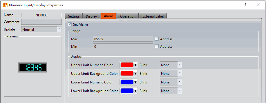
Figure 273【Alarm】Setting Screen of【Numeric Input/Display】
Table 140【Alarm】Setting Properties of【Numeric Input/Display】
|
Property |
Description |
|
【Set Alarm】 |
Set to enable the alarm function of Numeric Input/Display. Alarm related settings will appear below when this option is selected. |
|
【Range】 |
Set the range of the alarm; the alarm condition is fulfilled when the numeric value of the Numeric Input/Display reaches the maximum or minimum value. 【Max】 Set the maximum alarm value for the Numeric Input/Display; the【Address】below can be used to set the source address for the maximum value by the【Data Type】 set in the【Setting】page. 【Min】 Set the minimum alarm value for the Numeric Input/Display; the【Address】on the rear can be used to set the source address for the minimum value by the【Data Type】 set in the【Setting】page. |
|
【Display】 |
Set the appearance of the Numeric Input/Display follows the change when the alarm conditions are fulfilled. 【Upper Limit Numeric Color】 Sets the color of the text for the Numeric Input/Display when the set【Max】is exceeded. The【Blink】dropdown menu can be used to set the blinking speed of the text. There are four blinking speeds available to choose from: None, Slow, Medium and Fast. 【Upper Limit Background Color】 Sets the color of the background for the Numeric Input/Display when the set【Max】is exceeded. The【Blink】dropdown menu can be used to set the blinking speed of the background. There are four blinking speeds available to choose from: None, Slow, Medium and Fast. 【Lower Limit Numeric Color】 Sets the color of the text for the Numeric Input/Display when the set【Min】is not reached. The【Blink】 dropdown menu can be used to set the blinking speed of the text. There are four blinking speeds available to choose from: None, Slow, Medium and Fast. 【Lower Limit Background Color】 Sets the color of the background for the Numeric Input/Display when the set【Min】is not reached. The【Blink】dropdown menu can be used to set the blinking speed of the background. There are four blinking speeds available to choose from: None, Slow, Medium and Fast. |
19.4.3.4 【External Lable】
The【Numeric Input/Display】【External Lable】page is as shown in the figure below, the meanings of each setting item are listed below:
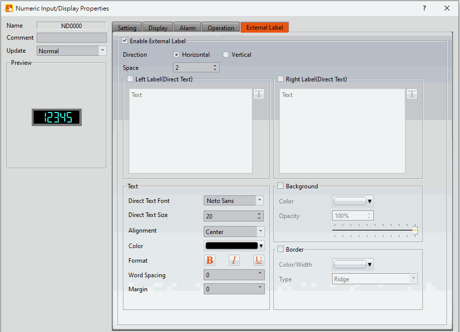
Figure 274【External Lable】Screen of【Numeric Input/Display】
Table 141【Numeric Input/Display】【External Lable】setting properties
|
Option |
Description |
|
【Enable External Lable】 |
Checked, the bottom will appear the external lable settings of the object. |
|
【Direction】 |
Set the display direction, there are horizontal and vertical two selections. |
|
【Space】 |
Set the space between external lable and the object. |
|
【Left/Top Lable(Direct Text)】 |
Fill in the text to be displayed on the left / top lable of the object, can be directly input or selected from【Font Library】. |
|
【Right/Bottom Lable(Direct Text)】 |
Fill in the text to be displayed on the right / bottom lable of the object, can be directly input or selected from【Font Library】. |
|
【Text】 |
【Direct Text Font】 Set the font of text. 【Direct Text Size】 Set the size of text, the default size is 20. 【Alignment】 Set the alignment of text. 【Color】 Set the color of text. 【Format】 Set the format of text, includes Bold, Italic and Underline. 【Word Spacing】 Set the word space of text. 【Margin】 Set the margin of text. |
|
【Background】 |
Check whether to display background, set the color and opacity of background after checked. 【Color】 Set the background color of external lable. 【Opacity】 Set the opacity of external lable background, the greater the value the more the background opacity is. |
|
【Border】 |
Check whether to display border. 【Color/Width】 Set the color and width of border. 【Type】 Set the type of border. |
19.4.4 【Text Input/Display】
【Text Input/Display】can display the text saved in specific addresses. The【Text Input/Display】can also be clicked to enter specific text to the register address if the【Allow Input】setting is enabled.
19.4.4.1 【Setting】
The【Text Input/Display】【Setting】page is as shown in the figure below, the meanings of each setting item are listed below:
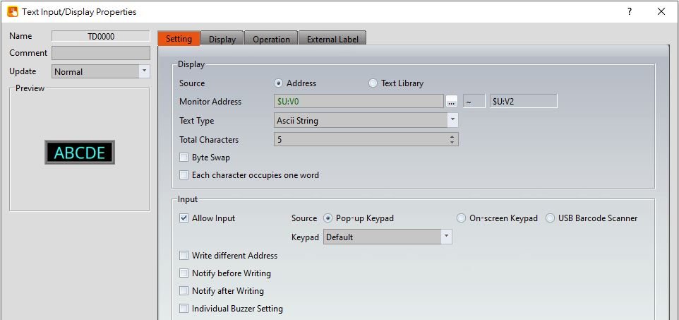
Figure 275【Setting】Screen of【Text Input/Display】
Table 142【Setting】Properties of【Text Input/Display】
|
Property |
Description |
|
【Preview】 |
Preview the appearance of this object. |
|
【Name】 |
The default name of the object. |
|
【Comment】 |
Set the comment of the object. |
|
【Update】 |
Provide user can select a suitable speed to get the latest data under different situation, such as you would like to get the latest data or adjust the object on the screen to display first, etc. Provide three modes: 【once】: update once only when switch to this page or use the system tag【OP_UPDATE_SCREEN_OBJECTS】, update once when trigger once a time, it will keep update if the monitor address is internal address. 【normal】: normal update speed. 【fast】: the fastest update speed. |
|
【Display】 |
【Source】 The source of the text can be either an【Address】or from the【Text Library】. If【Address】is selected, the【Monitor Address】can be set below and directly corresponds to the text to display. If【Text Library】is selected, the【Monitor Address】corresponds to the entry in the【Text Library】to read the text from. 【Monitor Address】 Set the monitored address of Text Input/Display; when this setting is changed, the final address below will change according to the inputted【Monitor Address】and【Total Characters】. 【Text Type】 Set the display type of text input/display, includes Ascii String, Unicode String(Simplified Chinese, Traditional Chinese, GB18030(Simplified Chinese), and Big5(Traditional Chinese). 【Ascii String】 When select as【Ascii String】, the object will display the Ascii string corresponding to【Monitor Address】, because one register includes 2 Ascii, such as【Total Characters】set as 5, it will take 3 registers. 【Unicode String(Simplified Chinese)】 When select as【Unicode String(Simplified Chinese)】, the object will display the Unicode string corresponding to【Monitor Address】, because one register includes 1 Unicode, such as【Total Characters】set as 5, it will take 5 registers.
【Unicode String(Others)】 When select as【Unicode String(Others)】, the object will display the Unicode string corresponding to【Monitor Address】, figure as shown below(display German), because one register includes 1 Unicode, such as【Total Characters】set as 15, it will take 15 registers.
【Total Characters】 Sets the total number of characters for Text Input/Display; when this setting is changed, the final address above will change according to the inputted【Monitor Address】and【Total Characters】. 【Byte Swap】 Select whether to enable the high and low byte swapping function. 【Each character occupies one word】 Set whether enable each character occupies one word, for example R0=A, R1=B, R2=C, R3=D, R4=E. 【Data Type】 Set the data type of the monitored address. This option is only enabled when【Text Library】is selected as the【Source】. 【Start Row】 Set the starting row in the【Text Library】that the text is obtained. For example, if the start row is set to 1 and the【Monitor Address】contains the value 3, the display will display the 4th entry in the【Text Library】. The【Start Row】can also be obtained from a specified address. This option is only enabled when【Text Library】is selected as the【Source】. |
|
【Input】 |
【Allow Input】 Set whether to allow the input function for the Text Input/Display object; related input settings will appear if this option is selected. 【Source】 When setting the touch Text Input/Display object, the source of the keyboard is【Pop-up Keypad】,【On-screen Keypad】or【USB Barcode Scanner】. 【Pop-up Keypad】 Select the【Keypad Screen】no. to use. 【On-screen Keypad】 Use the self-planned keyboard on the basic screen, and the Text Input/Display object object and the self-planned keyboard must be on the same basic screen. 【USB Barcode Scanner】 When the USB barcode scanner is selected as the input source, the text input/display object will change color when touched and will wait for the input of the USB barcode reader. After the input is entered, the data will be transferred directly to the specified address. When【Text Type】choose as【Unicode String(Simplified Chinese)】, the input keypad can only use provide by system, click【Text Input/Display】while executing, will show up the pinyin keypad, figure shown as below. Click the lower left corner【English/拼音(簡)】, can switch to English or Pinyin. If the input keypad is in pinyin, you can choose the word after enter pinyin.
【Write different Address】 Set to allow writing to a different address for the Text Input/Display object. Related settings will appear if this option is selected, allowing the setting of target address for writing text. The source address for reading text and the target address for writing text will be different if this option is used. 【Notify before Writing】 The signal will notify before writing. Level: Set the bit as 0 or 1. Pulse: Set the bit to 1 and automatically restore to 0 after continuing the time set by【Width】. 【Notify after Writing】 The signal will notify after writing. Level: Set the bit as 0 or 1. Pulse: Set the bit to 1 and automatically restore to 0 after continuing the time set by【Width】. 【Individual Buzzer Setting】 Can individually setup buzzer setting. Includes 5 modes: Off, Short, Long, Short-Short, Long-Short. 【Barcode Continuous Input】 Base on【USB Barcode Scanner】, you can determine which component to input next by Bit controlling to reduce inconvenience of manual selection ; if there is a component in【Comment】, it will be displayed in Barcode input Order interface.
|
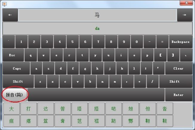
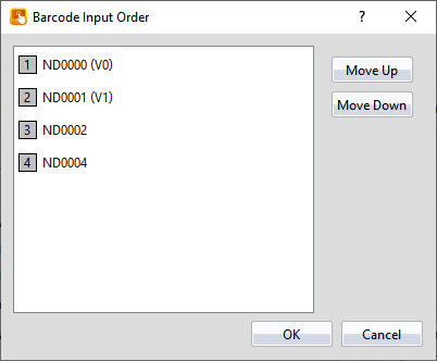
19.4.4.2 【Display】
The【Text Input/Display】【Display】page is as shown in the figure below, the meanings of each setting item are listed below:
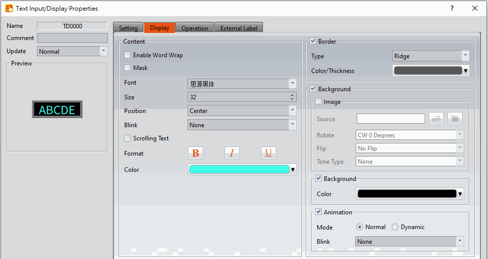
Figure 276【Display】Setting Screen of【Text Input/Display】
Table 143【Display】Setting Properties of【Text Input/Display】
|
Property |
Description |
|
【Content】 |
【Enable Word Wrap】 Enter a space in a word then will do the word wrap. 【Mask】 Set the text to be displayed as asterisks (*) for the Text Input/Display object. 【Font】 Set the font for the text of the Text Input/Display. 【Size】 Set the size for the text of the Text Input/Display. 【Position】 Set the position for the text of the Text Input/Display. 【Blink】 Set the blinking function for the text of the Text Input/Display. There are four blinking speeds available to choose from: None, Slow, Medium and Fast. 【Scrolling Text】 Set the scrolling text function for the text of the Text Input/Display. There are four scrolling speeds available to choose from slow to fast. 【Format】 Set the format of the text for the Text Input/Display, including Bold, Italics and Underline. 【Color】 Set the color for the text of the Text Input/Display. |
|
【Border】 |
【Type】 Set the border type for the Text Input/Display. 【Color/Thickness】 Set the color and thickness for the border of the Text Input/Display. |
|
【Background】 |
【Background】 Check whether to enable background 【Image】 Check whether to use image 【Source】 Set whether to use an image for the displayed background of the current editing state. When this option is checked, an【Image Selector】will appear asking the user to select an image either from the【Image Library】or from【File】. 【Rotate】 Set image rotation angle 【Flip】 Set the flip direction of the image, includes No Flip, X-Axis and Y-Axis. 【Tone Type】 You can choose the tone type you want to change. After selecting the type, you can choose the color from【Tone Color】. 【Background】 Check whether to enable the background. After checking, you can set the background color displayed in the current editing state from【Color】. 【Animation】 Check whether to enable animated effects. 【Mode】Choose whether to use static or dynamic control elements to flicker. 【Blink】Select the blinking mode, and use the numerical value to switch during dynamic control. |
19.4.4.3 【External Lable】
The【Text Input/Display】【External Lable】page is as shown in the figure below, the meanings of each setting item are listed below:
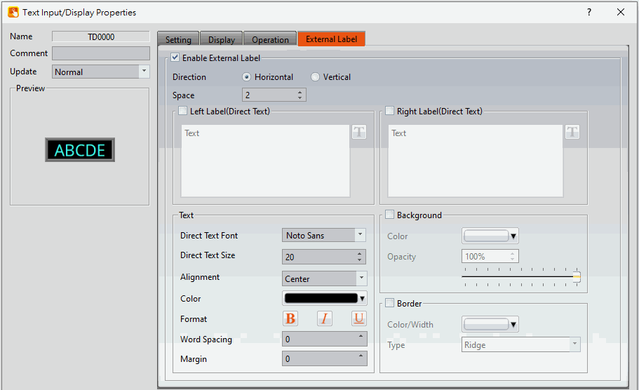
Figure 277【External Lable】Setting Screen of【Text Input/Display】
Table 144【Text Input/Display】【External Lable】setting properties
|
Option |
Description |
|
【Enable External Lable】 |
Checked, the bottom will appear the external lable settings of the object. |
|
【Direction】 |
Set the display direction, there are horizontal and vertical two selections. |
|
【Space】 |
Set the space between external lable and the object. |
|
【Left/Top Lable(Direct Text)】 |
Fill in the text to be displayed on the left / top lable of the object, can be directly input or selected from【Font Library】. |
|
【Right/Bottom Lable(Direct Text)】 |
Fill in the text to be displayed on the right / bottom lable of the object, can be directly input or selected from【Font Library】. |
|
【Text】 |
【Direct Text Font】 Set the font of text. 【Direct Text Size】 Set the size of text, the default size is 20. 【Alignment】 Set the alignment of text. 【Color】 Set the color of text. 【Format】 Set the format of text, includes Bold, Italic and Underline. 【Word Spacing】 Set the word space of text. 【Margin】 Set the margin of text. |
|
【Background】 |
Check whether to display background, set the color and opacity of background after checked. 【Color】 Set the background color of external lable. 【Opacity】 Set the opacity of external lable background, the greater the value the more the background opacity is. |
|
【Border】 |
Check whether to display border. 【Color/Width】 Set the color and width of border. 【Type】 Set the type of border. |
19.4.5 【QR code Input/Display】
【QR code Input/Display】can display QR code on the screen.
19.4.5.1 【Setting】
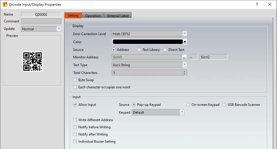
Figure 278【Setting】Screen of【QR code Input/Display】
Table 145【Setting】Properties of【QR code Input/Display】
|
Property |
Description |
|
【Error Correction Level】 |
If the QR code graphic is damaged, the content can still be read by the machine. Support 4 levels of Low (7%), Medium (15%), Quartile (25%), High (30%). |
|
【Color】 |
Set the color of QR code graphics. |
|
【Source】 |
Select the reading address of the QR code graphic data . 【Address】 Read the data of the set monitoring address, support Ascii String, Unicode (Simplified Chinese, Traditional Chinese, Others), GB18030 (Simplified Chinese), BIG5 (Traditional Chinese). 【Text Library】 Read the data in the text library to display the QR code. 【Direct Text】 After selecting, an input window will appear for the user to enter text |
|
【Input】 |
【Allow Input】 Set whether to allow the input function for the Numeric Input/Display object. Related input setting items will appear if this option is selected. 【Source】 When setting the touch Numeric Input/Display object, the source of the keyboard is【Pop-up Keypad】,【On-screen Keypad】or【USB Barcode Scanner】. 【Pop-up Keypad】 Select the【Keypad Screen】no. to use. 【On-screen Keypad】 Use the self-planned keyboard on the basic screen, and the Numeric Input/Display object object and the self-planned keyboard must be on the same basic screen. 【USB Barcode Scanner】 When the source is selected as a USB barcode scanner, touching the Numeric Input/Display object changes the object color and is put on standby for the input of the USB barcode scanner. When the input is complete, the data is transferred directly to the specified address. 【Write different Address】 Set to allow writing to a different address for the Numeric Input/Display object. Related settings will appear if this option is selected, allowing the setting of a target address for writing values. The source address for reading value and the target address for writing value will be different if this option is used. 【Notify before Writing】 The signal will notify before writing. Level: Set the bit as 0 or 1. Pulse: Set the bit to 1 and automatically restore to 0 after continuing the time set by【Width】. 【Notify after Writing】 The signal will notify after writing. Level: Set the bit as 0 or 1. Pulse: Set the bit to 1 and automatically restore to 0 after continuing the time set by【Width】. 【Individual Buzzer Setting】 Can individually setup buzzer setting. Includes 5 modes: Off, Short, Long, Short-Short, Long-Short. 【Barcode Continuous Input】 Base on【USB Barcode Scanner】, you can determine which component to input next by Bit controlling to reduce inconvenience of manual selection ; if there is a component in【Comment】, it will be displayed in Barcode input Order interface.
|
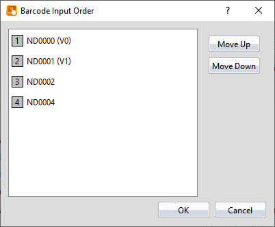
19.4.5.2 【External Lable】
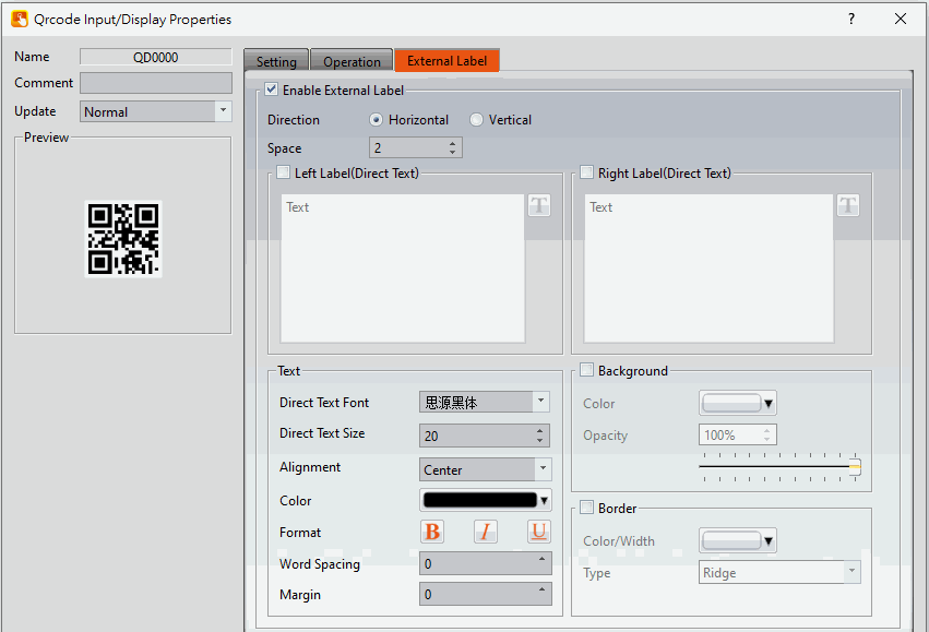
Figure 279【External Lable】Setting Screen of【QR code Input/Display】
Table 146【External Lable】Properties of【QR code Input/Display】
|
Option |
Description |
|
【Enable External Lable】 |
Checked, the bottom will appear the external lable settings of the object. |
|
【Direction】 |
Set the display direction, there are horizontal and vertical two selections. |
|
【Space】 |
Set the space between external lable and the object. |
|
【Left/Top Lable(Direct Text)】 |
Fill in the text to be displayed on the left / top lable of the object, can be directly input or selected from【Font Library】. |
|
【Right/Bottom Lable(Direct Text)】 |
Fill in the text to be displayed on the right / bottom lable of the object, can be directly input or selected from【Font Library】. |
|
【Text】 |
【Direct Text Font】 Set the font of text. 【Direct Text Size】 Set the size of text, the default size is 20. 【Alignment】 Set the alignment of text. 【Color】 Set the color of text. 【Format】 Set the format of text, includes Bold, Italic and Underline. 【Word Spacing】 Set the word space of text. 【Margin】 Set the margin of text. |
|
【Background】 |
Check whether to display background, set the color and opacity of background after checked. 【Color】 Set the background color of external lable. 【Opacity】 Set the opacity of external lable background, the greater the value the more the background opacity is. |
|
【Border】 |
Check whether to display border. 【Color/Width】 Set the color and width of border. 【Type】 Set the type of border. |
19.4.6 【Date/Time Display】
【Date/Time Display】can display the current date and time according to the format set by the user.
19.4.6.1 【Setting】
The【Date/Time Display】【Setting】page is as shown in the figure below, the meanings of each setting item are listed below:
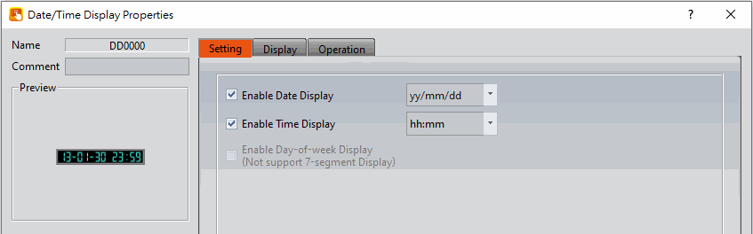
Figure 280【Setting】Screen of【Date/Time Display】
Table 147【Setting】Properties of【Date/Time Display】
|
Property |
Description |
|
【Preview】 |
Previews the appearance of this object. |
|
【Name】 |
The default name of the object. |
|
【Comment】 |
Set the comment of the object. |
|
【Enable Date Display】 |
Set to enable date display; a date format selector will appear for the user to select the display format of the date if this option is selected. |
|
【Enable Time Display】 |
Set to enable time display. A time format selector will appear for the user to select the display format of the time if this option is selected. |
|
【Enable Day-of-week Display】 |
Set to enable day-of-the-week display; a day-of-the-week format selector will appear for the user to select the display format of the day-of-the-week if this option is selected. This option is not available if a【7-segment Display】is used, please uncheck the 【7-segment Display】option in the【Date/Time Display】【Display】page. |
19.4.6.2 【Display】
【Date/Time Display】【Display】page is as shown in the figure below, the meanings of each setting item are listed below:
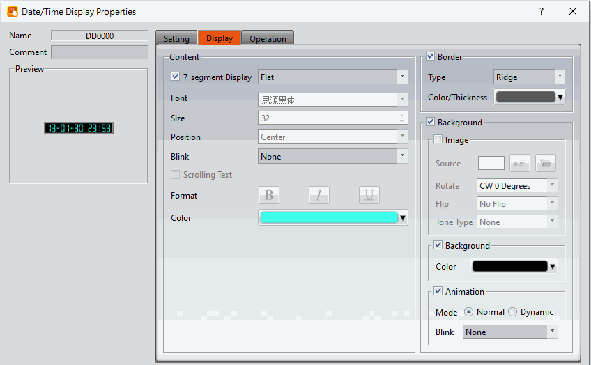
Figure 281【Display】Setting Screen of【Date/Time Display】
Table 148【Display】Setting Properties of【Date/Time Display】
|
Property |
Description |
|
【Content】 |
【7-segment Display】 Set to use the 7-segment display function for the Date/Time Display object. If this option is selected, related settings for setting of style of the 7-segment display will appear, including outlined, filled, flat. Note: while this option is selected, because it can only show part of text (0/O, 1, 2, 3, 4, 5/S, 6, 7, 8, 9/g, A, B, C, D, E, F, H, H, L, o, P, r, u, U, Y), the【Enable Day-of-week Display】function will be disabled. 【Font】 Set the font for the text of the Date/Time Display. 【Size】 Set the size for the text of the Date/Time Display. 【Position】 Set the position for the text of the Date/Time Display. 【Blink】 Set the blinking function for the text of the Date/Time Display. There are four blinking speeds available to choose from: None, Slow, Medium and Fast. 【Scrolling Text】 Set the scrolling text function for the text of the Date/Time Display. There are four scrolling speeds available to choose from slow to fast. 【Format】 Set the format of the text for the Date/Time Display, including Bold, Italics and Underline. 【Color】 Set the color for the text of Date/Time Display. |
|
【Border】 |
【Type】 Set the border type for the Date/Time Display. 【Color/Thickness】 Set the color and thickness for the border of the Date/Time Display. |
|
【Background】 |
【Background】 Check whether to enable background 【Image】 Check whether to use image 【Source】 Set whether to use an image for the displayed background of the current editing state. When this option is checked, an【Image Selector】will appear asking the user to select an image either from the【Image Library】or from【File】. 【Rotate】 Set image rotation angle 【Flip】 Set the flip direction of the image, includes No Flip, X-Axis and Y-Axis. 【Tone Type】 You can choose the tone type you want to change. After selecting the type, you can choose the color from【Tone Color】. 【Background】 Check whether to enable the background. After checking, you can set the background color displayed in the current editing state from【Color】. 【Animation】 Check whether to enable animated effects. 【Mode】Choose whether to use static or dynamic control elements to flicker. 【Blink】Select the blinking mode, and use the numerical value to switch during dynamic control. |
19.4.7 【Window Screen Display】
【Window Screen Display】can display the【Window Screen】created in the project, and supports using the numeric value of specific addresses to control the【Window Screen】displayed by the Window Screen Display.
19.4.7.1 【Setting】
The【Window Screen Display】【Setting】page is as shown in the figure below, the meanings of each setting item are listed below:
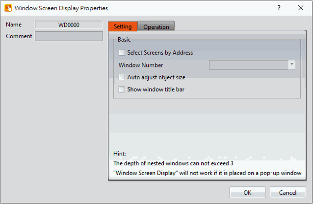
Figure 282【Setting】Screen of【Window Screen Display】
Table 149【Setting】Properties of【Window Screen Display】
|
Property |
Description |
|
【Name】 |
The default name of the object. |
|
【Comment】 |
Set the comment of the object. |
|
【Select Screens by Address】 |
Set to select a screen by address. The【Window Screen】displayed by Window Screen Display will be determined by the numeric value saved in【Window Selection Address】if this setting is selected. If this setting is not selected, the Window Screen Display will have a fixed display of the【Window Screen】selected by【Window Number】. |
|
【Window Number】 |
Set the【Window Screen】displayed by the Window Screen Display. This setting will appear if【Select Screens by Address】is not selected. |
|
【Window Selection Address】 |
Set the【Window Selection Address】of the Window Screen Display. When the HMI is operating, the Window Screen Display will read the【Window Selection Address】according to the【Data Type】Set, and display the【Window Screen】with the number that matches the numeric value read. This setting will appear if【Select Screens by Address】is selected. |
|
【Data Type】 |
Set the Data Type of the【Window Selection Address】. |
|
【Auto adjust object size】 |
Set the size of【Window Screen Display】, automatically adjust object size depending on the selected window screen. |
|
【Show Screens by Address】 |
After checking, the title bar will not appear when placing this component. |
19.4.8 【Meter】
【Meter】can read the value of specific registers and display this value by a pointer indicator.
Introduction to the property setting dialog are as follows:
19.4.8.1 【General】
The【Meter】【General】page is as shown in the figure below, the meanings of each setting item are listed below:
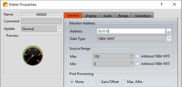
Figure 283【General】Setting Screen of【Meter】
Table 150【General】Setting Properties of【Meter】
|
Property |
Description |
||||||||||||||||
|
【Preview】 |
Preview the appearance of this object. |
||||||||||||||||
|
【Name】 |
The default name of the object. |
||||||||||||||||
|
【Comment】 |
Set the comment of the object. |
||||||||||||||||
|
【Update】 |
Provide user can select a suitable speed to get the latest data under different situation, such as you would like to get the latest data or adjust the object on the screen to display first, etc. Provide three modes: 【once】: update once only when switch to this page or use the system tag【OP_UPDATE_SCREEN_OBJECTS】, update once when trigger once a time, it will keep update if the monitor address is internal address. 【normal】: normal update speed. 【fast】: the fastest update speed. |
||||||||||||||||
|
【Monitor Address】 |
【Address】 Set the address to monitor. 【Data Type】 Set the data format of the monitored address. |
||||||||||||||||
|
【Source Range】 |
【Max】 Set the maximum value of the display range. -【Address】 Select to allow a maximum value of for the display range to change according to the contents of the specified address. 【Min】 Set the minimum value of the display range. -【Address】 Select to allow a minimum value of for the display range to change according to the contents of the specified address. Note: When【Address】is selected, the content value of the maximum address must be greater than the content value of the minimum address in order for the display range to be changed validly. |
||||||||||||||||
|
【Post Processing】 |
【None】 The object unused the post processing function. 【Gain/Offset】 Set whether to allow post-processing functions for the object. Related post processing settings will appear if this option is selected, allowing the setting of processing functions (add, subtract, multiply and divide) and constants. Formula is as follows: y=Ax+B, gain is A, offset for the B, y value is displayed for HMI, x is PLC value. For example, gain A=5, offset B=2, when the PLC x=3, HMI value display is 17 (17=(5*3)+2).
In the object, enter 12 and the PLC value x will get 2 (x=(y-B)/A, 2=(12-2)/5).
The【Address】checkbox can be used to set the source address for processing constant. The type of data used to read the data type of the read address will change according to the setting of the monitor address. 【Max./Min.】 Sets the ratio of the read source address and the display. Can be set by【Data Max.】,【Data Min.】,【Display Max.】and【Display Min.】to determine the proportional relationship. For example, read the PLC R100 address, and the maximum of the R100 is 100, minimum is 0, in the HMI wants to show the maximum is 1000, minimum is 0. So the【Data Max.】indicates the maximum value of the source address, can be set to 100,【Data Min.】indicates the minimum valueof the source address, can be set to 0,【Display Max.】indicates the maximum value of the display, can be set to 1000,【Data Min.】indicates the minimum value of the display, can be set to 0, when PLC register R100=50, then HMI will display as 500. If check the【Address】then can set the source address of the【Data Max.】,【Data Min.】,【Display Max.】and【Display Min.】, the data type of the read address will change according to the setting of the monitor address. |
19.4.8.2 【Display】
The【Meter】【Display】page is as shown in the figure below, the meanings of each setting item are listed below:
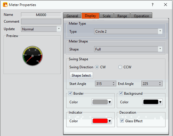
Figure 284【Display】Setting Screen of【Meter】
Table 151【Display】Setting Properties of【Meter】
|
Property |
Description |
|
【Meter Type】 |
【Type】 Set the meter type. There are the following four types:
|
|
【Meter Shape】 |
【Shape】 Set the meter shape. There are Circular/Semicircular/Quadrant available for selection.
|
|
【Swing Shape】 |
Set the swinging angle of the meter indicator. 【Shape Select】 Users can click this button to set common pointer swinging angles quickly. 【Swing Direction】 Set the swinging direction. There are two options:【CC】(Clockwise) and【CCW】(Counter-Clockwise). 【Start Angle】 Set the start angle of the meter. 【End Angle】 Set the end angle of the meter. |
|
【Border】 |
【Color】 Set the color of the border. |
|
【Background】 |
【Color】 Set the background color and filling of the meter. |
|
【Indicator】 |
【Color】 Set the color of the indicator. |
|
【Decoration】 |
【Glass effect】 Set whether or not the “glass effect” is shown. |
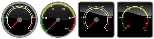
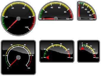
19.4.8.3 【Scale】
The【Meter】【Scale】page is as shown in the figure below, the meanings of each setting item are listed below:
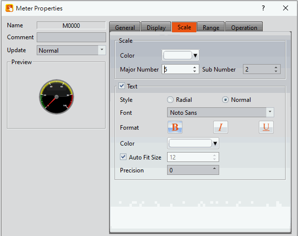
Figure 285【Scale】Setting Screen of【Meter】
Table 152【Scale】Setting Properties of【Meter】
|
Property |
Description |
|
【Scale Frame】 |
【Color】 Set the color of the scale. 【Major Number】 Set the number of major ticks. 【Sub Number】 Set the number of minor ticks. |
|
【Text】 |
【Style】 Set the style of the text, including radial and normal. 【Radial】 The text is angled such that it is perpendicular to the major ticks. 【Normal】 The text is angled such that it is parallel to the horizontal. 【Font】 Select the font for the text. 【Format】 Select the format of the text. 【Color】 Select the color of the text. 【Auto Fit Size】 If checked, the size of the text is automatically adjusted according to the size of the object. If not checked, the user is able to manually adjust the text size. 【Precision】 Set the number of decimal places the labels display. |
19.4.8.4 【Range】
The【Meter】【Range】page is as shown in the figure below, the meanings of each setting item are listed below:
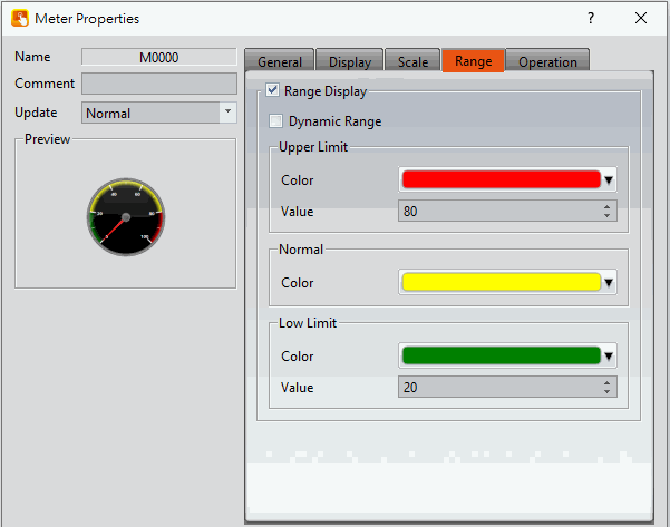
Figure 286【Range】Setting Screen of【Meter】
Table 153【Range】Setting Properties of【Meter】
|
Property |
Description |
|
【Scale Frame】 |
Select to display range marks on the meter. 【Dynamic Range】 Select to allow a maximum and minimum value of for the display range to change according to the contents of the specified address. Note: When【Dynamic Range】is selected, the content value of the maximum address must be greater than the content value of the minimum address in order for the range marks to be changed validly. |
|
【Upper Limit】 |
【Color】 Set the color of the upper limit range. 【Value】 Set the value of the upper limit. When【Dynamic Range】is selected, the address of the upper limit value will be set. |
|
【Normal】 |
【Color】 Set the color of the normal range. |
|
【Lower Limit】 |
【Color】 Set the color of the lower limit range. 【Value】 Set the value of the lower limit. When【Dynamic Range】is selected, the address of the lower limit value will be set. |
19.4.9 【Linear Meter】
【Linear Meter】can read the value of specific registers and display the value read using changes in the length or width of a bar.
Introduction to the property setting dialog is as follows
19.4.9.1 【General】
The【Linear Meter】【General】page is as shown in the figure below, the meanings of each setting item are listed below:
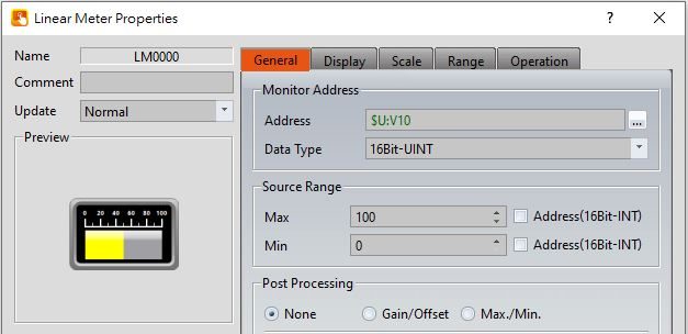
Figure 287【General】Setting Screen of【Linear Meter】
Table 154【General】Setting Properties of【Linear Meter】
|
Property |
Description |
||||||||||||||||
|
【Preview】 |
Preview the appearance of this object. |
||||||||||||||||
|
【Name】 |
The default name of the object. |
||||||||||||||||
|
【Comment】 |
Set the comment of the object. |
||||||||||||||||
|
【Update】 |
Provide user can select a suitable speed to get the latest data under different situation, such as you would like to get the latest data or adjust the object on the screen to display first, etc. Provide three modes: 【once】: update once only when switch to this page or use the system tag【OP_UPDATE_SCREEN_OBJECTS】, update once when trigger once a time, it will keep update if the monitor address is internal address. 【normal】: normal update speed. 【fast】: the fastest update speed. |
||||||||||||||||
|
【Monitor Address】 |
【Address】 Set the address to monitor. 【Data Type】 Set the data format of the monitor address. |
||||||||||||||||
|
【Source Range】 |
【Max】 Set the maximum value of the display range. -【Address】 Select to allow a maximum value of for the display range to change according to the contents of the specified address. 【Min】 Set the minimum value of the display range. -【Address】 Select to allow a minimum value of for the display range to change according to the contents of the specified address. Note: When【Address】is selected, the content value of the maximum address must be greater than the content value of the minimum address in order for the display range to be changed validly. |
||||||||||||||||
|
【Post Processing】 |
【None】 The object unused the post processing function. 【Gain/Offset】 Set whether to allow post-processing functions for the object. Related post processing settings will appear if this option is selected, allowing the setting of processing functions (add, subtract, multiply and divide) and constants. Formula is as follows: y=Ax+B, gain is A, offset for the B, y value is displayed for HMI, x is PLC value. For example, gain A=5, offset B=2, when the PLC x=3, HMI value display is 17 (17=(5*3)+2).
In the object, enter 12 and the PLC value x will get 2 (x=(y-B)/A, 2=(12-2)/5).
The【Address】checkbox can be used to set the source address for processing constant. The type of data used to read the data type of the read address will change according to the setting of the monitor address. 【Max./Min.】 Sets the ratio of the read source address and the display. Can be set by【Data Max.】,【Data Min.】,【Display Max.】and【Display Min.】to determine the proportional relationship. For example, read the PLC R100 address, and the maximum of the R100 is 100, minimum is 0, in the HMI wants to show the maximum is 1000, minimum is 0. So the【Data Max.】indicates the maximum value of the source address, can be set to 100,【Data Min.】indicates the minimum valueof the source address, can be set to 0,【Display Max.】indicates the maximum value of the display, can be set to 1000,【Data Min.】indicates the minimum value of the display, can be set to 0, when PLC register R100=50, then HMI will display as 500. If check the【Address】then can set the source address of the【Data Max.】,【Data Min.】,【Display Max.】and【Display Min.】, the data type of the read address will change according to the setting of the monitor address. |
19.4.9.2 【Display】
The【Linear Meter】【Display】page is as shown in the figure below, the meanings of each setting item are listed below:
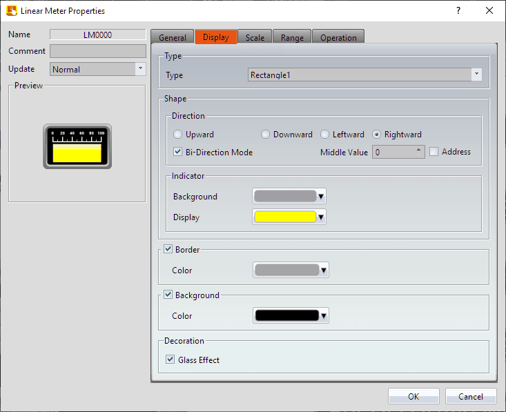
Figure 288【Display】Setting Screen of【Linear Meter】
Table 155【Display】Setting Properties of【Linear Meter】
|
Property |
Description |
|
【Type】 |
There are 2 types: Rectangle and Cylinder. |
|
【Direction】 |
Set the direction of the Linear Meter 【Bi-Direction Mode】 Select for a Linear Meter that changes with respect to the reference point -【Middle Value】. 【Address】 Once selected, the middle value will become dynamic. |
|
【Indicator】 |
【Background】 Set the background color of the indicator. 【Display】 Set the display color of the indicator. |
|
【Border】 |
【Color】 Set the color of the border. |
|
【Background】 |
【Color】 Set the color and filling of the background. |
|
【Decoration】 |
【Glass Effect】 Set whether or not the “glass effect” is shown. |
19.4.9.3 【Scale】
The【Linear Meter】【Scale】page is as shown in the figure below, the meanings of each setting item are listed below:
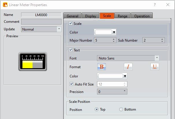
Figure 289【Scale】Setting Screen of【Linear Meter】
Table 156【Scale】Setting Screen of【Linear Meter】
|
Property |
Description |
|
【Scale Frame】 |
【Color】 Set the color of the scale. 【Major Number】 Set the number of major ticks. 【Sub Number】 Set the number of minor ticks. |
|
【Text】 |
【Font】 Select the font for the text. 【Format】 Select the format of the text. 【Color】 Select the color of the text. 【Auto Fit Size】 If checked, the size of the text is automatically adjusted according to the size of the object. If not checked, the user is able to manually adjust the text size. 【Precision】 Set the number of decimal places the labels display. |
|
【Scale Position】 |
When the user set the direction of the Linear Meter to【Upward】or【Downward】,【Left】or【Right】can be selected for the scale position. When the direction of the Linear Meter is 【Leftward】or【Rightward】,【Top】or【Bottom】can be selected for the scale position. |
19.4.9.4 【Range】
The【Linear Meter】【Range】page is as shown in the figure below, the meanings of each setting item are listed below:
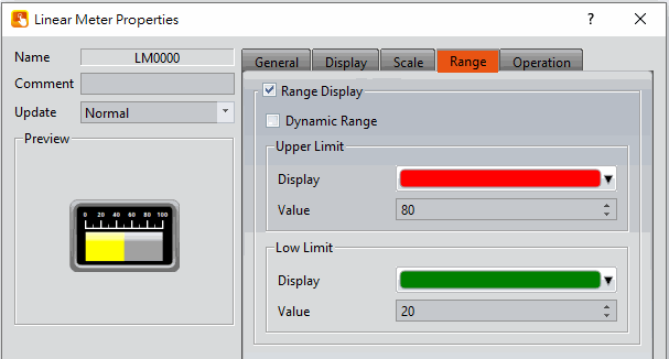
Figure 290【Range】Setting Screen of【Linear Meter】
Table 157【Range】Setting Properties of【Linear Meter】
|
Property |
Description |
|
【Range Display】 |
Select if the color for the indicator of the Linear Meter will be changed according to the contents of the monitored address. 【Dynamic Range】 Select to allow a maximum and minimum value for the display range to change according to the contents of the specified address. Note: When【Dynamic Range】is selected, the content value of the upper limit address must be greater than the content value of the lower limit address in order for the color of the indicator to change accordingly. |
|
【Upper Limit】 |
【Display】 Set the color of the upper limit range. 【Value】 Set the value of the upper limit. When【Dynamic Range】is selected, the address of the upper limit value will be set. |
|
【Lower Limit】 |
【Display】 Set the color of the lower limit range. 【Value】 Set the value of the lower limit. When【Dynamic Range】is selected, the address of the lower limit value will be set. |
19.4.10 【Circular Graph】
Circular Graph can read the specified register address value, and display the value as circular.
19.4.10.1 【General】
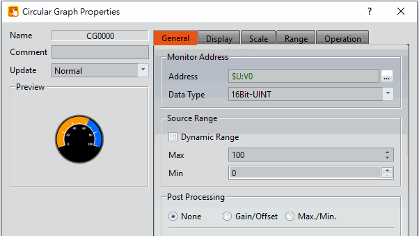
Figure 291【General】Setting Screen on【Circular Graph】
Table 158【General】Setting Properties of【Circular Graph】
|
Property |
Description |
|
【Preview】 |
Preview the appearance of this object. |
|
【Name】 |
The default name of the object. |
|
【Comment】 |
Set the comment of the object. |
|
【Update】 |
Provide user can select a suitable speed to get the latest data under different situation, such as you would like to get the latest data or adjust the object on the screen to display first, etc. Provide three modes: 【once】: update once only when switch to this page or use the system tag【OP_UPDATE_SCREEN_OBJECTS】, update once when trigger once a time, it will keep update if the monitor address is internal address. 【normal】: normal update speed. 【fast】: the fastest update speed. |
|
【Monitor Address】 |
【Address】 Set the monitor address to read 【Data Type】 Set the data type of the reading monitor address |
|
【Source Range】 |
【Dynamic Range】 Set the specified address of the maximum and minimum to change dynamically. 【Max】 Set the maximum value. If【Dynamic Range】is checked, then set the address to control. 【Min】 Set the minimum value. If【Dynamic Range】is checked, then set the address to control. Note: If【Dynamic Range】is checked, the maimum value must greater than the minimum value, the display range can be changed. |
|
【Post Processing】 |
【None】 This object does not use post-processing functions. 【Gain/Offset】 Set the value of gain and offset 【Max./Min.】 Set the ratio of reading source address and display. |
19.4.10.2 【Display】
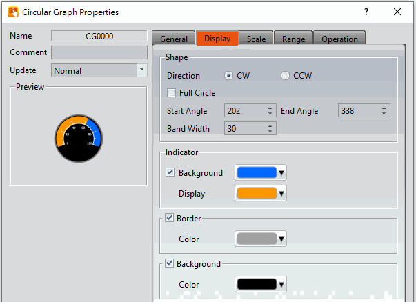
Figure 292【Display】Setting Screen on【Circular Graph】
Table 159【Display】Setting Properties of【Circular Graph】
|
Property |
Description |
|
【Shape】 |
Set the changing direction of the circular indicator area. |
|
【Direction】 |
Set the changing direction. There are two directions, [clockwise(CW)] and [counterclockwise(CCW)]. |
|
【Full Circle】 |
Set whether to the change range of the display area to a full circle. If [No], the range of change is from [Start Angle] to [End Angle]. |
|
【Start Angle】 |
Set the starting angle of the circular indicator area. |
|
【End Angle】 |
Set the end angle of the circular indicator area. |
|
【Band Width】 |
Set the width ratio of the circular belt, the ratio range is 5%~100%. |
|
【Indicator】 |
【Background】 The background color setting of the indicator area. 【Display】 The display color setting of the indicator area. |
|
【Border】 |
Border color setting |
|
【Background】 |
Background color and fill setting |
19.4.10.3 【Scale】
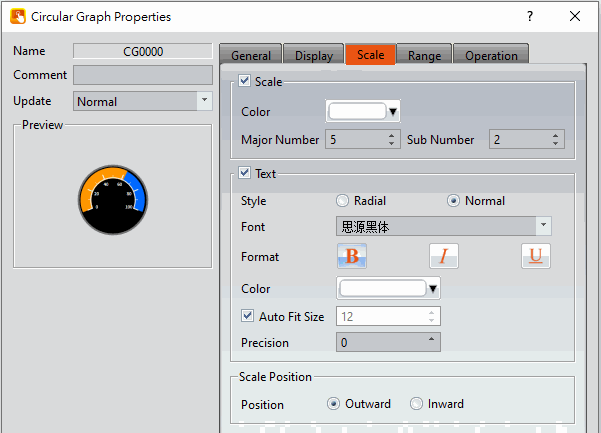
Figure 293【Scale】Setting Screen on【Circular Graph】
Table 160【Scale】Setting Properties of【Circular Graph】
|
Property |
Description |
|
【Scale】 |
【Color】 Set the scale color 【Major Number】 Set the scale major number 【Sub Number】 Set the scale sub number |
|
【Text】 |
【Style】 Provides【Radial】and【Normal】2 types 【Font】 Set the text font displayed on the bar graph scale 【Format】 Set the text format displayed on the bar graph scale, including bold, italic and underline 【Color】 Set the text color displayed on the bar graph scale 【Auto Fit Size】 The text size displayed by the bar graph scale is automatically adjusted according to the size of the object, if it is not checked, it can be adjusted manually 【Precision】 Set the decimal point position of the bar graph scale |
|
【Scale Position】 |
When the user sets the direction of the bar graph to【up】or【down】, the scale position can be selected from【Left】 or【Right】; on the contrary, when the direction of the bar graph is【Left】or【Right】, the scale The position can be selected from【up】or【down】. |
19.4.10.4 【Range】
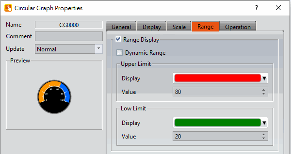
Figure 294【Range】Setting Screen on【Circular Graph】
Table 161【Range】Setting Properties of【Circular Graph】
|
Property |
Description |
|
【Range Display】 |
Check【Dynamic Range】to indicate whether the color of the indicator area of the bar graph changes with the content of the monitoring address. 【Dynamic Range】 The checked range shows whether the upper and lower limits can be changed with the content of the specified address. Note: When【Dynamic Range】is checked, the upper limit address content value must be greater than the lower limit address content value, and the color of the indicator area can be changed accordingly. |
|
【Upper Limit】 |
【Display】 Set the upper range color 【Value】 Set the upper limit value. When【Dynamic Range】is checked, the address of the upper limit value is set. |
|
【Low Limit】 |
【Display】 Set the lower limit range color 【Value】 Set the lower limit value. When【Dynamic Range】is checked, the address of the lower limit value is set. |
19.4.11 【Pie Chart】
It can read the value of a specific continuous register, and display the proportion of the multiple values read in the fo
19.4.11.1 【General】
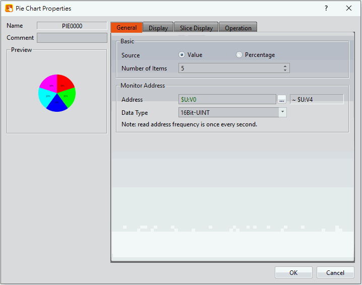
Figure 295【General】Setting Screen on【Pie Chart】
Table 162【General】Setting Properties of【Pie Chart】
|
Property |
Description |
|
【Preview】 |
Preview the appearance of this object. |
|
【Name】 |
The default name of the object. |
|
【Comment】 |
Set the comment of the object. |
|
【Basic】 |
【Source】 Set the type of data source to read from the pie chart, there are two type:【Value】and【Percentage】.
When【Percentage】is selected, the distribution of the pie chart will be displayed proportionally. If the total exceeds 100%, the pie chart will display Error.
【Number of Items】 Set the number of data items for the pie chart. |
|
【Monitor Address】 |
【Address】 Set the read address of the pie chart monitor. 【Data Type】 Set the number of data items for the pie chart. |
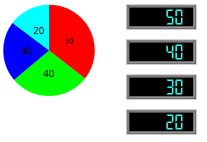
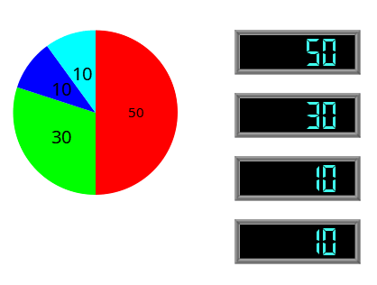
19.4.11.2 【Display】
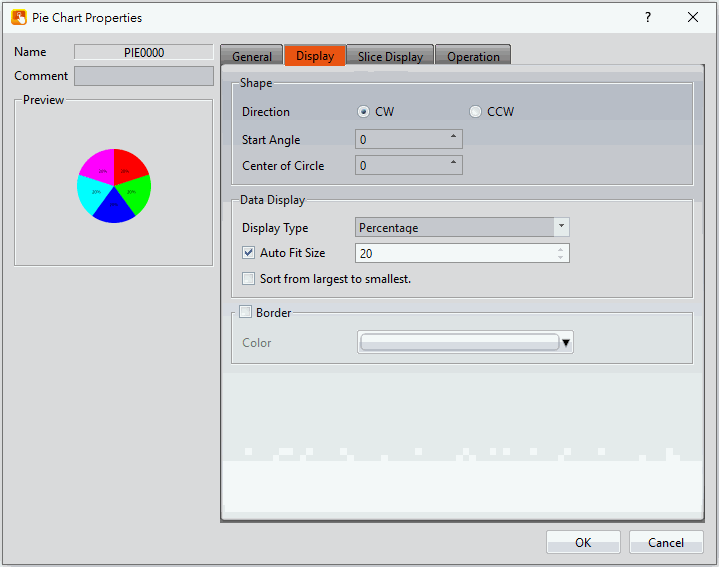
Figure 296【Display】Setting Screen on【Pie Chart】
Table 163【Display】Setting Properties of【Pie Chart】
|
Property |
Description |
|
【Shape】 |
【Direction】 Set the direction to display each items, includes【CW】and【CCW】. 【Center of Circle】 Set the center size of the circle. |
|
【Data Display】 |
【Display Type】 Set the font type of the pie chart to display the data, includes【None】,【Value】,【Percentage】. 【Auto Fit Size】 Auto adjust the font size according to the object size, it can be manual adjusted if this option is not enabled. 【Sort from largest to smallest】 Set the sorting of the data items of the pie chart, whether to sorting by the value of the data. |
|
【Border】 |
【Color】 Set the color of the pie chart border. |
19.4.11.3 【Slice Display】
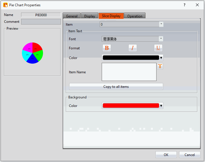
Figure 297【Slice Display】Setting Screen on【Pie Chart】
Table 164【Slice Display】Setting Properties of【Pie Chart】
|
Property |
Description |
|
【Item】 |
Switches the currently edited data item. |
|
【Item Text】 |
【Font】 Set the text font displayed in the currently edited item. 【Format】 Set the text format displayed in the current editing item, including bold, italic and underline. 【Color】 Set the text color displayed in the currently edited item. 【Item Name】 Set the item name to be displayed for the currently edited project. 【Copy to all items】 Apply the text property settings of the currently edited item to all items. |
|
【Background】 |
【Color】Sets the slice background color for data items. |
19.4.12 【Data Block Graph】
【Data Block Graph】is an object used to display curves, in which the x value of the curve uses continuous data values from a specified address as the source, and the y value is derived from the contents of the continuous data. Its main functions are as follows:
- Read the continuous data of a specified address directly.
- Pauses or starts updating the reading of the continuous data of a specified address through the【Sub Switch】, and clearing the displayed data. It can also temporarily preserve the old curve (persistence) for comparison purposes.
Introduction to the【Data Block Graph】property settings dialog box are as follows:
19.4.12.1 【General】
The【Data Block Graph】【General】page is as shown in the figure below, the meanings of each setting item are listed below:
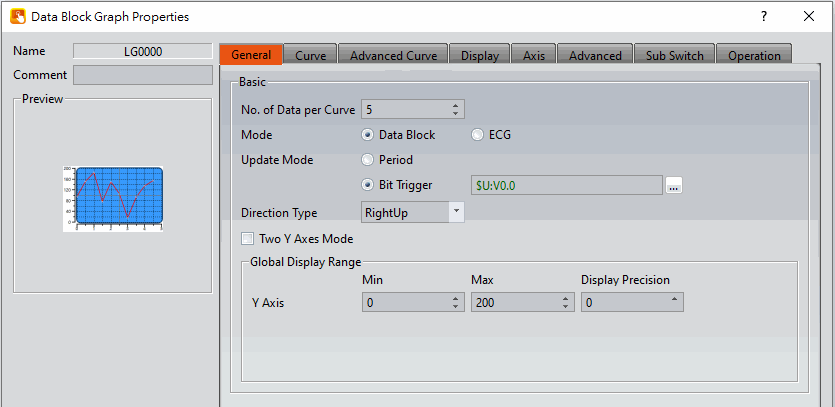
Figure 298【General】Setting Screen on【Data Block Graph】
Table 165【General】Setting Properties of【Data Block Graph】
|
Property |
Description |
|
【Preview】 |
Preview the appearance of this object. |
|
【Name】 |
The default name of the object. |
|
【Comment】 |
Set the comment of the object. |
|
【Basic】 |
【No. of Data per Curve】 Set the amount of data per curve, which is the number of dots per curve. 【Mode】 Set the mode of data curve operation, you can choose 【Data Block】or【ECG】. 【Update Mode】 Set the update mode, includes【Period】and【Bit Trigger】. 【Period】 Set the curve to be updated at a period time when it is display, set the period time of each curves after the option was checked. 【Bit Trigger】 Set the curve to be updated by trigger a bit when it is display, set the address of trigger bit of each curves after the option was checked. 【Direction Type】 Support 4 types: RightUp, LeftUp, RightDown, and LeftDown. 【Two Y Axes Mode】 Select to display two y axes on the graph. |
|
【Global Display Range】 |
Represents the range that can be displayed. 【Min】 Set the minimum Global Range value for the Y-axis. 【Max】 Set the maximum Global Range value for the Y-axis. Note: The【Global Display Range】represents the range that can be displayed. If【Max】is 100 and【Min】is 0, data exceeding this range will not be able to be displayed. 【Display Precision】 Set the number of decimal places the labels display. |
19.4.12.2 【Curve】
The【Data Block Graph】【Curve】page is as shown in the figure below, the meanings of each setting item are listed below:
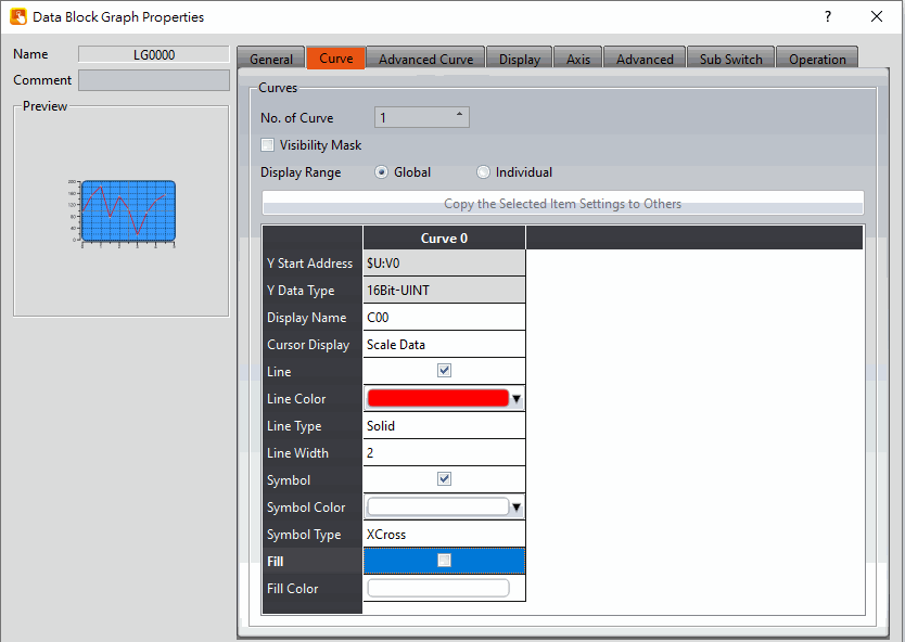
Figure 299【Curve】Setting Screen on【Data Block Graph】
Table 166【Curve】Setting Properties of【Data Block Graph】
|
Property |
Description |
||||||||||||||||||||||||
|
【Curves】 |
【No. of Curves】 Set the number of curves. The maximum is 32. 【No. of Curves (ECG)】 When【ECG】is selected, the curve will become 2 lines as a group, starting from curves 0-0, 0-1, the next group will be curves 1-0, 1-1, and so on, can be established in total 32 ECG curves (16 groups). 【Visibility Mask】 Select to use a visibility mask to control the visibility of the each curve. The user should assign a 32Bit-UINT register as the mask such that the 0 bit controls the display of curve 0, the 1 but controls the display of curve 1, and so on. 【Visibility Mask (ECG)】 When selecting the【ECG】, the user needs to set a register with a 16Bit-UINT data type. The 0th bit controls the visibility of the 0-0 and 0-1 curves, and the 1st bit controls the visibility of the 1-0 and 1-1 curves, and so on. 【Display Range】 Set the display mode for the display range of the curve. It is one of the two following types:
The display ranges of all the curves are identical to the【Global Display Range】.
The display range of all the curves can be different from the【Global Display Range】. Explanation: When to set【Display Range】as【Individual】-When the value ranges of the number of curves are different, for example when the value range of curve a is 0~10, and curve b is 0~1000, it can be discovered that the degree of changes for curve a will be difficult to observe if the two curves are placed in the same figure. This is when【Display Range】can be set as【Individual】and the display range of each curve can be defined; the system will automatically zoom the value of the curves according to the value in【Global Display Range】. Take this case for example, If the value in【Global Display Range】is 0~100, when the value of curve a is 5, the system will zoom it to 50; and when the value of curve b is 500, the system will also zoom it into 50, and so on. The parameters for curve properties in the table are as follows: 【Y Start Address】 Set the starting address for the source of the Y value of the curve. 【Y Data Type】 Set the data type for the Y value of the curve. Explanation: The range of the curve reading address is determined by the【No. of Data per Curve】, 【Start Address】 and【Data Type】; users can determine the range by looking at the following example.
【No. of Data per Curve】= 3; Y-axis【Start Address】@0:R0; Y-axis【Data Type】=16Bit-UINT
【No. of Data per Curve】= 3; Y-axis【Start Address】=$U:V0; Y Y-axis【Data Type】=32Bit-UINT
【Display Name】 The name of the curve to display on the graph. 【Y Max】 Set the maximum Individual Display Range value for the Y value of the curve, if【Display Range】is【Individual】 【Y Min】 Set the minimum Individual Display Range value for the Y-axis, if【Display Range】is【Individual】. 【Cursor Display】 Four options are available: None, Scale Data, Original Data, and Both. For example, if the【Global Display Range】was set to 0~100, the【Display Range】was set to individual,【Y Max】is set to 200 and【Y Min】is set to 0, when Y is 60, the cursor is set such that the scaled value of 30 is displayed. If the【Cursor Display】is set to orginal, the original value of 60 is displayed. 【Y Axis】 If【Two Y Axes Mode】is selected, the setting is used to decide the curve’s reference y-axis. 【Line】 Select whether to display the curve line. 【Line Color】 Set the color of the curve. 【Line Type】 Set the line type of curve, including solid, dash, dot, dash dot, dash dot dot, etc. 【Line width】 Set the width of the curve. 【Symbol】 Select to display the curve symbols. 【Symbol Color】 Set the color of the symbols. 【Symbol Type】 Set the symbol type. |
19.4.12.3 【Advanced Curve】
The【Data Block Graph】【Advanced Curve】page is as shown in the figure below, the meanings of each setting item are listed below:
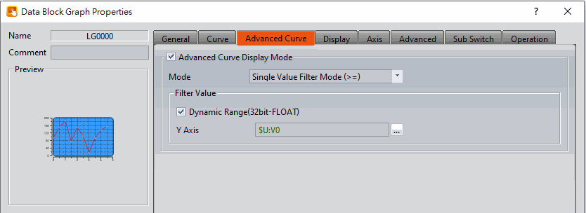
Figure 300【Advanced Curve】Setting Screen of【Data Block Graph】
Table 167【Advanced Curve】Setting Properties of【Data Block Graph】
|
Property |
Description |
|
【Advnaced Curve Display Mode】 |
Select to enable the advanced curve display mode. 【Mode】 There are four filter modes for setting the curve display, which are: 【Single Value Filter Mode (>=)】Display all curves greater than or equal to the filtered value. 【Single Value Filter Mode (>)】Display all curves greater than the filtered value. 【Single Value Filter Mode (<)】Display all curves less than the filtered value. 【Single Value Filter Mode (<=)】Display all curves less than or equal to the filtered value. The following is an example: Select the mode【Single Value Filter Mode (>=)】and set this value to 30.
|
|
【Filter Value】 |
Set the filter value of the filter mode. 【Dynamic Range(32bit-FLOAT)】 Check whether the filter value can be changed according to the content of the specified address. The data type is 32-bit floating point. 【Y Axis (Left)】 Set the filter value of the left Y axis. 【Y Axis (Right)】 Set the right Y-axis filter value (this setting can only be set when【Two Y Axes Mode】is checked). |
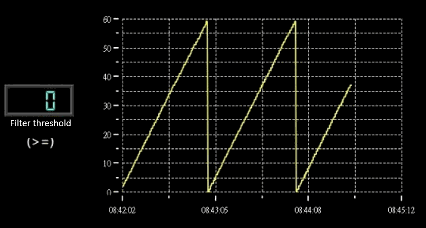
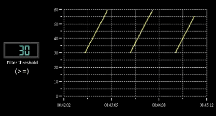
19.4.12.4 【Display】
The【Data Block Graph】【Display】page is as shown in the figure below, the meanings of each setting item are listed below:
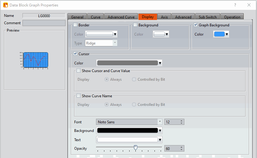
Figure 301【Display】Setting Screen of【Data Block Graph】
Table 168【Display】Setting Properties of【Data Block Graph】
|
Property |
Description |
|
【Border】 |
Select to display the border. 【Color】 Set the color of the border. 【Type】 Set the border type. |
|
【Background】 |
Select to display the background. 【Color】 Set the color of the background. |
|
【Graph Background】 |
Select to display the graph background. 【Color】 Set the color of the graph background. |
|
【Cursor】 |
Select to display the cursor. 【Color】 Set the color of the cursor. 【Show Cursor and Curve Value】 Select to display the value of cursor and curve. 【Show Cursor and Curve Value】【Display】 Set the visibility of the values. If【Always】is set, the values are always shown. If【Controlled by Bit】is selected, the visibility depends on the specified bit. 【Show Curve Name】 Select to display the curve name. 【Show Curve Name】【Display】 Set the visibility of the curve name. If【Always】is set, the curve name is always shown. If【Controlled by Bit】 is selected, the visibility of the curve name depends on the specified bit. 【Font】 Set the font and size of the cursor value. 【Background】 Set the background color of the cursor value. 【Text】 Set the text color of the cursor value. 【Opacity】 Set the background opacity of the cursor value. |
19.4.12.5 【Axis】
The【Data Block Graph】【Axis】page is as shown in the figure below, the meanings of each setting item are listed below:
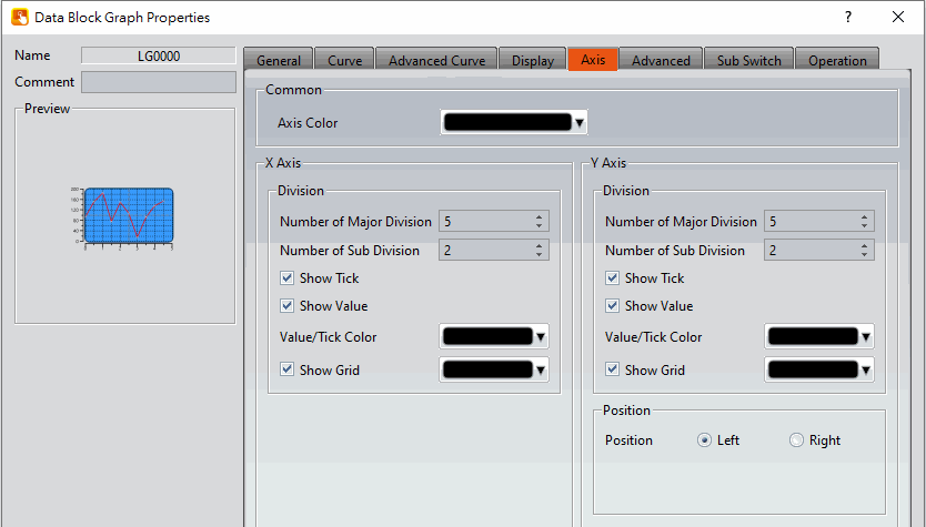
Figure 302【Axis】Setting Screen of【Data Block Graph】
Table 169【Axis】Setting Properties of【Data Block Graph】
|
Property |
Description |
|
【Common】 |
【Axis Color】 Set the color of the axis. |
|
【X-axis】 【Division】 |
【Number of Major Division】 Set the number of major divisions for the X-axis. 【Number of Sub Division】 Set the number of sub divisions for the X-axis. 【Show Tick】 Select to display the ticks. 【Show Value】 Select to display the values on the X-axis. 【Value/Tick Color】 Set the colors of the values and ticks. 【Show Grid】 Select to display vertical gridlines and set the color of the gridlines. |
|
【Y-axis】 【Division】 |
【Number of Major Division】 Set the number of major divisions for the Y-axis. 【Number of Sub Division】 Set the number of sub divisions for the Y-axis. 【Show Tick】 Select whether to display the tick on the Y-axis. 【Show Value】 Select to display the values on the Y-axis. 【Value/Tick Color】 Set the colors of the values and ticks. 【Show Grid】 Select to display horizontal gridlines and sets the color of the gridlines. |
|
【Y-axis】 【Position】 |
【Position】 Set the Y-axis position. |
19.4.12.6 【Advanced】
The【Data Block Graph】【Advanced】page is as shown in the figure below, the meanings of each setting item are listed below:
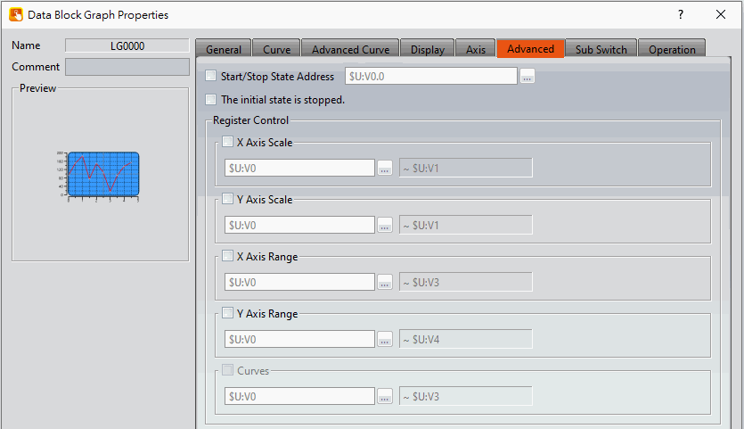
Figure 303【Advanced】Setting Screen of【Data Block Graph】
Table 170【Advanced】Setting Properties of【Data Block Graph】
|
Property |
Description |
||||||||||||||||||||||||||||||||||||||||||||||||||||||||||||||||||||||||||||||||||||||||||||||||||||||||||||||||||||||||||||||||||||||||||||||||||||||||||||||||||||||||||||||||||||
|
【Advanced】 |
【Start/Stop State Address】 Set such that the【Data Block Graph】will start/stop at the specified address. Only the display unit’s internal memory is supported. A value of 0 specifies the start state. A value of 1 specifies the stop state. 【The initial state is stopped】 Check whether to set the【Data Block Graph】initial state to stop state. |
||||||||||||||||||||||||||||||||||||||||||||||||||||||||||||||||||||||||||||||||||||||||||||||||||||||||||||||||||||||||||||||||||||||||||||||||||||||||||||||||||||||||||||||||||||
|
【Register Control】 |
【X Axis Scale】 X axis scale numbers can be specified by register, it will appear register setting below after checked, and will display the number of consecutive occupancy registers, this register is in 16 Bit-UINT format, table as below.
【Y Axis Scale】 Y axis scale numbers can be specified by register, it will appear register setting below after checked, and will display the number of consecutive occupancy registers, this register is in 16 Bit-UINT format, table as below.
【X Axis Range】 X axis range can be specified by register, it will appear register setting below after checked, and will display the number of consecutive occupancy registers, table as below.
Note: The X-axis range of【ECG】is【No. of Data per Curve】, and dynamic adjustment is not supported. 【Y Axis Range】 Y axis range can be specified by register, it will appear register setting below after checked, and will display the number of consecutive occupancy registers, table as below.
Note: maximum value should bigger than minimum value. 【Curves】
Note: maximum value should bigger than minimum value. 【Curves (ECG)】
Note: maximum value should bigger than minimum value. |
19.4.12.7 【Sub Switch】
The【Data Block Graph】【Sub Switch】page is as shown in the figure below, the meanings of each setting item are listed below:
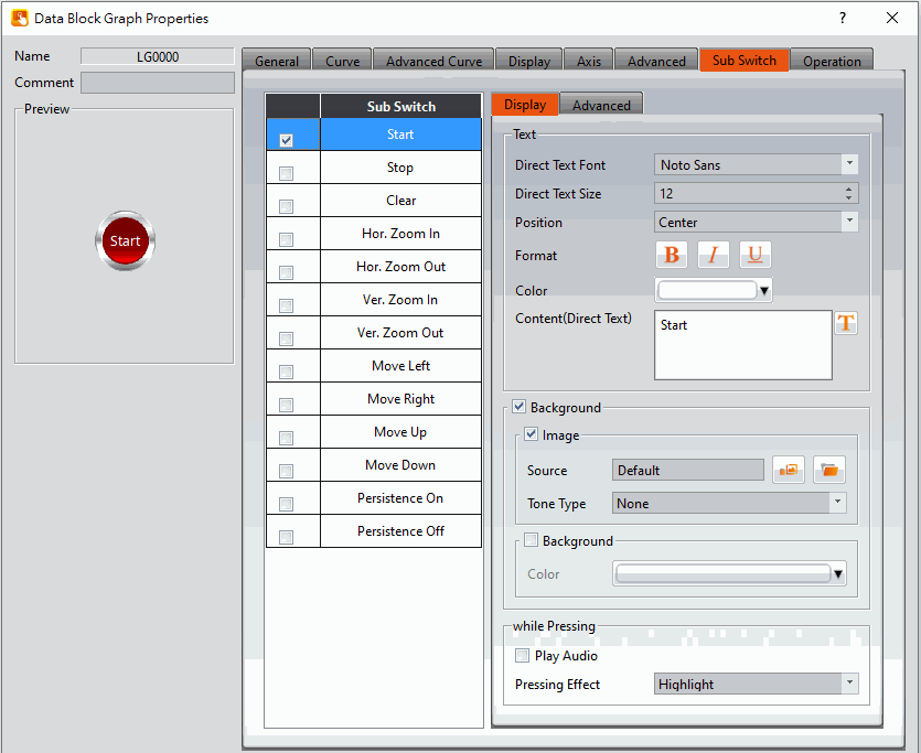
Figure 304【Sub Switch】Setting Screen of【Data Block Graph】
Table 171【Sub Switch】Setting Properties of【Data Block Graph】
|
Property |
Description |
|
【Sub Switch List】 |
【Sub Switch List】that can be selected for【Data Block Graph】. Sub switches can be enabled after selecting them. Settings for the appearance of the selected sub switches will also appear on the right. When different sub switches are selected from the list, the appearance settings to the right will be updated according to the sub switches selected. In which the (Sub Switches) are divided into:
Some sub switches are not supported under【ECG】, as follow: 【Hor. Zoom In】,【Hor. Zoom Out】,【Move Left】,【Move Right】,【Persistence On】,【Persistence Off】. |
|
【Display】【Text】 |
【Direct Text Font】 Set the text font of the sub switch currently selected. 【Direct Text Size】 Set the text size of the sub switch currently selected. 【Position】 Set the text position of the sub switch currently selected. 【Format】 Set the text format of the sub switch currently selected, including Bold, Italics and Underline. 【Color】 Set the text color of the sub switch currently selected. 【Content(Direct Text)】 Set the text of the sub switch currently selected. |
|
【Display】【Background】 |
Set the background of the sub switch currently selected. Check it to activate background settings, and the displayed background of the sub switch currently selected can be edited below. If this option is not checked, the background will be transparent. 【Use Image】 Set to use an image for the background of the sub switch currently selected. When this option is checked, image selection settings will appear asking the user to select an image either from the【Image Library】or from a file. 【Background Color】 Set the background color of the sub switch currently selected. This setting item will appear if 【Use Image】was not selected. |
|
【Display】【while Pressing】 |
【Play Audio】 Select to play audio when the sub switch is pressed. An【Audio Selector】will appear on the right when enabled. The switch on the right of the【Audio Selector】can be pressed to select an audio and the switch on the left of the【Audio Selector】can be pressed to play the selected audio. 【Pressing Effect】 Set the pressing effect of the sub switch currently selected. There are two effects available for selection:【None】and【Highlight】. |
|
【Advanced】【Operation Control】 |
Operation control of sub switch, it can enabled by bit or security. 【Enable by Bit】 Check whether the sub switch operation is controlled by a bit 【Show Disabled Sign】 Check if you want to display the forbidden symbol, it’s valid when check【Enable by Bit】,【Enabled by Word】or【Enable by Security】. 【Address】 Set the address of the sub switch operation control bit. 【State】 Set the control bit as 1 or 0 to operate object. 【Enabled by Word】 Check whether the operation is controlled by word. 【Address】 Set the operation control word address. 【Condition】 Set the condition of word control and when it is true then the object can be controlled, when false not the object can not be controlled. The condition include’ =’,’ !=’, ‘>’, ‘<’, ‘>=’, ‘<=’. 【Enable by Security】 Select the sub switch whether controlled by user level. 【User Level Condition】 Set the level and condition of the object. 【Hold Time】 Check whether the operation is controlled by hold time. Hold time can be divided into two kinds:
【Operator Confirm】 Check whether show comfirmation message window after checking the operation. 【Max. Waiting Time】 When the confirmation message window is displayed, If the user does not reply within this time, the system will close the confirmation message window and cancel this operation |
19.4.13 【Data Block XY Scatter】
【Data Block XY Scatter】is an object used to display a curve, in which the sources of both X/Y values are the continuous data contents of specified addresses. Its main functions are as follows:
- Read the continuous data of the specified addresses directly.
- Pauses or starts updating the reading of the continuous data of a specified address through the【Sub Switch】and clearing the displayed data. It can also temporarily preserve the old curve for comparison purposes.
Introduction to the property setting dialog box are as follows:
19.4.13.1 【General】
The【Data Block XY Scatter】【General】page is as shown in the figure below, the meanings of each setting item are listed below:
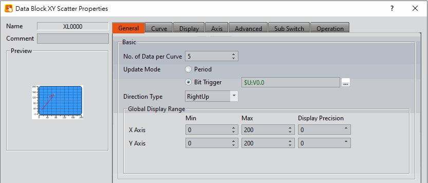
Figure 305【General】 Setting Screen of 【Data Block XY Scatter】
Table 172【General】 Setting Properties of【Data Block XY Scatter】
|
Property |
Description |
|
【Preview】 |
Preview the appearance of this object. |
|
【Name】 |
The default name of the object. |
|
【Comment】 |
Set the comment of the object. |
|
【Basic】 |
【No. of Data per Curve】 Set the amount of data per curve, which is the number of dots per curve. 【Update Mode】 Set the update mode, includes【Period】and【Bit Trigger】. 【Period】 Set the curve to be updated at a period time when it is display, set the period time of each curves after the option was checked. 【Bit Trigger】 Set the curve to be updated by trigger a bit when it is display, set the address of trigger bit of each curves after the option was checked. 【Direction Type】 Supprt 4 types: RightUp, LeftUp, RightDown, and LeftDown. |
|
【Global Display Range】 |
Set the range that can be displayed. 【Max】 Set the maximum Global Range value for the X-axis/Y-axis. 【Min】 Set the minimum Global Range value for the X-axis/Y-axis. Note: The 【Global Display Range】 represents the range that can be displayed. If【Max】is 100 and【Min】 is 0, data exceeding this range will not be able to be displayed. 【Display Precision】 Set the number of decimal places the labels display. |
19.4.13.2 【Curve】
The【Data Block XY Scatter】【Curve】page is as shown in the figure below, the meanings of each setting item are listed below:
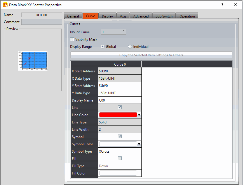
Figure 306【Curve】Setting Screen of【Data Block XY Scatter】
Table 173【Curve】Setting Properties of【Data Block XY Scatter】
|
Property |
Description |
||||||||||||||||||||||||
|
【Curves】 |
【No. of Curves】 Set the number of curves. The maximum is 32. 【Visibility Mask】 Select to use a visibility mask to control the visibility of the each curve. The user should assign a 32bit UINT register as the mask such that the 0 bit controls the display of curve 0, the 1 but controls the display of curve 1, and so on. 【Display Range】 Set the display mode for the display range of the curve. It is one of the two following types:
The display ranges of all the curves are identical to the【Global Display Range】.
The display range of all the curves can be different from the【Global Display Range】. Explanation: When to set【Display Range】as【Individual】-When the value ranges of the number of curves are different, for example when the value range of curve a is 0~10, and curve b is 0~1000, it can be discovered that the degree of changes for curve a will be difficult to observe if the two curves are placed in the same figure. This is when【Display Range】can be set as【Individual】and the display range of each curve can be defined; the system will automatically zoom the value of the curves according to the value in【Global Display Range】. Take this case for example, If the value in【Global Display Range】is 0~100, when the value of curve a is 5, the system will zoom it to 50; and when the value of curve b is 500, the system will also zoom it into 50, and so on. The parameters for curve properties in the table are as follows: 【X/Y Start Address】 Set the starting address for the source of the X/Y value of the curve. 【XY Data Type】 Set the data type for the X/Y value of the curve. Explanation: The range of the curve reading address is determined by the【No. of Data per Curve】,【Start Address】and【Data Type】; users can determine the range by looking at the following example.
【No. of Data per Curve】= 3; Y-axis【Start Address】@0:R0; Y-axis【Data Type】=16Bit-UINT
【No. of Data per Curve】= 3; Y-axis【Start Address】=$U:V0; Y Y-axis【Data Type】=32Bit-UINT
【X/Y Max】 Set the maximum Individual Display Range value for the Y value of the curve, this option will appear if【Display Range】is【Individual】. 【X/Y Min】 Set the minimum Individual Display Range value for the Y-axis, this option will appear if【Display Range】is【Individual】. 【Display Name】 The name of the curve to display on the graph. 【Line】 Select to display the curve line. 【Line Color】 Set the color of the curve. 【Line Type】 Set the line type of curve, including solid, dash, dot, dash dot, dash dot dot, etc. 【Line width】 Set the width of the curve. 【Symbol】 Select to display the curve symbols. 【Symbol Color】 Set the color of the symbols. 【Symbol Type】 Set the symbol type. 【Fill】 Set whether to fill-up the block. 【Fill Type】 Set the fill-up direction. 【Fill Color】 Set the fill-up color. |
19.4.13.3 【Display】
The【Data Block XY Scatter】【Display】page is as shown in the figure below, the meanings of each setting item are listed below:
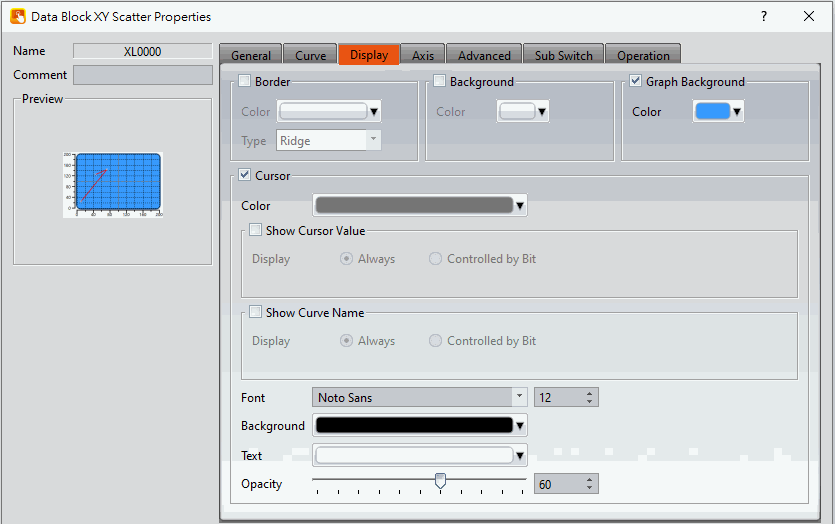
Figure 307【Display】Setting Screen of【Data Block XY Scatter】
Table 174【Display】Setting Properties of【Data Block XY Scatter】
|
Property |
Description |
|
【Border】 |
Select to display the border. 【Color】 Set the color of the border. 【Type】 Set the border type. |
|
【Background】 |
Set the visibility of the background. 【Color】 Set the color of the background. |
|
【Graph Background】 |
Select to enable a graph background. 【Color】 Set the color of the graph background. |
|
【Cursor】 |
Set the visibility of the cursor. 【Color】 Set the color of the cursor. 【Show Cursor Value】 Select the visibility of the cursor value. 【Show Cursor Value】【Display】 Set the visibility of cursor values. If【Always】is set, the cursor values are always shown. If【Controlled by Bit】is selected, the visibility of cursor values depends on the specified bit. 【Show Curve Name】 Select to display the curve name. 【Show Curve Name】【Display】 Set the visibility of the curve name. If【Always】is set, the curve name is always shown. If【Controlled by Bit】 is selected, the visibility of the curve name depends on the specified bit. 【Font】 Set the font type and size of cursor values. 【Background】 Set the background color of the cursor values. 【Text】 Set the text color of the cursor values. 【Opacity】 Set the background opacity of the cursor values. |
19.4.13.4 【Axis】
The【Data Block XY Scatter】【Axis】page is as shown in the figure below, the meanings of each setting item are listed below:
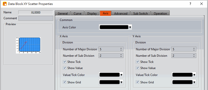
Figure 308【Axis】Setting Screen of【Data Block XY Scatter】
Table 175【Axis】Setting Properties of【Data Block XY Scatter】
|
Property |
Description |
|
【Common】 |
【Axis Color】 Set the color of the axis. |
|
【X-axis】 【Division】 |
【Number of Major Division】 Set the number of major divisions for the X-axis. 【Number of Sub Division】 Set the number of sub divisions for the X-axis. 【Show Tick】 Select to display the ticks. 【Show Value】 Select to display the values on the X-axis. 【Value/Tick Color】 Set the color of the values and ticks. 【Show Grid】 Select to display vertical gridlines, and set the color of the gridlines. |
|
【Y-axis】 【Division】 |
【Number of Major Division】 Set the number of major divisions for the Y-axis. 【Number of Sub Division】 Set the number of sub divisions for the Y-axis. 【Show Tick】 Select to display the ticks on the Y-axis. 【Show Value】 Select to display the values on the Y-axis. 【Value/Tick Color】 Set the color of the values and ticks. 【Show Grid】 Select to display horizontal gridlines, and set the color of the gridlines. |
19.4.13.5 【Advanced】
The【Data Block XY Scatter】【Advanced】page is as shown in the figure below, the meanings of each setting item are listed below:
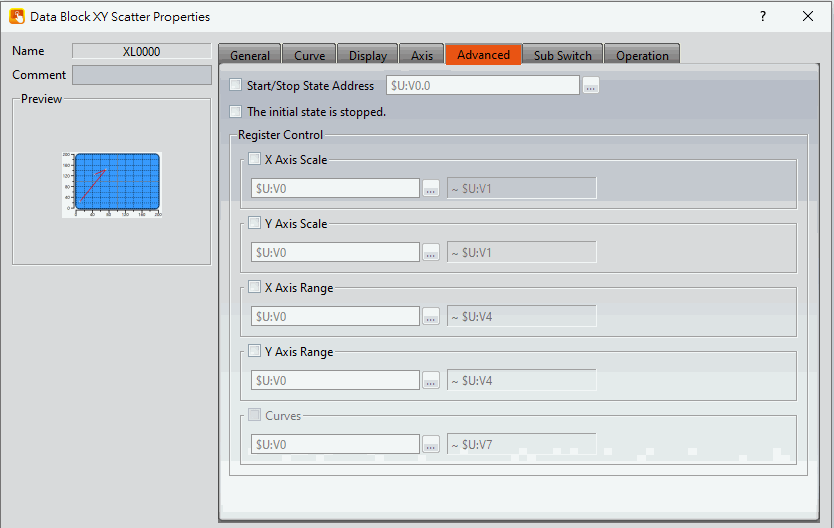
Figure 309【Advanced】Setting Screen of【Data Block XY Scatter】
Table 176【Advanced】Setting Properties of【Data Block XY Scatter】
|
Property |
Description |
|||||||||||||||||||||||||||||||||||||||||||||||||||||||||||||||||||||||||||||||||||||||||||||||||||||||||||||||||||||||||||||||||||||||||||||||||||||||||||
|
【Advanced】 |
【Start/Stop State Address】 Set such that the【Data Block Graph】will start/stop at the specified address. Only the display unit’s internal memory is supported. A value of 0 specifies the start state. A value of 1 specifies the stop state. 【The initial state is stopped】 Set the initial state of of the data to stop. |
|||||||||||||||||||||||||||||||||||||||||||||||||||||||||||||||||||||||||||||||||||||||||||||||||||||||||||||||||||||||||||||||||||||||||||||||||||||||||||
|
【Register Control】 |
【X Axis Scale】 X axis scale numbers can be specified by register, it will appear register setting below after checked, and will display the number of consecutive occupancy registers, this register is in 16 Bit-UINT format, table as below.
【Y Axis Scale】 Y axis scale numbers can be specified by register, it will appear register setting below after checked, and will display the number of consecutive occupancy registers, this register is in 16 Bit-UINT format, table as below.
【X Axis Range】 X axis range can be specified by register, it will appear register setting below after checked, and will display the number of consecutive occupancy registers, table as below.
Note: maximum value should bigger than minimum value. 【Y Axis Range】 Y axis range can be specified by register, it will appear register setting below after checked, and will display the number of consecutive occupancy registers, table as below.
Note: maximum value should bigger than minimum value. 【Curves】 If curve Y-axis display range use【individual】, check this option, each of the Y-axis curve can be specified by register, and will display the number of consecutive occupancy registers, table as below.
Note: maximum value should bigger than minimum value. |
19.4.13.6 【Sub Switch】
The【Data Block XY Scatter】【Sub Switch】page is as shown in the figure below, the meanings of each setting item are listed below:
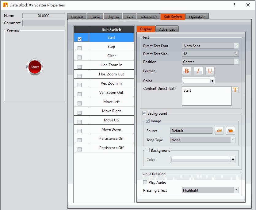
Figure 310【Sub Switch】Setting Screen of【Data Block XY Scatter】
Table 177【Sub Switch】Setting Properties of【Data Block XY Scatter】
|
Property |
Description |
|
【Sub Switch List】 |
【Sub Switch List】that can be selected for【Data Block XY Scatter】. Sub switches can be enabled after selecting them. Settings for the appearance of the selected sub switches will also appear on the right. When different sub switches are selected from the list, the appearance settings to the right will be updated according to the sub switches selected. In which the【Sub Switches】are divided into:
|
|
【Display】【Text】 |
【Direct Text Font】 Set the text font of the sub switch currently selected. 【Direct Text Size】 Set the text size of the sub switch currently selected. 【Position】 Set the text position of the sub switch currently selected. 【Format】 Set the text format of the sub switch currently selected, including Bold, Italics and Underline. 【Color】 Set the text color of the sub switch currently selected. 【Content(Direct Text)】 Set the text of the sub switch currently selected. |
|
【Display】【Background】 |
Set the background of the sub switch currently selected. Check it to activate background settings, and the displayed background of the sub switch currently selected can be edited below. If this option is not checked, the background will be transparent. 【Use Image】 Set to use an image for the displayed background of the sub switch currently selected. When this option is checked, image selection settings will appear asking the user to select an image either from the【Image Library】or from a file. 【Background Color】 Set the background color of the sub switch currently selected. This setting will appear if 【Use Image】was not selected. |
|
【Display】【while Pressing】 |
【Play Audio】 Select to play audio when the sub switch is pressed. An【Audio Selector】will appear on the right when enabled. The switch on the right of the【Audio Selector】can be pressed to select an audio and the switch on the left of the【Audio Selector】can be pressed to play the audio selected. 【Pressing Effect】 Set the pressing effect of the sub switch currently selected. There are two effects available for selection:【None】and【Highlight】. |
|
【Advanced】【Operation Control】 |
Operation control of sub switch, it can enabled by bit or security. 【Enable by Bit】 Check whether the sub switch operation is controlled by a bit 【Show Disabled Sign】 Check if you want to display the forbidden symbol, it’s valid when check【Enable by Bit】,【Enabled by Word】or【Enable by Security】. 【Address】 Set the address of the sub switch operation control bit. 【State】 Set the control bit as 1 or 0 to operate object. 【Enabled by Word】 Check whether the operation is controlled by word. 【Address】 Set the operation control word address. 【Condition】 Set the condition of word control and when it is true then the object can be controlled, when false not the object can not be controlled. The condition include’ =’,’ !=’, ‘>’, ‘<’, ‘>=’, ‘<=’. 【Enable by Security】 Select the sub switch whether controlled by user level. 【User Level Condition】 Set the level and condition of the object. 【Hold Time】 Check whether the operation is controlled by hold time. Hold time can be divided into two kinds:
【Operator Confirm】 Check whether show comfirmation message window after checking the operation. 【Max. Waiting Time】 When the confirmation message window is displayed, If the user does not reply within this time, the system will close the confirmation message window and cancel this operation |
19.4.14 【Multistate Switch】
【Multistate Switch】can write the numeric value corresponding to the set state into specific registers. The state can be changed by pressing the Multistate Switch and the numeric value written into the register will also change accordingly.
19.4.14.1 【Setting】
The【Multistate Switch】【Setting】page is as shown in the figure below, the meanings of each setting item are listed below:
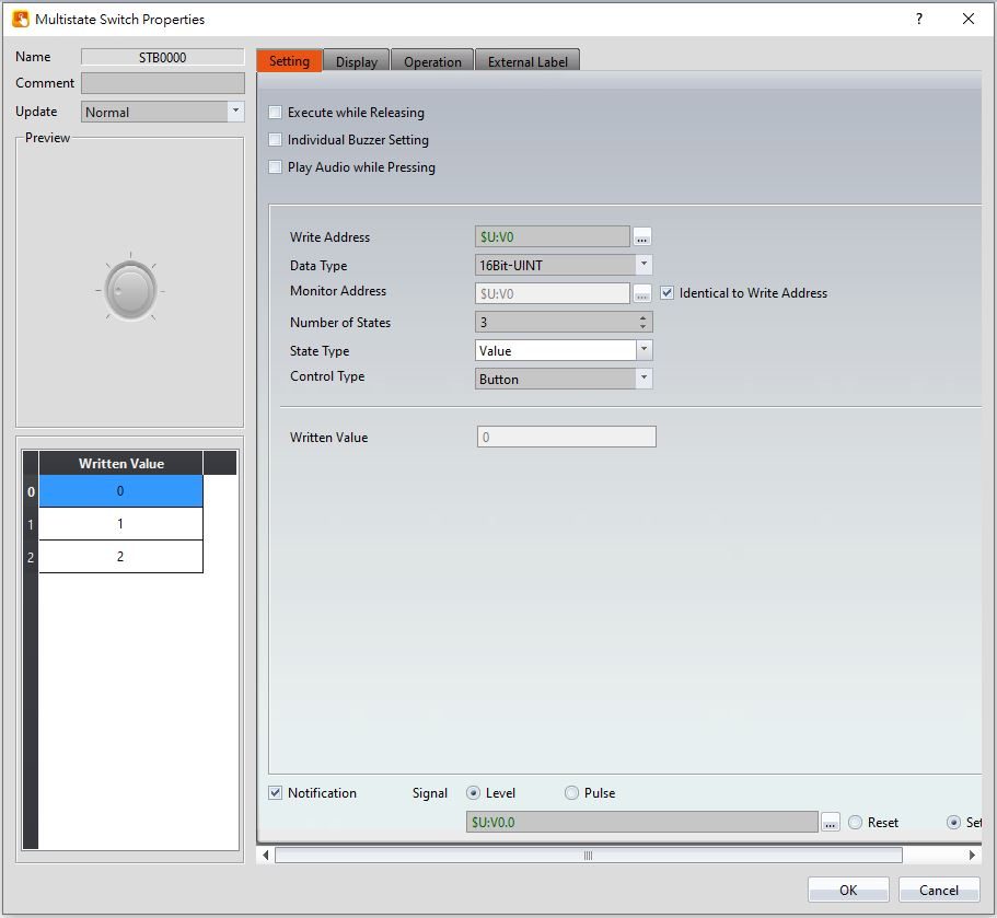
Figure 311【Setting】Screen of【Multistate Switch】
Table 178【Setting】Properties of【Multistate Switch】
|
Property |
Description |
|
【Preview】 |
Preview the appearance of this object. |
|
【Name】 |
The default name of the object. |
|
【Comment】 |
Set the comment of the object. |
|
【Update】 |
Provide user can select a suitable speed to get the latest data under different situation, such as you would like to get the latest data or adjust the object on the screen to display first, etc. Provide three modes: 【once】: update once only when switch to this page or use the system tag【OP_UPDATE_SCREEN_OBJECTS】, update once when trigger once a time, it will keep update if the monitor address is internal address. 【normal】: normal update speed. 【fast】: the fastest update speed. |
|
【Execute while Releasing】 |
Select to execute the action set for the Multistate Switch while releasing. The action will be executing immediately when the Step Switch is pressed if this option is not selected. |
|
【Individual Buzzer Setting】 |
Can individually setup buzzer setting. Includes 5 modes: Off, Short, Long, Short-Short, Long-Short. |
|
【Play Audio while Pressing】 |
Select to play audio when the Multistate Switch is pressed. An【Audio Selector】will appear on the right when enabled. The switch on the right of the【Audio Selector】can be pressed to select an audio and the switch on the left of the【Audio Selector】can be pressed to play the audio selected. |
|
【Write Address】 |
Set the operating address of the Multistate Switch. |
|
【Data Type】 |
Set the Data Type of the Multistate Switch. |
|
【Number of States】 |
Set the number of states of the Multistate Switch; the maximum number of states is 256. |
|
【State Type】 |
Set the State Type of the Multistate Switch. The【Written Value】cannot be edited and numeric values identical to each state number will be automatically filled out if【Value】is selected. For example, the【Written Value】will be 0 of the state is 0. Users can switch between states from the list on the left and customize the numeric value corresponding to each state from【Written Value】if【Custom】is selected. |
|
【Control Type】 |
Support 2 types to control: Button and List. |
|
【Written Value】 |
Sets the numeric value to write for each state when the Multistate Switch is pressed. |
|
【Notification】 |
Set to allow the notification function for the Multistate Switch. Related settings will appear if this option is selected, allowing setting of bit and value for notification. |
19.4.14.2 【Display】
The【Multistate Switch】【Display】page is as shown in the figure below, the meanings of each setting item are listed below:
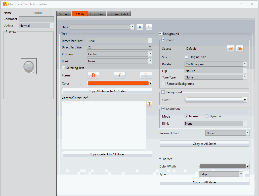
Figure 312【Display】Setting Screen of【Multistate Switch】
Table 179【Display】Setting Properties of【Multistate Switch】
|
Property |
Description |
|
【State】 |
Switch to the state currently editing. 0 and 1 buttons are provided to enable quick switching between states 0 and 1. |
|
【Text】 |
【Direct Text Font】 Set the font of the text for the current editing state. 【Direct Text Size】 Set the size of the text for the current editing state. 【Position】 Set the position of the text for the current editing state. 【Blink】 Set the blinking function for the text of the current editing state. There are four blinking speeds available to choose from: None, Slow, Medium and Fast. 【Scrolling Text】 Set the scrolling text function for the text of the current editing state. There are four scrolling speeds available to choose from slow to fast. 【Format】 Set the format of the text for the current editing state, including Bold, Italics and Underline. 【Color】 Set the color of the text for the current editing state. 【Copy Attributes to All States】 The text properties for the current editing state is applied to all states. 【Content (Direct Text)】 Set the text of the current editing state. It can be inputted directly or acquired from the【Text Library】. 【Copy Content to All States】 Apply the settings of the text for the current editing state to all states. |
|
【Background】 |
【Background】 Check whether to enable background 【Image】 Check whether to use image 【Source】 Set whether to use an image for the displayed background of the current editing state. When this option is checked, an【Image Selector】will appear asking the user to select an image either from the【Image Library】or from【File】. 【Size】 After setting, the original size of the picture can be displayed, and the【Position】option will appear to allow the user to select the area to be displayed. 【Rotate】 Set image rotation angle 【Flip】 Set the flip direction of the image, includes No Flip, X-Axis and Y-Axis. 【Tone Type】 You can choose the tone type you want to change. After selecting the type, you can choose the color from【Tone Color】. 【Remove Background】 You can set the color to be transparent by【Choose Color】. 【Background】 Check whether to enable the background. After checking, you can set the background color displayed in the current editing state from【Color】. 【Animation】 Check whether to enable animated effects. 【Mode】Choose whether to use static or dynamic control elements to flicker. 【Blink】Select the blinking mode, and use the numerical value to switch during dynamic control. 【Pressing Effect】 Set the pressing effect of the current editing state. There are two effects available for selection: None and Highlight. 【Copy to All States】 Apply the settings of the background for the currently editing state to all states. |
|
【Border】 |
Set the object border. 【Color/Width】 Set the color and width of the border. 【Type】 Set the type of the border. 【Copy to All States】 Apply the settings of the border for the current editing state to all states. |
19.4.14.3 【External Lable】
The【Multistate Switch】【External Lable】page is as shown in the figure below, the meanings of each setting item are listed below:
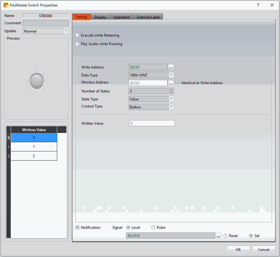
Figure 313【External Lable】Setting Screen of【Multistate Switch】
Table 180【Multistate Switch】【External Lable】setting properties
|
Option |
Description |
|
【Enable External Lable】 |
Checked, the bottom will appear the external lable settings of the object. |
|
【Direction】 |
Set the display direction, there are horizontal and vertical two selections. |
|
【Space】 |
Set the space between external lable and the object. |
|
【Left/Top Lable(Direct Text)】 |
Fill in the text to be displayed on the left / top lable of the object, can be directly input or selected from【Font Library】. |
|
【Right/Bottom Lable(Direct Text)】 |
Fill in the text to be displayed on the right / bottom lable of the object, can be directly input or selected from【Font Library】. |
|
【Text】 |
【Direct Text Font】 Set the font of text. 【Direct Text Size】 Set the size of text, the default size is 20. 【Alignment】 Set the alignment of text. 【Color】 Set the color of text. 【Format】 Set the format of text, includes Bold, Italic and Underline. 【Word Spacing】 Set the word space of text. 【Margin】 Set the margin of text. |
|
【Background】 |
Check whether to display background, set the color and opacity of background after checked. 【Color】 Set the background color of external lable. 【Opacity】 Set the opacity of external lable background, the greater the value the more the background opacity is. |
|
【Border】 |
Check whether to display border. 【Color/Width】 Set the color and width of border. 【Type】 Set the type of border. |
19.4.15 【Slide Switch】
【Slide Switch】allows users to write the numeric value corresponding to the final position of the slider into the set register by dragging.
19.4.15.1 【Setting】
The【Slide Switch】【Setting】page is as shown in the figure below, the meanings of each setting item are listed below:
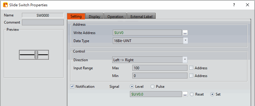
Figure 314【Setting】Screen of【Slide Switch】
Table 181【Setting】Properties of【Slide Switch】
|
Property |
Description |
|
【Preview】 |
Preview the appearance of this object. |
|
【Name】 |
The default name of the object. |
|
【Comment】 |
Set the comment of the object. |
|
【Address】 |
【Write Address】 Set the register address to write the numeric value when the user operates the Slide Switch. 【Data Type】 Set the Data Type of the Slide Switch Write Address. |
|
【Control】 |
【Direction】 Set the moving direction of the Slide Switch, including left to right, right to left, top to bottom, bottom to top. 【Input Range】 Set the【Max】and【Min】numeric values for the Slide Switch to write. The【Address】below can be used to set the source address for reading the maximum value or minimum value by【Data Type】. |
|
【Notification】 |
Set to allow the notification function for the Slide Switch. Related settings will appear if this option is selected, allowing setting of a register for notification, includes reset and set. |
19.4.15.2 【Display】
The【Slide Switch】【Display】page is as shown in the figure below, the meanings of each setting item are listed below:
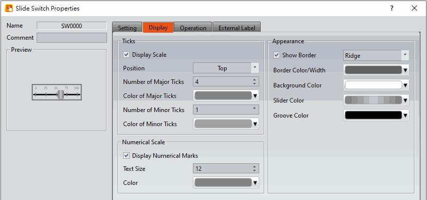
Figure 315【Display】Setting Screen of【Slide Switch】
Table 182【Display】Setting Properties of【Slide Switch】
|
Property |
Description |
|
【Ticks】 |
【Display Scale】 Set whether to display the scale of the Slide Switch. 【Position】 Set the position to display the scale for the Slide Switch. 【Number of Major Ticks】 Set the number of major ticks for the Slide Switch. 【Color of Major Ticks】 Set the color of the major ticks for the Slide Switch. 【Number of Minor Ticks】 Set the amount of minor ticks for the Slide Switch. 【Color of Minor Ticks】 Set the displayed color of the minor ticks for the Slide Switch. |
|
【Numerical Scale】 |
【Display Numerical Marks】 Set to display the numerical marks for the Slide Switch. 【Color】 Set the color for the numerical marks on the Slide Switch. |
|
【Appearance】 |
【Border Type】 Set the border type of the Slide Switch. 【Border Color/Width】 Set the border color and border thickness of the Slide Switch. 【Background Color】 Set the background color of the Slide Switch. 【Slider Color】 Set the slider color of the Slide Switch. 【Groove Color】 Set the groove color of the Slide Switch. |
19.4.15.3 【External Lable】
The【Slide Switch】【External Lable】page is as shown in the figure below, the meanings of each setting item are listed below:
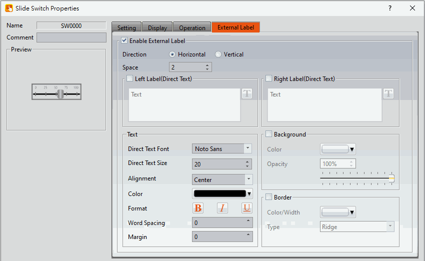
Figure 316【External Lable】Setting Screen of【Slide Switch】
Table 183【Slide Switch】【External Lable】setting properties
|
Option |
Description |
|
【Enable External Lable】 |
Checked, the bottom will appear the external lable settings of the object. |
|
【Direction】 |
Set the display direction, there are horizontal and vertical two selections. |
|
【Space】 |
Set the space between external lable and the object. |
|
【Left/Top Lable(Direct Text)】 |
Fill in the text to be displayed on the left / top lable of the object, can be directly input or selected from【Font Library】. |
|
【Right/Bottom Lable(Direct Text)】 |
Fill in the text to be displayed on the right / bottom lable of the object, can be directly input or selected from【Font Library】. |
|
【Text】 |
【Direct Text Font】 Set the font of text. 【Direct Text Size】 Set the size of text, the default size is 20. 【Alignment】 Set the alignment of text. 【Color】 Set the color of text. 【Format】 Set the format of text, includes Bold, Italic and Underline. 【Word Spacing】 Set the word space of text. 【Margin】 Set the margin of text. |
|
【Background】 |
Check whether to display background, set the color and opacity of background after checked. 【Color】 Set the background color of external lable. 【Opacity】 Set the opacity of external lable background, the greater the value the more the background opacity is. |
|
【Border】 |
Check whether to display border. 【Color/Width】 Set the color and width of border. 【Type】 Set the type of border. |
19.4.16 【Selector List】
【Selector List】allows users to display multiple switches using a pull-down menu so that related switches can be organized into a single list, making it convenient for the operators to select the switches needed.
19.4.16.1 【Setting】
The【Selector List】【Setting】page is as shown in the figure below, the meanings of each setting item are listed below:
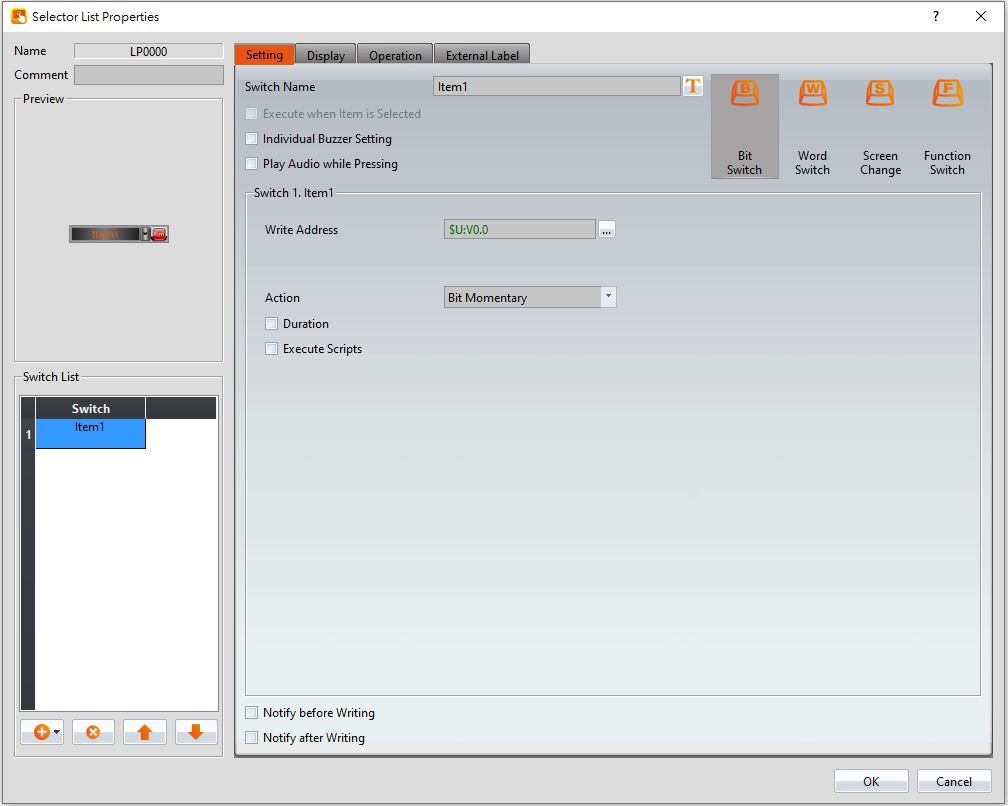
Figure 317【Setting】Screen of【Selector List】
Table 184【Setting】Properties of【Selector List】
|
Property |
Description |
|
【Preview】 |
Preview the appearance of this object. |
|
【Name】 |
The default name of the object. |
|
【Comment】 |
Set the comment of the object. |
|
【Switch Name】 |
Set the name of the switch currently selected. Users can change the currently selected switch from the【Switch List】. |
|
【Play Audio while Pressing】 |
Select to play audio when the Step Switch is pressed. An【Audio Selector】will appear on the right when enabled. The switch on the right of the【Audio Selector】can be pressed to select an audio and the switch on the left of the【Audio Selector】can be pressed to play the audio selected. |
|
【Execute when Item is Selected】 |
Select whether to enable the【Execute when Item is Selected】function. When it is enabled, the function of a switch will be executed immediately when the user selected a switch from the Selector List object. If it is not enabled, the function of the selected switch will only be executed after the user pressed the【Execute】button. When the Switch using【Bit Momentary】 action of【Bit Switch】in the【Switch List】, or the【Continuously Add】/【Continuously Subtract】of【Add Data】action /【Subtract Data】 action in the【Word Switch】, 【Execute When this Item is Selected】the option will not be able to check. |
|
【Individual Buzzer Setting】 |
Can individually setup buzzer setting. Includes 5 modes: Off, Short, Long, Short-Short, Long-Short. |
|
【Bit Switch】 |
Change the currently editing switch type to【Bit Switch】,for the related property settings please refer to the description of the switch. |
|
【Word Switch】 |
Change the currently editing switch type to【Word Switch】,for the related property settings please refer to the description of the switch.. |
|
【Change Screen】 |
Change the currently editing switch type to【Change Screen】,for the related property settings please refer to the description of the switch.. |
|
【Function Switch】 |
Change the currently editing switch type to【Function Switch】,for the related property settings please refer to the description of the switch.. |
|
【Notification】 |
Set whether to allow the notification function. Related setting items will appear if this option is selected, allowing setting of bit and value for notification. |
|
【Switch List】 |
Display the switch list currently included in the Selector List item object. 【Add】 Increase the number of switches in the【Switch List】; the type of switch to add can be selected. 【Delete】 Delete the switch currently selected in the【Switch List】. 【Up】 Move the order of the switch currently selected in the【Switch List】up. 【Down】 Move the order of the switch currently selected in the【Switch List】down. |
|
【Notify before Writing】 |
The signal will notify before writing. Level: Set the bit as 0 or 1. Pulse: Set the bit to 1 and automatically restore to 0 after continuing the time set by【Width】. |
|
【Notify after Writing】 |
The signal will notify after writing. Level: Set the bit as 0 or 1. Pulse: Set the bit to 1 and automatically restore to 0 after continuing the time set by【Width】. |
Note: When all members of the selector list are【Word Switches】, the action set to【Write Data】, and the【Data Types】are the same, if the address is changed through the list, the constant change will show up in the monitoring object. If the address is changed through an outside object, the item in the list will change accordingly. This does not apply if the【Data Type】is 32Bit-Float.
Example: There are three【Word Switches】in the【Selector List】. The actions are all set to【Write Data】and the【Data Types】are the same. All three switches also control the same register: R100. Item1 is set write 1 into the address, Item2 is set write 2 into the address, and Item3 is set to write 3 into the address. If R100 has 2 written into it, the item shown in the selector list will be item 2.
19.4.16.2 【Display】
The【Selector List】【Display】page is as shown in the figure below, the meanings of each setting item are listed below:
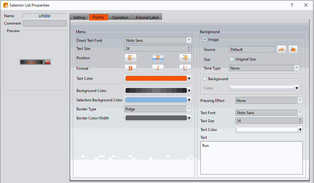
Figure 318【Display】Setting Screen of【Selector List】
Table 185【Display】Setting Properties of【Selector List】
|
Property |
Description |
|
【Menu】 |
【Direct Text Font】 Set the font of the text displayed for the Selector List. 【Size】 Set the size of the text displayed for the Selector List. 【Position】 Set the position of the text displayed for the Selector List. 【Format】 Set the format of the text displayed for the Selector List, including Bold, Italics and Underline. 【Color】 Set the color of the text displayed for the Selector List. 【Background Color】 Set the displayed background color of the Selector List. 【Selection Background Color】 Set the displayed background color of the selected item in Selector List. 【Border Type】 Set the displayed border type of the Selector List. 【Border Color/Width】 Set the displayed border color and border thickness of the Selector List. |
|
【Background】 |
【Image】 Check whether to use image 【Source】 Set whether to use an image for the displayed background of the current editing state. When this option is checked, an【Image Selector】will appear asking the user to select an image either from the【Image Library】or from【File】. 【Size】 After setting, the original size of the picture can be displayed, and the【Position】option will appear to allow the user to select the area to be displayed. 【Tone Type】 You can choose the tone type you want to change. After selecting the type, you can choose the color from【Tone Color】. 【Background】 Check whether to enable background 【Pressing Effect】 Set the pressing effect of the current editing state. There are two effects available for selection: None and Highlight. 【Text Font】 Set the text font displayed on the item menu button. 【Text Size】 Set the text size displayed on the item menu button. 【Text Color】 Set the text color displayed on the item menu button. 【Text】 Set the text displayed on the item menu button. |
19.4.16.3 【External Lable】
The【Selector List】【External Lable】page is as shown in the figure below, the meanings of each setting item are listed below:
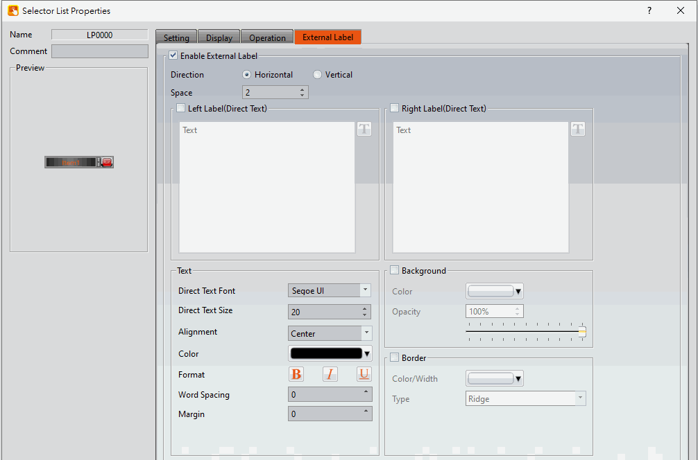
Figure 319【External Lable】Setting Screen of【Selector List】
Table 186【Selector List】【External Lable】setting properties
|
Option |
Description |
|
【Enable External Lable】 |
Checked, the bottom will appear the external lable settings of the object. |
|
【Direction】 |
Set the display direction, there are horizontal and vertical two selections. |
|
【Space】 |
Set the space between external lable and the object. |
|
【Left/Top Lable(Direct Text)】 |
Fill in the text to be displayed on the left / top lable of the object, can be directly input or selected from【Font Library】. |
|
【Right/Bottom Lable(Direct Text)】 |
Fill in the text to be displayed on the right / bottom lable of the object, can be directly input or selected from【Font Library】. |
|
【Text】 |
【Direct Text Font】 Set the font of text. 【Direct Text Size】 Set the size of text, the default size is 20. 【Alignment】 Set the alignment of text. 【Color】 Set the color of text. 【Format】 Set the format of text, includes Bold, Italic and Underline. 【Word Spacing】 Set the word space of text. 【Margin】 Set the margin of text. |
|
【Background】 |
Check whether to display background, set the color and opacity of background after checked. 【Color】 Set the background color of external lable. 【Opacity】 Set the opacity of external lable background, the greater the value the more the background opacity is. |
|
【Border】 |
Check whether to display border. 【Color/Width】 Set the color and width of border. 【Type】 Set the type of border. |
19.4.17 【Radio Button】
【Radio Button】includes multiple buttons and status,in this group button, only one of the state objects can be operated at a time, write the data to the corresponding value or corresponding bit of the PLC, and at the same time only one state will be on, for operator easy to use.
19.4.17.1 【Setting】
【Radio Button】【Setting】paging shown as below, each of the setting meaning as follow:
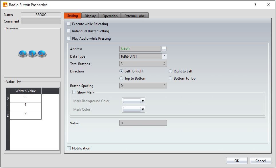
Figure 320【Radio Button】【Setting】setting paging
Table 187【Radio Button】【Setting】setting properties
|
Property |
Description |
|
【Preview】 |
Preview the appearance of this object. |
|
【Name】 |
The default name of the object. |
|
【Comment】 |
Set the comment of the object. |
|
【Excute while Releasing】 |
Select to execute the action set for the radio button while releasing. The action will be executed immediately when the switch is pressed if this option is not selected. |
|
【Individual Buzzer Setting】 |
Can individually setup buzzer setting. Includes 5 modes: Off, Short, Long, Short-Short, Long-Short. |
|
【Play Audio while Pressing】 |
Select to play audio when the switch is pressed. An【Audio Selector】will appear on the right when enabled. The switch on the right of the【Audio Selector】can be pressed to select an audio and the switch on the left of the【Audio Selector】can be pressed to play the selected audio. |
|
【Address】 |
Set the operate address of the radio button. |
|
【Data Type】 |
Set the data type of the radio button, including 16Bit-BCD、16Bit-INT、16Bit-UINT、32Bit-BCD、32Bit-INT、32Bit-UINT and 32Bit-FLOAT, etc. |
|
【Total Buttons】 |
Set the numbers of total buttons. |
|
【Direction】 |
Set the direction of the radio button, including right to left, left to right, top to bottom, bottom to top. |
|
【Button Spacing】 |
Set button spacing of each button. |
|
【Show Mark】 |
Set whether mark the radio button. 【Mark Backgroung Color】 Set the background color that the radio button mark to display. 【Mark Color】 Set the color that radio button mark to display. |
|
【Value】 |
Set each button write the vaiue to the【Address】. |
|
【Notification】 |
Set whether permit radio button to enable notification function. After enable, can set the notification address and the value that want to write in while excute the radio button |
|
【Value List】 |
Display Each button in the radio button group corresponds to the value written to【Address】, while【Total Buttons】increase or decrease, 【Value List】will also changed. |
19.4.17.2 【Display】
【Radio Button】【Display】paging shown as below, each of the setting meaning as follow:
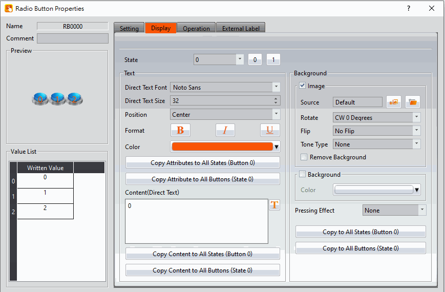
Figure 321【Radio Button】【Display】setting paging
Table 188【Radio Button】【Display】setting properties
|
Property |
Description |
|
【State】 |
Select the state needed to be edited. 0 and 1 buttons are provided to enable quick switching between states 0 and 1. |
|
【Text】 |
【Direct Text Font】 Set the font of the radio button. 【Direct Text Size】 Set the size of the radio button. 【Position】 Set the position of the radio button. 【Format】 Set the format of the radio button, including bold, italic, underline 【Color】 Set the color of the radio button. 【Copy Attributes to All States (Button)】 Applies the text attribute setting of the current edit state to all states 【Copy Attributes to All Buttons (State)】 Apply the text attribute settings for the current edit state to all buttons 【Content】 Set the text displayed of the current edit status, either directly or by the【Text Library】. 【Copy Content to All States (Button)】 Applies the text settings of the current edit state to all states. 【Copy Content to All Buttons (State)】 Applies the text settings of the current edit state to all buttons. |
|
【Background】 |
【Image】 Check whether to use image 【Source】 Set whether to use an image for the displayed background of the current editing state. When this option is checked, an【Image Selector】will appear asking the user to select an image either from the【Image Library】or from【File】. 【Rotate】 Set image rotation angle 【Flip】 Set the flip direction of the image, includes No Flip, X-Axis and Y-Axis. 【Tone Type】 You can choose the tone type you want to change. After selecting the type, you can choose the color from【Tone Color】. 【Remove Background】 You can set the color to be transparent by【Choose Color】. 【Background】 Check whether to enable the background. After checking, you can set the background color displayed in the current editing state from【Color】. 【Pressing Effect】 Set the pressing effect of the current editing state. There are two effects available for selection: None and Highlight. 【Copy to All States (Button n)】 Apply the settings of the background for the currently editing state to all buttons. 【Copy to All States (State n)】 Apply the settings of the background for the currently editing state to all states. |
19.4.17.3 【External Lable】
The【Radio Button】【External Lable】page is as shown in the figure below, the meanings of each setting item are listed below:
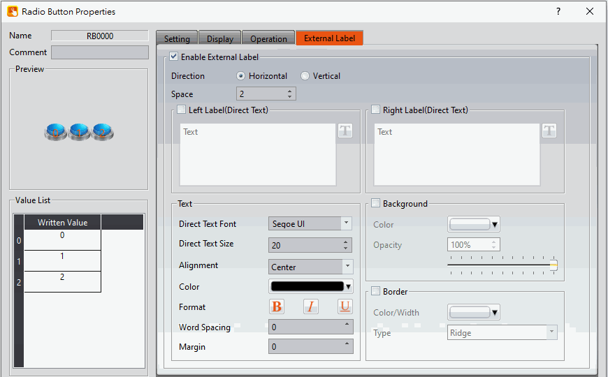
Figure 322【Radio Button】【External Lable】setting paging
Table 189【Radio Button】【External Lable】setting properties
|
Option |
Description |
|
【Enable External Lable】 |
Checked, the bottom will appear the external lable settings of the object. |
|
【Direction】 |
Set the display direction, there are horizontal and vertical two selections. |
|
【Space】 |
Set the space between external lable and the object. |
|
【Left/Top Lable(Direct Text)】 |
Fill in the text to be displayed on the left / top lable of the object, can be directly input or selected from【Font Library】. |
|
【Right/Bottom Lable(Direct Text)】 |
Fill in the text to be displayed on the right / bottom lable of the object, can be directly input or selected from【Font Library】. |
|
【Text】 |
【Direct Text Font】 Set the font of text. 【Direct Text Size】 Set the size of text, the default size is 20. 【Alignment】 Set the alignment of text. 【Color】 Set the color of text. 【Format】 Set the format of text, includes Bold, Italic and Underline. 【Word Spacing】 Set the word space of text. 【Margin】 Set the margin of text. |
|
【Background】 |
Check whether to display background, set the color and opacity of background after checked. 【Color】 Set the background color of external lable. 【Opacity】 Set the opacity of external lable background, the greater the value the more the background opacity is. |
|
【Border】 |
Check whether to display border. 【Color/Width】 Set the color and width of border. 【Type】 Set the type of border. |
19.4.18 【Input Display】
【Input Display】is used on a【Base Screen】/【Window Screen】/【Keypad Screen】; it can display the numeric value or text currently entered with the keypad.
The【Input Display】property settings dialog is as shown in the figure below, the meanings of each setting option are listed below:
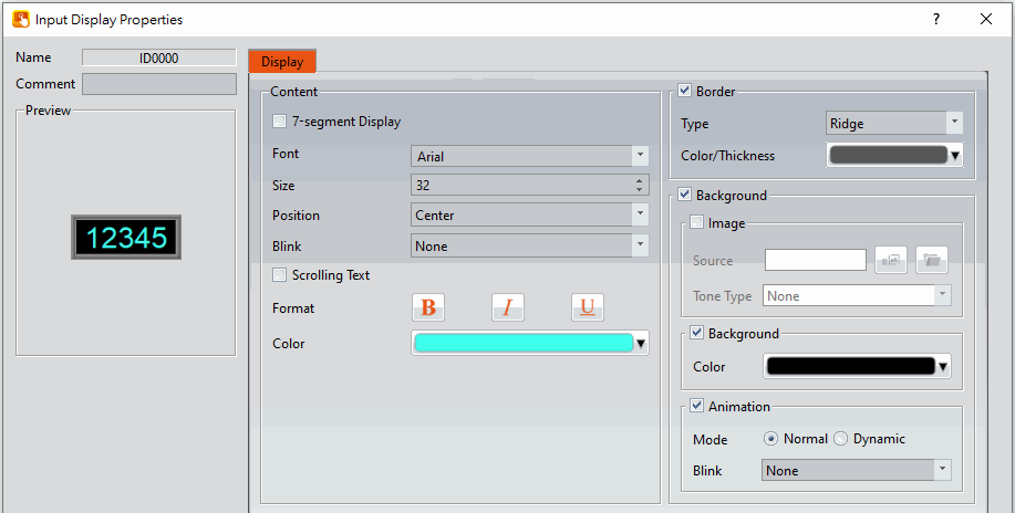
Figure 323 Setting Dialog of【Input Display】
Table 190 Setting Properties of【Input Display】
|
Property |
Description |
|
【Preview】 |
Preview the appearance of this object. |
|
【Name】 |
The default name of the object. |
|
【Comment】 |
Set the comment of the object. |
|
【Content】 |
【7-segment Display】 Set to use the 7-segment display function for the Input Display object. If this option is selected, related setting items for setting of style of the 7-segment display will appear. Note: while this option is selected, it can only show part of text (0/O, 1, 2, 3, 4, 5/S, 6, 7, 8, 9/g, A, B, C, D, E, F, h, H, L, o, P, r, u, U, Y). 【Font】 Set the font for the text of Input Display. 【Size】 Set the size for the text of Input Display. 【Position】 Set the position for the text of Input/Display. 【Blink】 Set the blinking function for the text of the Input/Display. There are four blinking speeds available to choose from: None, Slow, Medium and Fast. 【Scrolling Text】 Set the scrolling text function for the text of the Input/Display. There are four scrolling speeds available to choose from slow to fast. 【Format】 Set the format of the text for the Input/Display, including Bold, Italics and Underline. 【Color】 Set the color for the text of the Input/Display. |
|
【Border】 |
【Type】 Set the border types for Input Display. 【Color/Thickness】 Set the color and thickness for the border of the Input/Display. |
|
【Background】 |
【Image】 Check whether to use image 【Source】 Set whether to use an image for the displayed background of the current editing state. When this option is checked, an【Image Selector】will appear asking the user to select an image either from the【Image Library】or from【File】. 【Tone Type】 You can choose the tone type you want to change. After selecting the type, you can choose the color from【Tone Color】. 【Background】 Check whether to enable the background. After checking, you can set the background color displayed in the current editing state from【Color】. 【Animation】 Check whether to enable animated effects. 【Mode】Choose whether to use static or dynamic control elements to flicker. 【Blink】Select the blinking mode, and use the numerical value to switch during dynamic control. |
19.4.19 【Key】
Key is used on a【Base Screen】/【Window Screen】/【Keypad Screen】. It can provide the functions for the keypad needed for inputting numeric value or text. The 9 functions include【Text】,【ENT】,【CLR】,【BS】,【DEL】,【LEFT】,【RIGHT】,【Caps Lock】and【CANCEL】.
19.4.19.1 【Setting】
The【Key】【Setting】 page is as shown in the figure below, the meanings of each setting item are listed below:
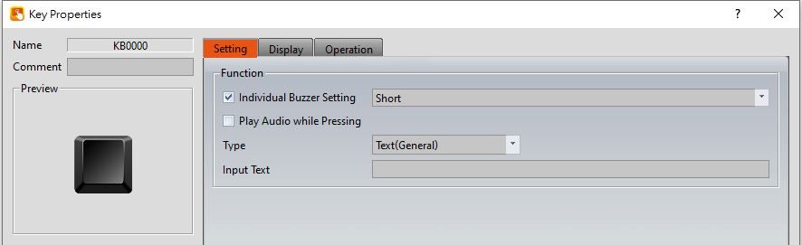
Figure 324【Setting】Screen of【Key】
Table 191【Setting】Properties of【Key】
|
Property |
Description |
|
【Preview】 |
Preview the appearance of this object. |
|
【Name】 |
The default name of the object. |
|
【Comment】 |
Set the comment of the object. |
|
【Function】 |
Set the function type of the key. 【Individual Buzzer Setting】 Can individually setup buzzer setting. Includes 5 modes: Off, Short, Long, Short-Short, Long-Short. 【Play Audio while Pressing】 Select to play audio when the Key is pressed. An【Audio Selector】will appear on the right when enabled. The switch on the right of the【Audio Selector】can be pressed to select an audio and the switch on the left of the【Audio Selector】can be pressed to play the audio selected. 【Text(General)】 Text input, when the user presses it, the planned characters will be displayed on the【Input Display】. 【Text(Custom Letter Case)】 Text input. After selecting, you can customize the characters that can be entered when the keyboard is switched between upper and lower case. If select this option, you can set the content in【Input text (Upper case)】and【Input text (Lower case)】 【ENT】 The numeric value or text entered on the【Keypad Screen】will be submitted and the【Keypad Screen】will be closed after this key is pressed. 【CLR】 The numeric value or text entered on the【Keypad Screen】will be cleared after this key is pressed. 【BS】 A single numeric value or text prior to the position of the cursor will be deleted after this key is pressed. 【DEL】 A single numeric value or text after the position of the cursor will be deleted after this key is pressed. 【LEFT】 The cursor will move one space forward after the user presses this key. 【RIGHT】 The cursor will move one space backward after the user presses this key. 【Caps Lock】 The case mode of the text input will be changed after this key is pressed. 【Cancel】 The【Keypad Screen】will be closed and input will be cancelled after the user presses this key. |
19.4.19.2 【Display】
The【Key】【Display】page is as shown in the figure below, the meanings of each setting item are listed below:
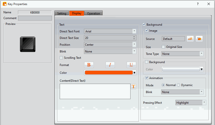
Figure 325【Display】Setting Screen of【Key】
Table 192【Display】Setting Properties of【Key】
|
Property |
Description |
|
【Text】 |
【Direct Text Font】 Set the font of the text for the key. 【Direct Text Size】 Set the size of the text for the key. 【Position】 Set the position of the text for the key. 【Blink】 Set the blinking function for the text of the key. There are four blinking speeds available to choose from: None, Slow, Medium and Fast. 【Scrolling Text】 Set the scrolling function for the text of the key. There are four scrolling speeds available to choose from slow to fast. 【Format】 Set the format of the text for the key, including Bold, Italics and Underline. 【Color】 Set the color of the text for the key. 【Content(Direct Text)】 Set the text of the key; it can be inputted directly or acquired from the【Text Library】. |
|
【Background】 |
Background settings for the key. The background of the key can be edited below if the background setting is selected, otherwise the background will be transparent. 【Use Image】 Set to use an image for the background of the key. When this option is checked, an【Image Selector】will appear asking the user to select an image either from the【Image Library】or from a file. 【Original Size of Image】 Display the original size of the image. 【Image Position】 Appears after checking【Original Size of Image】, you can select the position of the picture to be displayed. 【Color】 Set the background color of the key. This setting item will appear if【Use Image】was not selected. 【Blink】 Set the blinking function for the background of the key. There are four blinking speeds available to choose from: None, Slow, Medium and Fast. 【Animation】 Check whether to enable animated effects. 【Mode】Choose whether to use static or dynamic control elements to flicker. 【Blink】Select the blinking mode, and use the numerical value to switch during dynamic control. 【Pressing Effect】 Set the pressing effect of the key. There are two effects available for selection: None and Highlight. |
19.4.20 【Limit Value Display】
【Limit Value Display】is used on a【Base Screen】/【Window Screen】/【Keypad Screen】, it can display the maximum or minimum input value allowed for the current keypad.
The【Limit Value Display】settings page is as shown in the figure below, the meanings of each setting item are listed below:
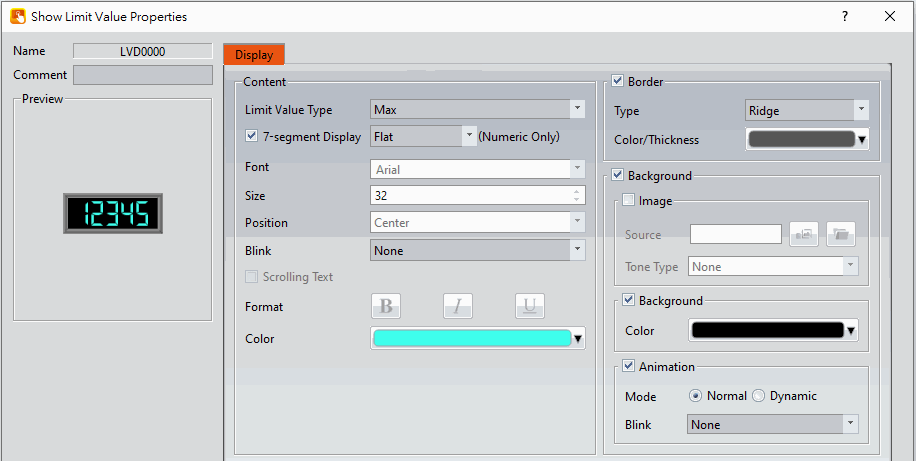
Figure 326 Setting Dialog of【Limit Value Display】
Table 193 Setting Properties of【Limit Value Display】
|
Property |
Description |
|
【Preview】 |
Previews the appearance of this object. |
|
【Name】 |
The default name of the object. |
|
【Comment】 |
Set the comment of the object. |
|
【Content】 |
【Limit Value Type】 Set to display【Max】or【Min】for Limit Value Display. 【7-segment Display】 Set to use the 7-segment display function for the Limit Value Display object. If this option is selected, related setting items for setting of style of the 7-segment display will appear, including outline, filled, flat. Note: When using the 7-segment display function, only part of the text (0 / O, 1, 2, 3, 4, 5 / S, 6, 7, 8, 9 / g, A, B, C, D, E , F, h, H, L, o, P, r, u, U, Y) can be displayed. 【Font】 Set the font of the text for the Limit Value Display. 【Size】 Set the size of the text for the Limit Value Display. 【Position】 Set the position of the text for the Limit Value Display. 【Blink】 Set the blinking function for the text of the Limit Value Display. There are four blinking speeds available to choose from: None, Slow, Medium and Fast. 【Scrolling Text】 Set the scrolling text function for the text of the Limit Value Display. There are four scrolling speeds available to choose from slow to fast. 【Format】 Set the format of the text for the Limit Value Display, including Bold, Italics and Underline. 【Color】 Set the color of the text for the Limit Value Display. |
|
【Border】 |
Border settings for the Limit Value Display. The border of the Limit Value Display can be edited below if border setting is selected, otherwise the Limit Value Display will be displayed with no border. 【Type】 Set the border types for the Limit Value Display. 【Color/Thickness】 Set the color and thickness for the border of the Limit Value Display. |
|
【Background】 |
Background settings for the Limit Value Display. The background of the Limit Value Display can be edited below if background setting is selected, otherwise the background will be transparent. 【Use Image】 Set to use an image for the background of Limit Value Display. When this option is checked, an【Image Selector】will appear asking the user to select an image either from the【Image Library】or from a file. 【Color】 Set the background color of the Limit Value Display. This setting item will appear if 【Use Image】 was not selected. 【Blink】 Set the blinking function for the background of the Limit Value Display. There are four blinking speeds available to choose from: None, Slow, Medium and Fast. 【Animation】 Check whether to enable animated effects. 【Mode】Choose whether to use static or dynamic control elements to flicker. 【Blink】Select the blinking mode, and use the numerical value to switch during dynamic control. |
19.4.21 【Animated Graphic】
【Animated Graphic】can control multiple states. The state, position and size displayed by【Animated Graphic】can be changed by setting specific control addresses in order to achieve effects such as moving objects, zooming in, zooming out etc.
19.4.21.1 【Setting】
The【Animated Graphic】【Setting】page is as shown in the figure below, the meanings of each setting item are listed below:
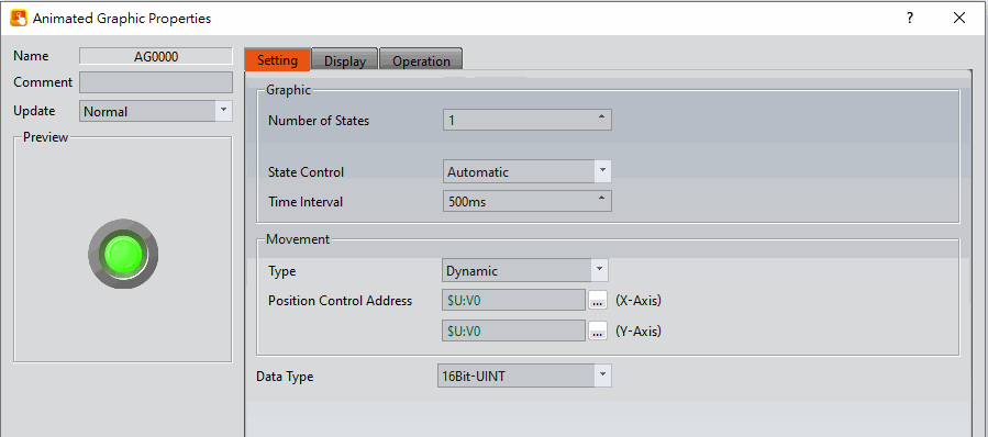
Figure 327【Setting】Screen of【Animated Graphic】
Table 194【Setting】Properties of【Animated Graphic】
|
Property |
Description |
||||||||||||||||
|
【Preview】 |
Preview the appearance of this object. |
||||||||||||||||
|
【Name】 |
The default name of the object. |
||||||||||||||||
|
【Comment】 |
Set the comment of the object. |
||||||||||||||||
|
【Update】 |
Provide user can select a suitable speed to get the latest data under different situation, such as you would like to get the latest data or adjust the object on the screen to display first, etc. Provide three modes: 【once】: update once only when switch to this page or use the system tag【OP_UPDATE_SCREEN_OBJECTS】, update once when trigger once a time, it will keep update if the monitor address is internal address. 【normal】: normal update speed. 【fast】: the fastest update speed. |
||||||||||||||||
|
【Graphic】 |
【Number of States】 Set the number of states for the animated graphic. 【State Control】 Set the state changing method of the animated graphic;【Automatic】mode means that the state of the animated graphic will change regularly. 【Dynamic】mode indicates the state of the dynamic graphic, which will change according to the value【State Control Address】. 【Time Interval】 Set the state change time interval for the animated graphic. 【State Control Address】 Sets the time interval for the dynamic graphic state change, and change according to the register’s value. |
||||||||||||||||
|
【Movement】 |
【Type】 Set the position changing method of the animated graphic. 【Dynamic】mode means that the position of the animated graphic will change according to the numeric value saved on the【Position Control Address】. 【Still】mode means that the position of the animated graphic will remain the same. 【Polyline】mode means that the position of the animated graphic will change according to the planning path or position. 【Position Control Address】 Divided into X-axis and Y-axis control addresses. If the【Type】is【Dynamic】, the user can move the animated graphic by changing the numeric value saved in the X-axis and Y-axis control address. 【Move Control】 Display when【Type】select as【Polyline】, main to set the path or position under【Polyline】mode. 【Along Path】 The animated graph change the position according to the planning path.
【Along Position】 The animated graph change the position according to the planning position(point). 【Dynamically Change Position】 The animated graph change the position(point) according to the【Position Control Address】value, if【Position Control Address】=0 display point 1, 【Position Control Address】=5 display point 6. 【Rate】 Animated graph moving speed, the unit is v/s. 【Edit Path】 Will show up this option when【Type】select as【Polyline】, click to show the figure as below. Provide user to change the position by modify x-axis and y-axis or adjust the path by【Insert】and【Remove】.
Except adjust the path by【Edit Path】also can directly edit on the work space by dragging, table as follow:
|
||||||||||||||||
|
【Data Type】 |
Set the data type of the animated graphic; this setting will appear when the selection of the【Type】for【State Control】or【Movement】is controlled by specific addresses. |
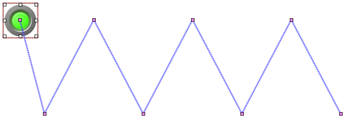
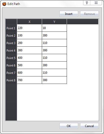
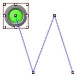
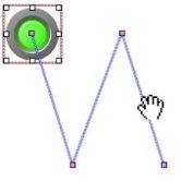
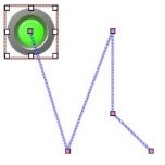
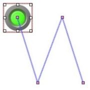
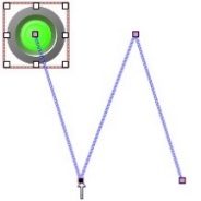
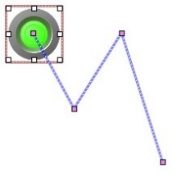
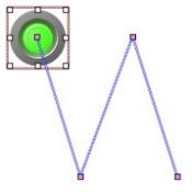
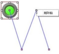
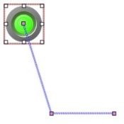
19.4.21.2 【Display】
The【Animated Graphic】【Display】page is as shown in the figure below, the meanings of each setting are listed below:
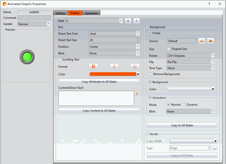
Figure 328【Display】Setting Screen of【Animated Graphic】
Table 195【Display】Setting Properties of【Animated Graphic】
|
Property |
Description |
|
【State】 |
Select the state needed to be edited. 0 and 1 buttons are provided to enable quick switching between states 0 and 1. |
|
【Text】 |
【Direct Text Font】 Set the font of the text for the current editing state. 【Direct Text Size】 Set the size of the text for the current editing state. 【Position】 Set the position of the text for the current editing state. 【Blink】 Set the blinking function for the text of the current editing state. There are four blinking speeds available to choose from: None, Slow, Medium and Fast. 【Scrolling Text】 Set the scrolling text function for the text of the current editing state. There are four scrolling speeds available to choose from slow to fast. 【Format】 Set the format of the text for the current editing state, including Bold, Italics and Underline. 【Color】 Set the color of the text for the current editing state. 【Copy Attributes to All States】 The text properties for the current editing state is applied to all states. 【Content (Direct Text)】 Set the text of the current editing state. It can be inputted directly or acquired from the【Text Library】. 【Copy Contents to All States】 Apply the settings of the text for the current editing state to all states. |
|
【Background】 |
Background settings for the current editing state. The displayed background of the animated graphic can be edited below if background setting is selected. Otherwise, the background of the currently editing state will be transparent. 【Use Image】 Set to use an image for the displayed background of the current editing state. When this option is checked, an【Image Selector】will appear asking the user to select an image either from the【Image Library】or from a file. 【Original Size of Image】 Display the original size of the image. 【Image Position】 Appears after checking【Original Size of Image】, you can select the position of the picture to be displayed. 【Color】 Set the background color of the current editing state. This setting item will appear if【Use Image】was not selected. 【Blink】 Set the blinking function for the background of the current editing state. There are four blinking speeds available to choose from: None, Slow, Medium and Fast. 【Remove Background】 Choose transparent color through【Choose Color】. 【Rotate】 Rotate the graph, includes CW 0 Degrees, CW 90 Degrees, CW 180 Degrees and CW 270 Degrees. 【Flip】 Flip the graph, includes No Flip, X-Axis and Y-Axis. 【Animation】 Check whether to enable animated effects. 【Mode】Choose whether to use static or dynamic control elements to flicker. 【Blink】Select the blinking mode, and use the numerical value to switch during dynamic control. 【Copy to All States】 Apply the settings of the background for the current editing state to all states. |
|
【Border】 |
Set the object border. 【Color/Width】 Set the color and width of the border. 【Type】 Set the type of the border. 【Copy to All States】 Apply the settings of the border for the current editing state to all states. |
19.4.22 【Rotation Indicator】
【Rotation Indicator】is made up of multiple indicators arranged as a ring. Designers can set the rotation display mode or speed by the PLC register or HMI internal address.
19.4.22.1 【Setting】
The【Rotation Indicator】【Setting】page is as shown in the figure below, the meanings of each setting item are listed below:
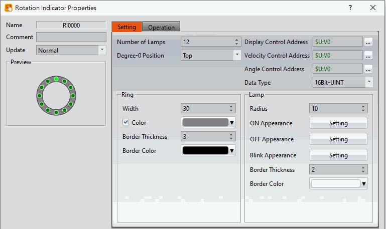
Figure 329【Setting】Screen of【Rotation Indicator】
Table 196【Setting】Properties of【Rotation Indicator】
|
Property |
Description |
||||||||||||||||||
|
【Preview】 |
Preview the appearance of this object. |
||||||||||||||||||
|
【Name】 |
The default name of the object. |
||||||||||||||||||
|
【Comment】 |
Set the comment of the object. |
||||||||||||||||||
|
【Update】 |
Provide user can select a suitable speed to get the latest data under different situation, such as you would like to get the latest data or adjust the object on the screen to display first, etc. Provide three modes: 【once】: update once only when switch to this page or use the system tag【OP_UPDATE_SCREEN_OBJECTS】, update once when trigger once a time, it will keep update if the monitor address is internal address. 【normal】: normal update speed. 【fast】: the fastest update speed. |
||||||||||||||||||
|
【Number of Lamps】 |
Set the number of indicators to display in the【Rotation Indicator】object. There can be 8 to 40 indications in multiples of 4. |
||||||||||||||||||
|
【Degree-0 Position】 |
Set the zero degree position of【Rotation Indicator】which is the starting position when rotating, including top, bottom, left, and right. |
||||||||||||||||||
|
【Display Control Address】 |
Set the display control address for the【Rotation Indicator】object. HMI will reads the【Display Control Address】. When the range of read number is between 0 ~ 7,【Rotation Indicator】is displayed following the table below. If the range of reading number is not 0 ~ 7, the【Rotation Indicator】will retain the previous displayed mode.
|
||||||||||||||||||
|
【Velocity Control Address】 |
Sets the rotation speed or blinking rate for the【Rotation Indicator】object. If the value of 【Display Control Address】is 3 or 4, its range is 0 ~ 1000 at a multiple of 10ms. If the value of【Display Control Address】is 7, its range is 0 ~ 100 at a multiple of 100ms. |
||||||||||||||||||
|
【Angle Control Address】 |
Sets the angle for the【Rotation Indicator】object. Its range is 0 ~ 360. If the value is greater than 360, 【Rotation Indicator】will retain the previously displayed mode. |
||||||||||||||||||
|
【Data Type】 |
Set the data type of the【Rotation Indicator】. |
||||||||||||||||||
|
【Ring】 |
【Width】 Sets the width of the ring for the【Rotation Indicator】. 【Color】 Sets the color of the ring for the 【Rotation Indicator】. If the color setting is not checked, it will be displayed as transparent. 【Border Thickness】 Sets the border width of the ring for the【Rotation Indicator】. 【Border Color】 Sets the border color of the ring for the【Rotation Indicator】. |
||||||||||||||||||
|
【Lamp】 |
【Radius】 Sets the radius of the indicator for the【Rotation Indicator】. 【ON Appearance】 After clicking the setting, you can select the【Image】and 【Color】when the lamp is on in the pop-up window. 【OFF Appearance】 After clicking the setting, you can select the【Image】and 【Color】when the lamp is off in the pop-up window. 【Blink Appearance】 Sets the color or picture of the flashing state for the【Rotation Indicator】. If you check the “Use Image” option, the 【Image Selector】will appear for users to choose an image from【Image Library】 or from a file. 【Border Thickness】 Sets the border width of the lamp for the【Rotation Indicator】. 【Border Color】 Sets the border color of the lamp for the【Rotation Indicator】. |
19.4.23 【Gif Display】
【Gif Display】can display .gif files as a dynamic image.
19.4.23.1 【Setting】
The【Gif Display】【Setting】page is a shown in the figure below. Each option is explained.
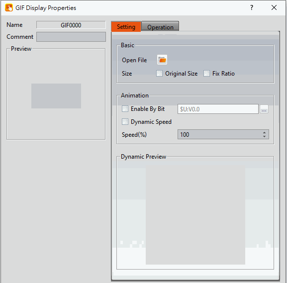
Figure 330 【Setting】Screen of【GIF Display】
Table 197【Setting】Properties of【GIF Display】
|
Property |
Description |
|
【Preview】 |
Preview the appearance of this object. |
|
【Name】 |
The default name of the object. |
|
【Comment】 |
Set the comment of the object. |
|
【Basic】 |
【Open FIle】 Select a GIF format image on the computer. 【Size】 Select the size of the GIF image. 【Original Size】 Set the image to be its original size. The image size cannot be changed in the work space. If this option is not changed, the size is adjustable. 【Fixed Ratio】 The image size can be adjusted but its original aspect ratio will be maintained. |
|
【Animation】 |
【Enable by Bit】 Set whether the GIF image is dynamically controlled by this bit. 【DynamicSpeed】 Set whether the change speed of the GIF dynamic graph is controlled by the register 【Speed】 Adjust the playback speed of the GIF. When【DynamicSpeed】is unchecked, you can set the constant value of the change dpeed, when check【DynamicSpeed】, you can set register in this field. |
|
【Dynamic Preview】 |
The GIF with the current settings applied is previewed here. |
19.4.24 【Historic Trend】
【Historic Trend】is a curve object used to read the data in the Recording Buffer of the【Data Logger】, in which the X value is time and the Y value is the data captured by the【Data Logger】. Its functions are as follows:
- View the data of the【Data Logger】.
- Pause or start updating the data of the【Data Logger】through the【Sub Switch】, and clear the displayed data. It can also zoom or move the figure.
19.4.24.1 【General】
【Historic Trend】【General】setting paging as shown below, the meaning of each setting is as follows :
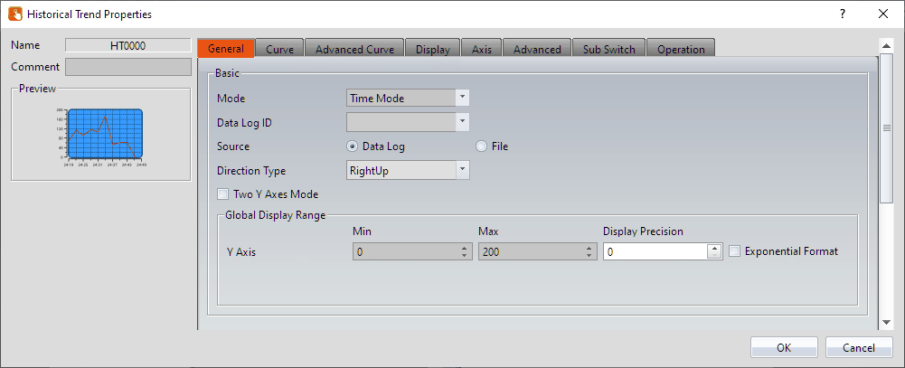
Figure 331【General】Setting Screen of【Historic Trend】
Table 198【General】Setting Properties of【Historic Trend】
|
Property |
Description |
|
【Preview】 |
Preview the appearance of this object. |
|
【Name】 |
The default name of the object. |
|
【Comment】 |
Set the comment of the object. |
|
【Basic】 |
【Data Log ID】 Select the ID of the Data Log to track. 【Source】 Select the【Historic Trend】source:【Data Log】or【File】. 【Data Log】 Use【Data Log】as the source of the data. Refer to Chapter 7 -Data Log. 【File】 Use an exported CSV or TXT file as the source of the data. When this option is selected, set the【File Address】. This register value corresponds to the position of the file in a path. For example, if the the register was R50, a 0 in R50 corresponds to the first file in the path, 1 corresponds to the second, and so on.
【Continue Files】 Supports only for PC model, this mode will read the export files continuously from the folder so the users no need to import files all the time when viewing old files. 【Mode】 Select the【Historic Trend】display mode: 【Time Mode】or【Index Mode】. 【Time Mode】 Set the X-axis of the【Historic Trend】as time. 【Index Mode】 Set the X-axis of the【Historic Trend】as a specified index. 【Two Y Axes Mode】 Check whether to display two Y-axes on the graph. 【Refresh data automatically】 When source choose as【file】will appear this option, check this option, it will automatically refresh when new data comes. |
|
【Global Display Range】 |
Represents the range that can be displayed. 【Min】 Set the minimum Global Range value for the Y-axis. 【Max】 Set the maximum Global Range value for the Y-axis. Note: The【Global Display Range】represents the range that can be displayed. If【Max】is 100 and【Min】is 0, data exceeding this range will not be able to be displayed. 【Display Precision】 Set the number of decimal places represented for Y-axis values. 【Exponential Format】 When selected, the Y-axis values will be displayed in exponential form. 【X Axis (Index Points) Max】 If the【Index Mode】is set to【Index Mode】the maximum X-axis index point can be selected. |
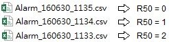
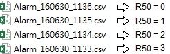
19.4.24.2 【Curve】
【Historic Trend】【Curve】setting paging as shown below, the meaning of each setting is as follows :
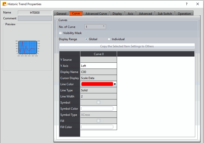
Figure 332【Curve】Setting Screen of【Historic Trend】
Table 199【Curve】Setting Properties of【Historic Trend】
|
Property |
Description |
|
【Curve】 |
【No. of Curve】 Select the number of curves. The maximum curve lines are up to 32. 【Visibility Mask】 Select whether to use visibility mask to control the visibility of the each curve. While selecting, use should assign the 32bit UINT register as the mask, in which the 0 bit control the display of the curve 0, and so on. 【Display Range】 Used to set the display mode for the display range of the curve. It is usually one of the two following types:
The display ranges of all the curves are identical to the【Global Display Range】.
The display range of all the curves can be different from the【Global Display Range】. Explanation: When to set【Display Range】as【Individual】- When the value ranges of the number of curves are different, for example when the value range of curve a is 0~10, and curve b is 0~1000, it can be discovered that the degree of changes for curve a will be difficult to observe if the two curves are placed in the same figure. This is when【Display Range】can be set as【Individual】and the display range of each curve can be defined. The system will automatically zoom the value of the curves according to the value in【Global Display Range】. Take this case for example, if the value in【Global Display Range】is 0~100, when the value of curve a is 5, the system will zoom it to 50 and when the value of curve b is 500, the system will also zoom it into 50, and so on. Another time to use- When【Global Display Range】is set to 0~100,【Display Precision】is set to 1, then the axis will display 0.0~100.0 at this time, and the value of curve a is 0~1000. When the curve A value is 500, it will be It is scaled to 50.0. The curve property table is described below: 【Y Source】 Set the source for the Y value of the curve; the selection of the source depends on the setting of the【Data Logger】. 【Display Name】 Set the name of the curve. 【Y Max】 Set the maximum Individual Display Range value for the Y value of the curve, this option will appear if【Display Range】is【Individual】.. 【Y Min】 Set the minimum Individual Display Range value for the Y value of the curve, this option will appear if【Display Range】is【Individual】.. 【Cursor Display】 Four options are available: None, Scale Data, Original Data, and Both. For example, if the【Global Display Range】was set to 0~100, the【Display Range】was set to individual, 【Y Max】is set to 200 and【Y Min】is set to 0, when Y is 60, the cursor is set such that the scaled value of 30 is displayed. If the【Cursor Display】is set to orginal, the original value of 60 is displayed. 【Y Axis】 If【Two Y Axes Mode】is selected, the setting is used to decide the curve’s reference y-axis. 【Line Color】 Set the line color of the curve. 【Line Type】 Set the line type of curve. 【Line Width】 Set the curve width. 【Symbol】 Check whether to display curve’s symbol. 【Symbol Color】 Set the symbol color. 【Symbol Type】 Set the symbol type. 【Fill】 Check whether to fill up the curve. 【Fill Color】 Set the fill color. |
19.4.24.3 【Advanced Curve】
【Historic Trend】【Advanced Curve】setting paging as shown below, the meaning of each setting is as follows :
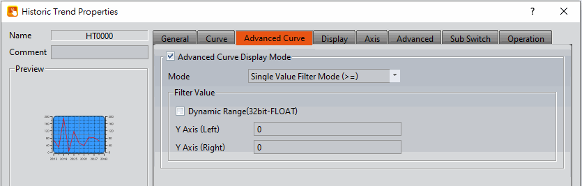
Figure 333【Advanced Curve】Setting Screen of【Historic Trend】
Table 200【Advanced Curve】Setting Properties of【Historic Trend】
|
Property |
Description |
|
【Advnaced Curve Display Mode】 |
Select to enable the advanced curve display mode. 【Mode】 There are four filter modes for setting the curve display, which are: 【Single Value Filter Mode (>=)】Display all curves greater than or equal to the filtered value. 【Single Value Filter Mode (>)】Display all curves greater than the filtered value. 【Single Value Filter Mode (<)】Display all curves less than the filtered value. 【Single Value Filter Mode (<=)】Display all curves less than or equal to the filtered value. The following is an example: Select the mode【Single Value Filter Mode (>=)】and set this value to 30.
|
|
【Filter Value】 |
Set the filter value of the filter mode. 【Dynamic Range(32bit-FLOAT)】 Check whether the filter value can be changed according to the content of the specified address. The data type is 32-bit floating point. 【Y Axis (Left)】 Set the filter value of the left Y axis. 【Y Axis (Right)】 Set the right Y-axis filter value (this setting can only be set when【Two Y Axes Mode】is checked). |
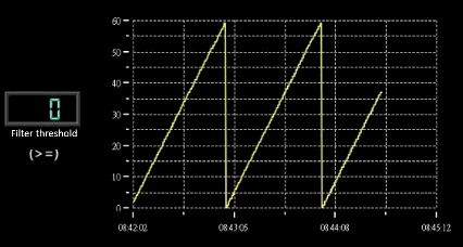
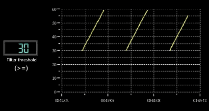
19.4.24.4 【Display】
【Historic Trend】【Display】setting paging as shown below, the meaning of each setting is as follows :
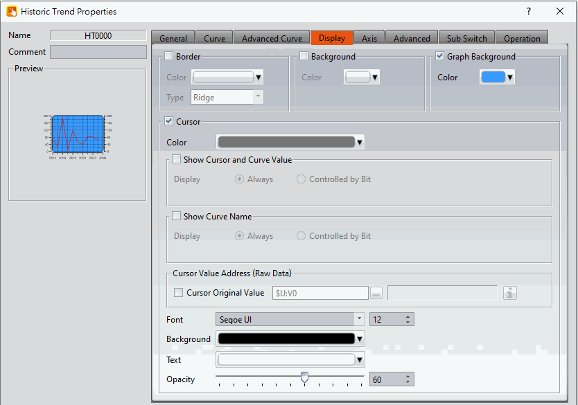
Figure 334【Display】Setting Screen of【Historic Trend】
Table 201【Display】Setting Properties of【Historic Trend】
|
Property |
Description |
|
【Border】 |
Select to display the border. 【Color】 Set the color of the border. 【Type】 Set the border type. |
|
【Background】 |
Select to display the background. 【Color】 Set the color of the background. |
|
【Graph Background】 |
Select to display the graph background. 【Color】 Set the color of the graph background. |
|
【Cursor】 |
Select to display the cursor. 【Color】 Set the color of the cursor. 【Show Cursor and Curve Value】【Display】 Set the visibility of cursor values. If【Always】is set, the cursor and curve values are always shown. If【Controlled by Bit】is selected, the visibility of the values depends on a specified bit. 【Show Curve Name】【Display】 Set the visibility of the curve name. If【Always】is set, the curve name is always shown. If【Controlled by Bit】 is selected, the visibility of the curve name depends on the specified bit. 【Cursor Original Address (Raw Data)】 Display the original value where the cursor place. 【Font】 Set the font and size of cursor values. 【Background】 Set the background color of the cursor values. 【Text】 Set the text color of the cursor values. 【Opacity】 Set the background opacity of the cursor values. |
19.4.24.5 【Axis】
【Historic Trend】【Axis】setting paging as shown below, the meaning of each setting is as follows :
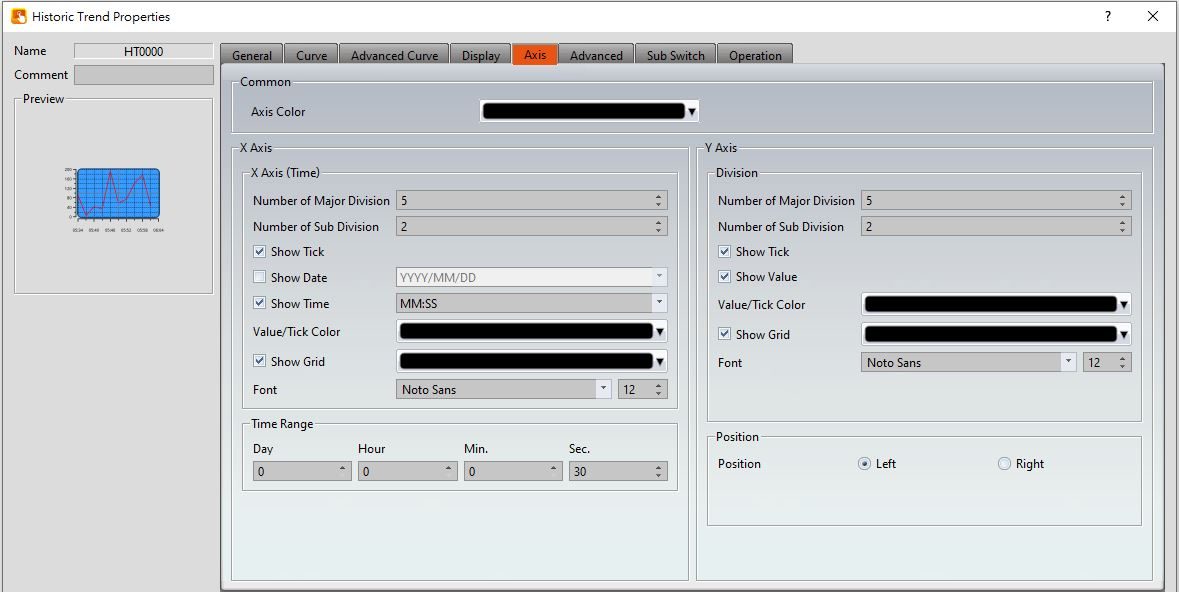
Figure 335【Axis】Setting Screen of【Historic Trend】
Table 202【Axis】Setting Properties of【Historic Trend】
|
Property |
Description |
|
【Common】 |
【Axis Color】 Set the color of the axis. |
|
【Time Range】(Time Mode) |
Set the time range of the X-axis 【Day】 Set the number of days. 【Hour】 Set the number of hours. 【Min.】 Set the number of minutes. 【Sec.】 Set the number of seconds. |
|
【X-axis (Time)】 |
【Number of Major Division】 Sets the number of major divisions on the X-axis. 【Number of Sub Division】 Sets the number of sub divisions on the X-axis. 【Show Tick】 Select to display the ticks. 【Show Value】(Index Mode) Select to display the value. 【Show Date】 Select to display the date on the X-axis, and sets the display format of the date. 【Show Time】 Select to display the time on the X-axis, and sets the display format of the time. 【Value/Tick Color】 Set the colors of the time and ticks. 【Show Grid】 Select to display vertical gridlines, and sets the color of the gridlines. |
|
【Y-axis】 【Division】 |
【Number of Major Division】 Set the number of major divisions on the Y-axis. 【Number of Sub Division】 Set the number of sub divisions on the Y-axis. 【Show Tick】 Select to display the ticks on the Y-axis. 【Show Value】 Select to display the values on the Y-axis. 【Value/Tick Color】 Set the colors of the values and ticks. 【Show Grid】 Select whether to display horizontal gridlines, and sets the color of the gridlines. 【Font】 Set the font and size of the scale |
|
【Y-axis】 【Position】 |
【Position】 Set the Y-axis position:【Left】or【Right】 |
19.4.24.6 【Advanced】
【Historic Trend】【Advanced】setting paging as shown below, the meaning of each setting is as follows :
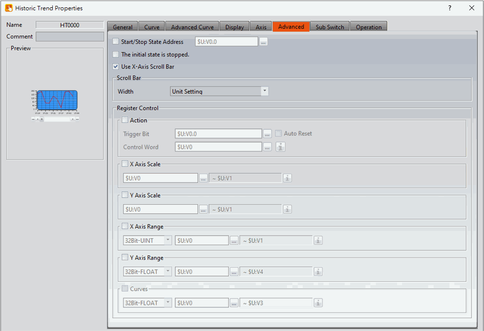
Figure 336【Advanced】Setting Screen of【Historic Trend】
Table 203【Advanced】Setting Properties of【Historic Trend】
|
Property |
Description |
|||||||||||||||||||||||||||||||||||||||||||||||||||||||||||||||||||||||||||||||||||||||||||||||||||||||||||||||||||||||||||||
|
【Advanced】 |
【Start/Stop State Address】 Set the【Data Block Graph】will start/stop at the specified address. Only the display unit’s internal memory is supported. A value of 0 specifies the start state. A value of 1 specifies the stop state. 【The initial state is stopped】 Set the initial state of of the data to stop. 【Use X-Axis Scroll Bar】 Set to enable the X-axis scroll bar functionality. Allows for easy viewing of the historic trend curve. 【Scroll Bar】 It appears when [Use X-axis scroll bar] is checked, and you can modify the [Width] item to make the slider zoom in or out. |
|||||||||||||||||||||||||||||||||||||||||||||||||||||||||||||||||||||||||||||||||||||||||||||||||||||||||||||||||||||||||||||
|
【Register Control】 |
【Action】 After checking, you can set【Trigger Bit】and【Control Word】. The function is to use the register to execute the sub-switch to achieve automatic control.
【X Axis Scale】 X axis scale numbers can be specified by register, it will appear register setting below after checked, and will display the number of consecutive occupancy registers, this register is in 16 Bit-UINT format, table as below.
【Y Axis Scale】 Y axis scale numbers can be specified by register, it will appear register setting below after checked, and will display the number of consecutive occupancy registers, this register is in 16 Bit-UINT format, table as below.
【X Axis Range】 X axis range can be specified by register, it will appear register setting below after checked, and will display the number of consecutive occupancy registers, table as below.
【Y Axis Range】 Y axis range can be specified by register, it will appear register setting below after checked, and will display the number of consecutive occupancy registers, table as below.
Note: maximum value should greater than minimum value. 【Curves】 If curve Y-axis display range use【individual】, check this option, each of the Y-axis curve can be specified by register, and will display the number of consecutive occupancy registers, table as below.
Note: maximum value should greater than minimum value. |
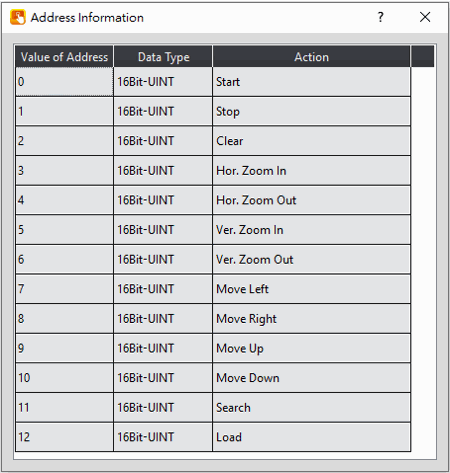
19.4.24.7 【Sub Switch】
【Historic Trend】【Sub Switch】setting paging as shown below, the meaning of each setting is as follows :
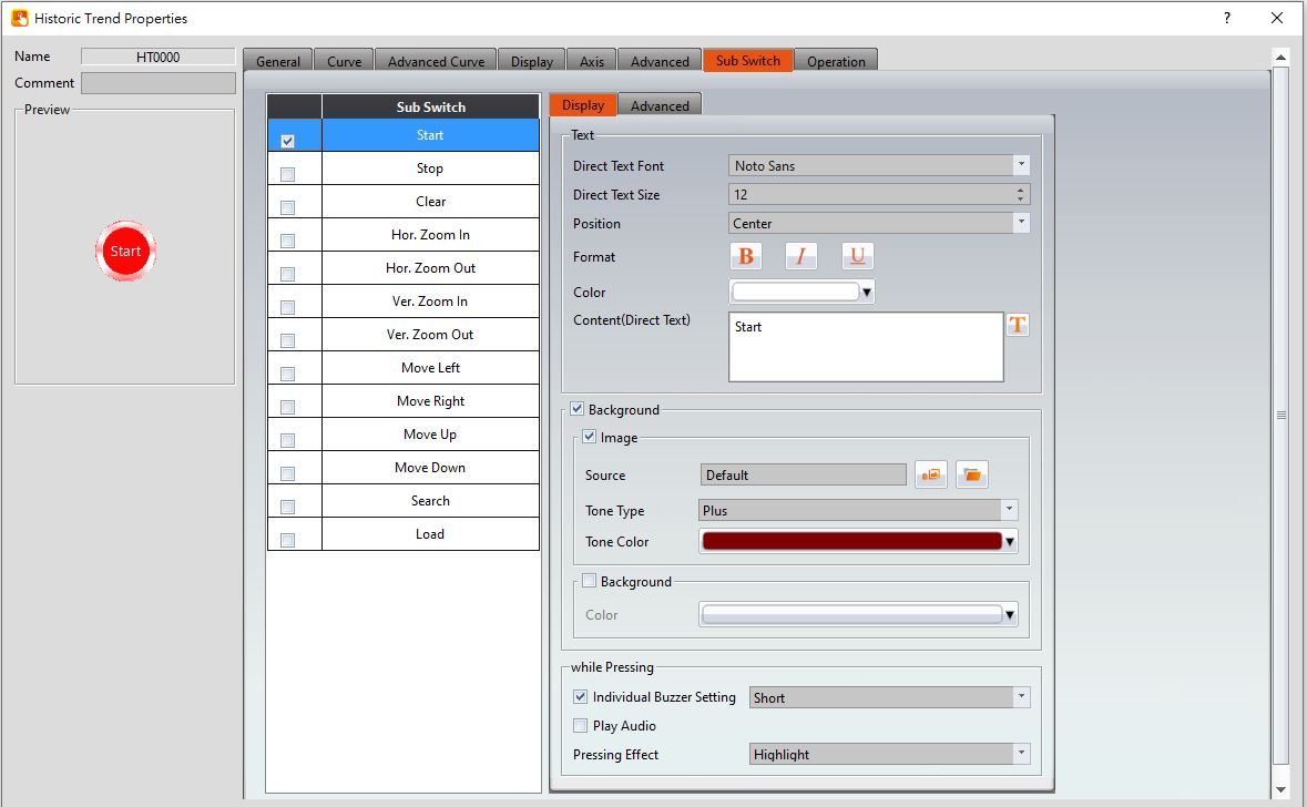
Figure 337【Sub Switch】Setting Screen of【Historic Trend】
Table 204【Sub Switch】Setting Properties of【Historic Trend】
|
Property |
Description |
|
【Sub Switch List】 |
【Sub Switch List】that can be selected for【Historic Trend】. Sub switches can be enabled after selecting them. Settings for the appearance of the selected sub switches will also appear on the right. When different sub switches are selected from the list, the appearance settings to the right will be updated according to the sub switches selected. In which the Sub Switches are divided into:
|
|
【Display】【Text】 |
【Direct Text Font】 Set the text font of the sub switch currently selected. 【Direct Text Size】 Set the text size of the sub switch currently selected. 【Position】 Set the text position of the sub switch currently selected. 【Format】 Set the text format of the sub switch currently selected, including Bold, Italics and Underline. 【Color】 Set the text color of the sub switch currently selected. 【Content(Direct Text)】 Set the text of the sub switch currently selected. |
|
【Display】【Background】 |
Set the background of the sub switch currently selected. Check it to activate background settings, and the displayed background of the sub switch currently selected can be edited below. If this option is not checked, the background will be transparent. 【Use Image】 Set to use an image for the displayed background of the sub switch currently selected. When this option is checked, image selection settings will appear asking the user to select an image either from the【Image Library】or from a file. 【Background Color】 Set the background color of the sub switch currently selected. This setting will appear if【Use Image】was not selected. |
|
【Display】【while Pressing】 |
【Individual Buzzer Setting】 Can individually setup buzzer setting. Includes 5 modes: Off, Short, Long, Short-Short, Long-Short. 【Play Audio】 Select to play audio when the sub switch is pressed. An【Audio Selector】will appear on the right when enabled. The switch on the right of the【Audio Selector】can be pressed to select an audio and the switch on the left of the【Audio Selector】can be pressed to play the audio selected. 【Pressing Effect】 Set the pressing effect of the sub switch currently selected. There are two effects available for selection:【None】and【Highlight】. |
|
【Advanced】【Operation Control】 |
Operation control of sub switch, it can enabled by bit or security. 【Enable by Bit】 Check whether the sub switch operation is controlled by a bit 【Show Disabled Sign】 Check if you want to display the forbidden symbol, it’s valid when check【Enable by Bit】,【Enabled by Word】or【Enable by Security】. 【Address】 Set the address of the sub switch operation control bit. 【State】 Set the control bit as 1 or 0 to operate object. 【Enabled by Word】 Check whether the operation is controlled by word. 【Address】 Set the operation control word address. 【Condition】 Set the condition of word control and when it is true then the object can be controlled, when false not the object can not be controlled. The condition include’ =’,’ !=’, ‘>’, ‘<’, ‘>=’, ‘<=’. 【Enable by Security】 Select the sub switch whether controlled by user level. 【User Level Condition】 Set the level and condition of the object. 【Hold Time】 Check whether the operation is controlled by hold time. Hold time can be divided into two kinds:
【Operator Confirm】 Check whether show comfirmation message window after checking the operation. 【Max. Waiting Time】 When the confirmation message window is displayed, If the user does not reply within this time, the system will close the confirmation message window and cancel this operation |
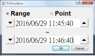
19.4.25 【Historic XY Scatter】
【Historic XY Scatter】 is a curve object used to read the【Recording Buffer】data of the【Data Log】, in which the X/Y values are both data captured by the【Data Log】. Its main functions are as follows:
- View the Recording Buffer data of the【Data Log】.
- Pause or start updating the data of the 【Data Log】through the【Sub Switch】and clear the displayed data.
19.4.25.1 【General】
【Historic XY Scatter】【General】setting paging as shown below, the meaning of each setting is as follows :
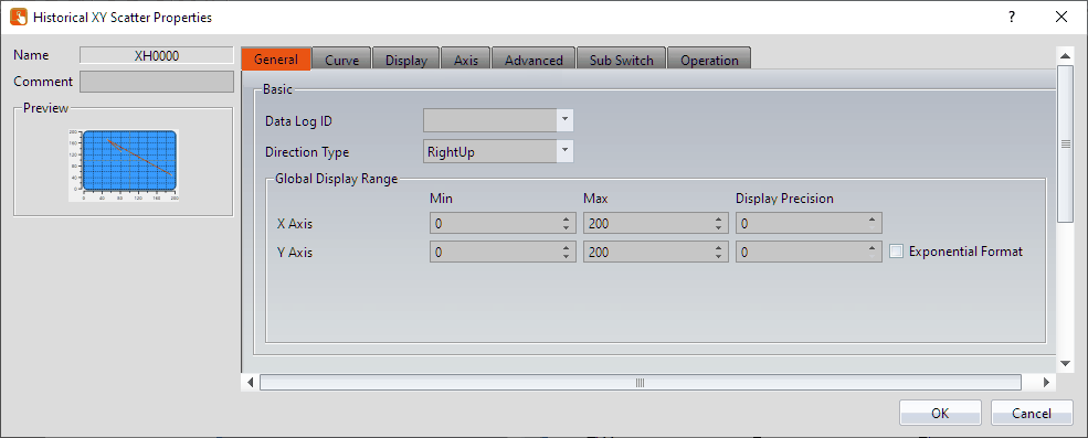
Figure 338【General】Setting Screen of【Historic XY Scatter】
Table 205【General】Setting Properties of【Historic XY Scatter】
|
Property |
Description |
|
【Preview】 |
Preview the appearance of this object. |
|
【Name】 |
The default name of the object. |
|
【Comment】 |
Set the comment of the object. |
|
【Basic】 |
【Data Log ID】 Set the ID of the Data Log group to display. |
|
【Global Display Range】 |
Set the range that can be displayed. 【Max】 Set the maximum Global Range value for the X-axis/Y-axis. 【Min】 Set the minimum Global Range value for the X-axis/Y-axis. Note: The【Global Display Range】represents the range that can be displayed. If【Max】is 100 and【Min】is 0, data exceeding this range will not be able to be displayed. 【Display Precision】 Set the number of decimal places represented for X/Y-axis values. 【Exponential Format】 When selected, the Y-axis values will be displayed in exponential form. |
19.4.25.2 【Curve】
【Historic XY Scatter】【Curve】setting paging as shown below, the meaning of each setting is as follows :
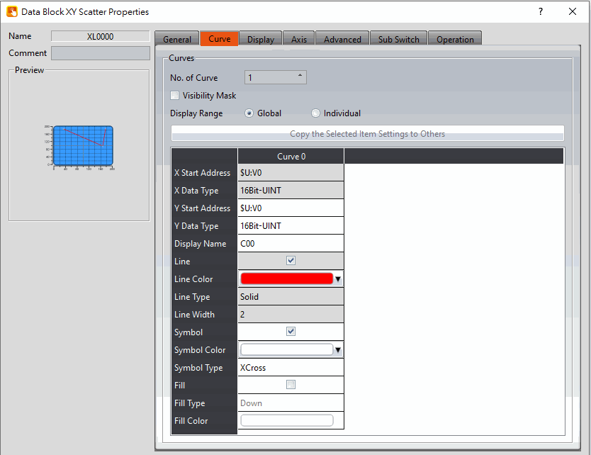
Figure 339【Curve】Setting Screen of【Historic XY Scatter】
Table 206【Curve】 Setting Properties of【Historic XY Scatter】
|
Property |
Description |
|
【Curve】 |
【No. of Curve】 Select the number of curves up to a maximum of 32. 【Visibility Mask】 Select whether to use visibility mask to control the visibility of the each curve. While selecting, use should assign the 32bit UINT register as the mask, in which the 0 bit control the display of the curve 0, and so on. 【Display Range】 Used to set the display mode for the display range of the curve. It is usually one of the two following types:
The display ranges of all the curves are identical to the【Global Display Range】.
The display range of all the curves can be different from the【Global Display Range】. Explanation: When to set【Display Range】as【Individual】- Whenthe value ranges of the number of curves are different, for example when the value range of curve a is 0~10, and curve b is 0~1000, it can be discovered that the degree of changes for curve a will be difficult to observe if the two curves are placed in the same figure. This is when【Display Range】can be set as【Individual】and the display range of each curve can be defined. The system will automatically zoom the value of the curves according to the value in【Global Display Range】. Take this case for example, if the value in【Global Display Range】is 0~100, when the value of curve a is 5, the system will zoom it to 50 and when the value of curve b is 500, the system will also zoom it into 50, and so on. 【X/Y Source】 Set the source for the X/Y valuesX/ of the curve; the selection of the source depends on the setting of the【Data Logger】. 【Display Name】 Set the name of the curve. 【X/Y Max】 Set the maximum Individual Display Range value for the X/Y value of the curve, this option will appear if【Display Range】is【Individual】. 【X/Y Min】 Set the minimum Individual Display Range value for the Y value of the curve, this option will appear if【Display Range】is【Individual】. 【Line】 Set to show the curve. 【Line Color】 Set the line color of the curve. 【Line Type】 Set the line type of curve. 【Line Width】 Set the curve width. 【Symbol】 Select to display the curve symbols. 【Symbol Color】 Set the color of the symbols. 【Symbol Type】 Set the symbol type. 【Fill】 Check whether to fill up the curve. 【Fill Type】 Set the fill type. 【Fill Color】 Set the fill color. |
19.4.25.3 【Display】
【Historic XY Scatter】【Display】setting paging as shown below, the meaning of each setting is as follows :
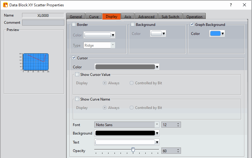
Figure 340【Display】Setting Screen of【Historic XY Scatter】
Table 207【Display】Setting Properties of【Historic XY Scatter】
|
Property |
Description |
|
【Border】 |
Select to display the border. 【Color】 Set the color of the border. 【Type】 Set the border type. |
|
【Background】 |
Select to display the background. 【Color】 Set the color of the background. |
|
【Graph Background】 |
Select to display the graph background. 【Color】 Set the color of the graph background. |
|
【Cursor】 |
Select to display the cursor. 【Color】 Set the color of the cursor. 【Show Cursor Value】 Select to display the cursor value. 【Show Cursor Value】【Display】 Set the visibility of cursor values. If【Always】is set, the cursor values are always shown. If【Controlled by Bit】is selected, the visibility of cursor values depends on the specified bit. 【Show Curve Name】 Select to display the curve name. 【Show Curve Name】【Display】 Set the visibility of the curve name. If【Always】is set, the curve name is always shown. If【Controlled by Bit】 is selected, the visibility of curve name depends on the specified bit. 【Font】 Set the font type and size of cursor values. 【Background】 Set the background color of the cursor values. 【Text】 Set the text color of the cursor values. 【Opacity】 Set the background opacity of the cursor values. |
19.4.25.4 【Axis】
【Historic XY Scatter】【Axis】setting paging as shown below, the meaning of each setting is as follows :
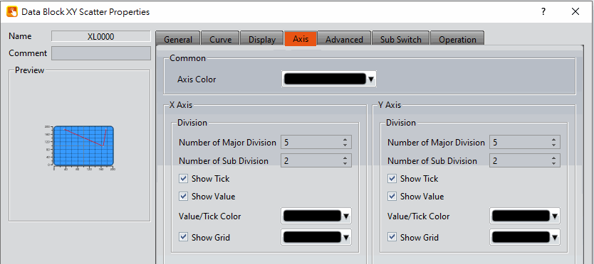
Figure 341【Axis】Setting Screen of【Historic XY Scatter】
Table 208【Axis】Setting Properties of【Historic XY Scatter】
|
Property |
Description |
|
【Common】 |
【Axis Color】 Set the color of the axis. |
|
【X-axis】 【Division】 |
【Number of Major Division】 Set the number of major divisions of the X-axis. 【Number of Sub Division】 Set the number of sub divisions of the X-axis. 【Show Tick】 Select to display the ticks on the X-axis. 【Show Value】 Select to display the values on the X-axis. 【Value/Tick Color】 Set the color of the values and ticks. 【Show Grid】 Select to display vertical gridlines and set the color of the gridlines. |
|
【Y-axis】 【Division】 |
【Number of Major Division】 Set the number of major divisions of the Y-axis. 【Number of Sub Division】 Set the number of sub divisions of the Y-axis. 【Show Tick】 Select to display the ticks on the Y-axis. 【Show Value】 Select to display the values on the Y-axis. 【Value/Tick Color】 Set the color of the values and ticks. 【Show Grid】 Select to display horizontal gridlines, and set the color of the gridlines. |
19.4.25.5 【Advanced】
【Historic XY Scatter】【Advanced】setting paging as shown below, the meaning of each setting is as follows :
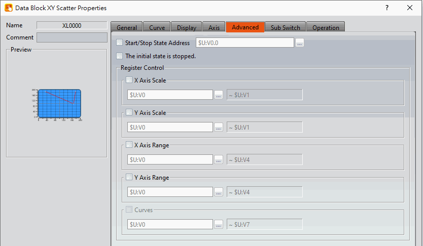
Figure 342【Advanced】Setting Screen of【Historic XY Scatter】
Table 209【Advanced】Setting Properties of【Historic XY Scatter】
|
Property |
Description |
|||||||||||||||||||||||||||||||||||||||||||||||||||||||||||||||||||||||||||||||||||||||||||||||||||||||||||||||||||||||||||||||||||||||||||||||||||||||||||
|
【Advanced】 |
【Start/Stop State Address】 Set such that the【Data Block Graph】will start/stop at the specified address. Only the display unit’s internal memory is supported. A value of 0 specifies the start state. A value of 1 specifies the stop state. 【The initial state is stopped】 Set the initial state of of the data to stop. |
|||||||||||||||||||||||||||||||||||||||||||||||||||||||||||||||||||||||||||||||||||||||||||||||||||||||||||||||||||||||||||||||||||||||||||||||||||||||||||
|
【Register Control】 |
【X Axis Scale】 X axis scale numbers can be specified by register, it will appear register setting below after checked, and will display the number of consecutive occupancy registers, this register is in 16 Bit-UINT format, table as below.
【Y Axis Scale】 Y axis scale numbers can be specified by register, it will appear register setting below after checked, and will display the number of consecutive occupancy registers, this register is in 16 Bit-UINT format, table as below.
【X Axis Range】 X axis range can be specified by register, it will appear register setting below after checked, and will display the number of consecutive occupancy registers, table as below.
Note: maximum value should bigger than minimum value. 【Y Axis Range】 Y axis range can be specified by register, it will appear register setting below after checked, and will display the number of consecutive occupancy registers, table as below.
Note: maximum value should bigger than minimum value. 【Curves】 If curve Y-axis display range use【individual】, check this option, each of the Y-axis curve can be specified by register, and will display the number of consecutive occupancy registers, table as below.
Note: maximum value should bigger than minimum value. |
19.4.25.6 【Sub Switch】
【Historic XY Scatter】【Sub Switch】setting paging as shown below, the meaning of each setting is as follows :
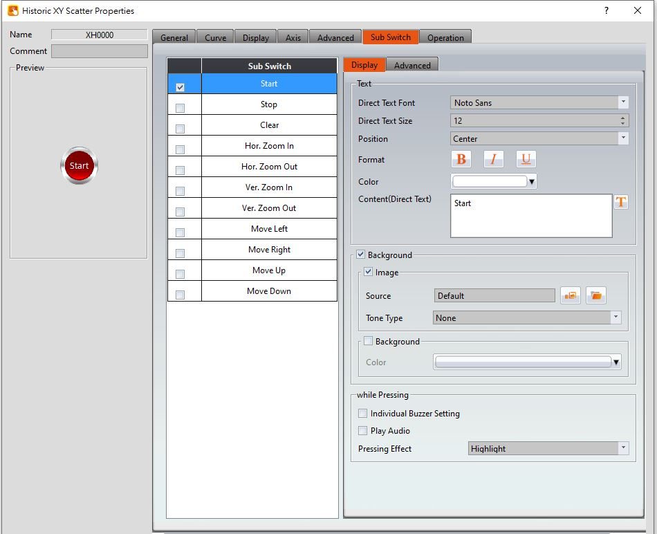
Figure 343【Sub Switch】Setting Screen of【Historic XY Scatter】
Table 210【Sub Switch】Setting Properties of【Historic XY Scatter】
|
Property |
Description |
|
【Sub Switch List】 |
【Sub Switch List】that can be selected for【Historic XY Scatter】. Sub switches can be enabled after selecting them. Settings for the appearance of the selected sub switches will also appear on the right. When different sub switches are selected from the list, the appearance settings to the right will be updated according to the sub switches selected. In which the【Sub Switches】are divided into:
|
|
【Display】【Text】 |
【Direct Text Font】 Set the text font of the sub switch currently selected. 【Direct Text Size】 Set the text size of the sub switch currently selected. 【Position】 Set the text position of the sub switch currently selected. 【Format】 Set the text format of the sub switch currently selected, including Bold, Italics and Underline. 【Color】 Set the text color of the sub switch currently selected. 【Content(Direct Text)】 Set the text of the sub switch currently selected. |
|
【Display】【Background】 |
Set the background of the sub switch currently selected. Check it to activate background settings, and the displayed background of the sub switch currently selected can be edited below. If this option is not checked, the background will be transparent. 【Use Image】 Set to use an image for the displayed background of the sub switch currently selected. When this option is checked, an image selection setting item will appear asking the user to select an image either from the【Image Library】or from a file. 【Background Color】 Set the displayed background color of the sub switch currently selected. This setting item will appear if【Use Image】was not selected. |
|
【Display】【while Pressing】 |
【Individual Buzzer Setting】 Can individually setup buzzer setting. Includes 5 modes: Off, Short, Long, Short-Short, Long-Short. 【Play Audio】 Select to play audio when the sub switch is pressed. An【Audio Selector】will appear on the right when enabled. The switch on the right of the【Audio Selector】can be pressed to select an audio and the switch on the left of the【Audio Selector】can be pressed to play the audio selected. 【Pressing Effect】 Set the pressing effect of the sub switch currently selected. There are two effects available for selection:【None】and【Highlight】. |
|
【Advanced】【Operation Control】 |
Operation control of sub switch, it can enabled by bit or security. 【Enable by Bit】 Check whether the sub switch operation is controlled by a bit 【Show Disabled Sign】 Check if you want to display the forbidden symbol, it’s valid when check【Enable by Bit】,【Enabled by Word】or【Enable by Security】. 【Address】 Set the address of the sub switch operation control bit. 【State】 Set the control bit as 1 or 0 to operate object. 【Enabled by Word】 Check whether the operation is controlled by word. 【Address】 Set the operation control word address. 【Condition】 Set the condition of word control and when it is true then the object can be controlled, when false not the object can not be controlled. The condition include’ =’,’ !=’, ‘>’, ‘<’, ‘>=’, ‘<=’. 【Enable by Security】 Select the sub switch whether controlled by user level. 【User Level Condition】 Set the level and condition of the object. 【Hold Time】 Check whether the operation is controlled by hold time. Hold time can be divided into two kinds:
【Operator Confirm】 Check whether show comfirmation message window after checking the operation. 【Max. Waiting Time】 When the confirmation message window is displayed, If the user does not reply within this time, the system will close the confirmation message window and cancel this operation |
19.4.26 【Historic Data Table】
【Historic Data Table】 is a table object used the read the Recording Buffer data of the【Data Log】. Its main functions are as follows:
- View the Recording Buffer data of the【Data Log】.
- Pause or start updating the data of the【Data Log】through the【Sub Switch】, and clear the displayed data.
19.4.26.1 【General】
【Historic Data Table】【General】setting paging as shown below, the meaning of each setting is as follows :
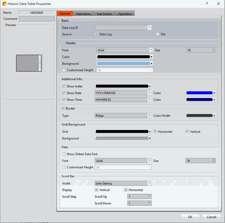
Figure 344【General】Setting Screen of【Historic Data Table】
Table 211【General】Setting Properties of【Historic Data Table】
|
Property |
Description |
|
【Preview】 |
Preview the appearance of this object. |
|
【Name】 |
The default name of the object. |
|
【Comment】 |
Set the comment of the object. |
|
【Basic】 |
【Data Log ID】 Set the ID of the Data Log group to display. 【Source】 Set the source from the【Data Log】 or【File】. 【Data Log】 Use【Data Log】as the source of the data. Refer to Chapter 7 -Data Log. 【File】 Display the CSV or TXT file exported by【Data Log】, or display the CSV or TXT file with the same format content as【Data Log ID】. After clicking the file, the corresponding address setting will appear at the back. This address will mainly Corresponding file order, for example, this address is set to R25, and there are 3 files under datalog\Group_1. At this time, R25 will correspond to the following values according to the order.
If one more file is added at this time, there are 4 files in total, and the corresponding values of R25 in this order will be as shown below.
So when R25 changes its content value, it also changes its displayed file. 【Continue Files】 Supports only for PC model, this mode will read the export files continuously from the folder so the users no need to import files all the time when viewing old files. 【Fresh data automatically】 Set under the【File】mode whether to automatically update the table display based on the stored data. 【Loaded File Name】 Show under the【File】mode,set an address which display the name of the file currently read by the data table. |
|
【Header】 |
Select to display the header. 【Font】 Set the font of the header. 【Size】 Set the size of the header. 【Color】 Set the color of the header. 【Background】 Set the background color of the header. |
|
【Additional Info.】 |
【Show Index】 Select to display the index, and set its display color. 【Show Date】 Select to display the date, and set its display color and format. 【Show Time】 Select to display the time, and set its display color and format. |
|
【Border】 |
Select to display the border. 【Type】 Set the border type. 【Color/Width】 Set the color and width of the border. |
|
【Grid/Background】 |
【Grid】 Set the color of the grid. 【Horizontal】 Select to display horizontal gridlines. 【Vertical】 Select to display vertical gridlines. 【Background】 Set the color of the background. |
|
【Data】 |
【Show Oldest Data First】 Set whether to display the oldest data in the top of the form, if unchecked then the oldest data will in the bottom of the form. 【Font】 Set the font of the data. 【Size】 Set the size of the data. 【Customize Height】 Users can customize the field height. |
|
【Scroll Bar】 |
【Width】 Adjust the right side scroll bar width, provides 5 widths. 【Display】 You can check whether to display the scroll bar. 【Scroll Step】 Set how many lines to switch at a time, use with sub switch. |
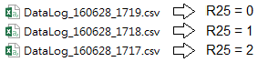
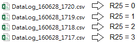
19.4.26.2 【Data Items】
【Historic Data Table】【Data Items】setting paging as shown below, the meaning of each setting is as follows :
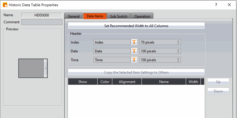
Figure 345【Data Items】Setting Screen of【Historic Data Table】
Table 212【Data Items】Setting Properties of【Historic Data Table】
|
Property |
Description |
|
【Set Recommended Width to All Columns】 |
When this button is pressed, the software calculates the required column width at the time of planning and sets its field width |
|
【Header】 |
【Index】 Edit the【Index】entry of the header text. The text can be entered directly or selected from the text library, the width of the entry can be adjusted by incrementing or decrementing the pixel count. 【Date】 Edit the【Date】entry of the header text. The text can be entered directly or selected from the text library, the width of the entry can be adjusted by incrementing or decrementing the pixel count. 【Time】 Edit the【Time】entry of the header text. The text can be entered directly or selected from the text library, the width of the entry can be adjusted by incrementing or decrementing the pixel count. |
|
【Data Items】 |
【Copy the Selected Item Settings to Others】 This button will be enabled when an entire row is selected. Users can use this button to copy the settings of the selected item into other items. This simplifies the setting process for the user. 【Up】 This button will be enabled when an entire row is selected; users can use this button to change the order of the item. 【Down】 This button will be enabled when an entire row is selected; users can use this button to change the order of the item. The items within the table are determined by the【Data Log】, in which the item settings include:
Set the visibility of this item.
The color of the item.
The alignment of the item.
This is used to view the names set by the【Data Log】and cannot be set. Please go to the settings page of the【Data Log】to change the name of the item.
Column width setting. |
19.4.26.3 【Sub Switch】
【Historic Data Table】【Sub Switch】setting paging as shown below, the meaning of each setting is as follows :
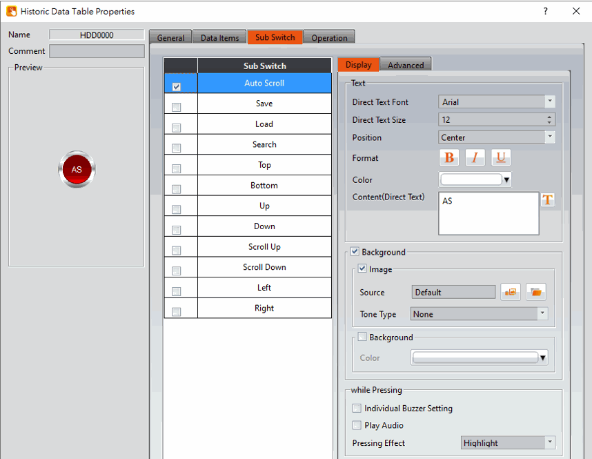
Figure 346【Sub Switch】Setting Screen of【Historic Data Table】
Table 213【Sub Switch】Setting Properties of【Historic Data Table】
|
Property |
Description |
|
【Auto Scroll】 |
Auto scroll on/off, this is invert switch. When new data is updated to the【Historical Data Table】, if auto-scroll is enabled, the table will automatically scroll to the latest data. Otherwise, the table will not scroll automatically. |
|
【Save】 |
Click to save all the data in the【Data Log】buffer, The storage format, destination, naming, etc. will depend on the settings of【Data Log】. |
|
【Load】 |
When【Source】is【File】, pressing this button will display the following dialog window. To allow the operator to choose which files in the【Historic Data Table】to display. These files can be from within the HMI, Micro SD card, or USB. |
|
【Search】 |
Allows the operator to search the data in【Historic Data Table】. Pressing this button will display following dialog windowand allows the operator to enter the date and time to search the data in the【Historic Data Table】. Note: When using the search, please note that the year is expressed as yy or yyyy. These are two different formats. If you choose the wrong one, you will not be able to search. |
|
【Top】 |
Display the list to the top. |
|
【Bottom】 |
Display the list to the bottom. |
|
【Up】 |
Move the list up one column. |
|
【Down】 |
Move the list down one column. |
|
【Scroll Up】 |
Scroll up n columns, n can be set in the【General】. |
|
【Scroll Down】 |
Scroll down n columns, n can be set in the【General】. |
|
【Left】 |
Move the list one column to the left. |
|
【Right】 |
Move the list one column to the right. |
|
【File Print】 |
It can be used when the mode is【File】. Print out all the data in the file. |
|
【Filter】 |
After enabling this option, you can select and display records from a specific time period. This feature is only available when the continuous file function is enabled. |
|
【Display】【Text】 |
【Direct Text Font】 Set the font of the sub switch currently selected. 【Direct Text Size】 Set the text size of the sub switch currently selected. 【Position】 Set the text position of the sub switch currently selected. 【Format】 Set the text format of the sub switch currently selected, including Bold, Italics and Underline. 【Color】 Set the text color of the sub switch currently selected. 【Content(Direct Text)】 Set the text of the sub switch currently selected. |
|
【Display】【Background】 |
Set the background of the sub switch currently selected. Check it to activate background settings, and the displayed background of the sub switch currently selected can be edited below. If this option is not checked, the background will be transparent. 【Use Image】 Set to use an image for the displayed background of the sub switch currently selected. When this option is checked, an image selection setting item will appear asking the user to select an image either from the【Image Library】or from a file. 【Background Color】 Set the background color of the sub switch currently selected. This setting will appear if【Use Image】was not selected. |
|
【Display】【while Pressing】 |
【Individual Buzzer Setting】 Can individually setup buzzer setting. Includes 5 modes: Off, Short, Long, Short-Short, Long-Short. 【Play Audio】 Select to play audio when the sub switch is pressed. An【Audio Selector】will appear on the right when enabled. The switch on the right of the【Audio Selector】can be pressed to select an audio and the switch on the left of the【Audio Selector】can be pressed to play the audio selected. 【Pressing Effect】 Set the pressing effect of the sub switch currently selected. There are two effects available for selection:【None】and【Highlight】. |
|
【Advanced】【Operation Control】 |
Operation control of sub switch, it can enabled by bit or security. 【Enable by Bit】 Check whether the sub switch operation is controlled by a bit 【Show Disabled Sign】 Check if you want to display the forbidden symbol, it’s valid when check【Enable by Bit】,【Enabled by Word】or【Enable by Security】. 【Address】 Set the address of the sub switch operation control bit. 【State】 Set the control bit as 1 or 0 to operate object. 【Enabled by Word】 Check whether the operation is controlled by word. 【Address】 Set the operation control word address. 【Condition】 Set the condition of word control and when it is true then the object can be controlled, when false not the object can not be controlled. The condition include’ =’,’ !=’, ‘>’, ‘<’, ‘>=’, ‘<=’. 【Enable by Security】 Select the sub switch whether controlled by user level. 【User Level Condition】 Set the level and condition of the object. 【Hold Time】 Check whether the operation is controlled by hold time. Hold time can be divided into two kinds:
【Operator Confirm】 Check whether show comfirmation message window after checking the operation. 【Max. Waiting Time】 When the confirmation message window is displayed, If the user does not reply within this time, the system will close the confirmation message window and cancel this operation |
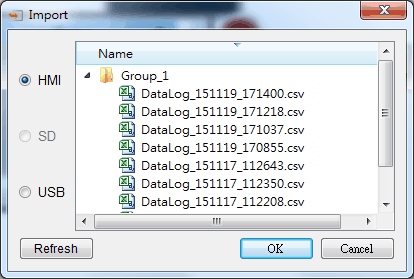
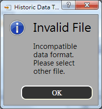
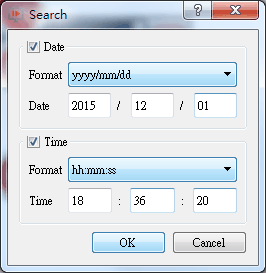
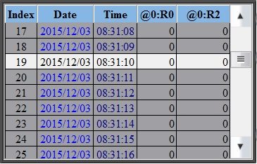
19.4.27 【Historic Data Selector】
The【Historic Data Selector】allows a user to select and view a【Data Log】that was exported into a CSV or TXT file. When the【Historic Data Selector】is accessed, a dropdown menu gives the user the files to view. Clicking on one of the files allows the user to view it.
19.4.27.1 【Setting】
【Historic Data Selector】【Setting】setting paging as shown below, the meaning of each setting is as follows :
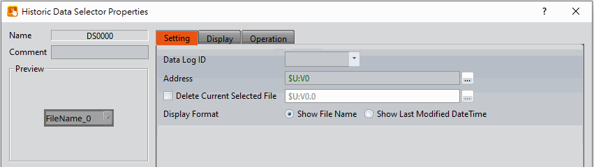
Figure 347【General】Setting Screen of【Historic Data Selector】
Table 214【General】Setting Properties of【Historic Data Selector】
|
Property |
Description |
|
【Preview】 |
Preview the appearance of this object. |
|
【Name】 |
The default name of the object. |
|
【Comment】 |
Set the comment of the object. |
|
【Basic】 |
【Data Log ID】 Set the ID of the Data Log group to display. 【Address】 Set up a register to control the displayed files. This address mainly corresponds to the order of the files. For example, this address is set to R25, and there are 3 files under datalog\Group_1. At this time, R25 will correspond to the values in the following order.
If one more file is added at this time, there are 4 files in total, and the corresponding values of R25 in this order will be as shown below.
【Display Format】 Press the selector than will display the corresponding file name of the【Data Log ID】, and the display format can be selected from【Show File Name】or【Show Last Modified Date Time】.
【Show Last Modified DateTime】 When the Data Selector is accessed, it will display the data collection date and time of the corresponding file.
【Show Date】 Set whether to display the date of the file and set the display format, select【Show Last Modified DateTime】, this option will appear. 【Show Time】 Set whether to display the file time and set the display format, select【Show Last Modified DateTime】, this option will appear. |
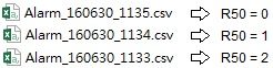
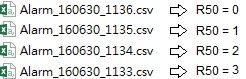
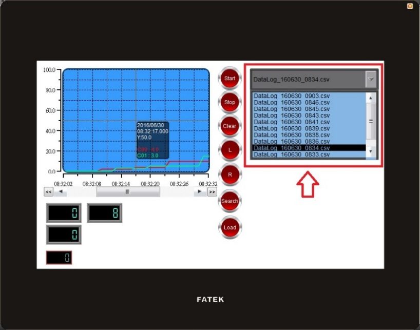
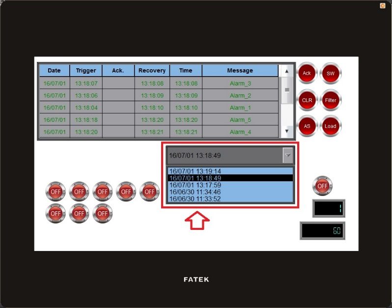
19.4.27.2 【Display】
【Historic Data Selector】【Display】setting paging as shown below, the meaning of each setting is as follows :
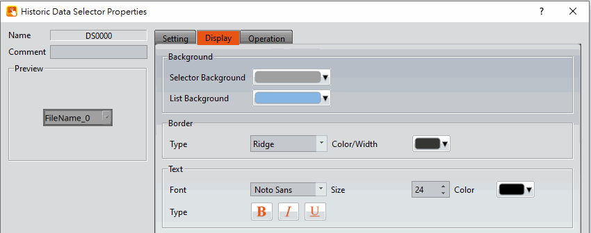
Figure 348【Display】Setting Screen of【Historic Data Selector】
Table 215【Display】Setting Properties of【Historic Data Selector】
|
Property |
Description |
|
【Background】 |
【Selector Background】 Set the color of the background. 【List Background】 Set the color of the list background |
|
【Border】 |
【Type】 Set the border type. 【Color/Width】 Set the color of the border. |
|
【Text】 |
【Font】 Set the font and size of cursor values. 【Size】 Set the size of the text. 【Color】 Set the color of the text. 【Type】 Set the format of the text. |
19.4.28 【Alarm Display】
【Alarm Display】is used to display the status of alarms that occurred during project execution. It can notify the operator of alarm related contents including alarm messages, levels occurrences, acknowledgement and recovery time etc.
19.4.28.1 【Setting】
The【Alarm Display】【Setting】page is as shown in the figure below, the meanings of each setting item are listed below:
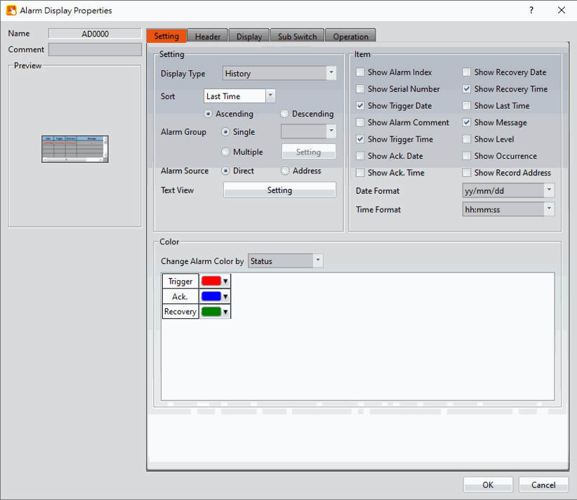
Figure 349【Setting】Screen of【Alarm Display】
Table 216【Setting】Properties of【Alarm Display】
|
Property |
Description |
|
【Preview】 |
Preview the appearance of this object. |
|
【Comment】 |
Set the comment of the object. |
|
【Name】 |
The default name of the object. |
|
【Setting】 |
【Display Type】 Set the display type of the Alarm Display. When【History】is selected, the Alarm Display will give a complete display of alarm related messages. When【Log】is selected, the Alarm Display will display the various changes of alarm state entry by entry. When【Active】is selected, the Alarm Display will only display alarms that have not yet recovered. When【Load CSV File】is selected, the Alarm Display will display the contents of the specified CSV file. When【Database】is selected, the Alarm Display will read the data when connecting to the database. When selecting the database, all groups will be displayed forcibly, and the sub switch【Filter】cannot be used. 【New Alarm on Top】 Set to place new alarms on the top of the table. If not selected, new alarms will be added to the bottom of the table. 【Sort】 Set the sorting of the alarm display, you can choose to sort by the last time or serial number. 【Alarm Group】 Set the displayed Alarm Group of the Alarm Display. If the【Direct】option is selected, the Alarm Display will only display the alarm groups set below. If the【Address】 option is selected, the alarm group displayed by Alarm Display will be determined by the numeric value of the address set below. 【Single】 Set the alarm display only display a alarm group. 【Multiple】 Set the alarm display can display multiple groups, you can select the group to be displayed at【Setting】, need to set the alarm group in the alarm function, click to select, If you set 2 alarm groups,click on the settings will appear as shown below 2 alarm groups to choose from.
【Alarm Source】 When【Direct】is selected, this display will be displayed according to the setting of【Alarm Group】. When selecting【Address】, the user can set an address, and the data type is 16 UINT. If the【Alarm Group】at this time selects【Single】, the displayed group can be switched through this address; If the【Alarm Group】at this time selects【Multiple】, enter 0 to display all groups, and enter a number to display a single group. 【Enable File Control】 If the【Display Type】is seleted as【Load CSV File】, this option will be available. If selected, the file control can be done using a register. The value in the register corresponds to the file order inside the specified path. New CSV files are added to the top of the path, i.e position 0.
【Enable File Control】(Load CSV File) Set the bit to control whether to enable the file. 【Refresh Data Automatically】(Load CSV File) Set under the【Load CSV file】mode whether to automatically update the table display based on the stored data. 【Loaded File Name】 Show under the【Load CSV file】mode,set an address which display the name of the file currently read by the data table. 【Text View】 Set the display position, size and function of the alarm text view. |
|
【Item】 |
Set the display contents of the Alarm Display. 【Show Alarm Index】 Set to allow Alarm Display to display the index of the Alarm. 【Show Serial Number】 Set to allow Alarm Display to display the alarm’s serial number. For all alarm groups, all automatically generated alarms have serial numbers that increment by 1 unless the serial number has been cleared. 【Show Trigger Date】 Set to allow Alarm Display to display the trigger date. 【Show Alarm Comment】 Set to allow Alarm Display to display the alarm comment. 【Show Trigger Time】 Set to allow Alarm Display to display the trigger time. 【Show Ack. Time】 Set to allow Alarm Display to display the alarm acknowledgement time. 【Show Recovery Time】 Set to allow Alarm Display to display the alarm recovery time. 【Show Last Time】 Set to allow Alarm Display to display the last alarm event, including trigger time, confirmation time, and recovery time. 【Show Message】 Set to allow Alarm Display to display the alarm message. 【Show Level】 Set to allow Alarm Display to display the alarm level. 【Show Record Address】 Set to allow Alarm Display to display the saved numeric value of the alarm record address. 【Show Occurrence】 Set to allow Alarm Display to display the alarm occurrences. 【Date Format】 This option will appear if【Show Trigger Date】is selected. It can be used to select the display format of the date for the Alarm Display. 【Time Format】 This option will appear if【Show Trigger Time】,【Show Ack. Time】or【Show Recovery Time】is selected. It can be used to select the display format of the time for the Alarm Display. |
|
【Color】 |
【Change Alarm Color by】 Set the condition for the displayed color change of the Alarm Display. When【Status】is selected, the Alarm Display will determine the display color according to the status of the alarm. When【Level】is selected, the Alarm Display will determine the display color according to the level of the alarm. When【Status + Level】is selected, the Alarm Display will determine the displayed color according to the status and level of the alarm. |
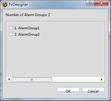
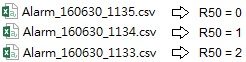
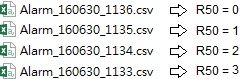
19.4.28.2 【Header】
The【Alarm Display】【Header】page is as shown in the figure below, the displayed headers of the Alarm Display can be modified in this page.
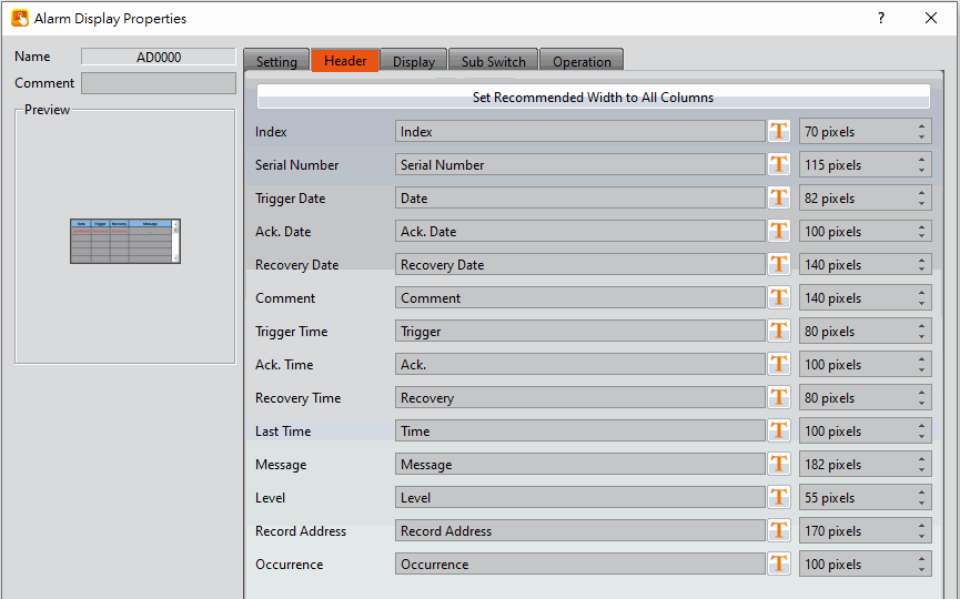
Figure 350【Display】Setting Screen of【Alarm Display】
Table 217【Header】Setting Properties of【Alarm Display】
|
Property |
Description |
|
【Set Recommended Width to All Columns】 |
When this button is pressed, the software calculates the required column width at the time of planning and sets its field width |
|
【Header】 |
Select the displayed text for the alarm display. The text can be entered directly or selected from the Text Library. 【Width】 Set the width of each column. |
19.4.28.3 【Display】
The【Alarm Display】【Display】page is as shown in the figure below, the meanings of each setting item are listed below:
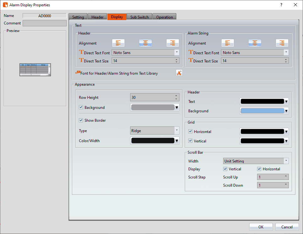
Figure 351【Display】Setting Screen of【Alarm Display】
Table 218【Display】Setting Properties of【Alarm Display】
|
Property |
Description |
|
【Text】 |
【Alignment】 Set the alignment of header or content. 【Direct Text Font】 Set the font of header or content. 【Direct Text Size】 Set the size of header or content. 【Font for Header/Alarm String from Text Library】 The font and size of the string can be set here. |
|
【Appearance】 |
【Row Height】 Set the row height of the Alarm Display. 【Background】 Set the background color of the Alarm Display. 【Show Border】 Set to display the border. When it is checked, the color, width and type of the border can be set. 【Type】 Set the border type of the Alarm Display. 【Color/Width】 Set the border color and thickness of the Alarm Display. |
|
【Header】 |
Set the header appearance of the Alarm Display. It includes【Text】to set the text color of the header and【Background】to set the background color of the header. |
|
【Grid】 |
Set to display the【Horizontal】and【Vertical】gridlines of the Alarm Display; if display is selected, the color of the gridlines can be set. |
|
【Scroll Bar】 |
【Width】 Adjust the right side scroll bar width, provides 5 widths. 【Display】 Check whether to display the slider. 【Scroll Step】 Set how many lines to switch at a time, use with sub-switch. |
19.4.28.4 【Sub Switch】
The【Alarm Display】【Sub Switch】page is as shown in the figure below, the meanings of each setting item are listed below:
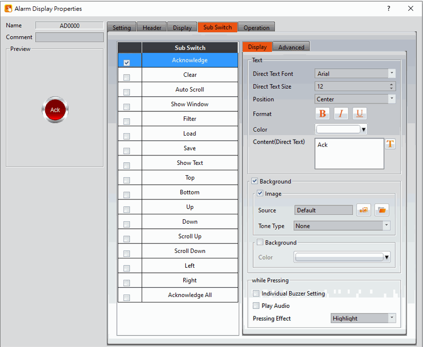
Figure 352【Sub Switch】Setting Screen of【Alarm Display】
Table 219【Sub Switch】Setting Properties of【Alarm Display】
|
Property |
Description |
|
【Acknowledge】 |
Change the status of the currently selected alarm to acknowledge. |
|
【Clear】 |
Clear all alarms displayed on Alarm Display. |
|
【Auto Scroll】 |
Set to enable the auto scroll function. If enabled, when a new alarm occurs, the Alarm Display will automatically scroll to the position of the newest alarm. |
|
【Show Window】 |
When this switch is pressed, the system will display the【Window Screen】that corresponds to the currently selected alarm in the【Alarm】setting. |
|
【Filter】 |
Apply a filter to the alarm time display in order to find the alert message. Filter options include trigger time, confirmation time, recovery and last time.
|
|
【Load】 |
When the display time for the alarm display is set to【CSV File】, pressing the sub switch loads the specified CSV file. The operator can select where the CSV file should be imported from: HMI internal memory, Micro SD card, or USB.
|
|
【Save】 |
Export the data on the display according to the export settings. If the filter is used, only the filtered data will be exported. |
|
【Show Text】 |
Please refer to【Show Text View】in chapter 0- 【Advanced Setting】 |
|
【Top】 |
Move the alarm list to the top. |
|
【Bottom】 |
Move the alarm list to the bottom. |
|
【Up】 |
Move the list up one column. |
|
【Down】 |
Move the list down one column. |
|
【Scoll Up】 |
Scroll up n columns, n can be set in the【Display】->【Scroll Step】. |
|
【Scroll Down】 |
Scroll down n columns, n can be set in the【Display】->【Scroll Step】【Scroll Step】. |
|
【Left】 |
Move the list one column to the left. |
|
【Right】 |
Move the list one column to the right. |
|
【Acknowledge All】 |
When multiple alarms are happening in the list, you can use this sub-switch to confirm all of them. |
|
【Display】【Text】 |
【Direct Text Font】 Set the text font of the sub switch currently selected. 【Direct Text Size】 Set the text size of the sub switch currently selected. 【Position】 Set the text position of the sub switch currently selected. 【Format】 Set the text format of the sub switch currently selected, including Bold, Italics and Underline. 【Color】 Set the text color of the sub switch currently selected. 【Content(Direct Text)】 Set the text of the sub switch currently selected. |
|
【Display】【Background】 |
Set the background of the sub switch currently selected. Check it to activate background settings, and the displayed background of the sub switch currently selected can be edited below. If this option is not checked, the background will be transparent. 【Use Image】 Set to use an image for the displayed background of the sub switch currently selected. When this option is checked, an image selection setting item will appear asking the user to select an image either from the【Image Library】or from a file. 【Background Color】 Set the background color of the sub switch currently selected. This setting will appear if 【Use Image】was not selected. |
|
【Display】【while Pressing】 |
【Individual Buzzer Setting】 Can individually setup buzzer setting. Includes 5 modes: Off, Short, Long, Short-Short, Long-Short. 【Play Audio】 Select to play audio when the sub switch is pressed. An【Audio Selector】will appear on the right when enabled. The switch on the right of the【Audio Selector】can be pressed to select an audio and the switch on the left of the【Audio Selector】can be pressed to play the audio selected. 【Pressing Effect】 Set the pressing effect of the sub switch currently selected. There are two effects available for selection:【None】and【Highlight】. |
|
【Advanced】【Operation Control】 |
Operation control of sub switch, it can enabled by bit or security. 【Enable by Bit】 Check whether the sub switch operation is controlled by a bit 【Show Disabled Sign】 Check if you want to display the forbidden symbol, it’s valid when check【Enable by Bit】,【Enabled by Word】or【Enable by Security】. 【Address】 Set the address of the sub switch operation control bit. 【State】 Set the control bit as 1 or 0 to operate object. 【Enabled by Word】 Check whether the operation is controlled by word. 【Address】 Set the operation control word address. 【Condition】 Set the condition of word control and when it is true then the object can be controlled, when false not the object can not be controlled. The condition include’ =’,’ !=’, ‘>’, ‘<’, ‘>=’, ‘<=’. 【Enable by Security】 Select the sub switch whether controlled by user level. 【User Level Condition】 Set the level and condition of the object. 【Hold Time】 Check whether the operation is controlled by hold time. Hold time can be divided into two kinds:
【Operator Confirm】 Check whether show comfirmation message window after checking the operation. 【Max. Waiting Time】 When the confirmation message window is displayed, If the user does not reply within this time, the system will close the confirmation message window and cancel this operation |
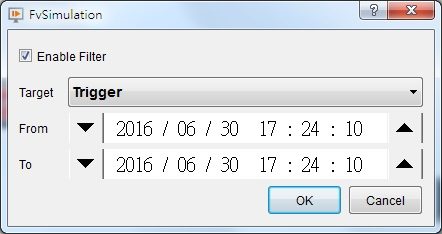
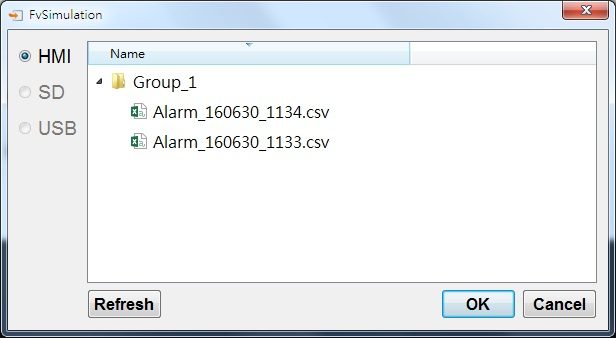
19.4.29 【Alarm Scrolling Text】
Alarm Scrolling Text is used to display alarm states that occurred during project execution. The difference between Alarm Display and Alarm Scrolling Text is that Alarm Scrolling Text uses scrolling text to display the contents of the alarm currently occurring, including alarm messages, level, occurrences, acknowledgement and recovery time etc.
19.4.29.1 【Setting】
The【Alarm Scrolling Text】【Setting】page is as shown in the figure below, the meanings of each setting item are listed below:
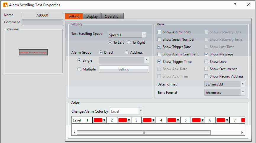
Figure 353【Setting】Screen of【Alarm Scrolling Text】
Table 220【Setting】Properties of【Alarm Scrolling Text】
|
Property |
Description |
|
【Preview】 |
Previews the appearance of this object. |
|
【Comment】 |
Set the comment of the object. |
|
【Name】 |
The default name of the object. |
|
【Setting】 |
【Text Scrolling Speed】 Set the scrolling speed of Alarm Scrolling Text. There are four speeds that can be set from slow to fast:【Speed 1】to【Speed 4】. Also can set the text movement direction【To Left】or 【To Right】. 【Alarm Group】 Set the Alarm Group of the Alarm Scrolling Text to display. If the【Direct】option is selected, the Alarm Scrolling Text will only display the alarm groups set below. If the【Address】option is selected, the alarm group displayed by Alarm Scrolling Text will be determined by the numeric value of the address set below. 【Single】 Set the alarm display only display a alarm group. 【Multiple】 Set the alarm display can display multiple groups, you can select the group to be displayed at【Setting】, need to set the alarm group in the alarm function, click to select, If you set 2 alarm groups,click on the settings will appear as shown below 2 alarm groups to choose from.
|
|
【Item】 |
Set the display contents of Alarm Scrolling Text. 【Show Alarm Index】 Set to allow the Alarm Display to display the index of the Alarm. 【Show Serial Number】 Set to allow Alarm Display to display the alarm’s serial number. For all alarm groups, all automatically generated alarms have serial numbers that increment by 1 unless the serial number has been cleared. 【Show Trigger Date】 Set to allow the Alarm Scrolling Text to display the trigger date. 【Show Alarm Comment】 Set to allow the Alarm Scrolling Text to display the alarm comment. 【Show Trigger Time】 Set to allow the Alarm Scrolling Text to display the trigger time. 【Show Message】 Set to allow the Alarm Scrolling Text to display the alarm message. 【Show Level】 Set to allow the Alarm Scrolling Text to display the alarm level. 【Show Record Address】 Set to allow the Alarm Scrolling Text to display the saved numeric value of the alarm record address. 【Show Occurrence】 Set to allow the Alarm Scrolling Text to display the alarm occurrences. 【Date Format】 This option will appear if【Show Trigger Date】is selected. It can be used to select the display format of the date for the Alarm Scrolling Text. 【Time Format】 This option will appear if【Show Trigger Time】is selected. It can be used to select the display format of the time for the Alarm Scrolling Text. |
|
【Color】 |
【Change Alarm Color by】 Set the condition for the displayed color change of the Alarm Scrolling Text. The Alarm Scrolling Text will determine the display color according to the level of the alarm. |
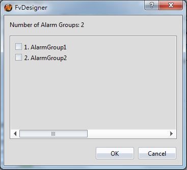
19.4.29.2 【Display】
The【Alarm Scrolling Text】【Display】page is as shown in the figure below, the meanings of each setting item are listed below:
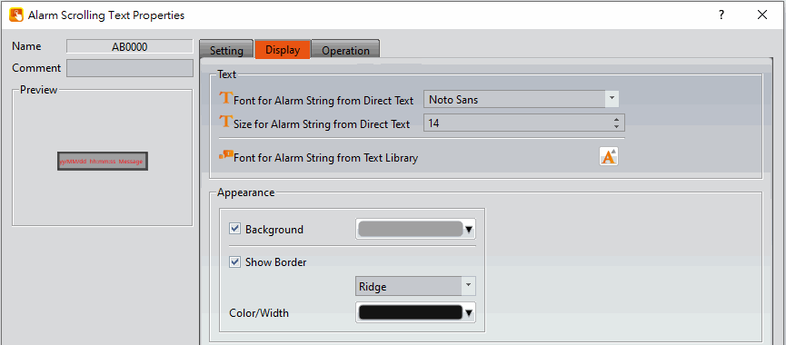
Figure 354【Display】Setting Screen of【Alarm Scrolling Text】
Table 221【Display】Setting Properties of【Alarm Scrolling Text】
|
Property |
Description |
|
【Text】 |
【Font for Alarm String from Direct Text】 The font of the alarm string can be set here. 【Size for Alarm String from Direct Text】 The size of the alarm string can be set here. 【Font for Alarm String from Text Library】 The font and size of the alarm string can be set here. |
|
【Appearance】 |
【Background】 Set the background color of the Alarm Scrolling Text. 【Show Border】 Set to display the border. When it is checked, the color, width and type of the border can be set at the bottom. 【Type】 Set the border type of the Alarm Scrolling Text. 【Color/Width】 Set the border color and border thickness of the Alarm Scrolling Text. |
19.4.30 【Alarm Data Selector】
The【Alarm Data Selector】allows a user to select and view an【Alarm】that was exported into a CSV file. When the【Alarm Data Selector】is accessed, a dropdown menu gives the user the files to view. Clicking on one of the files allows the user to view it.
19.4.30.1 【Setting】
【Alarm Data Selector】【Setting】setting paging as shown below, the meaning of each setting is as follows :
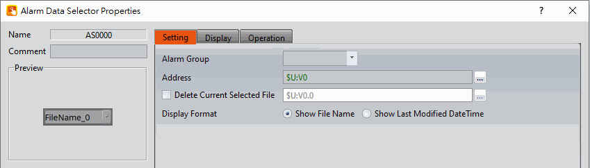
Figure 355【General】Setting Screen of【Alarm Data Selector】
Table 222【General】Setting Properties of【Alarm Data Table】
|
Property |
Description |
|
【Preview】 |
Preview the appearance of this object. |
|
【Comment】 |
Set the comment of the object. |
|
【Name】 |
The default name of the object. |
|
【Basic】 |
【Alarm Group】 Set the ID of the alarm group to display 【Address】 Select the register to control the visibility of a file. This address corresponds to the file path of alarms. The value stored in the register corresponds to the file number in the path, with the topmost file at position 0.
【Display Format】 Select how the alarm data files are displayed when the Alarm Data Selector is accessed. There are two options for【Display Format】:【Show File Name】and【Show Last Modified DateTime】. 【Show File Name】 When the Alarm Data Selector is accessed, it will display the file names.
【Show Last Modified DateTime】 When the Alarm Data Selector is accessed, it will display the data collection date and time of the corresponding file.
【Show Date】 Select to show the dates of the files when the Alarm Data Selector is accessed. The format of the date can be set. 【Show Time】 Select to show the times of the files when Alarm Data Selector is accessed. The fomat of the time can be set. |
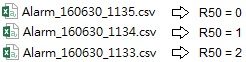
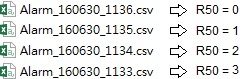
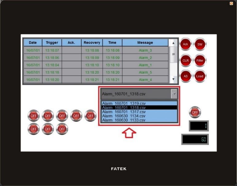
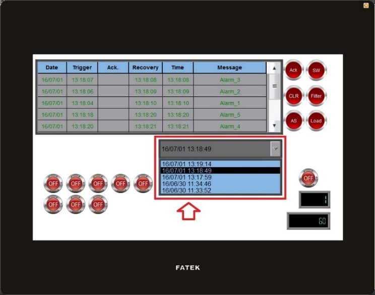
19.4.30.2 【Display】
【Alarm Data Selector】【Display】setting paging as shown below, the meaning of each setting is as follows :
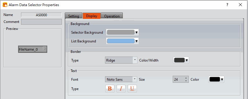
Figure 356【Display】Setting Screen of【Alarm Data Selector】
Table 223【Display】Setting Properties of【Alarm Data Table】
|
Property |
Description |
|
【Background】 |
【Selector Background】 Set the color of the background. 【List Background】 Set the color of the list background |
|
【Border】 |
【Type】 Set the border type. 【Color/Width】 Set the color of the border. |
|
【Text】 |
【Font】 Set the font and size of cursor values. 【Size】 Set the size of the text. 【Color】 Set the color of the text. 【Type】 Set the format of the text. |
19.4.31 【Recipe Selector】
【Recipe Selector】allows user to select a specific recipe in a recipe group during execution. Please refer to Chapter 9–Recipe for functions related to recipes.
19.4.31.1 【General】
【Recipe Selector】【General】setting paging as shown below, the meaning of each setting is as follows :
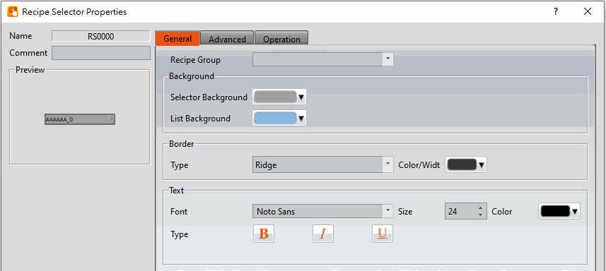
Figure 357【General】Setting Page of【Recipe Selector】
Table 224【General】Setting Properties of【Recipe Selector】
|
Property |
Description |
|
【Comment】 |
Set the comment of the object. |
|
【Name】 |
The default name of the object. |
|
【Preview】 |
Preview the appearance of this object. |
|
【Recipe Group】 |
If the user adds a new recipe group in the recipe setting function, the ID and name of the recipe group will be displayed here. The user must select a recipe group before the【OK】button is pressed. |
|
【Background】 |
【Selector Background】 Set the background color of the selector. 【List Background】 Set the background color of the drop-down list. |
|
【Border】 |
【Type】 Set the border type. 【Color/Width】 Set the border color and width. |
|
【Text】 |
【Font】 Set the text font. 【Size】 Set the text font size. 【Color】 Set the text color. 【Type】 Set the format of the text. |
19.4.31.2 【Advanced】
【Recipe Selector】【Advanced】setting paging as shown below, the meaning of each setting is as follows :
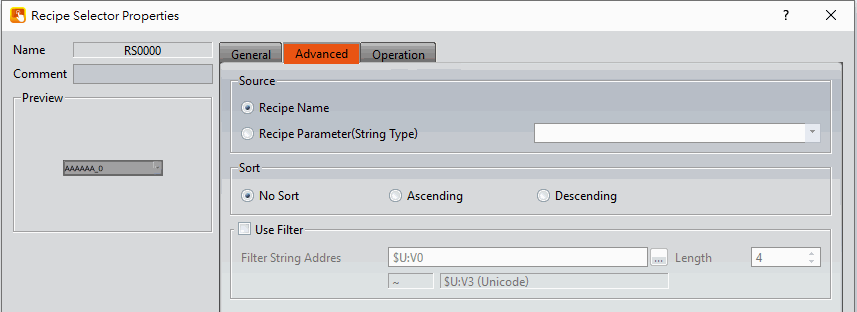
Figure 358【Advanced】Setting Page of【Recipe Selector】
Table 225【General】Setting Properties of【Recipe Selector】
|
Property |
Description |
|
【Source】 |
Set the source of recipe selector. 【Recipe Name】 Default value, use the recipe name as the data of recipe selector. 【Recipe Parameter(ASCII Type)】 When there is an ASCII String type in the recipe parameter |
|
【Sort】 |
Set whether the recipe selector data is sorted by text. 【No Sort】 Default value, The recipe selector data is not sorted and displayed in the original order. 【Ascending】 The recipe selector data is sorted in positive order. 【Descending】 The recipe selector data is sorted in reverse order. |
|
【Use Filter】 |
Is to use the filter in dynamic mode, by specifying the value or text of【Filter String Address】, filter the options required in the recipe selector, for example, 【Filter String Address】=50, and R50=A, then the recipe selector only displays the recipe group name with the "A" text. 【Use Filter】 Set whether to enable filtering. 【Filter String Address】 Set the text address used for dynamic filtering, and the length of the text. |
19.4.32 【Recipe Table】
【Recipe Table】is used to read recipe group data set in the【Recipe】function. Users can also dynamically change the data in the recipe table during execution. Please refer to Chapter 9–Recipe for functions related to recipes. Recipe Table has the following functions:
- To view the complete data of recipe group select【Show All】or select 【Only Show Current Recipe】to show current recipe.
- Use the【Sub Switch】to load or save the recipe group file.
19.4.32.1 【General】
【Recipe Table】【General】setting paging as shown below, the meaning of each setting is as follows :
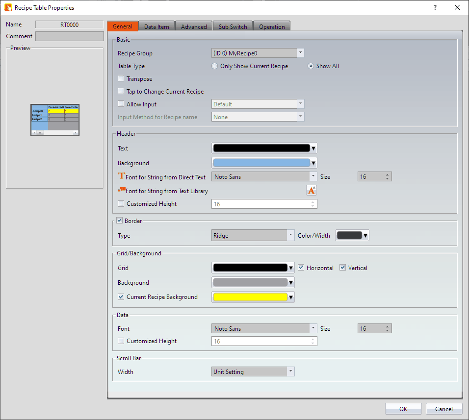
Figure 359【General】Setting Page of【Recipe Table】
Table 226【General】Setting Properties of【Recipe Table】
|
Property |
Description |
|
【Comment】 |
Set the comment of the object. |
|
【Preview】 |
Preview the appearance of this object. |
|
【Name】 |
The default name of the object. |
|
【Basic】 |
【Recipe Group】 If the user adds a new recipe group in the recipe setting function, the ID and name of the recipe group will be displayed here. The user must select a recipe group before the【OK】button is pressed. 【Table Type】 If【Only Show Current Recipe】is selected, the current recipe will be displayed according to the【Control Address of Recipe No.】in the recipe setting. If【Show All】is selected, all contents of the recipe group will be displayed. 【Transpose】 Reverse the rows and columns. For example, row 1 in the original table becomes column 1 in the transposed table.
【Tap to Change Current Recipe】 Users can change the current recipe group by clicking on during the execution period,【Control Address of Recipe No.】will also change. 【Allow Input】 The user will be able to dynamically change the parameters and the recipe names in the recipe table during execution if this option is selected. 【Input Method for Recipe name】 Select the input method for recipe name, inculde【None】and【Pinyin(Simplified Chinese)】two ways. 【None】 If【Input Method for Recipe name】select as【None】will show up the figure as below, provide user to modify or input recipe name through the following keypad.
【Pinyin(Simplified Chinese)】 If【Input Method for Recipe name】select as【Pinyin(Simplified Chinese)】will show up the figure as below, provide user to modify or input recipe name through the following keypad, switch to English or Pinyin.
|
|
【Header】 |
【Font Color】 Set the header font color. 【Background】 Set the header background color. 【Font for String from Direct Text】 Set the header font. 【Size】 Set the header font size. 【Font for String from the Text Library】 when the text is from library, can set the font and size. 【Customized Height】 User can customized the height of the header field. |
|
【Border】 |
【Type】 Set the border type. 【Color/Width】 Set the border color and width. |
|
【Grid/Background】 |
【Grid】 Set the line color of the grid. 【Horizontal】 Select to display the horizontal grid lines. 【Vertical】 Select to display the vertical grid lines. 【Background】 Set the background color. 【Current Recipe Background】 Set the background color for the currently selected recipe group. |
|
【Data】 |
【Font】 Set the data font. 【Size】 Set the data font size. 【Customized Height】 User can customized the height of the data field. |
|
【Scroll Bar】 |
【Width】 Adjust the right side scroll bar width, provides 5 widths. |
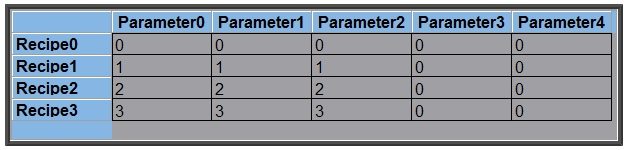
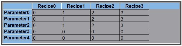
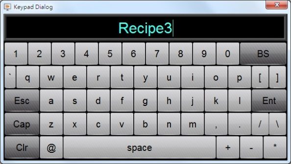
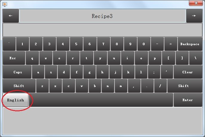
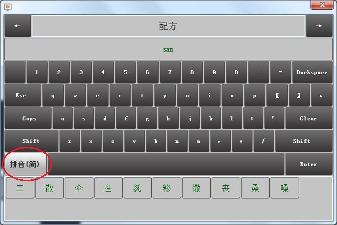
19.4.32.2 【Data Item】
【Recipe Table】【Data Item】setting paging as shown below, the meaning of each setting is as follows :
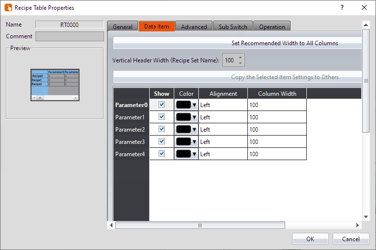
Figure 360【Data Item】Setting Page of【Recipe Table】
Table 227【Data Item】Setting Properties of【Recipe Table】
|
Property |
Description |
|
【Set Recommended Width to All Columns】 |
When this button is pressed, the software calculates the required column width at the time of planning and sets its field width. |
|
【Vertical Header Width (Recipe Parameter Name)】 |
Set the column width of【Recipe Table】header. 【Column Width】 Set the column width of【Recipe Table】field, in addition to the left field, this【Transpose】option needs to be checked. |
|
【Copy Width(Recipe Set Name)】 |
Select a parameter name from below, and then click this button to change the settings of other items to the same as the settings of the item selected. |
|
【Show】 |
Use the checkbox to set whether to display this recipe. |
|
【Color】 |
Set color of the parameter data. |
|
【Alignment】 |
Determine the alignment of the parameter data. |
|
【Column width】 |
Set the column width of recipe parameter. |
19.4.32.3 【Advanced】
【Recipe Table】【Advanced】setting paging as shown below, the meaning of each setting is as follows :
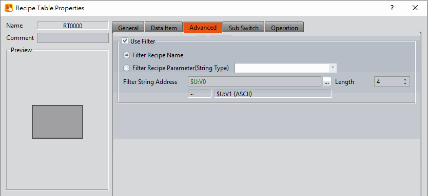
Figure 361【Advanced】Setting Page of【Recipe Table】
Table 228【Advanced】Setting Properties of【Recipe Table】
|
Property |
Description |
|
【Use Filter】 |
Check whether to enable this filter function or not. |
|
【Filter Recipe Name】 |
Display the recipe group that is filter by recipe name.
|
|
【Filter Recipe Parameter(String Type)】 |
Display the recipe group that is filter by recipe parameters.
|
|
【Filter String Address】 |
Set the address for filtering the string. |
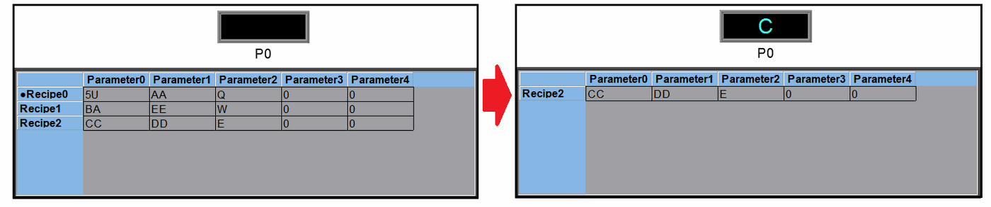
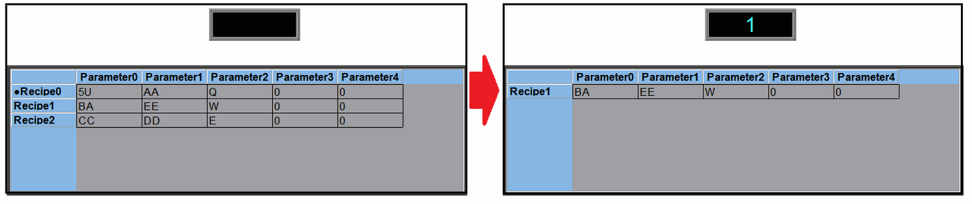
19.4.32.4 【Sub Switch】
【Recipe Table】【Sub Switch】setting paging as shown below, the meaning of each setting is as follows :
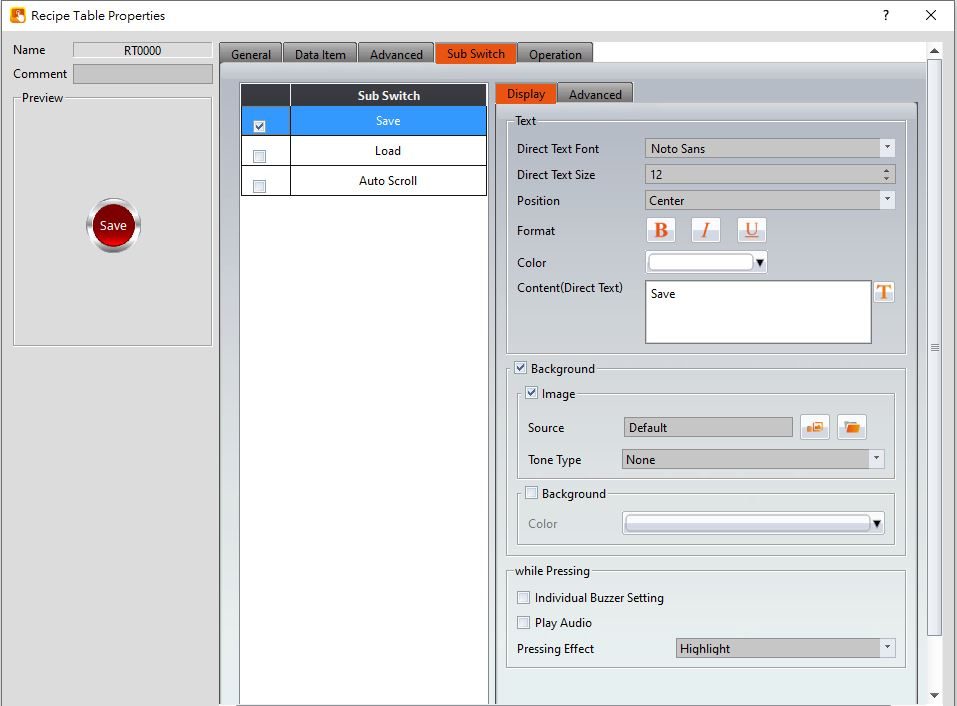
Figure 362【Sub Switch】Setting Page of【Recipe Table】
Table 229【Sub Switch】Setting Properties of【Recipe Table】
|
Property |
Description |
|
【Sub Switch List】 |
If the【Save】or【Load】button is selected from the table, corresponding buttons will also appear at the top-right side of the recipe table in the workspace after pressing the【OK】button. 【Save】 If the user presses this button during execution, the current parameter contents of the【Recipe Table】will be saved to the recipe group file configured in the recipe setting. 【Load】 If the user presses this button during execution, the contents of the recipe group file configured in the recipe setting will be loaded into the【Recipe Table】. 【Auto Scroll】 When the【Control Address of Recipe No.】has changed, the recipe table will jump to the corresponding recipe. |
|
【Display】【Text】 |
【Direct Text Font】 Set the text font of the sub switch currently selected. 【Direct Text Size】 Set the text size of the sub switch currently selected. 【Position】 Set the text position of the sub switch currently selected. 【Format】 Set the text format of the sub switch currently selected, including Bold, Italics and Underline. 【Color】 Set the text color of the sub switch currently selected. 【Content(Direct Text)】 Set the text of the sub switch currently selected. |
|
【Display】【Background】 |
Set the background of the sub switch currently selected. Check it to activate background settings, and the displayed background of the sub switch currently selected can be edited below. If this option is not checked, the background will be transparent. 【Use Image】 Set to use an image for the displayed background of the sub switch currently selected. When this option is checked, an image selection setting item will appear asking the user to select an image either from the【Image Library】or from a file. 【Background Color】 Set the background color of the sub switch currently selected. This setting will appear if【Use Image】was not selected. |
|
【Display】【While Pressing】 |
【Individual Buzzer Setting】 Can individually setup buzzer setting. Includes 5 modes: Off, Short, Long, Short-Short, Long-Short. 【Play Audio】 Select to play audio when the sub switch is pressed. An【Audio Selector】will appear on the right when enabled. The switch on the right of the【Audio Selector】can be pressed to select an audio and the switch on the left of the【Audio Selector】can be pressed to play the audio selected. 【Pressing Effect】 Set the pressing effect of the sub switch currently selected. There are two effects available for selection:【None】and【Highlight】. |
|
【Advanced】【Operation Control】 |
Operation control of sub switch, it can enabled by bit or security. 【Enable by Bit】 Check whether the sub switch operation is controlled by a bit 【Show Disabled Sign】 Check if you want to display the forbidden symbol, it’s valid when check【Enable by Bit】,【Enabled by Word】or【Enable by Security】. 【Address】 Set the address of the sub switch operation control bit. 【State】 Set the control bit as 1 or 0 to operate object. 【Enabled by Word】 Check whether the operation is controlled by word. 【Address】 Set the operation control word address. 【Condition】 Set the condition of word control and when it is true then the object can be controlled, when false not the object can not be controlled. The condition include’ =’,’ !=’, ‘>’, ‘<’, ‘>=’, ‘<=’. 【Enable by Security】 Select the sub switch whether controlled by user level. 【User Level Condition】 Set the level and condition of the object. 【Hold Time】 Check whether the operation is controlled by hold time. Hold time can be divided into two kinds:
【Operator Confirm】 Check whether show comfirmation message window after checking the operation. 【Max. Waiting Time】 When the confirmation message window is displayed, If the user does not reply within this time, the system will close the confirmation message window and cancel this operation |
19.4.33 【Operation Viewer】
【Operation Viewer】is an object used to read the Recording Buffer data of the【Operation Log】. Its main functions are as follows:
- View the Recording Buffer data of the【Operation Log】.
- Data filter function, which displays items that the user is only interested in.
- Pause or start updating the data of the Recording Buffer through the【Sub Switch】, and clear or save the data in the Recording Buffer.
19.4.33.1 【General】
【Operation Viewer】【General】setting paging as shown below, the meaning of each setting is as follows :
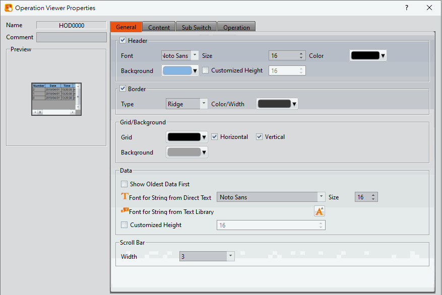
Figure 363【General】Setting Screen of【Operation Viewer】
Table 230【General】Setting Properties of【Operation Viewer】
|
Property |
Description |
|
【Preview】 |
Preview the appearance of this object. |
|
【Name】 |
The default name of the object. |
|
【Comment】 |
Set the comment of the object. |
|
【Header】 |
Select to display the header. 【Font】 Set the font of the header. 【Size】 Set the size of the header. 【Color】 Set the color of the header. 【Background】 Set the background color of the header. 【Customized Height】 User can customized the height of the header field. |
|
【Border】 |
Select to display the border. 【Type】 Set the border type. 【Color/Width】 Set the color and width of the border. |
|
【Grid/Background】 |
【Grid】 Set the color of the grid. 【Horizontal】 Select to display horizontal gridlines. 【Vertical】 Select to display vertical gridlines. 【Background】 Set the color of the background. |
|
【Data】 |
【Show Oldest Data First】 Set whether to display the oldest data in the top of the form, if unchech then the oldest data will in the bottom of the form. 【Font for String from Direct Text】 The font of the string can be set here. 【Size】 Set the font size for the direct text. 【Font for String from Text Library】 The font and size of the string can be set here. 【Customized Height】 User can customized the height of the data field. |
|
【Scroll Bar】 |
【Width】 Adjust the right side scroll bar width, provides 5 widths. |
19.4.33.2 【Content】
【Operation Viewer】【Content】setting paging as shown below, the meaning of each setting is as follows :
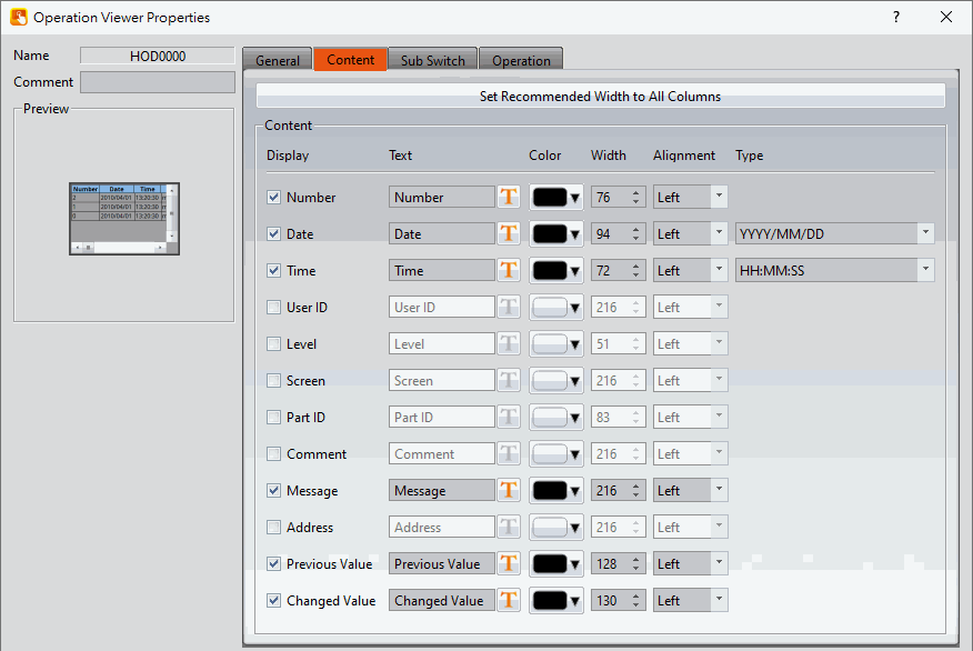
Figure 364【Content】Setting Screen of【Operation Viewer】
Table 231【Content】Setting Properties of【Operation Viewer】
|
Property |
Description |
|
【Set Recommended Width to All Columns】 |
When this button is pressed, the software calculates the required column width at the time of planning and sets its field width. |
|
【Content】 |
Every Operation Log data entry includes information; users can choose to display the items they are interested in. The following are the descriptions of each item:
Operation Log serial number.
Operation Log date. Can select the format of the date in the right.
Operation Log time. Can select the format of the time in the right.
The current user name; when【Security Manager】->【Mode】is【Level】, no information will be recorded in this field. When【Mode】is【User】, the current signer will display, however, if the security level is forced to change by address(【Security Level】address of【Project Explorer】-> 【Unit Setting】-> 【Control Address】), the user ID will be displayed as "?" Until the next normal login, this field will show the current login.
The level of the current user.
The screen the operating object is located.
The ID of the operating object.
The comment of the operating object.
The message of the operating object.
The access address of the operating object.
The previous value of the access address content for the operating object.
The current value of the changed access address content for the operating object. The setting of the items can be divided into:
Set the visibility of this item.
Set the display text for the header. The text can be entered directly or selected from the text library.
The color of this item.
The column width of this item.
The alignment method of this item.
This setting is only available for【Date】 and【Time】. It sets the display format. |
19.4.33.3 【Sub Switch】
【Operation Viewer】【Sub Switch】setting paging as shown below, the meaning of each setting is as follows :
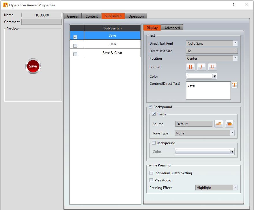
Figure 365【Sub Switch】Setting Screen of【Operation Viewer】
Table 232【Sub Switch】Setting Properties of【Operation Viewer】
|
Property |
Description |
|
【Sub Switch List】 |
【Sub Switch List】that can be selected for【Operation Viewer】. Sub switches can be enabled after selecting them. Settings for the appearance of the selected sub switches will also appear on the right. When different sub switches are selected from the list, the setting contents of the appearance setting items to the right will be updated according to the sub switches selected. In which the【Sub Switches】are divided into:
|
|
【Display】【Text】 |
【Direct Text Font】 Set the text font of the sub switch currently selected. 【Direct Text Size】 Set the text size of the sub switch currently selected. 【Position】 Set the text position of the sub switch currently selected. 【Format】 Set the text format of the sub switch currently selected, including Bold, Italics and Underline. 【Color】 Set the text color of the sub switch currently selected. 【Content(Direct Text)】 Set the text of the sub switch currently selected, the text can be entered directly or selected from the【Text Library】. |
|
【Display】【Background】 |
Set the background of the sub switch currently selected. Check it to activate background settings, and the displayed background of the sub switch currently selected can be edited below. If this option is not checked, the background will be transparent. 【Use Image】 Set to use an image for the displayed background of the sub switch currently selected. When this option is checked, an image selection setting item will appear asking the user to select an image either from the【Image Library】or from a file. 【Background Color】 Set the background color of the sub switch currently selected. This setting will appear if 【Use Image】was not selected. |
|
【Display】【while Pressing】 |
【Individual Buzzer Setting】 Can individually setup buzzer setting. Includes 5 modes: Off, Short, Long, Short-Short, Long-Short. 【Play Audio】 Select to play audio when the sub switch is pressed. An【Audio Selector】will appear on the right when enabled. The switch on the right of the【Audio Selector】can be pressed to select an audio and the switch on the left of the【Audio Selector】can be pressed to play the audio selected. 【Pressing Effect】 Set the pressing effect of the sub switch currently selected. There are two effects available for selection:【None】and【Highlight】. |
|
【Advanced】【Operation Control】 |
Operation control of sub switch, it can enabled by bit or security. 【Enable by Bit】 Check whether the sub switch operation is controlled by a bit 【Address】 Set the address of the sub switch operation control bit. 【State】 Set the control bit as 1 or 0 to operate object. 【Enabled by Word】 Check whether the operation is controlled by word. 【Address】 Set the operation control word address. 【Condition】 Set the condition of word control and when it is true then the object can be controlled, when false not the object can not be controlled. The condition include’ =’,’ !=’, ‘>’, ‘<’, ‘>=’, ‘<=’. 【Enable by Security】 Select the sub switch whether controlled by user level. 【User Level Condition】 Set the level and condition of the object. 【Show Disabled Sign】 Check if you want to display the forbidden symbol, it’s valid when check【Enable by Bit】,【Enabled by Word】 or【Enable by Security】. 【Hold Time】 Check whether the operation is controlled by hold time. Hold time can be divided into two kinds:
【Operator Confirm】 Check whether show comfirmation message window after checking the operation. 【Max. Waiting Time】 When the confirmation message window is displayed, If the user does not reply within this time, the system will close the confirmation message window and cancel this operation |
19.4.34 【Schedule Setting Table】
【Schedule Setting Table】is the object that used to read【Schedule】of【Function】inside the【Project Exploer】, so need to plan the【Schedule】function first. In addition to its main function can show the start time of the schedule, the end time, the start date, etc., allows designers to quickly design, but also provides HMI operation to dynamically change the start time and end time of each schedule
19.4.34.1 【General】
【Schedule Setting Table】【General】setting paging as shown below, the meaning of each setting is as follows :
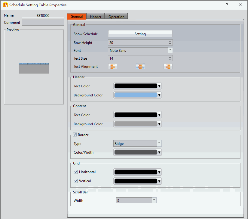
Figure 366【Schedule Setting Table】【General】setting paging
Table 233【Schedule Setting Table】【General】property setting
|
Property |
Description |
|
【Preview】 |
Preview the appearance of this object. |
|
【Name】 |
The default name of the object. |
|
【Comment】 |
Set the comment of the object. |
|
【General】 |
【Show Schedule】 click【Setting】on the right, able to select scheduled schedule group number in the【Schedule】function. 【Row Height】 Set each of the row height in the table. 【Font】 Set the font of the text in the table. 【Text Size】 Set the text size in the table. 【Text Alignment】 Set the alignment of the text in the table, including left, center, right and so on。 |
|
【Header】 |
【Text Color】 Set the text color of the header. 【Background Color】 Set the background color. |
|
【Content】 |
【Text Color】 Set the text color of the content. 【Background Color】 Set the background color. |
|
【Border】 |
【Type】 Set border type. 【Color/Width】 Set the color and width of the border. |
|
【Grid】 |
【Horizontal】 Check whether you want to display the horizontal and set the horizontal color. 【Vertical】 Check whether you want to display the vertical and set the vertical color |
|
【Scroll Bar】 |
【Width】 Adjust the right side scroll bar width, provides 5 widths. |
19.4.34.2 【Header】
【Schedule Setting Table】【Header】setting paging as shown below, the meaning of each setting is as follows :
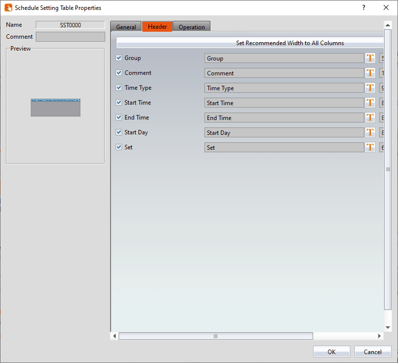
Figure 367【Schedule Setting Table】【Header】setting paging
Table 234【Schedule Setting Table】【Header】property setting
|
Property |
Description |
|
【Set Recommended Width to All Columns】 |
When this button is pressed, the software calculates the required column width at the time of planning and sets its field width. |
|
【Content】 |
Each of the schedule includes multiple information, the user can select the item using the checklist and can change the title display text on the right, the following is a description of each item:
The group serial number of the schedule.
Comment of the schedule.
The type of the schedule is a constant or an address.
Start time of the schedule.
End time of the schedule.
Start day of the schedule.
Press to modify the start and end times of each schedule. |
19.4.35 【Video Input Display】
【Video Input Display】can be used to display the video of the camera that connected to the HMI USB port, for the setting of USB camera image parameters, please refer to Chapter3.3.3- Video Input .
19.4.35.1 【Setting】
【Video Input Display】【Setting】setting paging as shown below, the meaning of each setting is as follows :
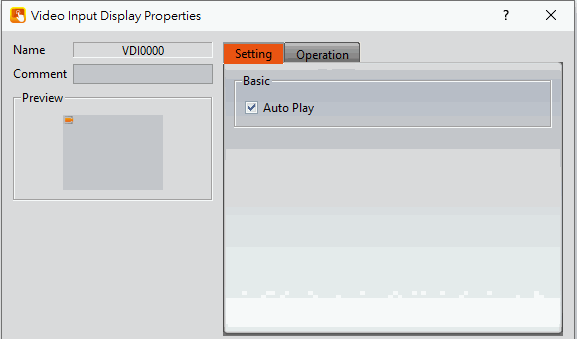
Figure 368【Video Input Display】【Setting】setting paging
Table 235【Video Input Display】【Setting】setting property
|
Property |
Description |
|
【Preview】 |
Preview the appearance of this object. |
|
【Name】 |
The default name of the object. |
|
【Comment】 |
Set the comment of the object. |
|
【Basic】 |
【Auto Play】 Set wether to auto play when swith to this page when the camera was not started yet. |
19.4.36 【IP Camera Player】
Usage Notes:
- When the player is in playback mode, the Screen Saver will be disabled and will only be re-enabled after playback stops.
- If Visibility Control is enabled, when the object is hidden, the stream will stop and the pre-recorded buffer will be cleared. When the object becomes visible again, the stream will enter playback mode if Auto Play is enabled.
19.4.36.1 【General】
This section only introduces the Player configuration properties. For camera configuration, please refer to the relevant camera settings section3.3.3.2-IP Camera
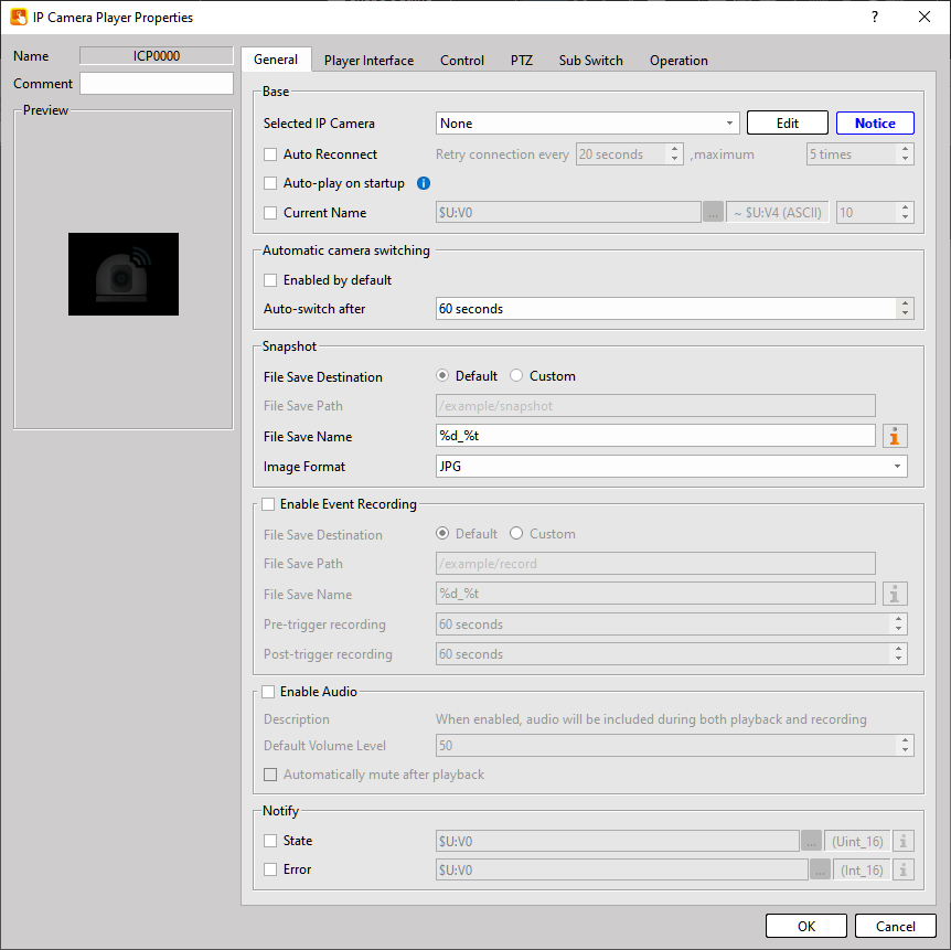
Figure 369【IP Camera Player】【General】setting paging
Table 236【IP Camera Player】【General】property setting
|
Property |
Description |
|
【Basic】 |
【Selected IP Camera】Click the Edit button on the right to open the selector window where one or more cameras can be selected. 【Auto Reconnect】When enabled, if the network camera fails to play normally, the system will automatically attempt to reconnect. Interval : Default 20 seconds, range 10–600 seconds Attempts : Default 5 times, range 1–999 times 【Auto -play on startup】When enabled, playback will start automatically when the object is initialized or changes from hidden to visible. Hover the mouse over the exclamation icon for additional information. 【Current Name】Displays the name of the currently playing network camera using the configured register. 【Notice】Supported streaming formats are as follows. Please verify that the network camera’s stream settings comply:
|
|
【Automatic camera switching】 |
【Rotation Interval】 Range: 10–86400 seconds |
|
【Snapshot】 |
【File Save Destination】
【File Save Path】When 【Custom】,【USB】, or【SD】 is selected, the path can be edited. 【File Save Name】Defines the file name for saving screenshots. Variables can be used. Variables available: %i : Index number (starts from 1, automatically increments based on files in the directory) %N : Camera name defined in the Network Camera Page %d : Date (format: yyyymmdd) %t : Time (format: hhMMss) 【Image Format】Selectable formats: JPG or PNG |
|
【Enable Event Recording】 |
【File Save Destination】
【File Save Path】When 【Custom】,【USB】, or【SD】 is selected, the path can be edited. 【File Save Name】Defines the file name for saving screenshots. Variables can be used. Variables available: %i : Index number (starts from 1, automatically increments based on files in the directory) %N : Camera name defined in the Network Camera Page %d : Date (format: yyyymmdd) %t : Time (format: hhMMss) 【Pre-trigger recording/Post-trigger recording】 Example: 11:59:31 → 12:00:30 Total video length: 1 minute |
|
【Enable Audio】 |
【Enable Audio】If disabled, playback and recording will not include sound. 【Default Volume Level】 Range 0–100 【Automatically mute after playback】When enabled, the volume will automatically be set to 0 when playback starts. |
|
【Notify】 |
【State】Displays the current player status. 【Error】Displays the player error code. |
19.4.36.2 【Player Interface】
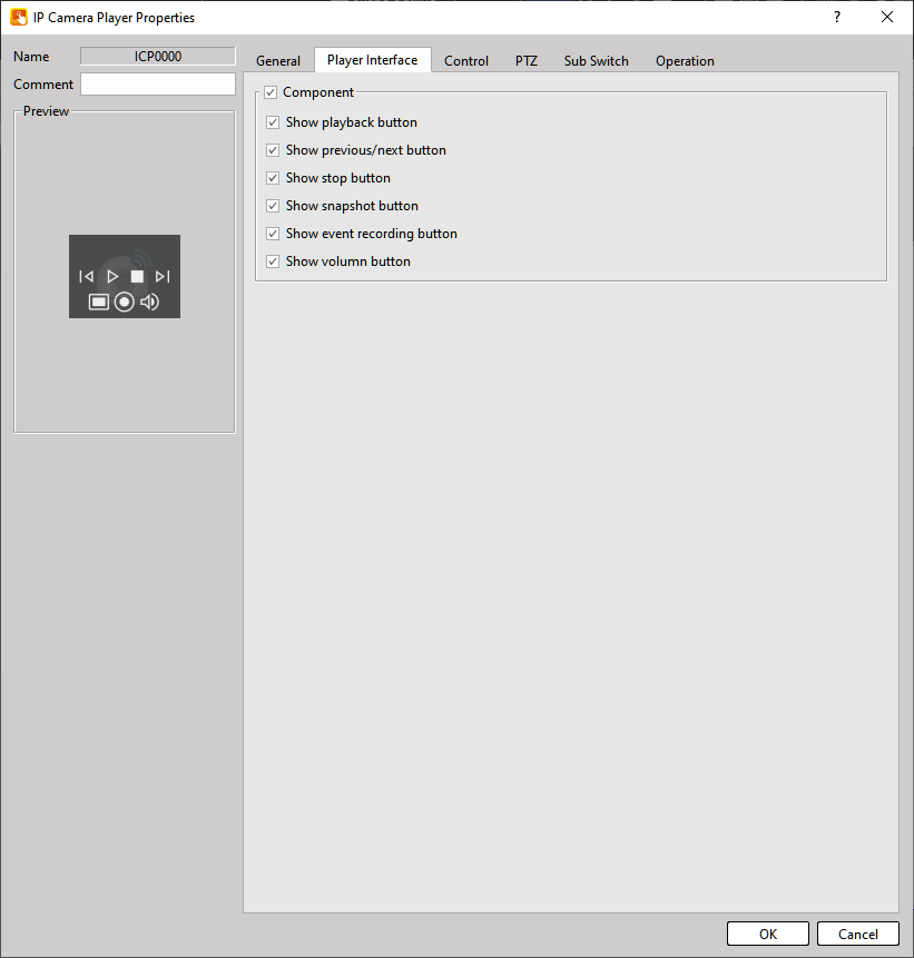
Figure 370【Player Interface】Setting Page
Table 237【Player Interface】Properties Setting
|
Property |
Description |
|
【Show playback button】 |
Plays the network camera stream. |
|
【Show previous/next button】 |
Switches the currently displayed camera. |
|
【Show stop button】 |
Stops the camera stream. |
|
【Show snapshot button】 |
Captures the current video frame. |
|
【Show event recording button】 |
Starts recording. |
|
【Show volumn button】 |
Displays a volume slider that can be adjusted. |
Important Notes
- The player interface uses an embedded design.
When the HMI screen is touched, the control interface appears. Tapping outside the interface hides it. - The component layout is fixed and cannot be modified.
- The component size automatically scales based on the object size and the number of enabled components.
19.4.36.3 【Control】
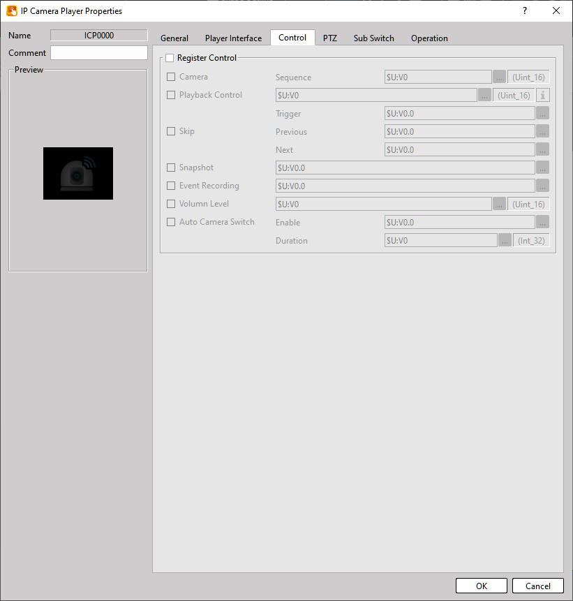
Figure 371【IP Camera Player】【Control】Setting Page
Table 238【IP Camera Player】【Control】Properties Setting
|
Property |
Description |
||||||||
|
【Camera】 |
Uses a register to set the currently displayed camera index number. |
||||||||
|
【Playback Control】 |
|
||||||||
|
【Skip】 |
Use a Bit to switch to the previous or next camera. |
||||||||
|
【Snapshot】 |
Use a Bit to trigger a screenshot. |
||||||||
|
【Event Recording】 |
Use a Bit to trigger recording. |
||||||||
|
【Volumn Level】 |
Use a register to control the volume (range 0–100). |
||||||||
|
【Auto Camera Switch】 |
Use a register to configure camera rotation. |
19.4.36.4 【PTZ】
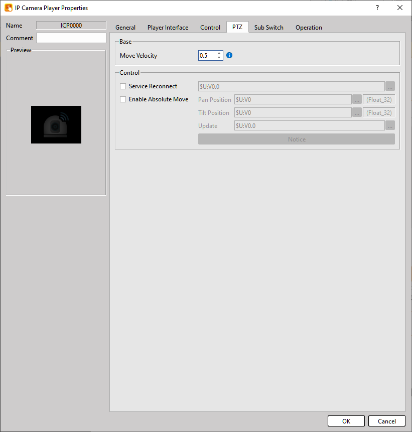
Figure 372【IP Camera Player】【PTZ】Setting Page
Table 239【IP Camera Player】【PTZ】Properties Setting
|
Property |
Description |
|
【Basic】 |
【Movement Velocity】 Sets the camera movement speed vector. Due to mechanical inertia, the camera may slightly overshoot the target position when stopping and may automatically adjust back to the correct angle. |
|
【Control】 |
【Service Reconnect】Reconnect to the PTZ service. 【Enable Absolute Move】Quickly move the camera to a specific angle. 【Pan Position】Set the horizontal angle. 【Tilt Position】Set the vertical angle. 【Update】Trigger movement via a Bit. |
The valid range for Pan Position and Tilt Position is -1.0 to 1.0, representing relative camera positions.
The actual angle range depends on the camera model.
Example mapping:
|
Value |
Possible Angle |
|---|---|
|
Tilt = -1.0 |
≈ 90° |
|
Tilt = 1.0 |
≈ 0° |
|
Pan = 0.0 |
≈ 0° |
|
Pan = 1.0 |
≈ 180° |
|
Pan = -1.0 |
≈ 180° |
|
Pan ≈ 0.03 |
≈ 355° |
If the displayed position differs from the actual angle, use Update to re-query the correct position.
Because camera manufacturers implement PTZ differently, users must test the mapping themselves.
The player must be in playback mode (status = 2) for PTZ control to function correctly.
19.4.36.5 【Sub Switch】
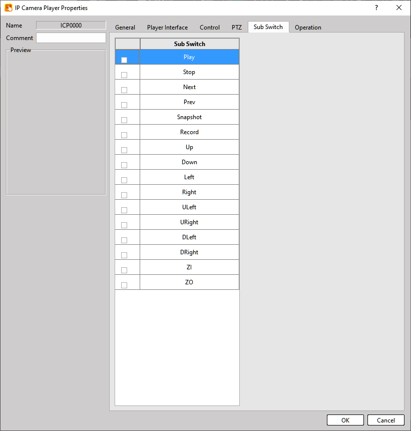
Figure 373【IP Camera Player】【Sub Switch】Setting Page
Table 240【IP Camera Player】【Sub Switch】Properties Setting
|
Property |
Description |
|
【Play】 |
Start the player. |
|
【Stop】 |
Stop the player. |
|
【Next】 |
Switch to the previous camera. |
|
【Prev】 |
Switch to the next camera. |
|
【Snapshot】 |
Capture a screenshot. |
|
【Record】 |
Start recording. |
|
【Up】 |
Press and hold to move the camera upward continuously. |
|
【Down】 |
Press and hold to move the camera downward continuously. |
|
【Left】 |
Press and hold to move the camera left continuously. |
|
【Right】 |
Press and hold to move the camera right continuously. |
|
【ULeft】 |
Move upward + left. |
|
【URight】 |
Move upward + right. |
|
【DLeft】 |
Move downward + left. |
|
【DRight】 |
Move downward + right. |
|
【ZI】 |
Press and hold to zoom in. |
|
【ZO】 |
Press and hold to zoom out. |
19.4.37 【SQL Query Table】
Use【SQL Query Table】to display the execution results of【SQL Query】commands.
19.4.37.1 【General】
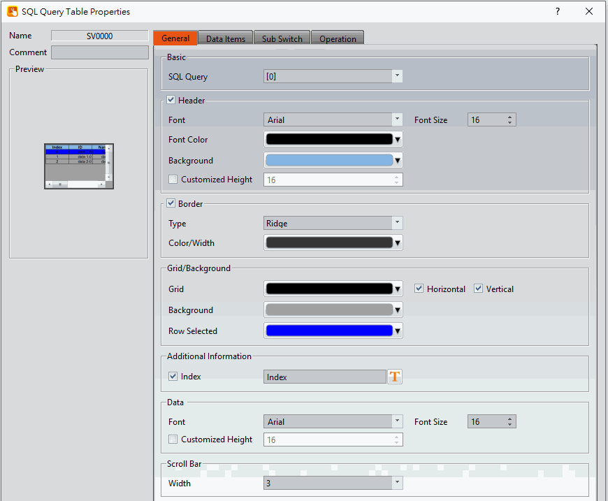
Figure 374【SQL Query Table】【General】setting paging
Table 241【SQL Query Table】【General】property setting
|
Property |
Description |
|
【Name】 |
The default name of the object. |
|
【Comment】 |
Set the comment of the object. |
|
【Preview】 |
Preview the appearance of this object. |
|
【Basic】 |
【SQL Query】 If the user adds the SQL query setting to the database function, the SQL query list can be seen here. The selected SQL query execution result will be displayed on the table. |
|
【Header】 |
Check whether to show header 【Font】 Set the header’s font 【Font Size】 Set the header’s font size 【Font Color】 Set the header’s font color 【Background】 Set the header’s background |
|
【Border】 |
【Type】 Set border type. 【Color/Width】 Set the color and width of the border. |
|
【Grid/Background】 |
【Grid】 Set the grid’s color 【Horizontal】 Check whether to display the horizontal line and set the color of the horizontal line 【Vertical】 Check whether to display the vertical line and set the color of the vertical line 【Background】 Set the color of the table background 【Row Selected】 Set the color to be displayed when you are elected to the specified row and column |
|
【Additional information】 |
【Index】 Check whether to display index |
|
【Data】 |
【Font】 Set the data’s font 【Font Size】 Set the data’s font size 【Customized Height】 The height of the data row can be set according to requirements |
|
【Scroll Bar】 |
【Width】 Adjust the right side scroll bar width, provides 5 widths. |
19.4.37.2 【Data Item】
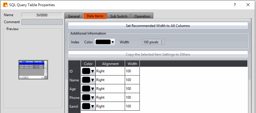
Figure 375【SQL Query Table】【Data Item】Setting Page
Table 242【SQL Query Table】【Data Item】Properties Setting
|
Property |
Description |
|
【Set Recommended Width to All Columns】 |
When this button is pressed, the software calculates the required column width at the time of planning and sets its field width. |
|
【Additional Information】 |
Set the width and text color of the title in the left column of【Index】. |
|
【Copy the Selected Item to Others】 |
Select one of the parameter names in the column below, and then click this button to change the settings of other items to be the same as the settings of the selected item. |
|
【Color】 |
Set the color of the data. |
|
【Alignment】 |
Decide how to align the data |
|
【Width】 |
Set the field width of the data |
19.4.37.3 【Sub Switch】
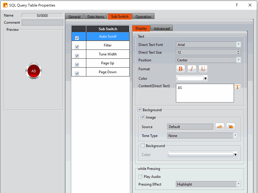
Figure 376【SQL Query Table】【Sub Switch】Setting Page
Table 243【SQL Query Table】【Sub Switch】Properties Setting
|
Property |
Description |
|
【Sub Switch】 |
【Auto Scroll】 Turn on/off the auto scrolling, this is a reverse switch. If is turned on, the table will automatically scroll to the row selection position of the SQL query. On the contrary, the form will not automatically scroll. 【Filter】 The displayed data can be filtered out based on fields and keywords
【Tune Width】 Automatically adjust the width of the fields in the table 【Page Up】 The Read command of SQL query will only read 1000 data from the database at a time, and after pressing it, the first 1000 data will be read 【Page Down】 The Read command of the SQL query only reads 1000 data from the database at a time, and after pressing it, the next 1000 data will be read. |
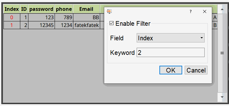
19.4.38 【VNC Viewer Display】
19.4.38.1 【Setting】
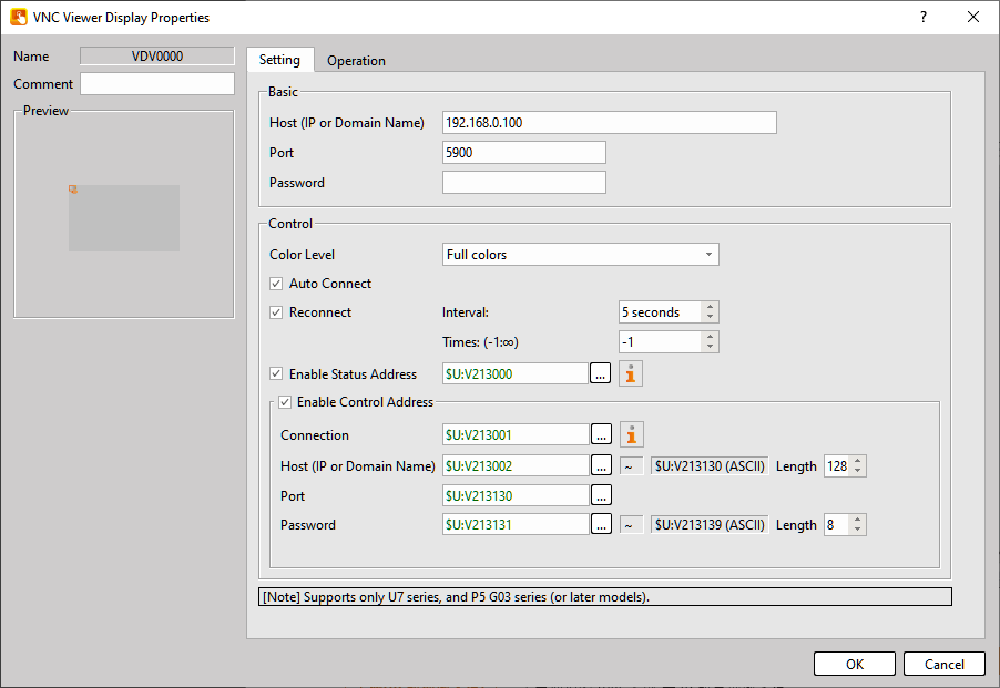
Figure 377【VNC Viewer Display】setting paging
Table 244【VNC Viewer Display】property setting
|
Property |
Description |
||||||||||
|
【Name】 |
|
||||||||||
|
【Host(IP or Donmain Name)】 |
Set the IP address or domain name of the VNC server to connect to. |
||||||||||
|
【Port】 |
Set the connection port. The default value is 5900. |
||||||||||
|
【Password】 |
Set the password required to connect to the server. |
||||||||||
|
【Color Level】 |
Set the display color level of the VNC viewer. Available options are Full, 256 Colors, 64 Colors, and 8 Colors. |
||||||||||
|
【Auto Connect】 |
When enabled, the system will automatically connect using the settings defined in Basic when the project starts. |
||||||||||
|
【Reconnect】 |
When enabled, the system will attempt to reconnect if the connection to the server is lost. 【Interval】 【Times】 |
||||||||||
|
【Enable Status Address】 |
Use a register to display the connection status.
|
||||||||||
|
【Enable Control Address】 |
Use registers to dynamically control the viewer functions. 【Connection】 Use numeric values to control the viewer state.
※Dynamic Update Procedure:
【Host(IP or Donmain Name)】Enter the server connection information in a register. The data type must be ASCII. 【Port】Enter the connection port in a register. The data type must be 16-bit UINT. 【Password】Enter the server password in a register. The data type must be ASCII. |
19.4.39 【2D Drawing Graph】
This function must be used together with the 【Recipe】 feature.
Users can sequentially configure curve objects for multiple Master point along a path.
Each newly added Master point corresponds to a new recipe entry.
The recipe parameters must follow a fixed format, as described below.
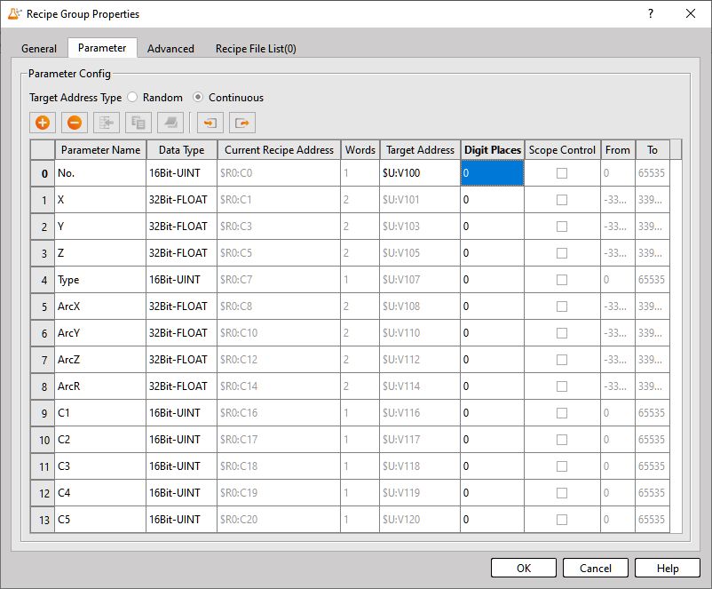
Figure 378【2D Drawing Graph-Recipe】setting paging
Table 245【2D Drawing Graph-Recipe】property setting
|
Property |
Description |
||||||||||||||
|
No. |
Index number |
||||||||||||||
|
X |
X coordinate of the point |
||||||||||||||
|
Y |
Y coordinate of the point |
||||||||||||||
|
Z |
Z coordinate of the point |
||||||||||||||
|
Type |
Point type
|
||||||||||||||
|
ArcX |
Arc Parameter 1
|
||||||||||||||
|
ArcY |
Arc Parameter 2
|
||||||||||||||
|
ArcZ |
Arc Parameter 3 |
||||||||||||||
|
ArcR |
Arc Parameter 4 |
||||||||||||||
|
C1 |
Custom Parameter 1 |
||||||||||||||
|
C2 |
Custom Parameter 2 |
||||||||||||||
|
C3 |
Custom Parameter 3 |
||||||||||||||
|
C4 |
Custom Parameter 4 |
||||||||||||||
|
C5 |
Custom Parameter 5 |
19.4.39.1 【General】
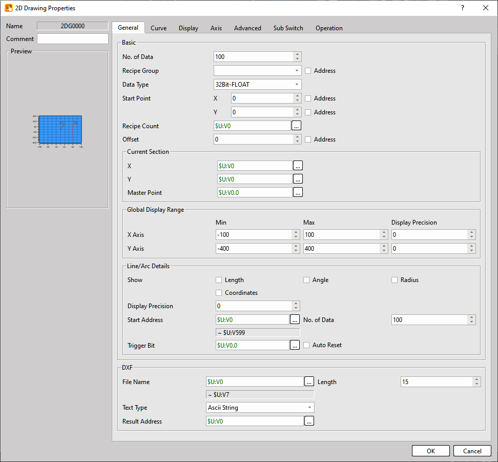
Figure 379【2D Drawing Graph-Recipe】【Gerneral】setting paging
Table 246【2D Drawing Graph-Recipe】【Gerneral】property setting
|
Property |
Description |
|||||||||||||
|
No. of Data |
Defines the maximum number of Master point. |
|||||||||||||
|
Recipe Group |
If recipe groups have been created in the Recipe Configuration, their ID and name will appear here. |
|||||||||||||
|
Data Type |
Defines the data type of the Master point data. |
|||||||||||||
|
Start Point |
If the 【Address】 option is checked, the start point can be dynamically controlled through a register. |
|||||||||||||
|
Recipe Count |
Defines the register address used to display the number of created recipes. |
|||||||||||||
|
Offset |
Defines the offset value of the path line. |
|||||||||||||
|
Current Section |
Displays the current X and Y coordinates and indicates whether the current position is a Master point. |
|||||||||||||
|
Global Display Range |
Defines the displayable range by setting the maximum and minimum values for the X and Y axes. |
|||||||||||||
|
Line/Arc Details |
Defines whether detailed information about Master point should be displayed on the 2D drawing object, including : Length, Angle, Radius, Coordinates Registers can also be configured to store these values.
|
|||||||||||||
|
DXF |
Defines the DXF file name to load and the register address storing the loading result. Result Address Definition :
|
19.4.39.2 【Advanced】
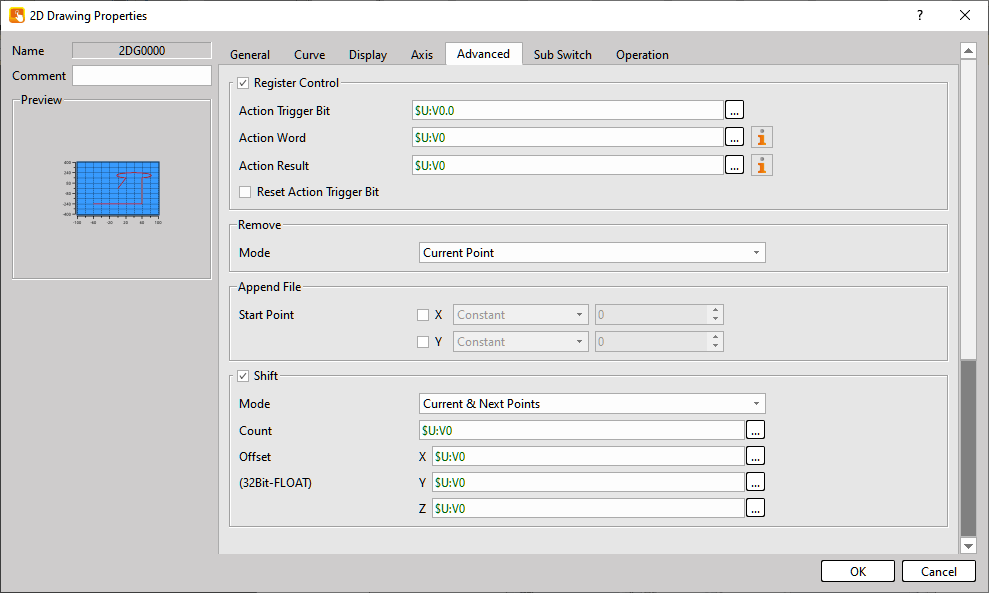
Figure 380【2D Drawing Graph-Recipe】【Advanced】Setting Page
Table 247【2D Drawing Graph-Recipe】【Advanced】Properties Setting
|
Property |
Description |
|
Register Control |
When enabled,【Action Trigger Bit】and【Action Word】can be configured. |
|
Remove |
Must be used with sub switch. |
|
Append File |
Must be used with sub switch. |
|
Shift |
Must be used with sub switch. |
19.4.39.3 【Sub Switch】
Figure 381【2D Drawing Graph-Recipe】【Sub Switch】Setting Page
Table 248【2D Drawing Graph-Recipe】【Sub Switch】Properties Setting
|
Property |
Description |
|||||||||||
|
Master Point |
【Auto Scroll】 Turn on/off the auto scrolling, this is a reverse switch. If is turned on, the table will automatically scroll to the row selection position of the SQL query. On the contrary, the form will not automatically scroll. Set the current position as a Master point. |
|||||||||||
|
Master Point Up Cursor |
Move the cursor to the previous Master point. |
|||||||||||
|
Master Point Down Cursor |
Move the cursor to the next Master point. |
|||||||||||
|
Type Selection |
Switch the line type between : Line, Arc (Through Point), Arc (Center) Clockwise, Arc (Center) Counterclockwise, Arc (Radius) Clockwise, Arc (Radius) Counterclockwise |
|||||||||||
|
Insert |
Insert a Master point after the current Master point. |
|||||||||||
|
Edit |
Modify the data of the current Master point. |
|||||||||||
|
Remove |
Remove Master point. The removal mode can be configured in the Advanced page.
|
|||||||||||
|
Clear |
Remove all Master point. |
|||||||||||
|
Update |
Update all Master point based on the recipe group data. |
|||||||||||
|
DXF |
Load a DXF file into the 2D drawing object and the selected recipe group. |
|||||||||||
|
Hor. Zoom In |
Zoom in horizontally |
|||||||||||
|
Hor. Zoom Out |
Zoom out horizontally |
|||||||||||
|
Ver. Zoom In |
Zoom in vertically |
|||||||||||
|
Ver. Zoom Out |
Zoom out vertically |
|||||||||||
|
Export |
Export all Master point to a file. |
|||||||||||
|
Append |
Append file data into the 2D drawing editor. The appended data will start from the current recipe number. This function requires configuration in the【Advanced】 → 【Append File】settings.
The starting point of appended data can be defined separately for X and Y. Available modes:
|
|||||||||||
|
Shift |
Allows batch translation of Master point.
The 【Mode】is explained as follows:
【Offset】X, Y, and Z are used to set the translation amount, and the values will be determined according to the data type settings. |
|||||||||||
|
Offset |
Apply path offset based on the【Offset】value defined in the【General】settings. |

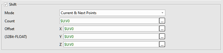
19.4.40 【Parison Graph】
The【Parison Graph】is an object used to edit 【interpolation curves】.
In this editor : The X-axis represents the value (index) and the the Y-axis represents the data amount.
Its main functions are as follows:
- Modify the index and value in the Current Section to adjust the curve displayed in the Profile Editor.
- Use sub switch to set/cancel Master point, switch interpolation types, clear data, or load interpolation results into the editor to edit the interpolation curve data.
- Provide a reference line to compare the difference between the interpolation curve and actual values. The reference line can be used in comparison mode, or enabled in normal mode through a reference line address. The data can be inserted into the Profile Editor using the Insert/Update Reference Line sub switch.
Notice :
- The first and last points of the interpolation curve are always Master point and cannot be canceled.
- After switching pages, the curve in the editor will be cleared automatically. You must use the sub switch to reload the data.
- This function is only available on P5 / U7 / FvRT models with software version V1.6.60 or later.
19.4.40.1 【General】
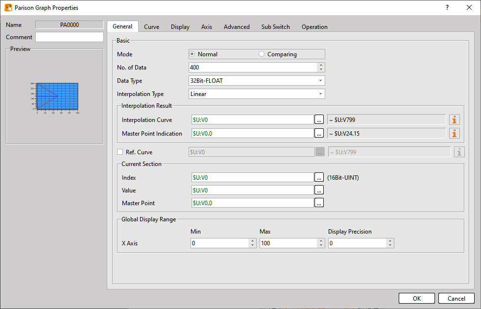
Figure 382【Parison Graph】【General】setting paging
Table 249【Parison Graph】【General】property setting
|
Property |
Description |
|
【Basic】 |
【Mode】 Defines the operating mode of the【Parison Graph】. Available modes:
【No. of Data】 Defines the number of data points in the curve. 【Data Type】 Defines the data type used for the curve values. 【Interpolation Type】 Defines the interpolation method used by the object. Available options : 【Linear】, 【S-Curve】. During runtime, the interpolation type can be switched using the【Interpolation Selection】sub switch. |
|
【Interpolation Result】 |
【Interpolation Curve】 Defines the starting address used to store the X values of the curve. Press the 【Output to PLC】 sub switch to write the curve data to this address. 【Mater Points Indication】 Defines whether each Y-axis control point is a Master point. The result is stored in individual bits : 1 = Master point, 0 = Not a Master point Press the【Output to PLC】sub switch to store the data at this address. In Comparison Mode, this option can be enabled if required. |
|
【Ref. Curve】 |
The【Ref. Curve】is displayed on top of the current curve for comparison. Use the【Insert / Update Ref. Curve】 sub switch to load the【Ref. Curve】into the editor. In Normal Mode, this option can be enabled if required. Noteice : Once a【Ref. Curve】is loaded, it cannot be removed from the screen. |
|
【Current Section】 |
Allows direct reading or modification of the index and value of the current point via registers. Inside the【Parison Graph】, the currently selected point is indicated by a blue cursor and master points are marked in green. Values will only update in the editor when the selected point is a master point. 【Index】Register address of the selected point index. 【Value】Register address of the selected point value. 【Master Point】Displays or sets whether the current point is a Master point (1 = yes, 0 = no). |
|
【Global Display Range】 |
Defines the display range of the X-axis. 【Min】Minimum value of the X-axis display range. 【Max】Maximum value of the X-axis display range. 【Display Precision】Number of decimal places displayed. Note: values outside this range will not be displayed. |
|
【Border】 |
【Type】 Set border type. 【Color/Width】 Set the color and width of the border. |
19.4.40.2 【Advanced】
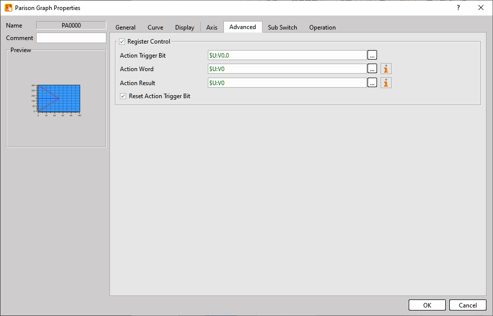
Figure 383【Parison Graph】【Advanced】Setting Page
Table 250【Parison Graph】【Advanced】Properties Setting
|
Property |
Description |
||||||||||||||||||
|
【Register Control】 |
Enable this option to allow the editor actions to be controlled through registers. |
||||||||||||||||||
|
【Action Trigger Bit】 |
Defines the bit used to trigger the action specified in the【Action Word】. |
||||||||||||||||||
|
【Action Word】 |
Defines the action to be executed via a register. The actions correspond to the【Sub Switch】. For detailed descriptions, please refer to the next section.
|
||||||||||||||||||
|
【Action Result】 |
Displays the execution result.
|
||||||||||||||||||
|
【Reset Action Trigger Bit】 |
Enable this option to automatically reset the【Action Trigger Bit】to zero after it is triggered. |
19.4.40.3 【Sub Switch】
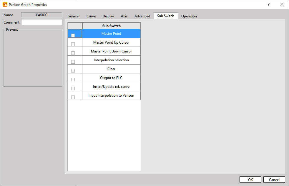
Figure 384【Parison Graph】【Sub Switch】Setting Page
Table 251【Parison Graph】【Sub Switch】Properties Setting
|
Property |
Description |
|
Mater Point |
【Auto Scroll】 Set or cancel the Master point at the current index position. |
|
Master Point Up Cursor |
Move the cursor to the previous Master point. |
|
Master Point Down Cursor |
Move the cursor to the next Master point. |
|
Interpolation Selection |
Switch between Polyline and Curve. |
|
Clear |
Clear all data displayed in the【Parison Graph】. |
|
Output to PLC |
Output the planned curve from the【Parison Graph】to the address specified in【Interpolation Curve】. |
|
Insert / Update Ref. Curve |
When the reference line function is enabled, this switch reads the reference line into the【Parison Graph】. Notice : Once loaded, the reference line cannot be removed except by changing pages or pressing【Clear】. |
|
Input interpolation to Parison |
Read the【Interpolation Curve】from the【Interpolation Result】address back into the 【Parison Graph】. Notice : The first and last master point bits in the【Interpolation Result】 address must be ON, otherwise the data reading will fail. |
19.4.41 【Signboard Cutting】
This is a 2D drawing object designed for special applications. By importing a DXF file that contains the outline of a signboard graphic, and after configuring the required parameters, the system can output all cutting positions on the signboard.
19.4.41.1 【General】
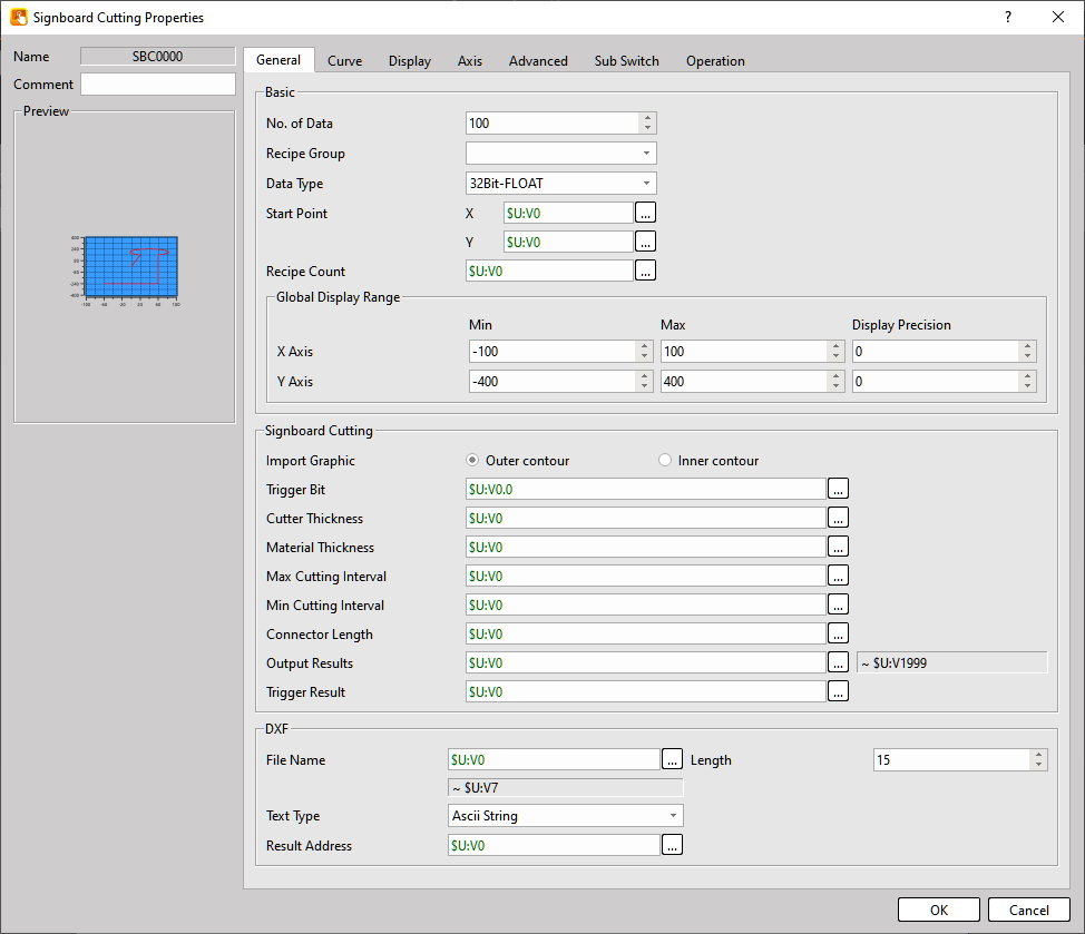
Figure 385【Signboard Cutting】【General】setting paging
Table 252【Signboard Cutting】【General】property setting
※Notice : Except for the【Signboard Cutting】section, all other settings are the same as the【2D Drawing Graph-Recipe】. Therefore, duplicated settings will not be described here.
|
Property |
Description |
||||||||
|
Inport Graphic |
Select whether the imported shape represents the outer contour or the inner contour of the signboard. |
||||||||
|
Trigger Bit |
Select a Bit address used to trigger the operation. |
||||||||
|
Cutter Thickness |
Set the thickness of the cutting blade used for signboard cutting. |
||||||||
|
Material Thickness |
Set the thickness of the signboard material. |
||||||||
|
Max Cutting Interval |
Set the maximum interval between cutting points. |
||||||||
|
Min Cutting Interval |
Set the minimum interval between cutting points. |
||||||||
|
Connector Length |
Set the joint length of the signboard. |
||||||||
|
Output Results |
After the trigger bit is activated, the calculated signboard cutting data will be stored at this address.
|
||||||||
|
Trigger Results |
After the trigger bit is activated, the execution result will be displayed here.
|
Tip: press ← → to switch chapters, Ctrl+K to search